The CSS classes used by Blazor UI are not documented. (I haven't looked outside the Blazor area, so maybe it's somewhere else in the docs? My team has no need for other Telerik products.) On a similar note, the Themes page in the documentation explains how to reference alternate themes like Bootstrap, but it doesn't explain how to actually use the classes, or how it integrates with the real Bootstrap CSS, which have many various useful, well-known utilities like margin and padding settings, which don't seem to be part of the Telerik theme support. (I'm an architect at a very large corporation, we do have one of those includes-everything DevCraft licenses, I just can't log in with that account.)
At this point, the expectation is that custom classes should be rendered on our component wrapper and it is up to those classes to provide sizing (such as 100% width). My previous post lists the two known issues in this regard. If other problems surface, let's discuss them separately as something that would need to be fixed or implemented. At this point, the Telerik Bootstrap theme should generally work with Bootstrap 4. I do not see value in competing with the official Bootstrap documentation on what their classes do, though, so I will not be documenting this further.
Regards,
Marin Bratanov
Progress Telerik
Hello,
The issue with the numeric textbox is that it renders the Class on the wrong element, I made the following page where you can track the status of this issue: https://feedback.telerik.com/blazor/1458547-class-does-not-render-on-the-main-wrapping-element. I added a workaround there.
For the combo box - this needs to be implemented (there are also a couple of workarounds there): https://feedback.telerik.com/blazor/1440092-dropdown-components-to-calculate-their-dropdown-element-width-to-match-the-actual-width-of-the-component-in-px-when-popupwidth-is-not-set.
Here is also the modified snippet that includes them both (highlighted):
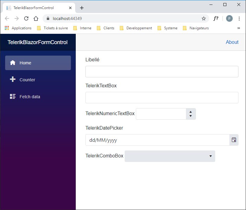
<div class="form-group">
    <label>Libellé</label>
    <input type="text" class="form-control" />
</div>

<div class="form-group">
    <label>TelerikTextBox</label>
    <TelerikTextBox Class="form-control" @bind-Value="@TelerikTextBoxField" />
</div>

<div class="form-group">
    <label>TelerikNumericTextBox</label>
    <TelerikNumericTextBox Class="form-control" Width="100%" @bind-Value="@TelerikNumericTextBoxField" T="int?" />
</div>

<div class="form-group">
    <label>TelerikDatePicker</label>
    <TelerikDatePicker Class="form-control" @bind-Value="TelerikDatePickerField" T="DateTime?" />
</div>


<div class="form-group">
    <label>TelerikComboBox</label>
    <TelerikDropDownList Class="form-control" Width="" Data="@TelerikComboBoxData" @bind-Value="TelerikComboBoxField"
                         ValueField="Id" TextField="Text" TItem="TelerikComboBoxItem" TValue="int?" />
</div>


@code{
    private string TelerikTextBoxField { get; set; }
    private int? TelerikNumericTextBoxField { get; set; }
    private DateTime? TelerikDatePickerField { get; set; }
    private int? TelerikComboBoxField { get; set; }
    private IList<TelerikComboBoxItem> TelerikComboBoxData { get; set; }

    public class TelerikComboBoxItem
    {
        public int Id { get; set; }
        public string Text { get; set; }
    }
}
Regards,
Marin Bratanov
Progress Telerik
Hi Marin,
I'm now using the 2.9.0 version. With TelerikNumericTextBox, it's OK but not with the other controls.
The source code
@page "/"
<div class="form-group">
<label>Libellé</label>
<input type="text" class="form-control" />
</div>
<div class="form-group">
<label>TelerikTextBox</label>
<TelerikTextBox Class="form-control" @bind-Value="@TelerikTextBoxField" />
</div>
<div class="form-group">
<label>TelerikNumericTextBox</label>
<TelerikNumericTextBox Class="form-control" @bind-Value="@TelerikNumericTextBoxField" T="int?" />
</div>
<div class="form-group">
<label>TelerikDatePicker</label>
<TelerikDatePicker Class="form-control" @bind-Value="TelerikDatePickerField" T="DateTime?" />
</div>
<div class="form-group">
<label>TelerikComboBox</label>
<TelerikDropDownList Class="form-control" Data="@TelerikComboBoxData" @bind-Value="TelerikComboBoxField"
ValueField="Id" TextField="Text" TItem="TelerikComboBoxItem" TValue="int?"/>
</div>
@code{
private string TelerikTextBoxField { get; set; }
private int? TelerikNumericTextBoxField { get; set; }
private DateTime? TelerikDatePickerField { get; set; }
private int? TelerikComboBoxField { get; set; }
private IList<TelerikComboBoxItem> TelerikComboBoxData { get; set; }
public class TelerikComboBoxItem
{
public int Id { get; set; }
public string Text { get; set; }
}
}
The result
Hi,
This seems to be working for me with 2.8.0 (we made fixes on the textbox in that release, earlier versions will probably have visual issues if you do that):
<div class="form-group">
    <label>Libellé</label>
    <input type="text" class="form-control" />
</div>

<div class="form-group">
    <label>Libellé</label>
    <TelerikTextBox @bind-Value="@someField" Class="form-control" />
</div>

@code{
    string someField { get; set; }
}
Of course, make sure to use our Bootstrap Theme. I am also attaching a short video that shows the expected rendering I see so you can confirm if I am missing something. This also applies to other bootstrap classes - you should be able to style and lay your elements as needed with Bootstrap, this is its purpose and we don't interfere with markup and styling outside of our components.
On using other bootstrap classes on your layout - you should also be able to use the col-* classes, I see no reason that will prevent you from doing so.
Regards,
Marin Bratanov
Progress Telerik
Hi,
I'm interesting by this question too because I tried to use the "form-group" class of bootstrap to associate label and Telerik controls but can't figure how to do it.
Indeed, the following code runs correctly (by default, label is above the input)
<div class="form-group">
<label>Libellé</label>
<input type="text" class="form-control" />
</div>
but this one doesn't because TelerikTextBox is place on the same row
<div class="form-group">
<label>Libellé</label>
<TelerikTextBox @bind-Value="@XXXX"/>
</div>
If I add the "form-control" class to the TelerikTextBox, the position is OK but the Bootstrap form control appears also so....
Marin, when you say that we can use Bootstrap to layout the interface, would you think only to row, col classes?
Hi again Jon,
I am writing to let you know that we intend to make improvements in this regard. I have just discussed the case with our front-end architect and we will probably amend our stylesheets and rendering to offer integration for bootstrap classes (maybe for our Bootstrap theme only, not for the others, this is yet to be determined). It is a large undertaking, though, and I cannot say what the time frame for it will be, but it will be announced in the release notes. Ultimately, you would be able to use (some of) the bootstrap classes in a fashion similar to what you would do with regular inputs (e.g., things like Class="form-control form-control-sm"). Depending on how this goes, perhaps we will also add some guidance on what is supported and what not. This is subject to the results of the integration work.
Regards,
Marin Bratanov
Progress Telerik
Hi Jon,
To put the executive summary in the beginning - Bootstrap and Telerik UI for Blazor are two completely separate products that do not share classes or code. You can use Bootstrap to create layouts and then put our components in those layouts by treating them like the <span> or <div> elements that they are. You can use Bootstrap classes and utilities on your own elements in the markup regardless of the components inside.
The Telerik Bootstrap theme is not the same as the Bootstrap framework (or styles), it is our own theme that uses the Bootstrap metrics and design approaches to fit into a Bootstrap layout better. It can also use variables from Bootstrap, and you can see one way to do that through building the SASS files for both Bootstrap and Telerik in the following sample app: https://github.com/telerik/blazor-dashboard.
The classes we use internally are not something that should be documented, because they (or the way we use them) may change as the code evolves. If you need to customize the components' appearance, you can use the Theme builder and make a custom theme: https://themebuilder.telerik.com/blazor-ui. Alternatively, for small tweaks, you can inspect the rendered HTML and devise the desired CSS rules to override our built-in ones: https://www.telerik.com/blogs/improve-your-debugging-skills-with-chrome-devtools.
With this in mind, could you provide some more details on what further information you would like to see in our documentation?
Regards,
Marin Bratanov
Progress Telerik
- All
- Completed (1457)
- Declined (372)
- Duplicated (410)
- In Development (3)
- Need More Info (25)
- Planned (1)
- Under Review (2)
- Unplanned (1106)
- Won't Fix (23)
- All
- UI for Blazor
- Agentic UI Generator
- AIPrompt
- AnimationContainer
- AppBar
- ArcGauge
- AutoComplete
- Avatar
- Badge
- Barcode
- Breadcrumb
- BrowserExtension
- Button
- ButtonGroup
- Calendar
- Card
- Carousel
- Charts
- Chat
- Checkbox
- Chip
- ChipList
- ChunkProgressBar
- CircularGauge
- ColorGradient
- ColorPalette
- ColorPicker
- ComboBox
- ContextMenu
- DateInput
- DatePicker
- DateRangePicker
- DateTimePicker
- Diagram
- Dialog
- DockManager
- Drawer
- DropDownButton
- DropDownList
- DropDownTree
- DropZone
- Editor
- FileManager
- FileSelect
- Filter
- FlatColorPicker
- FloatingActionButton
- FloatingLabel
- Form
- Gantt
- Grid
- GridLayout
- InlineAIPrompt
- Installer and VS Extensions
- Licensing
- LinearGauge
- ListBox
- ListView
- Loader
- LoaderContainer
- Map
- MaskedTextBox
- MediaQuery
- Menu
- MultiColumnComboBox
- MultiSelect
- Notification
- NumericTextBox
- Page Templates / Building Blocks
- Pager
- PanelBar
- PDFViewer
- PivotGrid
- Popover
- Popup
- ProgressBar
- PromptBox
- QRCode
- RadialGauge
- RadioGroup
- RangeSlider
- Rating
- Scheduler
- SegmentedControl
- Signature
- Skeleton
- Slider
- SmartPasteButton
- SpeechToTextButton
- SplitButton
- Splitter
- Spreadsheet
- StackLayout
- Stepper
- StockChart
- Switch
- TabStrip
- TaskBoard
- TextArea
- TextBox
- TileLayout
- TimePicker
- ToggleButton
- ToolBar
- Tooltip
- TreeList
- TreeView
- Upload
- ValidationMessage
- ValidationSummary
- ValidationTooltip
- VS Code Extension
- WebMCP
- Window
- Wizard