When I click on the CheckBox's label, "Select All," the dropdown closes. While if I click the TelerikCheckBox itself, it remains open.
===
TELERIK EDIT
Possible workarounds include:
- Wrap the clickable UI in the MultiSelect HeaderTemplate in an element with a tabindex attribute: https://blazorrepl.telerik.com/mfOlnvFk40G8PElJ33
- Cancel the MultiSelect OnClose event conditionally: https://blazorrepl.telerik.com/QpYvxvla44M3nsdp57
Hi,
I would like checkbox support including the check all checkbox on the multiselect component like: https://docs.telerik.com/devtools/aspnet-ajax/controls/combobox/functionality/checkbox-support
The url below shows how to create custom checkboxes in the multiselect component but adding a check all checkbox in the headertemplate does not update the multiselect popup
Testing this Select All Checkbox sample in Safari produces a different result compared to other browsers.
Click on the CheckBox in the MultiSelect Header Template closes the popup in Safari. In other browsers (e.g. Chrome, Firefox) the popup remains open after checking the SelectAll CheckBox.
Description
In Firefox, there are occasions in which multiple items remain focused (k-focus class is not removed from the blurred item)
Reproduction (if bug)
- Create a multiselect and set AutoClose="false".
- Open the component and select a few items.
- Close the component.
- Open the component and select a new item.
- Two items have the k-focus class.
Second related case:
- Create a multiselect and set AutoClose="false".
- Open the component and navigate up and down with the keyboard arrows.
- Select an item.
- The last focused item with the arrows is focused as well as the newly selected item.
Expected (if bug)
Only one item should have the k-focus class at a time.
Browser (if bug)
Firefox
Broken Telerik UI for Blazor version (if bug)
3.5.0
I was hoping to use the new AllowCustom feature to let users name a few areas, save those names in the backend and later show them as preselected when the user comes back so they don't have to retype the names every time they do an operation. But alas, the AllowCustom seems to only allow preselecting from what's in the Data list of values.
So code like below doesn't actually show a chip for Rome even though it's preselected. There is a workaround of setting the Data property to a list that contains the custom values I need preselected, but it feels clumsy and with the custom values I feel Multiselect should also check the selected values list for chips to render.
<TelerikMultiSelect
   @bind-Value="@SelectedCities"
   TItem="string" TValue="string"
   AllowCustom="true"
   Width="400px">
</TelerikMultiSelect>

<span>Selected: @SelectedCities.Count</span>

@code {
    private List<string> SelectedCities { get; set; } = new() {"Rome"};
}
Here are some details on the issue I am referring to:
- The problem only occurs when there is at least one item selected.
- If the focus is on the chip/selected item, you can properly navigate back to the previous input with Shift+Tab.
- If the focus is on the input, though, then you cannot use Shift+Tab to navigate back to the previous input/focusable element.
Reproduction: https://blazorrepl.telerik.com/GJkdbBvJ44uuG3fF40.
Like https://docs.telerik.com/blazor-ui/components/combobox/custom-value and https://www.telerik.com/kendo-angular-ui/components/dropdowns/multiselect/custom-values/ so the user can input tags on their own without them being in the app data source.
---
ADMIN EDIT
The following sample may be useful in implementing this in the meantime: https://github.com/telerik/blazor-ui/tree/master/multiselect/add-new-item
---
The MultiSelect displays initially selected items in the order in which the items occur in the data source. For example:
- The MultiSelect contains items 1, 2, 3, 4, 5.
- The user selects 4, 1, 3 in this order.
- The next time the user visits the MultiSelect page, the component will show 1, 3, 4 as selected.
In some scenarios it's important to preserve the original order of the selected items, so that it matches the users' personal preferences, perceived item importance or simply the selection history.
In the meantime, a possible workaround is to reorder the data source items, which are initially selected:
The OnBlur event does not fire after removing an item wehn using TagMode="@MultiSelectTagMode.Single"
I used this snippet in the Blazor REPL to reproduce the issue:
<p>@OnBlurMessage</p>
<TelerikMultiSelect Data="@Countries"
                    @bind-Value="@SelectedCountries"
                    TagMode="@MultiSelectTagMode.Single"
                    Placeholder="Enter Balkan country, e.g., Bulgaria"
                    Width="350px"
                    ClearButton="true"
                    AutoClose="false"
                    OnBlur="OnBlurHandler">
</TelerikMultiSelect>

@code {
    private List<string> Countries { get; set; } = new List<string>();

    private List<string> SelectedCountries { get; set; } = new List<string>();
    string OnBlurMessage {get; set;} = "";
    int i;

    protected override void OnInitialized()
    {
        Countries.Add("Albania");
        Countries.Add("Bosnia & Herzegovina");
        Countries.Add("Bulgaria");
        Countries.Add("Croatia");
        Countries.Add("Kosovo");
        Countries.Add("North Macedonia");
        Countries.Add("Montenegro");
        Countries.Add("Serbia");
        Countries.Add("Slovenia");
        base.OnInitialized();
    }

    void OnBlurHandler()
    {
        OnBlurMessage = $"OnBlurHandler touched {++i} times";
    }
}
Steps to reproduce:
- Select an item from the list then click out of the control. Note that the comments shows "OnBlurHandler touched 1 times".
- Click the x for the "1 item(s) selected" tag then click outside of the control. Note that the comment still shows "OnBlurHander touched 1 times".
- Click into the control then outside of control. Note that the comment is updated to show "OnBlurHandler touched 2 times".
The OnBlur event should fire after step 2.
Attached is a short video clip of what I see.
By design, the filter should be cleared when the user blurs the component. The filter is currently persisted and this is not correct.
Reproducible in the filtering demo.
When @bind-Value is used, the tags are ordered in the way the user chose them, which is the expected behavior.
When you don't use two-way binding, but alter the Value in the ValueChanged event (to implement some logic), the tags get reordered according to the their occurrence in the data source.
I would expect that they remain the user order in all cases.
Category 2
- Item 1
- Item 2
Category 1
- Item 3
- Item 4
But the MultiSelect control seems to order the category name alphabetically (Category 1, Category 2, etc).
We are happy with PersistFilterOnSelect, now the filter is more useful for a multi selection.
It is not wanted that the filter text is still there if the selection list is closed!! Please allow clearing the filter value upon closing.
===
ADMIN EDIT
===
The only possible way to currently clear the filter is to force the component re-render upon closing.
Here is an example: https://blazorrepl.telerik.com/GeusuFbQ4971bi9S29.
The https://feedback.telerik.com/blazor/1517344-filter-text-is-cleared-when-you-select-an-item ticket fixed a good usability issue with multiselect. Unfortunately, it creates a bug I ran into while starting to update my applications MultiSelects.
If you have PersistFilterOnSelect=true property set, but not AutoClose=false what happens is the user types '2' to filter the selection, selects something with the mouse and the drop down closes, but the filter doesn't clear so when next trying to select an item the old filter is still there, although it's not showing. The only way to clear the ghost filter seems to be to start typing a new thing to filter on and then backspace that which finally removes the ghost.
The docs kind of mention this with "To keep the filter upon selection, set the PersistFilterOnSelect parameter to true. It only applies when Filterable="true" and AutoClose="false"" but the ghost filter staying is clearly a bug. You can test this behaviour with a repl I made. Click the multiselect active, type for.ex. '2' and select an item with the mouse, the item is selected, the dropdown closed and the filter vanishes. Now click the multiselect again, the dropdown is already filtered as if '2' had been pressed, but it's not visible and can't be cleared without typing a new filter
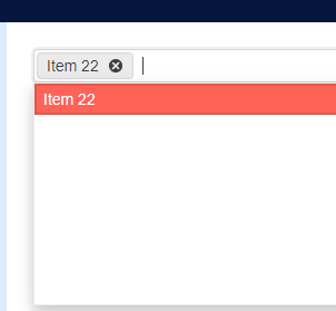
Below is a screenshot where I typed 22 as the filter, selected Item 22 and then clicked the MultiSelect again
So, imagine I want to select every item which contains letter 'S'. I type 'S' then when I click on the first item containing 'S', the 'S' in the input is removed and all the items are shown. So I need to type S again and again 1 time for each Item I want to select.
I attach a gif showing the behavior.
The dropdown (select) components such as ComboBox, MultiSelect etc. have a built-in loading indicator that includes several Skeleton instances.
I want to be able to remove that and add my custom loading indicator in the popup. Ideally, it would be a template so we could have some flexibility.
===
ADMIN EDIT
===
This request targets all the select components (AutoComplete, ComboBox, DropDownList, MultiColumnComboBox, MultiSelect).
The DropDownList currently does not have a built-in loader but that will be added as well as a prerequisite for the current feature. See Add a loading indicator in the popup.
I have set a small size to the MultiSelect. I noticed that the Summary Tag that contains the "1 more selected" text does not change - its size always remains the same regardless of the component size.
Reproduction: https://blazorrepl.telerik.com/cxFvPxvh58SMoekS04.
The Roundness setting of the MultiSelect also does not affect the summary tag.