Hello,
I noticed that all component of ComboBox (DropDownList, DropDownTree, MultiColumnComboBox) which have a GroupField doesn't provide a GroupTemplate
It would be very helpful to have one to further customize how we want the group to render
For example in my case, I want to customize items and groups to add checkbox on each level and parent checkbox will select/unselect children, but because I don't have access to group template I can't do it.
I think I can work something with the DropDownTree, but it will be kind of ugly as the component is not suited for multi selection and will not be related to the component selections
Thanks
Regards
Thomas
Support multiple users editing the same content in an editor.
This would be similar to the editor in something like confluence or online Word.
Regards
The ability to choose which options to appear in the ContextMenu.
=====
TELERIK EDIT: In the meantime, here is how to hide context menu items with CSS:
    /* Hide the Rename item in the FileManager context menu */
    .k-context-menu:has(.k-svg-i-download) .k-menu-item:nth-of-type(1) {
        display: none;
    }

    /* Hide the Delete item in the FileManager context menu */
    .k-context-menu:has(.k-svg-i-download) .k-menu-item:nth-of-type(3) {
        display: none;
    }
Here is a complete example: https://blazorrepl.telerik.com/cpPkuBEq408A36p010
I have been having issues adding the month view to a Telerik Blazor scheduler component, when there is grouping. It gives a null reference error any time I try to switch to the month view. I also tried it using the available demo for grouping in Telerik REPL, the only difference I found between my code and the demo was that I had used the ItemsPerSlot parameter. I added this to the demo, and was able to reproduce the error I was seeing, and I have attached the console output from the REPL demo. I believe there is either a bug with the ItemsPerSlot being used in conjunction with grouping on a scheduler component, or some instruction missing from how to set it up properly to prevent this null reference issue.
Changed code:
<SchedulerMonthView ItemsPerSlot="5"></SchedulerMonthView>
Demo used:
Blazor Scheduler (Event Calendar) Demos - Grouping | Telerik UI for Blazor
The Popup OnHide event does not fire if the app has previously closed the Popup instance programmatically with the Hide() method.
The issue can be reproduced in this documentation example.
Bug report
Reproduction of the problem
(bug report only)
- Run this example: https://blazorrepl.telerik.com/mUOqQflm56D4xScx54
- Select a font in the FontFamily dropdown.
- Click the UnorderedList tool in the Editor’s toolbar.
- A bullet is added and the FontFamily tool loses its value.
- Click right after the added bullet.
- Once again select a font in the FontFamily drodown.
- Click the UnorderedList tool in the Editor’s toolbar to remove the bullet.
- The FontFamily tool loses its value.
Current behavior
(optional)
Provide additional information if the steps for reproducing the faulty behavior are not sufficient to describe the issue.
Expected/desired behavior
The FontFamily tool should keep its value when an unordered list is added/removed.
Environment
- Kendo/Telerik version: 14.0.0
- Browser: [all]
Hi,
I would like checkbox support including the check all checkbox on the multiselect component like: https://docs.telerik.com/devtools/aspnet-ajax/controls/combobox/functionality/checkbox-support
The url below shows how to create custom checkboxes in the multiselect component but adding a check all checkbox in the headertemplate does not update the multiselect popup
Bug report
Reproduction of the problem
(bug report only)
1. Run this example: https://blazorrepl.telerik.com/cUaBGOOZ34pkp6wB57
2. Inspect the MultiSelect’s input.
3. Click within the component’s input area, to open its popup.
The issue is also reproducible in the other dropdown components: https://blazorrepl.telerik.com/GUurGmvw32oPqGYu03
Current behavior
(optional)
When the dropdown opens, an aria-controls attribute is applied to the MultiSelect’s input. Its value does not match any existing DOM element.
Expected/desired behavior
The value of the aria-controls attribute should point at an existing element (e.g., the popup’s list element: https://www.telerik.com/blazor-ui/documentation/components/multiselect/accessibility/wai-aria-support#multiselect-wrapping-element ). But in this case the MultiSelect is not bound to data and a list element is not rendered in the popup.
Environment
- Kendo/Telerik version: 14.1.0
- jQuery version:
- Browser: [all ]
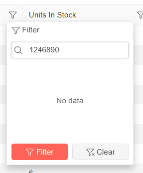
I am using a Blazor Telerik Grid and implementing a custom TelerikCheckBoxListFilter inside a FilterMenuTemplate.
When a user opens the "Name" filter menu and types a name quickly into the search/filter box, some of the text is removed automatically.
For example, if I type "1234567890" as input, without any delay - some of the letters will be cleared and it is showing as "1246890" in the filter search box. It could be because it is searching in real time, but the user input I am typing is not carried over correctly. See the attached screenshot taken from Telerik Demo site for the above said example.
Below is the column definition I am currently using:
<GridColumn Field="@nameof(Tenant.TenantName)" Title="Name" Width="*" FilterMenuType="@FilterMenuType.CheckBoxList">
<FilterMenuTemplate Context="context">
<TelerikCheckBoxListFilter Data="@Model.DistinctTenantNameList"
Field="@(nameof(FilterTenantName.TenantName))"
@bind-FilterDescriptor="@context.FilterDescriptor">
</TelerikCheckBoxListFilter>
</FilterMenuTemplate>
</GridColumn>
Description
An input with type="password" should not have a default role. See:
w3c/html-aria#422
https://w3c.github.io/html-aria/#dfn-no-corresponding-role
Steps To Reproduce
Inspect the rendering of the password input in this demo: https://demos.telerik.com/blazor-ui/textbox/password
Actual Behavior
The element renders a role="textbox" attribute.
Expected Behavior
The element does not render a role="textbox" attribute.
Browser
All
Last working version of Telerik UI for Blazor (if regression)
No response
UI for Blazor version 5.0 improved the FileSelect Stream performance by removing legacy code that meant to support older .NET versions.
However, the Stream performance is still worse and the component works slower, compared to the standard Blazor InputFile.
Steps to reproduce
Reproducible with UI for Blazor, as well as UI for ASP.NET Core (PDF.js and DPL processing)
- Open the attached file in the PDFViewer.
Actual Behavior
The content is visualized distorted, large parts of it are missing, layout is messed up.
Expected Behavior
The document content is visualized properly, as it is with: https://mozilla.github.io/pdf.js/web/viewer.html
The AutoComplete component does not update the category grouping header, even when the data within that group has been removed. As a result, the outdated group header remains visible until you scroll down to another group, at which point the first group header refreshes and disappears as expected.
Repro: REPL link.
Hi Support,
I have an issue with the DragToSelect feature of a Telerik grid in Blazor when this grid is inside a TelerikWindow.
Summary
When a TelerikGrid configured with GridSelectionSettings DragToSelect="true" is rendered inside the <WindowContent> of a <TelerikWindow>, the drag-to-select (rubber-band) behavior is not working properly — the user can only select cells/rows via individual clicks.
Single-click selection continues to work in both cases. The issue is specific to the drag gesture.
Steps to reproduce
Create a page with a TelerikWindow set to Visible="true".
Inside <WindowContent>, place a TelerikGrid with:
SelectionMode="@GridSelectionMode.Multiple"
SelectedCells / SelectedCellsChanged bound
<GridSettings><GridSelectionSettings SelectionType="@GridSelectionType.Cell" DragToSelect="true" /></GridSettings>
Open the window and try to select multiple cells by pressing the mouse button on a cell and dragging over neighboring cells.
Expected behavior
A rubber-band selection rectangle appears and all cells the pointer passes over become selected — same as when the identical grid is placed on a regular page (outside a modal window).
Actual behavior
Drag selection occur rarely. Only the single cell under the initial mousedown gets selected. The rubber-band rectangle rarely appears, and SelectedCellsChanged fires with a single descriptor instead of the full drag range.
Minimal repro (REPL-ready)
<TelerikWindow Visible="true" Width="800px" Height="500px">
<WindowTitle>Repro</WindowTitle>
<WindowContent>
<TelerikGrid Data="@Data" TItem="SampleItem"
SelectionMode="@GridSelectionMode.Multiple"
SelectedCells="@SelectedCells"
SelectedCellsChanged="@((IEnumerable<GridSelectedCellDescriptor> c) => SelectedCells = c)">
<GridSettings>
<GridSelectionSettings SelectionType="@GridSelectionType.Cell" DragToSelect="true" />
</GridSettings>
<GridColumns>
<GridColumn Field="@nameof(SampleItem.Id)" />
<GridColumn Field="@nameof(SampleItem.Name)" />
</GridColumns>
</TelerikGrid>
</WindowContent>
</TelerikWindow>
@code {
public record SampleItem(int Id, string Name);
private List<SampleItem> Data = Enumerable.Range(1, 20).Select(i => new SampleItem(i, $"Item {i}")).ToList();
private IEnumerable<GridSelectedCellDescriptor> SelectedCells = Enumerable.Empty<GridSelectedCellDescriptor>();
}
Now my questions :
- Is this a known limitation of DragToSelect when the grid is inside a modal TelerikWindow?
- Is there an officially supported workaround (CSS pointer-events tweak on .k-overlay, event capture override, grid setting, etc.)?
- If it is a bug, could you open a public issue we can track?
Many thanks you in advance.
Franck Boisdé
Description
Appointment editing does not work on Chrome for mobile (Android).
Steps To Reproduce
Run the following demo in the Chrome for mobile browser, on a mobile device with Android : https://demos.telerik.com/blazor-ui/scheduler/appointment-editing
- Attempt to edit an appointment by double tapping it
Actual Behavior
The popup editor does not show up.
Expected Behavior
The popup editor shows up.
Browser
Chrome
Last working version of Telerik UI for Blazor (if regression)
No response
Bug report
Reproduction of the problem
(bug report only)
Regression introduced in 13.0.0.
1. Run this example: https://blazorrepl.telerik.com/wUuSGClv00orFeRm59
Current behavior
(optional)
The Size, Rounded, FillMode parameters are ignored.
Expected/desired behavior
The parameter values should apply and change the appearance of the SearchBox.
Environment
- Browser: [all ]
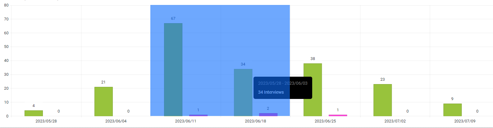
i.e here I would like it to return: 2023/06/11 & 2023/06/18
I'm trying to use the Blazor editor but the "Insert Image" function is very basic. Previously using Webforms & Core the insert image in the editor presented the user with a file management and image upload popup. Is this functionality available with the Blazor component?
=====ADMIN EDIT=====
Possible alternative:
- Utilize a custom Editor's tool that opens a Window or Dialog containing a FileManager.
- Use the FileManager's SelectedItemsChanged event to determine which image the user wants to insert into the Editor.
- Programmatically execute the Editor's insertImage command.
I would like the following behavior in the date picker. Perhaps it can be achieved with a parameter similar to the one in UI for ASP.NET AJAX - the FocusedDate property (something like RadDatePicker1.FocusedDate = DateTime.Today.AddDays(30);).
The current behaviour is:
* if date is set, show month of set date
*else show month of current date (today)
Desired behaviour:
* if date is set, show month of set date
* else if min date's month is greater than current date month then show month of min date
* else show month of current date
Here is a code snippet to illustrate the issue:
Open the picker - it will start in the month with today's date, but I want it to start at the min date - one month later

<TelerikDatePicker @bind-Value="@theDate" Min="@minDate" Max="@maxDate"></TelerikDatePicker>
@code {
    DateTime theDate = DateTime.Now;
    DateTime minDate = DateTime.Now.AddDays(60);
    DateTime maxDate = DateTime.Now.AddDays(230);
}
===
ADMIN EDIT
===
The request also applies to the rest of the pickers - DateTimePicker and DateRangePicker.