You can trigger the animation for the Drawer component by calling ToggleAsync() on the reference to the Drawer component:
<TelerikButton OnClick="@(async Task () => await DrawerRef!.ToggleAsync())" />
However, when you toggle the Expanded parameter instead, it still toggles the Drawer but does not trigger the animation:
<TelerikButton OnClick="@(() => Expanded = !Expanded)" />
As a result, if I want the Drawer component to be expanded by default, but I still want the user to be able to toggle it, I have to call ToggleAsync() on the reference to the component and bind the Expanded parameter, which is unnecessary verbose for such a common scenario:
<TelerikDrawer TItem="int" @ref="@DrawerRef" @bind-Expanded="@DrawerExpanded" Mode="@DrawerMode.Push">
	<Template>
		<NavMenu/>
	</Template>
	<DrawerContent>
		@Body
	</DrawerContent>
</TelerikDrawer>

@code
{
    private TelerikDrawer<int>? DrawerRef { get; set; }
    private bool DrawerExpanded { get; set; } = true;

    /// <remarks>
    /// We can't toggle DrawerExpanded because that won't trigger the animation.
    /// Only DrawerRef.ToggleAsync() triggers the animation.
    /// </remarks>
    private async Task ToggleDrawer() => await DrawerRef!.ToggleAsync();
}
I would like to trigger the animation for the Drawer component by toggling the Expanded parameter and not calling ToggleAsync() on the reference to the Drawer component. Toggling the Expanded parameter instead of calling a function on a reference to a component is a cleaner, simpler approach that better aligns with the philosophy of Blazor (using parameters rather than properties or functions on reference to components). Furthermore, this approach is used by various other Blazor component libraries such as MudBlazor, SyncFusion, and DevExpress. See:
I would like to be able to create Drawer Items in markup, not programmatically in code. Similar to https://feedback.telerik.com/blazor/1433539-declare-the-menu-items-in-markup-without-code. Ideally, I would like to have an implementation similar to MudBlazor's Drawer: https://www.mudblazor.com/components/drawer#usage.
Example:
<TelerikDrawer>
<DrawerSidebar>
<DrawerItem>
<NavLink />
</DrawerItem>
<DrawerItem>
<NavLink />
</DrawerItem>
</DrawerSidebar>
<DrawerContent>
@Body
</DrawerContent>
</TelerikDrawer>
Alternative Example:
<TelerikDrawer>
<TelerikMenu />
</TelerikDrawer>
I see that we can create Hierarchical Drawers by using the Template: Blazor Drawer Demos - Hierarchical Drawer | Telerik UI for Blazor.
However, implementing a Hierarchical Drawer through the Template is very verbose, complicated, and takes time to setup. This slows down initial development and future maintenance. With how common hierarchical sidebar menus are, I think there is significant value in updating the Telerik Drawer component to render hierarchical sidebar menus without the need to configure the Template or add other code.
Overall, I would like the Telerik Drawer component to automatically render a hierarchical sidebar menu by only passing in hierarchical data into the Data parameter and not having to configure the Template or provide additional code. Looking at MudBlazor's Navigation Menu component, they provide support for hierarchical sidebar menus up to four levels without any extra configuration.
Generally, I would expect Templates of components to only be necessary in uncommon scenarios. I would not consider hierarchical sidebar menus uncommon.
Cases:
- I am using the Template to control the rendering of the Drawer. When I place an <a> tag and focus it, I cannot use the Enter key to navigate to the desired link. The component traps the onkeypress event, which it should not.
- When I place a TreeView inside the Drawer Template and focus it, the keyboard navigation does not work because the Drawer traps the HTML events like onkeydown.
<Admin>
Workaround for the first case:
<script suppress-error="BL9992">
    window.navigateToHref = (ev) => {
        if (ev.key === "Enter") {
            location.href = ev.target.href
        }
    };
</script>

@* This example shows how to create header and footer for the Drawer and select an item manually. *@
<TelerikDrawer @bind-Expanded="@DrawerExpanded"
               Data="@Data"
               MiniMode="true"
               Mode="@DrawerMode.Push"
               @bind-SelectedItem="@SelectedItem"
               @ref="@DrawerRef">
    <Template>
        @* the header *@
        <div>
            <TelerikButton OnClick="@(() => DrawerRef.ToggleAsync())" Icon="@FontIcon.Menu" />
            @if (DrawerExpanded)
            {
                <div class="text-info" style="border-bottom:solid; font-weight: bold; margin-bottom: 3em; white-space:nowrap">
                    <a href="https://google.com" onkeydown="navigateToHref(event)">
                        My Custom Navigation to Google
                    </a>
                </div>
            }
            else
            {
                <div class="text-info" style="border-bottom:solid; font-weight: bold;">
                    Nav
                </div>
            }
        </div>

        @* custom items rendering and item selection *@

        <div class="k-drawer-items">
            <ul>
                @if (SelectedItem != null && DrawerExpanded)
                {
                    <li class="k-drawer-item" style="white-space:nowrap">
                        <div>
                            <p><strong>@SelectedItem.Text</strong></p>
                            <p>@SelectedItem.Description</p>
                        </div>
                    </li>
                }

                @foreach (var item in Data)
                {
                    @* Use onclick to handle manual item selection *@
                    <li @onclick="@(() => SelectedItem = item)"
                    class="k-drawer-item @GetSelectedItemClass(item)" style="white-space:nowrap">
                        <TelerikFontIcon Icon="@item.Icon"></TelerikFontIcon>
                        @if (DrawerExpanded)
                        {
                            <div>
                                <div>@item.Text</div>
                            </div>
                        }
                    </li>
                }
            </ul>
        </div>

        @* the footer *@
        @if (DrawerExpanded)
        {
            <div style="text-align: center; margin-top: 3em; padding-top: 2em; border-top: 2px solid black; white-space:nowrap">
                <img src="user-avatar.png" alt="my avatar" style="border-radius: 50%; width: 50px; height: 50px;" />
                <br /><br />
                <TelerikButton Icon="@FontIcon.Logout" ThemeColor="primary">Log Out</TelerikButton>
            </div>
        }
    </Template>
    <DrawerContent>
        <div class="m-5">Content for @SelectedItem?.Text - @SelectedItem?.Description</div>
    </DrawerContent>
</TelerikDrawer>


@code {
    public TelerikDrawer<DrawerItem> DrawerRef { get; set; }
    public DrawerItem SelectedItem { get; set; }
    public bool DrawerExpanded { get; set; } = true;
    public IEnumerable<DrawerItem> Data { get; set; } = new List<DrawerItem>
    {
        new DrawerItem {Text = "Shopping Cart", Icon = FontIcon.Cart, Description = "Items in shopping cart"},
        new DrawerItem {Text = "Settings", Icon = FontIcon.Gear, Description = "My profile settings"},
        new DrawerItem {Text = "Notifications", Icon = FontIcon.ExclamationCircle, Description = "My profile notifications"},
        new DrawerItem {Text = "Calendar", Icon = FontIcon.Calendar, Description = "My events"},
    };

    public string GetSelectedItemClass(DrawerItem item)
    {
        if (SelectedItem == null) return string.Empty;
        return SelectedItem.Text.ToLowerInvariant().Equals(item.Text.ToLowerInvariant()) ? "text-info" : "";
    }

    public class DrawerItem
    {
        public string Text { get; set; }
        public FontIcon? Icon { get; set; }
        public string Description { get; set; }
    }
}
</Admin>
Hello,
I would like to add a CSS-Class to some items in my TelerikDrawer control. Since the ItemTemplate only controls the contents and the Template is overkill as it overrides the rendering for the entire drawer contents, I was wondering whether there was any support for adding custom CSS classes to items (similar to how it is described for Angular here: https://www.telerik.com/kendo-angular-ui/components/layout/drawer/items/).
TIA
- Chris
Drawer component does not have a persist content option (e.g. PersistDrawerContent="true")
I believe the drawer component should have the same feature as Tabstrip PersistTabContent="true"
It would be nice to have a handle feature within the rendered Drawer component that would expand and collapse the component.
For example, see the following screenshots.
Draw Open
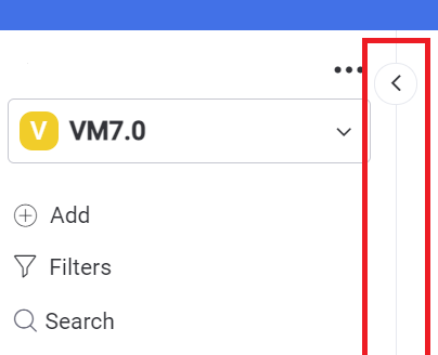
Draw Closed

Hi,
could you add an Enabled Parameter (like in the Button Component) to the default databound values from a Drawer Item?
Of course I can handle this with a template, but actually I dont like to implement the whole item behaviour and the looks.
Ok, I a little bit lazy, but I think this would be a find addition to the feature set.
Best regards
Christian
I'm using a custom drawer item to handle toggling the drawer open and close. Every time I click on my custom toggle item I call Drawer.ToggleAsync() (which I trigger on the SelectedItemChanged event handler). If the drawer is expanded to begin with, it is correctly collapsed to the mini view. However, if I click the toggle item again, the drawer expands and then immediately re-collapses itself. I put a breakpoint on the code that calls Drawer.ToggleAsync(), and it's only getting hit once for each click. This is very strange behavior. Please help me work out what's going on.
P.S If there is a better way to handle the click on my custom toggle drawer item (rather than using SelectedItemChanged), please let me know.
Code
@inherits LayoutComponentBase

<TelerikRootComponent>

    <div class="page">
        <div class="drawer-container">
            <TelerikDrawer
                           @ref="@Drawer"
                           Data="Data"
                           MiniMode="true"
                           Expanded="true"
                           Mode="@DrawerMode.Push"
                           SelectedItemChanged="((DrawerItem item) => SelectedItemChangedHandler(item))">
                <Content>
                    <div class="main">
                        <div class="content px-4">
                            @Body
                        </div>
                    </div>
                </Content>
            </TelerikDrawer>
        </div>
    </div>
</TelerikRootComponent>

@code {
    public TelerikDrawer<DrawerItem> Drawer { get; set; }
    public DrawerItem SelectedItem { get; set; }
    public IEnumerable<DrawerItem> Data { get; set; } =
        new List<DrawerItem>
        {
            new DrawerItem { Text = "Item1", Icon = IconName.Inbox },
            new DrawerItem { Text = "Item2", Icon = IconName.Information },
            new DrawerItem { Text = "Item3", Icon = IconName.MarkerPin },
            new DrawerItem { IsSeparator = true },
            new DrawerItem { Text = "Item4", Icon = IconName.Inbox },
            new DrawerItem { Text = "Item5", Icon = IconName.Inbox },
            new DrawerItem { Text = "Toggle", Icon = IconName.ArrowChevronLeft, IsToggle = true },
            };

    protected override Task OnInitializedAsync()
    {
        SelectedItem = Data.First();

        return base.OnInitializedAsync();
    }

    public class DrawerItem
    {
        public string Text { get; set; }
        public string Icon { get; set; }
        public bool IsSeparator { get; set; }
        public bool IsToggle { get; set; }
    }

    private async Task SelectedItemChangedHandler(DrawerItem item)
    {
        SelectedItem = item;

        if (item.IsToggle)
        {
            await Drawer.ToggleAsync();

            if (Drawer.Expanded)
            {
                item.Icon = IconName.ArrowChevronRight;
            }
            else
            {
                item.Icon = IconName.ArrowChevronLeft;
            }
        }
    }
}
For example, I could have projects with various levels of completeness. By grouping these by the project status would make it much easier to navigate.
I hate to refer to this as a bug, as I'm sure there is something we are missing. Here's are the bullet points of the scenario:
- We are using Telerik Drawer as our "NavMenu" component
- We are using Azure AD for Authentication
In the OnLogInSucceeded section of our Authentication.razor, we are building the user specific menu from SQL tables, structuring it in a hierarchical DrawerItem list.
When I pass that back to the Data property of the TelerikDrawer, the display does not update. StateHasChanged doesn't have any impact. We have tried tying it to a "service" to listen for changes. We have even called an event that would manually make the update.
MAIN LAYOUT

@inherits LayoutComponentBase
@inject NavigationManager navigationManager
@inject PublicClient Http
@inject IMatToaster toast

@using G2_Field.Shared
@using Microsoft.AspNetCore.Authorization
@using Microsoft.AspNetCore.Components.WebAssembly.Authentication

@inject IAuthorizationService AuthorizationService
@inject Employee dbUSER

@attribute [Authorize]


    <TelerikRootComponent>
        <div>
            <NavMenu @ref="nm" items="@Data" />
        </div>

        <div class="app-main">
            <div class="app-bar">
                <div style="float:left">
                    <TelerikButton OnClick="@ToggleDrawer" Icon="@Telerik.Blazor.IconName.Menu" Class="k-flat" />
                </div>
                <div style="float:right">
                    <LoginDisplay />
                </div>
            </div>
            <div>
                @Body
            </div>
        </div>
    </TelerikRootComponent>
    <MatToastContainer />

    @code {
        public TelerikDrawer<DrawerItem> Drawer { get; set; }
        public DrawerItem SelectedItem { get; set; }
        public bool Expanded { get; set; } = true;
        NavMenu nm;

        public List<DrawerItem> Data { get; set; } =
        new List<DrawerItem>
        {
            new DrawerItem { Text = "HOME", Icon = Telerik.Blazor.IconName.Window, Description = "Home", URL="" }
        };

        public async Task ToggleDrawer()
        {
            await nm.ToggleDrawer();
        }

        public async Task OnSidebarChange(List<DrawerItem> di)
        {
            Data = di;
            Console.WriteLine(di.Last().Children.Last().Text);
            await nm.RefreshMenu(di);
        }...

AUTHENTICATION

@page "/authentication/{Action}"
@using Microsoft.AspNetCore.Components.WebAssembly.Authentication
@using G2_Field.Shared
@using System.Security.Claims
@inject Employee dbUSER
@inject PublicClient Http
@using System.Threading.Tasks

<RemoteAuthenticatorView Action="@Action" OnLogInSucceeded=@OnLogInSucceeded>
    <LoggingIn>
        You are about to be redirected to https://login.microsoftonline.com.
    </LoggingIn>
</RemoteAuthenticatorView>

@code{
    [Parameter] public string Action { get; set; }
    AppCategories[] iMenu = new AppCategories[0];
    [CascadingParameter] private Task<AuthenticationState> authenticationStateTask { get; set; }

    [CascadingParameter] public Task<AuthenticationState> AuthenticationState { get; set; }
    [CascadingParameter] public List<DrawerItem> d { get; set; }
    [CascadingParameter(Name = "theMainLayout")] public MainLayout ml { get; set; }

    public async void OnLogInSucceeded()
    {
        var user = (await AuthenticationState).User;
        var un = (await AuthenticationState).User.Claims.ToList();
        var username = "";
        if (user.Identity.IsAuthenticated)
        {
            // Do some stuff
            Console.WriteLine("Log In Succeeded Event Fired");

            foreach (Claim u in un)
            {
                //Console.WriteLine(u.Type + " = " +  u.Value.ToString());
                if (u.Type == "preferred_username") { username = u.Value.ToString(); }
            }
            dbUSER = await Http.Client.GetJsonAsync<Employee>("/api/Index/GetCurrentEmployee/" + username);

            Console.WriteLine("EmpUserName=" + dbUSER.EmpUserName);

            var gUserName = dbUSER.EmpUserName;
            iMenu = await Http.Client.GetJsonAsync<AppCategories[]>("/api/Index/GetUserAppCategories/" + gUserName);

            d = new List<DrawerItem>();

            d.Add(new DrawerItem { Text = "HOME", Icon = "fa-home", Description = "Home", URL = "" });
            foreach (var app in iMenu)
            {
                List<DrawerItem> y = new List<DrawerItem>();
                foreach (var cat in app.ItemList)
                {
                    DrawerItem z = new DrawerItem
                    {
                        Text = cat.MenuItemTitle,
                        Icon = cat.MenuItemIcon,
                        Description = cat.MenuItemDescription,
                        URL = cat.MenuItemURL
                    };
                    y.Add(z);
                }

                DrawerItem x = new DrawerItem {
                    Text = app.MenuCategoryTitle,
                    Icon = Telerik.Blazor.IconName.Menu,
                    Description = app.MenuCategoryTitle,
                    Children = y
                };
                d.Add(x);
            }
            StateHasChanged();
            = new MainLayout();
            ml.OnSidebarChange(d);

        }
    }...


NAVMENU

@inject NavigationManager navigationManager
@using Microsoft.AspNetCore.Components.Authorization
@using Microsoft.AspNetCore.Components.WebAssembly.Authentication
@using G2_Field.Shared


<TelerikDrawer @ref="@Drawer" Data="@items" MiniMode="false" Mode="@DrawerMode.Overlay" TItem="DrawerItem" SelectedItemChanged="@OnItemSelect" @bind-Expanded="@Expanded">
    <Template Context="AuthDrawerContext">
        <div class="k-drawer-items" role="menubar" aria-orientation="vertical">
            <ul>
                @foreach (var item in AuthDrawerContext)
                {
                    var selectedClass = item == SelectedItem ? "k-state-selected" : string.Empty;
                    <li @onclick="@(() => OnItemSelect(item))" class="k-drawer-item @selectedClass">
                        <div class="k-level-@(item.Level)">
                            <TelerikIcon Icon="@item.Icon"></TelerikIcon>
                            <span class="k-item-text">@item.Text</span>
                        </div>

                        @if (item.Expanded && (item.Children?.Any() ?? false))
                        {
                            <span class="k-icon k-i-arrow-chevron-down" style="position:absolute; right:0; line-height: inherit; margin: 0 8px"></span>
                        }
                        else if (!item.Expanded && (item.Children?.Any() ?? false))
                        {
                            <span class="k-icon k-i-arrow-chevron-right" style="position:absolute; right:0; line-height: inherit; margin: 0 8px"></span>
                        }
                    </li>
                }

            </ul>
        </div>
    </Template>
</TelerikDrawer>


@code {
    [Parameter] public List<DrawerItem> items { get; set; }
    public TelerikDrawer<DrawerItem> Drawer { get; set; }
    public DrawerItem SelectedItem { get; set; }
    public bool Expanded { get; set; } = true;
    public List<DrawerItem> Data { get; set; } = new List<DrawerItem> { new DrawerItem { Text = "HOME", Icon = Telerik.Blazor.IconName.Window, Description = "Home", URL = "" } };

    public async Task ToggleDrawer() => await Drawer.ToggleAsync();

    protected override void OnInitialized()
    {
        items = Data;
        SelectedItem = items.First();
        StateHasChanged();
    }

    public void OnHover()
    {

    }

    public async Task RefreshMenu(List<DrawerItem> di)
    {
        items = di;
    }
Mini mode is very useful for conserving valuable screen estate but with the drawer in mini mode the user only sees a group of icons.
How can I add a mouse-over/hover descriptive text for each of the mini-mode icons so that users don't have to expand the menu to see the one that they want? I really don't want to resort to jQuery but this is an example where it may be the only solution.
The Drawer component is excellent BTW.
Kind regards,
Paul