Hello, I would like to have a mutiselect dropdown like you have for ajax:
https://demos.telerik.com/aspnet-ajax/combobox/examples/functionality/checkboxes/defaultcs.aspx
Syncfusion and radzen have this support for blazor :
https://blazor.syncfusion.com/demos/multiselect-dropdown/checkbox?theme=bootstrap5
https://blazor.radzen.com/dropdown
I know that you have a proposed solution for the MultiSelect component:
But the design of this one is not what I'm after, the box still expands downwards when selecting multiple items and it makes it hard to design a coherent page that does not make the dom "jump around". Also the implementation is cumbersome for more complex objects .
It would be better with a solution like you have for ajax where it just shows the first items that fits and then "+X items".
Hi
I have an TelerikMenu with a mix of internal and external links. The menu is using Data binding to a list of menu items. When using the mouse and clicking the external links it works as expected.
However when using the tab to set focus into the menu, then using the arrow keys to navigate to a menu item then hit Enter key, the link opens in the current tab, even if it set to target="_blank".
In this REPL the Enter key does nothing when at Telerik/Documentation and hitting Enter:
https://blazorrepl.telerik.com/mgYflMuM27MjqZrD54
In my case, the URL is opened in the current tab, instead of a new tab.
I'm using ItemTemplade to render the links and my template for external links looks like this:
if (item.IsExternal) { <ahref="@item.Url"class="@cssClass"target="_blank"rel="noopener noreferrer" @onclick="() => { if (isMobile) CloseMobileMenu(); }" @onclick:stopPropagation="!isMobile"> @item.Text <TelerikSvgIconIcon="@SvgIcon.HyperlinkOpen"Size="@ThemeConstants.SvgIcon.Size.Small"Class="@(isMobile ? "ms-2" : "ms-2")"/></a> }
The rendered HTML looks like this:
<li data-id="595df6d2-0580-42fd-999d-37f73afedcb6" tabindex="-1" class="k-item k-menu-item " role="menuitem" aria-live="polite"><span class="k-link k-menu-link "><div class="d-flex align-items-center justify-content-between w-100 px-2"><a href="https://theurl.com/an/l/45" class="k-menu-link-text" target="_blank" rel="noopener noreferrer">Go to external page<!--!-->
<!--!--><span class="telerik-blazor ms-2 k-icon-sm k-icon k-svg-icon k-svg-i-hyperlink-open" aria-hidden="true"><svg xmlns:xlink="http://www.w3.org/1999/xlink" xmlns="http://www.w3.org/2000/svg" viewBox="0 0 512 512"><!--!--><path d="M32 480h448V256h-32v192H64V64h192V32H32zM320 32l56.9 56.9.5.5L224 242.7l45.3 45.3 153.3-153.4L480 192V32z"></path></svg></span></a></div></span></li>I'd rather nog involve js-hacks to solve this issue. Is this a known bug or am i doing it wrong?
Hello,
I need to be able to set the colors of x-axis category labels conditionally. My current use case for this is that I'm displaying dates and need weekends and holidays to be their own colors. As far as I'm aware this cannot be accomplished in any way currently:
- ChartCategoryAxisLabels Color parameter cannot be conditional and applies to all labels
- ChartCategoryAxisLabels Template parameter must return plain text and cannot render styling or HTML
- The labels are drawn via canvas and therefore cannot be styled externally
The two solutions I could suggest are as follows:
- Make the ChartCategoryAxisLabels Color parameter able to be Kendo UI parsed like the Template Parameter
- In addition to the ChartCategoryAxis Categories parameter, support providing categories as render fragment children, with each having its own Color parameter
Thanks,
Robert
.png)
Possible to add in the FileManager preview pane, a preview of the actual file, if the file type is simple; i.e. image or video (or pdf); or provide functionality to add preview.
Cheers
Phil
I created a subclass of the TelerikGrid to extend the limited built-in search functionality.
To do that, I use the GridStateChanged event to rewrite the SearchFilter: I replace the default filter with a more complex CompositeFilterDescriptor (including highlighting). This works perfectly during normal interaction.
Now I also want the search to be persisted, so that after reloading the page the grid shows the same search again. Saving the grid state is not a problem, but when restoring the saved state during OnStateInit / GridStateInit, the following exception occurs:
Unable to cast object of type 'Telerik.DataSource.CompositeFilterDescriptor' to type 'Telerik.DataSource.FilterDescriptor'.
System.InvalidCastException: Unable to cast object of type 'Telerik.DataSource.CompositeFilterDescriptor' to type 'Telerik.DataSource.FilterDescriptor'.
at Telerik.Blazor.Components.Common.TableGridBase`2.LoadSearchFilter(IFilterDescriptor descriptor)
at Telerik.Blazor.Components.TelerikGrid`1.SetStateInternalAsync(GridState`1 state)
at Telerik.Blazor.Components.TelerikGrid`1.InvokeOnStateInit()
at Telerik.Blazor.Components.TelerikGrid`1.OnParametersSetAsync()
at Microsoft.AspNetCore.Components.ComponentBase.CallStateHasChangedOnAsyncCompletion(Task task)
at Microsoft.AspNetCore.Components.ComponentBase.RunInitAndSetParametersAsync()
at Microsoft.AspNetCore.Components.RenderTree.Renderer.GetErrorHandledTask(Task taskToHandle, ComponentState owningComponentState)
fail: Microsoft.AspNetCore.Components.Server.Circuits.CircuitHost[111]
Unhandled exception in circuit 'MYsaCsOgfpbyHeO0xNFpA7ViPHNUC6rpc1K9eIwVR5Y'.
System.InvalidCastException: Unable to cast object of type 'Telerik.DataSource.CompositeFilterDescriptor' to type 'Telerik.DataSource.FilterDescriptor'.
at Telerik.Blazor.Components.Common.TableGridBase`2.LoadSearchFilter(IFilterDescriptor descriptor)
at Telerik.Blazor.Components.TelerikGrid`1.SetStateInternalAsync(GridState`1 state)
at Telerik.Blazor.Components.TelerikGrid`1.InvokeOnStateInit()
at Telerik.Blazor.Components.TelerikGrid`1.OnParametersSetAsync()
at Microsoft.AspNetCore.Components.ComponentBase.CallStateHasChangedOnAsyncCompletion(Task task)
at Microsoft.AspNetCore.Components.ComponentBase.RunInitAndSetParametersAsync()
at Microsoft.AspNetCore.Components.RenderTree.Renderer.GetErrorHandledTask(Task taskToHandle, ComponentState owningComponentState)
I also tried saving the search term and the selected columns separately and then restoring the state in OnAfterRender, but at that point the SearchFilter can no longer be set.
How should I approach this? Is there a supported way to persist and restore a custom CompositeFilterDescriptor as the grid’s search filter (or otherwise restore the search state) without triggering this cast exception?
Sincerly Daniel
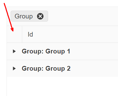
On a grid grouped by one or more fields, provide an option for end users to expand/collapse all rows at will. The following image is a suggestion of where this option (most likely a button) should appear:
Hi,
There's a bug in TelerikComboBox. If you have ScrollMode.Virtual enabled, together with ShowClearButton enabled you can end up in a state where "No data" is shown after opening the drop down.
Steps to reproduce.
- Use a TelerikComboBox in your view.
- Assign its Data Parameter a List containing 1000 items. Set PageSize paramter to 10.
- Open the ComboBox list, scroll to bottom and select an item.
- Press the ClearButton to deselect the item.
- Preform an action that resizes the List passed to the Data parameter to 10 items.
- Open the ComboBox list again, not it will sais No data instead of showing the 10 items.
As far as i can tell this happens because Skip property (TelerikSelectBase) is not reset in the ResetValue() method.
This does not happen when you manually clear the field, becouse that calls ChangeValue, wich in turn calls Filter(), and filter does this:
if (IsVirtualScrollable)
{
         Skip = 0;
}
The appointments are not on the right position in the scheduler, on day and week views.
They appear slight downwards. See screenshot from your demo pages.
The first appoinments are right. Later in time the appointments are off.
This is true for all themes.
Tested on Windows 11, with Brave, Firefox and Edge.
Best regards
Daniel Hüttenberger
1. Can you please add the ability to choose a chevron instead of a caret to signify there are menu items under it?
2. Can you please add the ability to collapse/expand the menu and just show the icon when collapsed.
For inspiration - https://www.fluentui-blazor.net/NavMenuTree
Thank you.
Do you have a planned date for Telerik UI for Blazor to fully support Visual Studio 2022 Professional?
Telerik UI for Blazor cannot be used with Visual Studio 2022 Professional in Debug mode and Hot Reload. There are couple issues, see below, that seems to be related, and that Telerik are not willing to fix. Those issues render Telerik UI for Blazor unusable when working with Visual Studio 2022 Professional with Hot Reload.
Predefined dialogs are not shown after hot reload updates are applied and Predefined dialogs throw when hot reload updates are applied
Blazor WASM breaks in VS2022 after Hot Reload in UI for Blazor | Telerik Forums
Hello guys,
I know you probably gonna redirect me to these topics:
https://feedback.telerik.com/blazor/1581128-ability-to-change-the-color-of-the-shape-on-click
But that is not a solution. The OnShapeClick-Event of the TelerikMap still triggers only if you click the shape, that was added last. Which means if I have 3 shapes in my TelerikMap, only a click on the third map will lead to the OnShapeClick event being triggered.
This is not a feature request, as you told Michael in his bug report und not at all related to the feature request of chaning a shape's color up on clicking it...but this is clearly a bug.
Please provide some short feedback on how / when this will be solved. Otherwise as a user of Blazor UI I have to manually write JavaScript Code, dismantle the DOM, trigger Interop-Methods etc. to achieve that behavior that should actually just work out of the box as documented.
Thanks and best regards!
Sebastian
When a DatePicker input is cleared by using the keyboard and the control loses focus, the state of a non-nullable DateTime property is inconsistent with the control.
This behavior is appropriate; however, it can cause user confusion when the underlying value is used to query for data based on a value the user no longer sees.
My proposed solution (bug fix) is to return the value of the DatePicker to the last known good value when the control loses focus.
StateHasChanged() by itself does not cause a re-render of the component, however changing the @key value of the DatePicker does.
See this REPL for a demonstration of the issue and workaround/fix: https://blazorrepl.telerik.com/czEjvVlK18i471S622
namespace Telerik.Blazor.Components.Common;
TelerikGrid<T>
{
public virtual void Rebind()
{
ProcessDataAsync();
}
}
Rebind() doesnt use async/await, but ProcessDataAsync() does, which leads to race conditions.
Here's a demo:
https://codepen.io/MaxSebastian/pen/jOzMWxE
Please let me know if this is possible to make...
Best,
Darko