The Popup OnHide event does not fire if the app has previously closed the Popup instance programmatically with the Hide() method.
The issue can be reproduced in this documentation example.
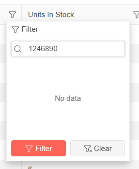
I am using a Blazor Telerik Grid and implementing a custom TelerikCheckBoxListFilter inside a FilterMenuTemplate.
When a user opens the "Name" filter menu and types a name quickly into the search/filter box, some of the text is removed automatically.
For example, if I type "1234567890" as input, without any delay - some of the letters will be cleared and it is showing as "1246890" in the filter search box. It could be because it is searching in real time, but the user input I am typing is not carried over correctly. See the attached screenshot taken from Telerik Demo site for the above said example.
Below is the column definition I am currently using:
<GridColumn Field="@nameof(Tenant.TenantName)" Title="Name" Width="*" FilterMenuType="@FilterMenuType.CheckBoxList">
<FilterMenuTemplate Context="context">
<TelerikCheckBoxListFilter Data="@Model.DistinctTenantNameList"
Field="@(nameof(FilterTenantName.TenantName))"
@bind-FilterDescriptor="@context.FilterDescriptor">
</TelerikCheckBoxListFilter>
</FilterMenuTemplate>
</GridColumn>
The AutoComplete component does not update the category grouping header, even when the data within that group has been removed. As a result, the outdated group header remains visible until you scroll down to another group, at which point the first group header refreshes and disappears as expected.
Repro: REPL link.
Hi Support,
I have an issue with the DragToSelect feature of a Telerik grid in Blazor when this grid is inside a TelerikWindow.
Summary
When a TelerikGrid configured with GridSelectionSettings DragToSelect="true" is rendered inside the <WindowContent> of a <TelerikWindow>, the drag-to-select (rubber-band) behavior is not working properly — the user can only select cells/rows via individual clicks.
Single-click selection continues to work in both cases. The issue is specific to the drag gesture.
Steps to reproduce
Create a page with a TelerikWindow set to Visible="true".
Inside <WindowContent>, place a TelerikGrid with:
SelectionMode="@GridSelectionMode.Multiple"
SelectedCells / SelectedCellsChanged bound
<GridSettings><GridSelectionSettings SelectionType="@GridSelectionType.Cell" DragToSelect="true" /></GridSettings>
Open the window and try to select multiple cells by pressing the mouse button on a cell and dragging over neighboring cells.
Expected behavior
A rubber-band selection rectangle appears and all cells the pointer passes over become selected — same as when the identical grid is placed on a regular page (outside a modal window).
Actual behavior
Drag selection occur rarely. Only the single cell under the initial mousedown gets selected. The rubber-band rectangle rarely appears, and SelectedCellsChanged fires with a single descriptor instead of the full drag range.
Minimal repro (REPL-ready)
<TelerikWindow Visible="true" Width="800px" Height="500px">
<WindowTitle>Repro</WindowTitle>
<WindowContent>
<TelerikGrid Data="@Data" TItem="SampleItem"
SelectionMode="@GridSelectionMode.Multiple"
SelectedCells="@SelectedCells"
SelectedCellsChanged="@((IEnumerable<GridSelectedCellDescriptor> c) => SelectedCells = c)">
<GridSettings>
<GridSelectionSettings SelectionType="@GridSelectionType.Cell" DragToSelect="true" />
</GridSettings>
<GridColumns>
<GridColumn Field="@nameof(SampleItem.Id)" />
<GridColumn Field="@nameof(SampleItem.Name)" />
</GridColumns>
</TelerikGrid>
</WindowContent>
</TelerikWindow>
@code {
public record SampleItem(int Id, string Name);
private List<SampleItem> Data = Enumerable.Range(1, 20).Select(i => new SampleItem(i, $"Item {i}")).ToList();
private IEnumerable<GridSelectedCellDescriptor> SelectedCells = Enumerable.Empty<GridSelectedCellDescriptor>();
}
Now my questions :
- Is this a known limitation of DragToSelect when the grid is inside a modal TelerikWindow?
- Is there an officially supported workaround (CSS pointer-events tweak on .k-overlay, event capture override, grid setting, etc.)?
- If it is a bug, could you open a public issue we can track?
Many thanks you in advance.
Franck Boisdé
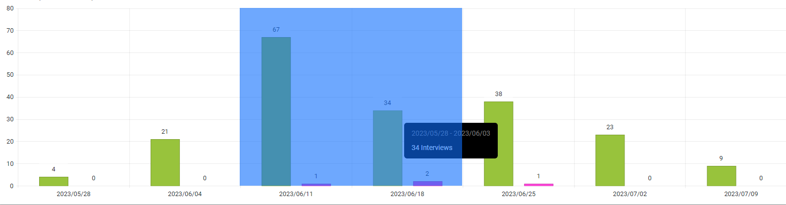
i.e here I would like it to return: 2023/06/11 & 2023/06/18
I am testing with a Blazor WASM Standalone app that uses Telerik UI for Blazor. I have a sample page with a button on click of which a predefined dialog (for example, alert) is shown. If you make some change on the page and hot reload is enabled, the button click no longer opens the predefined dialog. The dialog is shown only if I navigate to a different page.
The Set button should not be enabled when you change the month from the button in the popup, until the user selects a date too.
===
TELERIK EDIT:
If the user clicks Set without selecting a date, the component will assume DateTime.MinValue. You can set the current DateTime or clear the Value by using the DateTimePicker OnChange or ValueChanged event:
<TelerikDateTimePicker @bind-Value="@DateTimePickerValue"
                       OnChange="@DateTimePickerValueChanged"
                       Width="300px">
</TelerikDateTimePicker>

@code {
    private DateTime? DateTimePickerValue { get; set; }

    private void DateTimePickerValueChanged(object currentValue)
    {
        if (DateTimePickerValue.HasValue && DateTimePickerValue.Value == DateTime.MinValue)
        {
            // Set current DateTime
            DateTimePickerValue = DateTime.Now;

            // OR

            // Clear the value
            //DateTimePickerValue = default;
        }
    }
}
In TelerikSelectBase that the DropDownList inherits, the FieldIdentifier is set only in the OnInitializedAsync method and therefore the FieldIdentitier is never updated. This can cause issues with validation as seen in this example: https://blazorrepl.telerik.com/GyamPdlf37LXpPAW36.
To reproduce:
- Select the last item in the tree 7.Garden and change the value in the drop down list to Unsupported - the drop down list shows a red border.
- Select item 6.Garden from the tree. (Any item in the tree other than 1 will do) - I expect the drop down to not have the red border, yet is does.
For reference, in the TelerikInputBase, the FieldIdentifier is set in the SetParameterAsync and thus it is accordingly updated. See the TextBox behavior in the above sample.
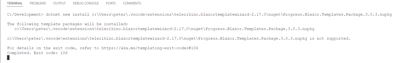
Hi,
Using VS code I tried to create a project using the latest Telerik UI for Blazor Productivity tools. Updated 24-12-03


The Error:
I would like to be able to disable one or more radio buttons in the RadioGroup.
=====
TELERIK EDIT
In the meantime, consider the following workaround, which relies on CSS and RadioGroup ItemTemplate.
<h4>Default Value Disabled</h4>

RadioGroupValue1: @RadioGroupValue1

<TelerikRadioGroup Data="@Options"
                   @bind-Value="@RadioGroupValue1"
                   ValueField="@nameof(RadioModel.Id)"
                   TextField="@nameof(RadioModel.Text)">
    <ItemTemplate>
        @{
            var dataItem = (RadioModel)context;
            var isChecked = dataItem.Id == RadioGroupValue1;
        }
        @if (!dataItem.Enabled)
        {
            <span class="disabled-radio-option">
                <span class="k-radio-wrap">
                    <input type="radio" value="@dataItem.Id" aria-checked="@isChecked" aria-disabled="true" aria-invalid="true"
                           class="@( $"fake k-radio k-radio-md {(isChecked ? "k-checked" : "")}" )" style="user-select: none;" />
                </span>
                <span>@dataItem.Text</span>
            </span>
        }
        else
        {
            <span>@dataItem.Text</span>
        }
    </ItemTemplate>
</TelerikRadioGroup>

<h4>No Default Value</h4>

RadioGroupValue2: @RadioGroupValue2

<TelerikRadioGroup Data="@Options"
                   @bind-Value="@RadioGroupValue2"
                   ValueField="@nameof(RadioModel.Id)"
                   TextField="@nameof(RadioModel.Text)">
    <ItemTemplate>
        @{
            var dataItem = (RadioModel)context;
            var isChecked = dataItem.Id == RadioGroupValue2;
        }
        @if (!dataItem.Enabled)
        {
            <span class="disabled-radio-option">
                <span class="k-radio-wrap">
                    <input type="radio" value="@dataItem.Id" aria-checked="@isChecked" aria-disabled="true" aria-invalid="true"
                           class="@( $"fake k-radio k-radio-md {(isChecked ? "k-checked" : "")}" )" style="user-select: none;" />
                </span>
                <span>@dataItem.Text</span>
            </span>
        }
        else
        {
            <span>@dataItem.Text</span>
        }
    </ItemTemplate>
</TelerikRadioGroup>

<style>
    .k-radio-list-item:has(.disabled-radio-option) {
        pointer-events: none;
        cursor: default;
        opacity: 0.6;
        gap: 0;
    }

    .disabled-radio-option {
        display: flex;
        align-items: center;
        align-content: center;
        gap: var(--kendo-spacing-1);
    }

    .k-radio-list-item:has(.disabled-radio-option) input:not(.fake) {
        display: none;
    }
</style>

@code{
    private int RadioGroupValue1 { get; set; } = 2;
    private int RadioGroupValue2 { get; set; }

    private List<RadioModel> Options { get; set; } = new List<RadioModel>
    {
        new RadioModel { Id = 1, Text = "Option 1" },
        new RadioModel { Id = 2, Text = "Option 2", Enabled = false },
        new RadioModel { Id = 3, Text = "Option 3" },
        new RadioModel { Id = 4, Text = "Option 4", Enabled = false },
        new RadioModel { Id = 5, Text = "Option 5" },
    };

    public class RadioModel
    {
        public int Id { get; set; }
        public string Text { get; set; } = string.Empty;
        public bool Enabled { get; set; } = true;
    }
}
The Grid performance worsens progressively with each subsequent edit operation. Please optimize that.
Test page: https://blazorrepl.telerik.com/mJuHFNbb17FpJu9b54
Click on a Price or Quantity cell to start edit mode and tab repetitively to observe the degradation.
The disable option is still showing the step and it is not good for me. I have 35 types of transactions and all of them have generic and specific step.
---
ADMIN EDIT
Here is a potential workaround - basic conditional markup can add or remove steps. The key thing is that they will be added to the end of the wizard if they had not been rendered. To handle this, dispose and re-initialize the component, so the step will be rendered at the correct position.
If you have complex steps, you can work around this by creating a collection of descriptor models for the list of steps and create the steps based on that collection, where you can keep the VIsible flag, in a fashion similar to this example for the TabStrip.
<TelerikButton OnClick="@ToggleStep">Toggle attachments step visibility</TelerikButton>

@if (WizardVisible)
{
    <TelerikWizard @bind-Value="@CurrStepIndex">
        <WizardSteps>
            <WizardStep Label="Personal Details" Icon="SvgIcon.User">
                <Content>
                    content here
                </Content>
            </WizardStep>

            @if (AttachmentsStepVisible)
            {
                <WizardStep Label="Attachments" Icon="SvgIcon.Paperclip">
                    <Content>
                        conditional content here
                    </Content>
                </WizardStep>
            }

            <WizardStep Label="Confirmation" Icon="SvgIcon.Check">
                <Content>
                    other content here
                </Content>
            </WizardStep>
        </WizardSteps>
    </TelerikWizard>
}


@code {
    private bool AttachmentsStepVisible { get; set; }
    private bool WizardVisible { get; set; } = true;

    private int CurrStepIndex { get; set; }

    private async void ToggleStep()
    {
        //dispose the Wizard
        WizardVisible = false;

        // defence against hiding the step when it is the last step, which would cause an exception
        if (AttachmentsStepVisible && CurrStepIndex == 2)
        {
            CurrStepIndex = 1;
        }

        //the actual visibility toggle
        AttachmentsStepVisible = !AttachmentsStepVisible;

        //allow some time for the disposal and toggling the step visibility prior to re-initialization
        await Task.Delay(10);

        //re-initialize the Wizard
        WizardVisible = true;

        StateHasChanged();
    }
}
---
The CheckBoxList filter does not work as expected when the Grid is bound to ExpandoObject
===
ADMIN EDIT: A possible workaround is to bind the Grid with OnRead event and populate the MemberType property of the filter descriptors manually:
@using System.Dynamic
@using Telerik.DataSource
@using Telerik.DataSource.Extensions

<TelerikGrid OnRead="@OnGridRead"
             TItem="@ExpandoObject"
             Pageable="true"
             Sortable="true"
             FilterMode="@GridFilterMode.FilterMenu"
             FilterMenuType="@FilterMenuType.CheckBoxList"
             Height="400px">
    <GridToolBarTemplate>
        <GridSearchBox />
    </GridToolBarTemplate>
    <GridColumns>
        @{
            if (GridData != null && GridData.Any())
            {
                <GridColumn Field="PropertyInt" FieldType="@GridPropertyTypes["PropertyInt"]" />
                <GridColumn Field="PropertyString" FieldType="@GridPropertyTypes["PropertyString"]" />
                <GridColumn Field="PropertyGroup" FieldType="@GridPropertyTypes["PropertyString"]" />
                <GridColumn Field="PropertyDate" FieldType="@GridPropertyTypes["PropertyDate"]" />
                <GridColumn Field="PropertyBool" FieldType="@GridPropertyTypes["PropertyBool"]" />
            }
        }
    </GridColumns>
</TelerikGrid>

@code {
    private List<ExpandoObject> GridData { get; set; } = new List<ExpandoObject>();

    private Dictionary<string, Type> GridPropertyTypes { get; set; } = new Dictionary<string, Type>() {
        { "Id", typeof(int) },
        { "PropertyInt", typeof(int) },
        { "PropertyString", typeof(string) },
        { "PropertyGroup", typeof(string) },
        { "PropertyDate", typeof(DateTime) },
        { "PropertyBool", typeof(bool) }
    };

    private async Task OnGridRead(GridReadEventArgs args)
    {
        args.Request.Filters.OfType<CompositeFilterDescriptor>()
        .Each(x =>
        {
            x.FilterDescriptors.OfType<FilterDescriptor>()
                .Each(y => y.MemberType = GridPropertyTypes[y.Member]);
        });

        var result = GridData.ToDataSourceResult(args.Request);

        args.Data = result.Data;
        args.Total = result.Total;
        args.AggregateResults = result.AggregateResults;
    }

    protected override void OnInitialized()
    {
        for (int i = 1; i <= 18; i++)
        {
            dynamic expando = new ExpandoObject();

            expando.Id = i;
            expando.PropertyGroup = $"Group {(i % 3 + 1)}";
            expando.PropertyInt = i;
            expando.PropertyString = $"String {(char)(64 + i)}{(char)(64 + i)}";
            expando.PropertyDate = DateTime.Now.AddMonths(-i);
            expando.PropertyBool = i % 2 != 0;

            GridData.Add(expando);
        }
    }
}
The problem with the extra characters at the beginning of the PDF document has resurfaced.
The bytes returned by GetFileAsync() don't start with %PDF-, but with JS.ReceiveByteArray. Some PDF readers and my antivirus flag the file as corrupt or suspicious. I worked around it by stripping everything before the first %PDF- occurrence in the bytes before writing to disk.
Telerik input components inside EditorTemplate render the whole grid on each keystroke
<AdminEdit>
As a workaround, you can use the standard Input components provided by the framework together with a CSS class that would visually make them like the Telerik Input Components. An example for the TextArea:
<InputTextArea class="k-textarea" @bind-Value="@myValue"></InputTextArea></AdminEdit>
At the moment start and end times effectively "round" to the nearest half an hour. This can give the impression of events overlapping when they do not
e.g.

Admin edit: This feature would be similar to the Exact Time Rendering in our WebForms suite: https://demos.telerik.com/aspnet-ajax/scheduler/examples/exacttimerendering/defaultcs.aspx