Issue: Opening and closing a window will cause the window to reopen with each following OnClick. This seems to have been introduced with the upgrade to .net10
Code: Below is an example used on the basic Telerik Blazor template. Copy this and replace Home.razor with it.
@page "/"

<PageTitle>Telerik Blazor App | Home</PageTitle>

<div id="home-page">
    <HomeSvg />

    <h1>Hello, Telerik UI for Blazor!</h1>

    <p>Welcome to your new Telerik Blazor app.</p>

    <TelerikButton OnClick="OpenWindow1">Click Here First</TelerikButton>
    <TelerikButton OnClick="OpenWindow2">Click Here Second</TelerikButton>
    <TelerikButton OnClick="@(async () => {await Task.Delay(100);})">Unrelated OnClick</TelerikButton>


</div>

<TelerikWindow Visible="ShowWindow1">
    <WindowActions>
        <WindowAction OnClick="CloseWindow1" Name="Close"></WindowAction>
    </WindowActions>
    <WindowContent>
        <span>Moving window now will help find this window in next step, but not necessary to replicate bug.</span>
        <br />
        <span>Close window using 'X'.</span>
    </WindowContent>
</TelerikWindow>

<TelerikWindow Visible="ShowWindow2">
    <WindowActions>
        <WindowAction OnClick="CloseWindow2" Name="Close"></WindowAction>
    </WindowActions>
    <WindowContent>
        <span>Window 1 shouldn't be appearing now, but it it is. Window 1 may be behind this window if you didn't drag in previous step.</span>
        <br />
        <span>If you close these windows, and click the 'Unrelated OnClick' button, both of these windows will reappear, despite just firing Task.Delay(100)</span>
    </WindowContent>
</TelerikWindow>

<style>
    #home-page {
        margin-left: auto;
        margin-right: auto;
        max-width: max-content;
        text-align: center;
        font-size: var(--kendo-font-size-xl);
    }

    @@media (min-height: calc(56px + 50px + 400px)) {
        /* header + footer + home page container*/
        #home-page {
            margin-top: calc(50vh - 28px - 25px - 200px);
        }
    }
</style>

@code {
    public bool ShowWindow1 { get; set; }
    public bool ShowWindow2 { get; set; }

    public async Task OpenWindow1()
    {
        ShowWindow1 = true;
    }

    public async Task OpenWindow2()
    {
        ShowWindow2 = true;
    }

    public void CloseWindow1()
    {
        ShowWindow2 = false;
        StateHasChanged();
    }

    public void CloseWindow2()
    {
        ShowWindow2 = false;
    }
}
When I click on the CheckBox's label, "Select All," the dropdown closes. While if I click the TelerikCheckBox itself, it remains open.
===
TELERIK EDIT
Possible workarounds include:
- Wrap the clickable UI in the MultiSelect HeaderTemplate in an element with a tabindex attribute: https://blazorrepl.telerik.com/mfOlnvFk40G8PElJ33
- Cancel the MultiSelect OnClose event conditionally: https://blazorrepl.telerik.com/QpYvxvla44M3nsdp57
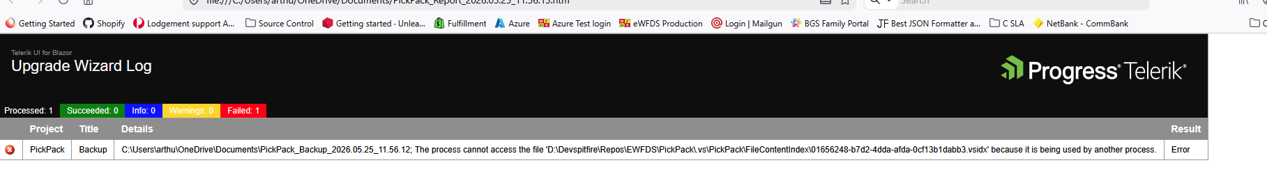
When ever I click the pop to Upgrade the UI assistant I get the following error screen.
DatePicker cursor not advancing after month input. The problem arises when dd/MMM/yyyy format is applied.
To reproduce the issue open this REPL example. Type any date in the second DatePicker. When inserting a month value the cursor is not moved to the year section.
After inserting a month the cursor should be moved to the year section. As when no format is applied (the first DatePicker)
When a table row does not have any cells, there might be lots of script errors when hovering the empty row with the mouse.
The error is the following:
Sometimes we even have a server error:
Microsoft.JSInterop.JSException: Not a table node: table_wrapper
RangeError: Not a table node: table_wrapper
at https://somesite/caesar/_content/Telerik.UI.for.Blazor/js/telerik-blazor.js?x=25.1.7.1096:23:1557112
at pl.get (https://somesite/caesar/_content/Telerik.UI.for.Blazor/js/telerik-blazor.js?x=25.1.7.1096:23:1558816)
at https://somesite/caesar/_content/Telerik.UI.for.Blazor/js/telerik-blazor.js?x=25.1.7.1096:23:1638148
at Be.decorations (https://somesite/caesar/_content/Telerik.UI.for.Blazor/js/telerik-blazor.js?x=25.1.7.1096:23:1638538)
at https://somesite/caesar/_content/Telerik.UI.for.Blazor/js/telerik-blazor.js?x=25.1.7.1096:23:1529498
at Wa.someProp (https://somesite/caesar/_content/Telerik.UI.for.Blazor/js/telerik-blazor.js?x=25.1.7.1096:23:1548718)
at Fa (https://somesite/caesar/_content/Telerik.UI.for.Blazor/js/telerik-blazor.js?x=25.1.7.1096:23:1529464)
at Wa.updateStateInner (https://somesite/caesar/_content/Telerik.UI.for.Blazor/js/telerik-blazor.js?x=25.1.7.1096:23:1545305)
at Wa.update (https://somesite/caesar/_content/Telerik.UI.for.Blazor/js/telerik-blazor.js?x=25.1.7.1096:23:1544591)
at Wa.setProps (https://somesite/caesar/_content/Telerik.UI.for.Blazor/js/telerik-blazor.js?x=25.1.7.1096:23:1544734)
at Microsoft.JSInterop.JSRuntime.InvokeAsync[TValue](Int64 targetInstanceId, String identifier, Object[] args)
at Telerik.Blazor.Components.TelerikEditor.SetOptions()
at Telerik.Blazor.Components.TelerikEditor.OnParametersSetAsync()
at Microsoft.AspNetCore.Components.ComponentBase.CallStateHasChangedOnAsyncCompletion(Task task)
at Microsoft.AspNetCore.Components.RenderTree.Renderer.GetErrorHandledTask(Task taskToHandle, ComponentState owningComponentState)
The server error is really hard to recreate, but it seems like users that has a slow computer and hovers the editor directly when loading gets this error sometimes...
Here is the source code (hovering the empty row will generate scripting errors):
<TelerikEditor Height="300px" @bind-Value="@Value" EditMode="Telerik.Blazor.EditorEditMode.Iframe" ReadOnly="true">
</TelerikEditor>

@code {
    public string Value { get; set; } =
            @"
<table>
    <tbody>
        <tr>
            <td>
               Some text
            </td>
        </tr>
        <tr style=""height: 24px"">
        </tr>
        <tr>
            <td>
                Some text
            </td>
        </tr>
    </tbody>
</table>
    ";
}
Hi,
The ask is for a feature request to take the already wonderfully done globally applied filter features down to a per column basis without the overhead and burden of resorting to the custom FilterMenuTemplate approach.
The current way of doing business creates much overhead in code particularly when several columns are involved.
Something like:
<TelerikGrid Data="@MyData"
FilterMode="@GridFilterMode.PerColumn"
<GridColumns>
<GridColumn Field="MyField01" FilterMode="@GridFilterColumnMode.FilterRow" />
<GridColumn Field="MyField02" FilterMode="@GridFilterColumnMode.FilterMenu" />
<GridColumn Field="MyField03" Filterable="false"/>
etc..
</GridColumns>
</TelerikGrid>
Thanks!
Ron
Hello,
seems like the GridToolbar(even the GridToolbarTemplate) in grid is not rendering "GridToolBarOverflowMode.Section". The "Scroll" mode is ok.
Is there any additional setup, or did i missed some setup...?
REPL:
https://blazorrepl.telerik.com/wqYQvvEq40GkajEZ30
based on:
https://www.telerik.com/blazor-ui/documentation/components/grid/toolbar
some mention about "sections" but it seems for another purpose:
https://www.telerik.com/blazor-ui/documentation/knowledge-base/common-net8-sections
Thanks
Hi,
I have a new laptop with a fresh install of visual studio and telerik etc etc. When I went to get the ai coding assistants to work, nothing I did worked. Spent hours trying to figure it out when Claude suggested I install NODE. After I did that, and went the the telerik blazor extension to "Configure MCP server globally" the ai worked.
First, have the configuration check to see if node is working and installed and give a warning if it is not, or let people know that it needs to be installed to make it work. Secondly, add this to the documentation. Such a pain in the ass when the documentation isn't complete. The amount of time i spent on this is stupid compared to how simple the solution was.
Peter
Hello
I notice that zoom on chart with numeric values make the axis values with a lot of decimal and didn't find a way to round them.
We can see it directly in the documentation here
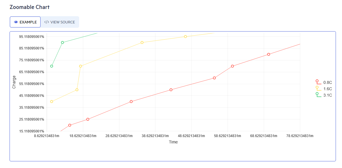
Is there a way to keep the axis to rounded value ?
Thank you
Regards,
Thomas
Hello,
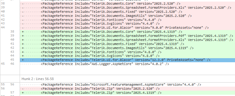
we recently updated Telerik.UI.for.Blazor from 9.0.0 to 12.3.0, afterwords we noticed that in several instances where we use the `TelerikGrid` component, keyboard interactions stopped working. Specifically the `@onkeydown` seems to no longer propagate to parent elements of the grid. As this was not mentioned in the Breaking changes for the version 10 or 12 releases we assume this to be a bug.
here a simplified example:
            <div style="padding: 0; width: @(ShowSidePanel ? "65%" : "99%")" tabindex="0" @onkeydown="@(OnKeyPress)">
                <TelerikGrid TItem="IncomingInvoiceGridItemViewModel"
                             @ref="GridRef"
                             Class="admin-grid"
                             Height="@OverviewHeight"
                             RowHeight="50"
                             Pageable="false"
                             PageSize="PageSize"
                             FilterMode="@GridFilterMode.FilterMenu"
                             Sortable="true"
                             Resizable="true"
                             Reorderable="true"
                             ShowColumnMenu="true"
                             ScrollMode="@GridScrollMode.Virtual"
                             SelectionMode="@GridSelectionMode.Single"
                             OnStateInit="@OnStateInit_SetStateAsync"
                             OnStateChanged="@OnStateChanged_SaveStateAsync"
                             SelectedItemsChanged="@OnSelectedItemsChanged_LoadPdf"
                             OnRead="@OnRead_UpdateFilteredItems">
                    <GridSettings>
                        <GridColumnMenuSettings Lockable="false" />
                    </GridSettings>
...
<!-- aggregates, columns and noDataTemplate omitted -->
...
                </TelerikGrid>
            </div>
Implementation / usages of the features did not change, only updates where changes required by the update Telerik.UI.for.Blazor from 9.0.0 to 12.3.0.
These were the dependencies updated alongside the update of Telerik.UI.for.Blazor from 9.0.0 to 12.3.0 :
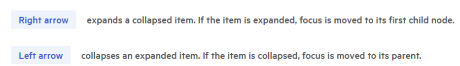
The TelerikPanelBar component is using Right and Left arrows on keyboard to opening and closing each tab.
https://demos.telerik.com/blazor-ui/panelbar/keyboard-navigation
When the page is zoomed to 200%, it gets a horizontal scrollbar, which is normally controlled with the left and right arrow keys on keyboard. However, these keys are assigned to opening and closing the TelerikPanelBar component, which makes it impossible to scroll the page horizontally while we have Tab on TelerikPanelBar. Is there any workaround that would allow horizontal scrolling with the left and right arrow keys on keyboard at this zoom level? Maybe it’s possible to change TelerikPanelBar behavior and opening and closing it by different keys?
If you use the FloatingLabel, when you tab into the DateInput control, the cursor is set at the very end of the text of the date format. However, if you do not use the FloatingLabel, and you tab into the DateInput control, the placeholder text is selected.
Reproduction: https://blazorrepl.telerik.com/wQlvclOZ14jEKaXU38.
===
ADMIN EDIT
===
The report is initially opened for DateInput, however, it also targets the rest of the date pickers that are compatible with FloatingLabel.
When you type something in the grid searchbox, there will be a X at the end to clear the box.
However, if you restore the grid from previously stored state like localstorage, and if the box has value, the X is not there.
Thanks!
I am overriding the built-in Add command and setting an InsertedItem through the TreeList state. However, it looks like the the built-in validation is invoked twice and two validation Tooltips are displayed for the field.

Try to use a Calendar (@bind-RangeStart, @bind-RangeEnd) and Date Input (@bind-value) with the same value bound to them. You can't correctly change the date upon input, it shows only today's date.
-------------------- ADMIN EDIT --------------------
The workaround for such a scenario is to not use the @bind-RangeStart, @bind-RangeEnd in Calendar with the same value as Date Input @bind-value. See the code below.
Razor:
<TelerikCalendar Views="1"
                 View="CalendarView.Month"
                 SelectionMode="CalendarSelectionMode.Range"
                 RangeStart="@StartTime"
                 RangeEnd="@EndTime"
                 RangeStartChanged="@((DateTime value) => { StartTime = value.Date + value.TimeOfDay; })"
                 RangeEndChanged="@((DateTime value) => { EndTime = value.Date + value.TimeOfDay; })">
</TelerikCalendar>
<br />
START DATE: @StartTime
<br />
END DATE: @EndTime

<br />

<TelerikDateInput @bind-Value="@inputTimeForStartDate" OnBlur="@OnBlurHandlerFirst" Format="hh:mm">
</TelerikDateInput>

<TelerikDateInput @bind-Value="@inputTimeForEndDate" OnBlur="@OnBlurHandlerSecond" Format="hh:mm">
</TelerikDateInput
C#:
DateTime inputTimeForStartDate { get; set; }
DateTime inputTimeForEndDate { get; set; }

public DateTime StartTime { get; set; }
public DateTime EndTime { get; set; }

private void OnBlurHandlerFirst()
{
    StartTime += inputTimeForStartDate.TimeOfDay;
}

private void OnBlurHandlerSecond()
{
    EndTime += inputTimeForEndDate.TimeOfDay;
Use a ToolBar with its ToolBarTemplateItem (with DropDownList inside of the template) in a separate component. Try to switch values in the DropDownList with the arrows of the keyboard. The value in the DropDownList does not change until you move away from it with a right arrow. This only happens when the template with the dropdown inside is in a separated component.
-------------------- ADMIN EDIT --------------------
The workaround for such a scenario is to export the DropDownList too onto a separated component and then call it in the ToolBarTemplateItem. See the attached sample project.
That's pretty weird but nevertheless very specific: if the Scheduler is loaded with POCO objects from EntityFramework with LazyLoading enabled (Castle.Proxies objects) them the k-event-drag-hint box is not shown (!)
It took me some time to figure it out...