Hi Support,
I have an issue with the DragToSelect feature of a Telerik grid in Blazor when this grid is inside a TelerikWindow.
Summary
When a TelerikGrid configured with GridSelectionSettings DragToSelect="true" is rendered inside the <WindowContent> of a <TelerikWindow>, the drag-to-select (rubber-band) behavior is not working properly — the user can only select cells/rows via individual clicks.
Single-click selection continues to work in both cases. The issue is specific to the drag gesture.
Steps to reproduce
Create a page with a TelerikWindow set to Visible="true".
Inside <WindowContent>, place a TelerikGrid with:
SelectionMode="@GridSelectionMode.Multiple"
SelectedCells / SelectedCellsChanged bound
<GridSettings><GridSelectionSettings SelectionType="@GridSelectionType.Cell" DragToSelect="true" /></GridSettings>
Open the window and try to select multiple cells by pressing the mouse button on a cell and dragging over neighboring cells.
Expected behavior
A rubber-band selection rectangle appears and all cells the pointer passes over become selected — same as when the identical grid is placed on a regular page (outside a modal window).
Actual behavior
Drag selection occur rarely. Only the single cell under the initial mousedown gets selected. The rubber-band rectangle rarely appears, and SelectedCellsChanged fires with a single descriptor instead of the full drag range.
Minimal repro (REPL-ready)
<TelerikWindow Visible="true" Width="800px" Height="500px">
<WindowTitle>Repro</WindowTitle>
<WindowContent>
<TelerikGrid Data="@Data" TItem="SampleItem"
SelectionMode="@GridSelectionMode.Multiple"
SelectedCells="@SelectedCells"
SelectedCellsChanged="@((IEnumerable<GridSelectedCellDescriptor> c) => SelectedCells = c)">
<GridSettings>
<GridSelectionSettings SelectionType="@GridSelectionType.Cell" DragToSelect="true" />
</GridSettings>
<GridColumns>
<GridColumn Field="@nameof(SampleItem.Id)" />
<GridColumn Field="@nameof(SampleItem.Name)" />
</GridColumns>
</TelerikGrid>
</WindowContent>
</TelerikWindow>
@code {
public record SampleItem(int Id, string Name);
private List<SampleItem> Data = Enumerable.Range(1, 20).Select(i => new SampleItem(i, $"Item {i}")).ToList();
private IEnumerable<GridSelectedCellDescriptor> SelectedCells = Enumerable.Empty<GridSelectedCellDescriptor>();
}
Now my questions :
- Is this a known limitation of DragToSelect when the grid is inside a modal TelerikWindow?
- Is there an officially supported workaround (CSS pointer-events tweak on .k-overlay, event capture override, grid setting, etc.)?
- If it is a bug, could you open a public issue we can track?
Many thanks you in advance.
Franck Boisdé
Bug report
Reproduction of the problem
(bug report only)
Regression introduced in 13.0.0.
1. Run this example: https://blazorrepl.telerik.com/wUuSGClv00orFeRm59
Current behavior
(optional)
The Size, Rounded, FillMode parameters are ignored.
Expected/desired behavior
The parameter values should apply and change the appearance of the SearchBox.
Environment
- Browser: [all ]
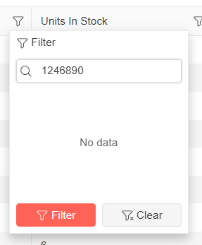
I am using a Blazor Telerik Grid and implementing a custom TelerikCheckBoxListFilter inside a FilterMenuTemplate.
When a user opens the "Name" filter menu and types a name quickly into the search/filter box, some of the text is removed automatically.
For example, if I type "1234567890" as input, without any delay - some of the letters will be cleared and it is showing as "1246890" in the filter search box. It could be because it is searching in real time, but the user input I am typing is not carried over correctly. See the attached screenshot taken from Telerik Demo site for the above said example.
Below is the column definition I am currently using:
<GridColumn Field="@nameof(Tenant.TenantName)" Title="Name" Width="*" FilterMenuType="@FilterMenuType.CheckBoxList">
<FilterMenuTemplate Context="context">
<TelerikCheckBoxListFilter Data="@Model.DistinctTenantNameList"
Field="@(nameof(FilterTenantName.TenantName))"
@bind-FilterDescriptor="@context.FilterDescriptor">
</TelerikCheckBoxListFilter>
</FilterMenuTemplate>
</GridColumn>
The Grid performance worsens progressively with each subsequent edit operation. Please optimize that.
Test page: https://blazorrepl.telerik.com/mJuHFNbb17FpJu9b54
Click on a Price or Quantity cell to start edit mode and tab repetitively to observe the degradation.
The CheckBoxList filter does not work as expected when the Grid is bound to ExpandoObject
===
ADMIN EDIT: A possible workaround is to bind the Grid with OnRead event and populate the MemberType property of the filter descriptors manually:
@using System.Dynamic
@using Telerik.DataSource
@using Telerik.DataSource.Extensions

<TelerikGrid OnRead="@OnGridRead"
             TItem="@ExpandoObject"
             Pageable="true"
             Sortable="true"
             FilterMode="@GridFilterMode.FilterMenu"
             FilterMenuType="@FilterMenuType.CheckBoxList"
             Height="400px">
    <GridToolBarTemplate>
        <GridSearchBox />
    </GridToolBarTemplate>
    <GridColumns>
        @{
            if (GridData != null && GridData.Any())
            {
                <GridColumn Field="PropertyInt" FieldType="@GridPropertyTypes["PropertyInt"]" />
                <GridColumn Field="PropertyString" FieldType="@GridPropertyTypes["PropertyString"]" />
                <GridColumn Field="PropertyGroup" FieldType="@GridPropertyTypes["PropertyString"]" />
                <GridColumn Field="PropertyDate" FieldType="@GridPropertyTypes["PropertyDate"]" />
                <GridColumn Field="PropertyBool" FieldType="@GridPropertyTypes["PropertyBool"]" />
            }
        }
    </GridColumns>
</TelerikGrid>

@code {
    private List<ExpandoObject> GridData { get; set; } = new List<ExpandoObject>();

    private Dictionary<string, Type> GridPropertyTypes { get; set; } = new Dictionary<string, Type>() {
        { "Id", typeof(int) },
        { "PropertyInt", typeof(int) },
        { "PropertyString", typeof(string) },
        { "PropertyGroup", typeof(string) },
        { "PropertyDate", typeof(DateTime) },
        { "PropertyBool", typeof(bool) }
    };

    private async Task OnGridRead(GridReadEventArgs args)
    {
        args.Request.Filters.OfType<CompositeFilterDescriptor>()
        .Each(x =>
        {
            x.FilterDescriptors.OfType<FilterDescriptor>()
                .Each(y => y.MemberType = GridPropertyTypes[y.Member]);
        });

        var result = GridData.ToDataSourceResult(args.Request);

        args.Data = result.Data;
        args.Total = result.Total;
        args.AggregateResults = result.AggregateResults;
    }

    protected override void OnInitialized()
    {
        for (int i = 1; i <= 18; i++)
        {
            dynamic expando = new ExpandoObject();

            expando.Id = i;
            expando.PropertyGroup = $"Group {(i % 3 + 1)}";
            expando.PropertyInt = i;
            expando.PropertyString = $"String {(char)(64 + i)}{(char)(64 + i)}";
            expando.PropertyDate = DateTime.Now.AddMonths(-i);
            expando.PropertyBool = i % 2 != 0;

            GridData.Add(expando);
        }
    }
}
Telerik input components inside EditorTemplate render the whole grid on each keystroke
<AdminEdit>
As a workaround, you can use the standard Input components provided by the framework together with a CSS class that would visually make them like the Telerik Input Components. An example for the TextArea:
<InputTextArea class="k-textarea" @bind-Value="@myValue"></InputTextArea></AdminEdit>
- If you select a row and then unselect that row (SelectedItems is empty), and hit the incorrectly enabled delete button, it removes a row that has not been selected. When there is no selected row, the delete tool should be disabled.
- If you use multiple selection, the delete tool will delete the last row, which is unexpected. It should delete all selected rows.
Workaround:
<TelerikGrid Data="@GridData"
             SelectionMode="@GridSelectionMode.Multiple"
             SelectedItems="@SelectedItems"
             SelectedItemsChanged="@( (IEnumerable<Employee> newSelected) => OnSelectedItemsChanged(newSelected) )"
             Height="300px">
    <GridToolBarTemplate>
        <TelerikButton Enabled="@(SelectedItems.Any())" OnClick="@DeleteSelectedEmployees">Delete</TelerikButton>
    </GridToolBarTemplate>
    <GridColumns>
        <GridCheckboxColumn SelectAll="true" />
        <GridColumn Field="Name" Title="Name" />
        <GridColumn Field="Team" Title="Team" />
    </GridColumns>
</TelerikGrid>

@code {
    private List<Employee> GridData { get; set; } = Enumerable.Range(1, 10).Select(i => new Employee
    {
        EmployeeId = i,
        Name = $"Employee {i}",
        Team = $"Team {i % 3}"
    }).ToList();

    private List<Employee> SelectedItems { get; set; } = new();

    private void OnSelectedItemsChanged(IEnumerable<Employee> items)
    {
        SelectedItems = items.ToList();
    }

    private void DeleteSelectedEmployees()
    {
        if (SelectedItems.Any())
        {
            GridData = GridData.Except(SelectedItems).ToList();
            SelectedItems.Clear();
        }
    }

    public class Employee
    {
        public int EmployeeId { get; set; }
        public string Name { get; set; }
        public string Team { get; set; }
        public override bool Equals(object obj) => obj is Employee e && e.EmployeeId == EmployeeId;
        public override int GetHashCode() => EmployeeId.GetHashCode();
    }
}
I have the following configuration:
Editor component in Grid EditorTemplate and the Grid editing mode is popup
Here is a REPL example https://blazorrepl.telerik.com/QeuUwsvb15sxbLuB04
The popup that opens when editing the Grid resizes when I type in the Editor
Steps to reproduce the issue:
1. Run the REPL example
2. Click the Edit button in the Grid
3. Resize the popup
4. Start to type something in the Editor
5. The popup resizes
Bug report
Reproduction of the problem
(bug report only)
Regression introduced in 9.0.0.
1. Run the code posted below and export the Grid.
2. Open the exported Excel file.
<TelerikGrid Data=@GridData
             Pageable="true" Sortable="true" Resizable="true" Reorderable="true"
             ShowColumnMenu="true" FilterMode="@GridFilterMode.FilterMenu"
             Width="800px" Height="400px">
    <GridToolBar>
        <GridToolBarExcelExportTool>
            Export to Excel
        </GridToolBarExcelExportTool>
    </GridToolBar>
    <GridExport>
        <GridExcelExport FileName="telerik-grid-export" AllPages="false" />
    </GridExport>
    <GridColumns>
        <GridColumn Title="Personal Information">
            <Columns>
                <GridColumn Field=@nameof(Customer.FirstName) Title="First Name" Width="100px" />
                <GridColumn Field=@nameof(Customer.LastName) Title="Last Name" Width="100px" />
            </Columns>
        </GridColumn>
        <GridColumn Title="Company">
            <Columns>
                <GridColumn Field=@nameof(Customer.CompanyName) Title="Name" />
                <GridColumn Field=@nameof(Customer.HasCompanyContract) Title="Has Contract" Width="120px" />
            </Columns>
        </GridColumn>
        <GridColumn Title="Contact Details">
            <Columns>
                <GridColumn Field="@nameof(Customer.Email)" Title="Email"></GridColumn>
                <GridColumn Field="@nameof(Customer.Phone)" Title="Phone"></GridColumn>
                <GridColumn Field="@nameof(Customer.City)" Title="City"></GridColumn>
            </Columns>
        </GridColumn>
    </GridColumns>
</TelerikGrid>

@code {
    public List<Customer> GridData { get; set; }

    public class Customer
    {
        public int Id { get; set; }
        public string PasswordHash { get; set; }
        public string FirstName { get; set; }
        public string LastName { get; set; }
        public string CompanyName { get; set; }
        public bool HasCompanyContract { get; set; }
        public string Email { get; set; }
        public string Phone { get; set; }
        public string City { get; set; }
    }

    // generation of dummy data
    protected override void OnInitialized()
    {
        GridData = GenerateData();
    }

    List<Customer> GenerateData()
    {
        var data = new List<Customer>();

        string[] fNames = new string[] { "Nancy", "John", "Orlando", "Jane", "Bob", "Juan" };
        string[] lNames = new string[] { "Harris", "Gates", "Smith", "Caprio", "Gash", "Gee" };
        string[] cNames = new string[] { "Acme", "Northwind", "Contoso" };
        string[] cities = new string[] { "Denver", "New York", "LA", "London", "Paris", "Helsinki", "Moscow", "Sofia" };
        Random rnd = new Random();

        for (int i = 0; i < 150; i++)
        {
            string fName = fNames[rnd.Next(0, fNames.Length)];
            string lName = lNames[rnd.Next(0, lNames.Length)];
            string cName = cNames[rnd.Next(0, cNames.Length)];
            data.Add(new Customer
            {
                Id = i,
                PasswordHash = "not shown",
                FirstName = fName,
                LastName = lName,
                CompanyName = cName,
                HasCompanyContract = i % 3 == 0,
                Email = $"{fName}.{lName}@{cName}.com",
                Phone = $"{rnd.Next(100, 999)}-555-{rnd.Next(100, 999)}",
                City = cities[rnd.Next(0, cities.Length)]
            });
        }

        return data;
    }
}
Current behavior
(optional)
The “Personal Information”, “Company”, “Contact Details” headers are not exported.
Expected/desired behavior
The multi-column headers are exported.
Environment
- Kendo/Telerik version: 14.0.0
- Browser: [all ]
The Grid resets and disables the adaptive mode for a column menu if the column has been hidden. The component also uses the previous adaptive mode that is no longer correct if the browser window is resized.
Steps to reproduce:
- Shrink the browser width. Hide a column, show it back and then show its column menu.
- Start from a wide browser. Show a column menu. Shrink the browser. Show the same column menu.
- Start from a narrow browser. Show a column menu. Expand the browser. Show the same column menu.
Test page:
<TelerikGrid Data="@GridData"
             AdaptiveMode="@AdaptiveMode.Auto"
             FilterMode="GridFilterMode.FilterMenu"
             ShowColumnMenu="true">
    <GridColumns>
        <GridColumn Field="@nameof(Product.Name)" />
        <GridColumn Field="@nameof(Product.Group)" />
        <GridColumn Field="@nameof(Product.Price)" DisplayFormat="{0:c2}" />
        <GridColumn Field="@nameof(Product.Quantity)" DisplayFormat="{0:n0}" />
        <GridColumn Field="@nameof(Product.Released)" DisplayFormat="{0:d}" />
        <GridColumn Field="@nameof(Product.Discontinued)" />
    </GridColumns>
</TelerikGrid>

@code {
    private List<Product> GridData { get; set; } = new();

    protected override void OnInitialized()
    {
        var rnd = Random.Shared;

        for (int i = 1; i <= 3; i++)
        {
            GridData.Add(new Product()
            {
                Id = i,
                Name = $"Name {i} {(char)rnd.Next(65, 91)}{(char)rnd.Next(65, 91)}",
                Group = $"Group {i % 3 + 1}",
                Price = rnd.Next(1, 100) * 1.23m,
                Quantity = rnd.Next(0, 10000),
                Released = DateTime.Today.AddDays(-rnd.Next(60, 1000)),
                Discontinued = i % 4 == 0
            });
        }
    }

    public class Product
    {
        public int Id { get; set; }
        public string Name { get; set; } = string.Empty;
        public string Group { get; set; } = string.Empty;
        public decimal Price { get; set; }
        public int Quantity { get; set; }
        public DateTime Released { get; set; }
        public bool Discontinued { get; set; }
    }
}
Customers report inconsistent in-cell editing behavior with DatePicker columns in the Grid.
- Case 1: click a date cell to enter edit mode, then click outside the Grid — edit mode terminates.
- Case 2: click a date cell to enter edit mode, open the DatePicker popup, then click outside the Grid — the popup closes but the cell remains stuck in edit mode until pressing Esc or clicking another cell.
Here is a REPL test page that reproduces the issue (first date column) and provides a workaround (second date column):
https://blazorrepl.telerik.com/QAErkrEh090ykIxR16
The workaround relies on Grid EditorTemplate, the DatePicker OnClose event, and programmatic Grid edit mode management. The relevant code is:
@using System.ComponentModel.DataAnnotations

<TelerikGrid @ref="@GridRef"
             Data="@GridData"
             EditMode="@GridEditMode.Incell"
             OnUpdate="@OnGridUpdate"
             OnCreate="@OnGridCreate">
    <GridToolBarTemplate>
        <GridCommandButton Command="Add">Add Item</GridCommandButton>
    </GridToolBarTemplate>
    <GridColumns>
        <GridColumn Field="@nameof(Product.Name)" />
        <GridColumn Field="@nameof(Product.StartDate)" Title="BUG" DisplayFormat="{0:d}" />
        <GridColumn Field="@nameof(Product.EndDate)" Title="WORKAROUND" DisplayFormat="{0:d}">
            <EditorTemplate>
                @{ var editItem = (Product)context; }
                <TelerikDatePicker Value="editItem.EndDate"
                                   ValueChanged="@((DateTime? newValue) => OnGridDatePickerValueChanged(newValue, editItem))"
                                   ValueExpression="@( () => editItem.EndDate )"
                                   OnClose="@(async () => await OnGridDatePickerClose(editItem))" />
            </EditorTemplate>
        </GridColumn>
    </GridColumns>
</TelerikGrid>

@code {
    #nullable enable

    private TelerikGrid<Product>? GridRef;
    private List<Product> GridData { get; set; } = new();

    private int LastId { get; set; }

    private DateTime LastDatePickerValueChanged { get; set; } = DateTime.Now;

    private void OnGridDatePickerValueChanged(DateTime? newValue, Product editItem)
    {
        editItem.EndDate = newValue;
        LastDatePickerValueChanged = DateTime.Now;
    }

    private async Task OnGridDatePickerClose(Product editItem)
    {
        if (DateTime.Now - LastDatePickerValueChanged > TimeSpan.FromMilliseconds(500))
        {
            GridState<Product> gridState = GridRef!.GetState();

            if (gridState.EditItem is not null && gridState.EditItem.Id == editItem.Id)
            {
                // Uncomment to perform an item update instead of cancel
                // OnGridUpdate(new GridCommandEventArgs { Item = editItem });

                gridState.OriginalEditItem = null!;
                gridState.EditItem = null!;

                await GridRef.SetStateAsync(gridState);
            }
        }
    }

    private void OnGridCreate(GridCommandEventArgs args)
    {
        var createdItem = (Product)args.Item;

        createdItem.Id = ++LastId;

        GridData.Insert(0, createdItem);
    }

    private void OnGridUpdate(GridCommandEventArgs args)
    {
        var updatedItem = (Product)args.Item;
        var originalItemIndex = GridData.FindIndex(i => i.Id == updatedItem.Id);

        if (originalItemIndex != -1)
        {
            GridData[originalItemIndex] = updatedItem;
        }
    }

    protected override void OnInitialized()
    {
        for (int i = 1; i <= 5; i++)
        {
            GridData.Add(new Product()
            {
                Id = ++LastId,
                Name = $"Product {LastId}",
                Price = Random.Shared.Next(0, 100) * 1.23m,
                Quantity = Random.Shared.Next(0, 1000),
                StartDate = DateTime.Today.AddDays(-Random.Shared.Next(60, 1000)),
                EndDate = DateTime.Today.AddDays(Random.Shared.Next(1, 60)),
                IsActive = LastId % 4 > 0
            });
        }
    }

    public class Product
    {
        public int Id { get; set; }
        [Required]
        public string Name { get; set; } = string.Empty;
        public decimal Price { get; set; }
        public int Quantity { get; set; }
        public DateTime? StartDate { get; set; }
        public DateTime? EndDate { get; set; }
        public bool IsActive { get; set; }
    }
}
Bug report
Reproduction of the problem
Possibly related to https://github.com/telerik/blazor/issues/2594
- Run this example: https://blazorrepl.telerik.com/wAkdbZPo47oCuV5G32
- Without scrolling the Grid horizontally resize a non-locked column (e.g., In Stock)
Current behavior
(optional)
The first locked column (ID) is rendered after the second locked column (Product Name). When you resize a non-locked column, the ID column disappears and is revealed at its new position after you scroll the Grid horizontally.
The behavior is reproducible with RTL enabled.
Expected/desired behavior
The order of the locked columns should persist.
Environment
- Telerik version: 13.0.0
- Browser: [all]
I am resetting the Grid State by calling Grid.SetState(null). This doesn't reset ColumnState<T>.Locked boolean to false and the columns remain locked.
---
ADMIN EDIT
---
A possible workaround for the time being is to additionally loop through the ColumnStates collection of the State and set the Locked property to false for each column.
An exception occurs if a Grid row is dropped in another empty Grid in RTL mode:
Error: System.FormatException: the input string '-1' was not in a correct format.
How to reproduce:
- Go to https://demos.telerik.com/blazor-ui/grid/editing-incell
- Go to the last Grid page, which has empty space below the last table row.
- Open any Grid cell for editing.
- Click on the empty space in the Grid below the last table row.
- The Grid does not exit edit mode like it should.
The regression was introduced in version 12.2.0. The last version that works correctly is 12.0.0.
The possible workarounds are:
- Remove the Grid Height, so that there is no empty space after the last Grid row. You can apply a max-height style to the Grid to prevent unlimited vertical expansion.
- Use an @onfocusout event in the Grid <EditorTemplate> to close the Grid edit mode programmatically:
@using System.ComponentModel.DataAnnotations
@using Telerik.DataSource
@using Telerik.DataSource.Extensions

<TelerikGrid @ref="@GridRef"
             OnRead="@OnGridRead"
             TItem="@Product"
             EditMode="@GridEditMode.Incell"
             OnCreate="@OnGridCreate"
             OnDelete="@OnGridDelete"
             OnUpdate="@OnGridUpdate"
             Height="600px">
    <GridToolBarTemplate>
        <GridCommandButton Command="Add">Add Item</GridCommandButton>
    </GridToolBarTemplate>
    <GridColumns>
        <GridColumn Field="@nameof(Product.Name)">
            <EditorTemplate>
                @{ var dataItem = (Product)context; }
                <span @onfocusout="@( async () => await OnGridCellFocusOut(nameof(Product.Name)) )">
                    <TelerikTextBox @bind-Value="@dataItem.Name" />
                </span>
            </EditorTemplate>
        </GridColumn>
        @* <GridColumn Field="@nameof(Product.Price)" DisplayFormat="{0:C2}" />
        <GridColumn Field="@nameof(Product.Quantity)" DisplayFormat="{0:N0}" />
        <GridColumn Field="@nameof(Product.ReleaseDate)" DisplayFormat="{0:d}" /> *@
        <GridColumn Field="@nameof(Product.Discontinued)" Width="120px">
            <EditorTemplate>
                @{ var dataItem = (Product)context; }
                <span @onfocusout="@( async () => await OnGridCellFocusOut(nameof(Product.Discontinued)) )">
                    <TelerikCheckBox @bind-Value="@dataItem.Discontinued" />
                </span>
            </EditorTemplate>
        </GridColumn>
        <GridCommandColumn Width="180px">
            <GridCommandButton Command="Delete">Delete</GridCommandButton>
        </GridCommandColumn>
    </GridColumns>
</TelerikGrid>

@code {
    private TelerikGrid<Product>? GridRef { get; set; }

    private ProductService GridProductService { get; set; } = new();

    private async Task OnGridCellFocusOut(string field)
    {
        await Task.Delay(100);

        if (GridRef is null)
        {
            return;
        }

        GridState<Product> gridState = GridRef.GetState();
        Product? editItem = gridState.EditItem as Product;

        if (editItem is null)
        {
            return;
        }

        GridCommandEventArgs args = new GridCommandEventArgs()
        {
             Field = field,
             Item = editItem
        };

        await OnGridUpdate(args);


        gridState.EditField = default;
        gridState.EditItem = default!;
        gridState.OriginalEditItem = default!;

        await GridRef.SetStateAsync(gridState);
    }

    private async Task OnGridCreate(GridCommandEventArgs args)
    {
        var createdItem = (Product)args.Item;

        await GridProductService.Create(createdItem);
    }

    private async Task OnGridDelete(GridCommandEventArgs args)
    {
        var deletedItem = (Product)args.Item;

        await GridProductService.Delete(deletedItem);
    }

    private async Task OnGridRead(GridReadEventArgs args)
    {
        DataSourceResult result = await GridProductService.Read(args.Request);

        args.Data = result.Data;
        args.Total = result.Total;
        args.AggregateResults = result.AggregateResults;
    }

    private async Task OnGridUpdate(GridCommandEventArgs args)
    {
        var updatedItem = (Product)args.Item;

        await GridProductService.Update(updatedItem);
    }

    public class Product
    {
        public int Id { get; set; }
        [Required]
        public string Name { get; set; } = string.Empty;
        public string Description { get; set; } = string.Empty;
        public decimal? Price { get; set; }
        public int Quantity { get; set; }
        [Required]
        public DateTime? ReleaseDate { get; set; }
        public bool Discontinued { get; set; }
    }

    #region Data Service

    public class ProductService
    {
        private List<Product> Items { get; set; } = new();

        private int LastId { get; set; }

        public async Task<int> Create(Product product)
        {
            await SimulateAsyncOperation();

            product.Id = ++LastId;

            Items.Insert(0, product);

            return LastId;
        }

        public async Task<bool> Delete(Product product)
        {
            await SimulateAsyncOperation();

            if (Items.Contains(product))
            {
                Items.Remove(product);

                return true;
            }

            return false;
        }

        public async Task<List<Product>> Read()
        {
            await SimulateAsyncOperation();

            return Items;
        }

        public async Task<DataSourceResult> Read(DataSourceRequest request)
        {
            return await Items.ToDataSourceResultAsync(request);
        }

        public async Task<bool> Update(Product product)
        {
            await SimulateAsyncOperation();

            int originalItemIndex = Items.FindIndex(x => x.Id == product.Id);

            if (originalItemIndex != -1)
            {
                Items[originalItemIndex] = product;
                return true;
            }

            return false;
        }

        private async Task SimulateAsyncOperation()
        {
            await Task.Delay(100);
        }

        public ProductService(int itemCount = 5)
        {
            Random rnd = Random.Shared;

            for (int i = 1; i <= itemCount; i++)
            {
                Items.Add(new Product()
                {
                    Id = ++LastId,
                    Name = $"Product {LastId}",
                    Description = $"Multi-line\ndescription {LastId}",
                    Price = LastId % 2 == 0 ? null : rnd.Next(0, 100) * 1.23m,
                    Quantity = LastId % 2 == 0 ? 0 : rnd.Next(0, 3000),
                    ReleaseDate = DateTime.Today.AddDays(-rnd.Next(365, 3650)),
                    Discontinued = LastId % 2 == 0
                });
            }
        }
    }

    #endregion Data Service
}