We upgraded to the latest Telerik Blazor components (8.1.1).
I think there's a bug in the TabStrip when setting the index of the ActiveTabIndex or @bind-ActiveTabIndex.
The page will scroll to the active tab automatically.
Here's a link to the Repl - https://blazorrepl.telerik.com/GfaTEmbR45zQSzEq44
If you remove @bind-ActiveTabIndex="@ActiveTabIndex" from the TelerikTabStrip then the page load normally.
Thanks,
Cesar
The TabStrip ActiveTabIdChanged event fires when the user navigates to another page.
The workaround is to detect app navigation and prevent the business logic execution. The example below is for the general case. If the app navigates programmatically with NavigationManager.NavigateTo(), you can set the IsNavigating flag immediately before that.
@implements IDisposable
@inject NavigationManager NavManager

<TelerikTabStrip ActiveTabId="@ActiveTabId"
                 ActiveTabIdChanged="@TabStripActiveTabIdChanged">
    @for (int i = 1; i <= TabCount; i++)
    {
        int tabIndex = i;

        <TabStripTab @key="@tabIndex" Title="@($"Tab {tabIndex}")" Id="@($"tab{tabIndex}")">
            <h2>Tab @tabIndex</h2>
        </TabStripTab>
    }
</TelerikTabStrip>

@code {
    private string ActiveTabId { get; set; } = "tab1";

    private bool IsNavigating { get; set; }

    private const int TabCount = 3;


    private async Task TabStripActiveTabIdChanged(string newActiveTabId)
    {
        if (IsNavigating)
        {
            return;
        }

        ActiveTabId = newActiveTabId;
    }

    protected override async Task OnAfterRenderAsync(bool firstRender)
    {
        if (firstRender)
        {
            locationChangingRegistration = NavManager.RegisterLocationChangingHandler(OnLocationChanging);
        }
    }

    private IDisposable? locationChangingRegistration;

    private ValueTask OnLocationChanging(LocationChangingContext context)
    {
        IsNavigating = true;

        return ValueTask.CompletedTask;
    }

    public void Dispose() => locationChangingRegistration?.Dispose();
}
The window actions OnClick handler does not execute when a predefined action (e.g. Close) is triggered. This prevents custom logic from running during standard close operations.
Reproducible on version 14.0.0
Repro: https://blazorrepl.telerik.com/wqaJcWbu45qZxbeX49
When ActiveTabId is null, the TabStrip selects the first tab automatically, but does not render its content.
<TelerikTabStrip @bind-ActiveTabId="@TabStripActiveTabId">
    <TabStripTab Title="First" Id="t1">
        First tab content.
    </TabStripTab>
    <TabStripTab Title="Second" Id="t2">
        Second tab content.
    </TabStripTab>
    <TabStripTab Title="Third" Id="t3">
        Third tab content.
    </TabStripTab>
</TelerikTabStrip>

@code {
    private string? TabStripActiveTabId { get; set; }
}
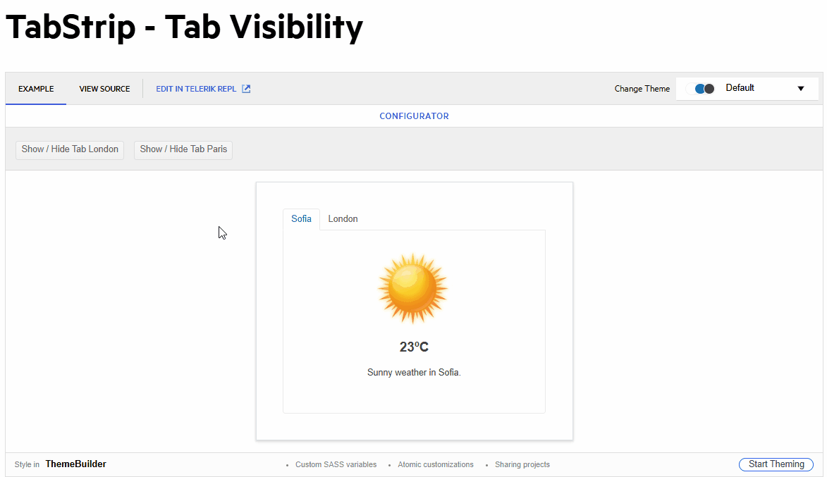
With `PersistTabContent="true"`, when tabs start with `Visible="false"` and later become `Visible="true"`, all visible tab contents are instantiated simultaneously instead of only the active tab.
Reproduction:
@page "/TestPage"

<button @onclick="Load">Load</button>

<TelerikTabStrip PersistTabContent="true">
    <TabStripTab Title="Tab 1" Visible="@_tabsVisible">
        <TestInitComponent Message="Hello from tab1" />
    </TabStripTab>
    <TabStripTab Title="Tab 2" Visible="@_tabsVisible">
        <TestInitComponent Message="Hello from tab2" />
    </TabStripTab>
    <TabStripTab Title="Tab 3" Visible="@_tabsVisible">
        <TestInitComponent Message="Hello from tab3" />
    </TabStripTab>
</TelerikTabStrip>

@code {
    private bool _tabsVisible = false;

    private void Load()
    {
        _tabsVisible = true;
    }
}
TestInitComponent.razor
<h3>TestInitComponent</h3>

@code {

    [Parameter]
    public string Message { get; set; } = string.Empty;

    protected override void OnInitialized()
    {
        base.OnInitialized();
        Console.WriteLine($"TestInitComponent OnInitialized {Message}");
    }
}
Steps: Open page → click Load.
When clicking on a tab to drag it to reorder, it will process the tab change as soon as the tab is clicked to start a drag operation. Preferably, we'd like the tab select action to only happen on a mouseup instead of a mousedown (and cancelled on drag.) This is a reproduction in the REPL: https://blazorrepl.telerik.com/mAayPpGb59GjWvUT47. But it so simple that you probably don't need it. This is the main razor file:
- Activating the second tab leads to its header having the focus (correct).
- Using the tab key, the focus changes to the second tabs content (correct).
- Using "Shift + Tab", the focus changes back to the header row, but to the first tab header (incorrect, the second tab header should be focused).
- Using the right arrow key, the focus changes to the third tab header and this tab gets activated (actually correct, but confusing considering the previous point).
The problem is caused by the tab index of the tab headers not being updated properly. The first one seems to have 0 at all times, while all others stay at -1. Instead, the active tab header should have tab index 0, while all others get -1.
One can generally loop through a collection of items to create several TabStrip instances as shown in the Tabs Collection article.
However, when I am dynamically adding or removing tabs I am hitting a variety of problems targeting:
- The active tab is not correctly set;
- The focus is not always set on the active tab;
- Upon adding/removing a tab, all tabs are re-created and thus their content cannot be persisted;
Please add support for dynamic tabs.
This currently happening in both my application, and in some of your demos. If you set the focus to one of the tabs in the tabstrip, and then hit the tab key on the keyboard, it should set focus to the tabstrip content itself. However, in some cases it sets the focus right back to the tab, so you can never navigate off of the tab with the keyboard.
An example of this can be seen in the Overview and Scrollable Tabs demos, but it is working in position and alignment demo. I should also note that if I open the Overview and Scrollable demos in the Repl, it also works. So I'm not sure what is preventing it on the demo pages themselves. Any help would be appreciated, since the same thing is happening in my projects after I upgraded the Telerik controls to v9.x. Here are the demo links that I'm referring to.
https://demos.telerik.com/blazor-ui/tabstrip/overview
https://demos.telerik.com/blazor-ui/tabstrip/scrollable-tabs
We have recently update to version 7.0.0 of Telerik for Blazor controls.
We have also access to Progress ThemeBuilder application which we use to customize the default Material theme.
After the update to version 7 and also upgrading and compiling the new theme file for our application, TabStrip items fail to display the correct css and defaults to the theme's original css.
ThemeBuilder produces rules for the tab item items with the following path
.lvs-tabstrip.k-tabstrip .k-tabstrip-items-wrapper .k-tabstrip-items.k-reset.k-tabstrip-items-start .k-item.k-tabstrip-item
where the actual control generates the following
.lvs-tabstrip.k-tabstrip .k-tabstrip-items-wrapper .k-tabstrip-items.k-reset.k-tabstrip-items-start .k-item
As you can see it is missing the k-tabstrip-item class and the custom theme fails to render correctly. Either Telerik blazor libary did not add this extra class to each tab item or theme builder is inserting this class when it should not.
I can place this extra class on each TabStripTab element on its Class property, but I feel this is something that the actual Telerik for Blazor libray should do.
Looking at the source code of Telerik for Blazor library, the TabStipTab component generates add the k-item as default and then applies the value of property ClassToRender and its value is
$"{ActiveCssClass} {DisabledCssClass} {Class} {FirstItemClass} {LastItemClass}".Trim()
The Class is an empty string, which I currently use to "fix" the problem but I certainly would like a better solution like a real fix :)
Thank you telerik team
Description
When the user selects an empty tab and then switches to another tab, the empty tab remains highlighted (appears as if it's still selected).
Reproduction
Reproduction: https://blazorrepl.telerik.com/mRkVczaV02S9QkmJ28
Steps:
1. Select the second tab (which has no content).
2. Select the first tab.
Both tabs are highlighted as selected.
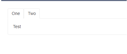
To deactivate all tabs I have to set the ActiveTabIndex parameter to -1.
This was working up to version 4.6.0. After that version I start getting an error:
System.ArgumentOutOfRangeException: Index was out of range. Must be non-negative and less than the size of the collection. (Parameter 'index')
Here is an example with 4.6.0 where it is working:
https://blazorrepl.telerik.com/QSPuvKvI06m6AhF929
Here is an example with the current version:
https://blazorrepl.telerik.com/mIvOlqlI062NR9Vi59
When I am dynamically adding or removing tabs I am hitting a variety of problems targeting:
The active tab is not correctly set
the focus is not always set to the active tab
upon adding/removing a tab all tabs are re-created and their content is not persisted
This is causing some data loss, picklist filter loss, lag time when opening and closing tabs
Hi all,
Could you please add the OnBeforeActiveTabIndexChange event and allow cancellation (prevent) of ActiveTabIndexChanged in the handler?
I saw an example in the doc about how to prevent tab (index) change, but it is not sufficient because of:
- event if you won't change the tab index, the active tab is still being destroyed and recreated;
- we want to avoid keeping the tab in memory by using the PersistTabContent flag;
We need to prevent tab switching by showing the user a confirmation and reacting to the user's choice. We need to prevent the tab switching - not to post react and apply any kind of crutches.
Hello,
I am utilizing the TabStrip component with nested custom components that have parameters. When I change tabs, the inner child component's OnParametersSet is being fired off twice.
Please research if it's possible to prevent the duplicate renders and life cycle events.
Greetings.
I think I found a minor bug when using the TabStrip component. If you have something like this:
<TelerikTabStrip>
	<TabStripTab Title="First tab">
		<p>First content</p>
	</TabStripTab>
	<TabStripTab Title="Second tab">
		<p>Second content</p>
	</TabStripTab>
	<TabStripTab Title="Third tab">

	</TabStripTab>
 </TelerikTabStrip>
And you click the tab without content, it stays selected.
Regards
Reproduction: https://blazorrepl.telerik.com/QHFuExbc57Wq6HVG28.
Here is a REPL test page. If the user navigates forwards and backwards via the Wizard buttons, the TreeView checkboxes persist their state. If the user navigates via the Stepper, the checkbox state is not retained.
The issue is triggered by the TabStrip.
A possible workaround is to prevent Stepper clicks with CSS:
.k-tabstrip .k-wizard .k-stepper .k-step {
  pointer-events: none;
}
Hello
Many times when removing a TabItem manually, we need to update some parameter or trigger some event. I think this is a missing feature for the TabStrip Component and should be added as soon as possible. I made a Custom Version of the TabStrip and added this functionality (see the unrelined Lines below):
In TelerikTabStrip.razor.cs
/// <summary>
/// Fires when a tab has been removed.
/// </summary>
[Parameter]
public EventCallback<int> TabRemoved { get; set; }
void ITabContainer.RemoveTab(ICustomTab tab)
{
int tabIndex = Tabs.IndexOf(tab);
if (PersistTabContent)
{
PersistedTabs.Remove(tab);
}
Tabs.Remove(tab);
if (TabRemoved.HasDelegate)
TabRemoved.InvokeAsync(tabIndex);
}
This way we can handle the event of removing the TabItems manually and trigger additional actions.
What also could help is triggering the ActiveTabIndexChanged whenever a new TabItem is added or removed.
Thanks
BR
Besir