Hello,
I see this often when running your Product updater, or it may come from within VS 2026 when it prompts to update projects. I had Telerik UI for Blazor 13.2 installed, updated using the product updater and got the prompt for the project updater and now 13.3.0 is active. The problem though is when you add a new version entry in the nuget package sources the older version(s) are not being removed. This breaks the build, it will fail to restore packages, etc.
Telerik UI for Blazor requires unsafe-inline styles in order to render style attributes from the .NET runtime.
Please add support for strict CSS CSP without the need for unsafe inline styles.
===
TELERIK EDIT:
Due to the complexity and required effort to add strict CSS CSP support:
- The feature request must gather enough votes.
- We may implement it gradually. That's why, everyone who is interested, please specify the exact components and features that you need to be compliant sooner.
URL: https://blazorrepl.telerik.com/QJkQPwlw09eSCmk905?_gl=1%2a1wzzh94%2a_gcl_au%2aODg2NjQ4ODc0LjE3NDMwNjY1NTI.%2a_ga%2aODYwMDgyNjY4LjE3MzI3OTMyMTA.%2a_ga_9JSNBCSF54%2aczE3NDc2MzAyNjkkbzUkZzEkdDE3NDc2MzYwMjYkajE4JGwwJGgwJGRHVjE1OElLdHB0ZXJwc1VOWHNzTWlJTEhVVlVQckU0Ynd3
Screen Readers: NVDA (2024.4.2.35031), JAWS (2025.2504.89), Narrator
- This issue is observed with All three screen readers.
- Open URL: https://blazorrepl.telerik.com/QJkQPwlw09eSCmk905?_gl=1%2a1wzzh94%2a_gcl_au%2aODg2NjQ4ODc0LjE3NDMwNjY1NTI.%2a_ga%2aODYwMDgyNjY4LjE3MzI3OTMyMTA.%2a_ga_9JSNBCSF54%2aczE3NDc2MzAyNjkkbzUkZzEkdDE3NDc2MzYwMjYkajE4JGwwJGgwJGRHVjE1OElLdHB0ZXJwc1VOWHNzTWlJTEhVVlVQckU0Ynd3 in latest edge browser.
- Press tab key to reach 'Select files button'.
- Verify whether screen reader is announcing label and note information for 'Select files' button or not.
Screen reader is announcing as 'Select files button collapsed'.
Refer Attachment:
1. Screen reader is not announcing label and note information for 'Select files' button.png
2. Screen reader is not announcing label and note information for 'Select files' button.mp4
gettting the state x
gridref.rebind()
setting new state x
would re-expand the row automatically - didnt work
added Equal and GetHashCode- still dont work

I my understanding, the simplest way to get a coding agent provide better assistance to a very specific product like telerik blazor, is by just providing the documentation.
My first experiments with the telerik mcp server are not succesful. I would think that linking the full documentation directly to the coding agent can seriously lead to better results.
AI Coding agents are doing a great job with more standard frontend framework like react, they seem to be common knowledge. We know that Blazor and in particular Telerik blazor is a niche product (not only niche, but also NICE), so coding agents needs to have clear instructions on everything.
Of course, i don't know how your documentation system works, and how easy it would be to generate .md files from this?
Thanks for looking into this matter
Don't hesitate to contact me directly for further questions or whatsoever.
warm regards
paul
I would like to add some custom actions into the popup window. I know I can implement a custom edit popup with an entirely custom content and actions. However, this requires a lot of custom work to just add one additional action in the popup. Please provide an easier option to add custom actions in the edit window.
Please consider altering or providing configuration for how DateTime values are formatted in filter expressions generated by ToDataSourceRequest(). Currently, the format includes full precision (e.g., 2025-04-04T00:00:00.0000000), which causes issues when passed to Entity Framework Core with SQL Server, as SQL Server expects precision up to milliseconds (.fff), not ticks (.fffffff).
Why This Is a Problem
- When passing filter expressions from ToDataSourceRequest() directly into a LINQ-to-EF query, the resulting SQL query fails if the DateTime string has 0000000 (7 digits of precision).
- SQL Server’s datetime and datetime2 types don’t support nanosecond-level precision.
- EF Core attempts to translate it, but fails with SQL conversion errors
So the user would have something like: 'Cupcakes (12 count), Mozzarella Cheese - Kraft, ...'
So the autocomplete would filter the string to find the part after the last comma and use that to search, but when the user finds their item and selects it, it needs to append to the string (and add a comma) and not overwrite it. Then continue the cycle.
Attempting to use OnChange does not allow for this to happen. On selection of a dropdown item, it will overwrite the string entirely.
I noticed that when the ReadTimeout property of the FileSelect's FileInfoStream is read, the code seem to block completely.
You will find a Blazor Web App project attached to this ticket showcasing the issue.
Please add support for automatic Grid table layout, which will allow column widths to be set by the browser, based on the cell content.
===
TELERIK EDIT:
This is a huge task with many implications. We require large-enough customer demand before we start exploring or implementing it.
Everyone who is interested, please drop a few lines here and share:
- What problems are you trying to solve?
- What benefits you want to achieve?
- Why the current Grid capabilities and behavior don't work for you?
Here are some thoughts on the matter:
HTML tables have two layout modes: auto and fixed. In auto layout, the table column widths depend on the content. In fixed layout, all column widths are equal or obey the set styles, no matter the content.
The Blazor Grid renders separate tables for its header cells and data cells. This allows the data area to scroll, while the header area remains visible at all times. The only reliable way to ensure column alignment between the two tables is to apply a fixed table-layout style. This results in the behavior, which we have described in the documentation.
The only way to have auto table layout in the Blazor Grid is to render the component as a single <table>, which is currently not available.
Possible workarounds include:
- Set optimal fixed widths for all columns, or at least the ones with predictable content.
- Autofit the columns with non-predictable content, or simply set a bit larger widths to make sure the content doesn't clip or wrap.
Here is are a few links on the matter:
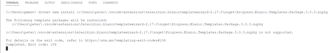
Hi,
Using VS code I tried to create a project using the latest Telerik UI for Blazor Productivity tools. Updated 24-12-03

The Error:
Hi Team,
I would like to request the UI for Blazor Cards to have data-binding functionality.
Thank you!
When enabling/disabling a form element that is defined in a child component, the element is successfully disabled, however a console error occurs. The error occurs whether the child component makes the update or the parent makes the update through a passed parameter. The error does not occur for form elements defined in the parent. The error does not occur for basic html input elements defined in the child.
Element definition:
<TelerikTextBox
Id="ElementMisc"
AutoComplete="new-password"
@bind-Value="@_searchModel.ElementMisc"
Enabled="!_elementSelectMode"
class="textbox-75"
DebounceDelay="0">
</TelerikTextBox>
Update Code defined in child:
if (results.Data.Count > 1)
{
_elementSelectMode= true;
StateHasChanged();
}
Console Error:
Uncaught (in promise) Error: Assertion failed - heap is currently locked
at mr (blazor.web.js:1:158963)
at Object.beginInvokeDotNetFromJS (blazor.web.js:1:157244)
at w.invokeDotNetMethodAsync (blazor.web.js:1:3978)
at C.invokeMethodAsync (blazor.web.js:1:5486)
at r.invokeMethodAsync (telerik-blazor.js:22:1272553)
at r.onBlur (telerik-blazor.js:22:1463592)
at ye.setOrRemoveAttributeOrProperty (blazor.web.js:1:28630)
at ye.applyAttribute (blazor.web.js:1:27574)
at ye.applyEdits (blazor.web.js:1:24601)
at ye.updateComponent (blazor.web.js:1:23606)
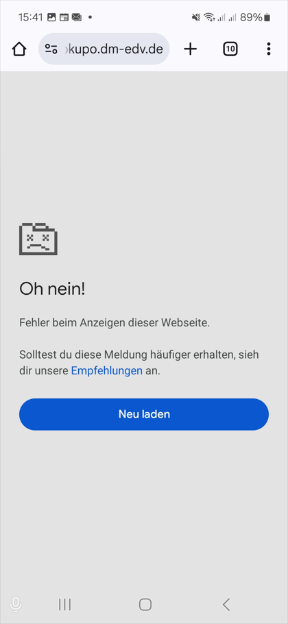
Hello,
we are using the PDFViewer Component.
The zoom function usually works perfectly, both on mobile and desktop.
But there is one exception.
There is one scenario, where our PO got an crash, when he try to use ANY zoom functionality of the component.
He is using:
- a Samsung Galaxy S21 FE 5G
- Android 14
- Chrome Browser
I know smart components are still in preview but please make this available as soon as you can in the editor component. This would be a HUGE deal!
Github link
I want to be able to create custom views for the Gantt Timeline, for example - minutes view.
-------------------------
ADMIN EDIT
-------------------------
The post is marked with "Need more info" label, so we can gather feedback from the community on how this feature is expected to be exposed for configuration and what the desired behavior is. An important point to consider regarding this enhancement is that, depending on its implementation, it might override the built-in Gantt Timeline functionalities, so it will be up to the application logic to handle the tasks features (for example editing, dependencies etc). Please share your comments and ideas.