Duplicated
Last Updated: 29 Sep 2021 05:47 by ADMIN
Sheraz
Created on: 07 Jul 2021 12:24
Category: MultiSelect
Type: Bug Report
0
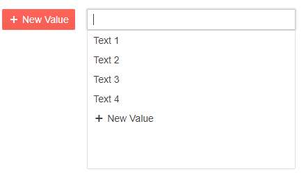
Primary button in MultiSelect FooterTemplate is not shown correctly

Hi team,

I just upgraded Blazor version to 2.25 and the primary button in FooterTemplate of MultiSelect started behaving differently. This was shown correctly prior to update. Also, normal button where Primary="true" is shown with correct styling.

I have written a little code snippet to demonstrate.
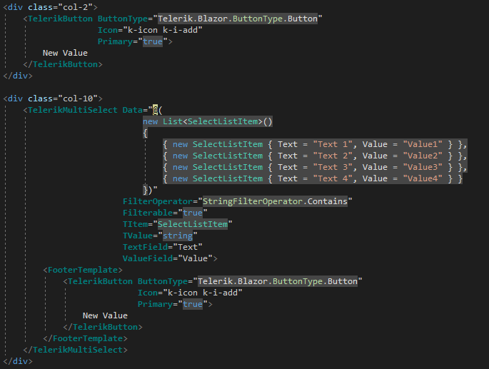

            <div class="row">
                <div class="col-2">
                    <TelerikButton ButtonType="Telerik.Blazor.ButtonType.Button"
                                   Icon="k-icon k-i-add"
                                   Primary="true">
                        New Value
                    </TelerikButton>
                </div>

                <div class="col-10">
                    <TelerikMultiSelect Data="@(
                                            new List<SelectListItem>()
                                            {
                                                { new SelectListItem { Text = "Text 1", Value = "Value1" } },
                                                { new SelectListItem { Text = "Text 2", Value = "Value2" } },
                                                { new SelectListItem { Text = "Text 3", Value = "Value3" } },
                                                { new SelectListItem { Text = "Text 4", Value = "Value4" } }
                                            })"
                                        FilterOperator="StringFilterOperator.Contains"
                                        Filterable="true"
                                        TItem="SelectListItem"
                                        TValue="string"
                                        TextField="Text"
                                        ValueField="Value">
                        <FooterTemplate>
                            <TelerikButton ButtonType="Telerik.Blazor.ButtonType.Button"
                                           Icon="k-icon k-i-add"
                                           Primary="true">
                                New Value
                            </TelerikButton>
                        </FooterTemplate>
                    </TelerikMultiSelect>
                </div>
            </div>


As it can be seen the the code for button is exactly same in both places but the output is different.

Please have a look into this.

Many thanks,


Duplicated
This item is a duplicate of an already existing item. You can find the original item here:
1 comment
ADMIN
Hristian Stefanov
Posted on: 14 Jul 2021 09:47

Hi Sheraz,

The described behavior comes from the design of our product and this is a good point for an enhancement in our themes. We have opened a feature request for button styles changes inside a toolbar in our Themes feedback portal and thus I have changed the status of the bug report to "Declined".

I added your vote there on your behalf to increase the priority of the item. We prioritize feature requests based on interest. You are also automatically subscribed, and you will get notified via email over status changes.

Our themes and styles have rules that provide the desired and expected appearance for various situations, and in some cases when you don't want that, you can use CSS to change the appearance to match your needs.

In the meantime, here is an example I made for you that takes the original colors of a button and alters the flex alignment settings for the list so that it does not look stretched. You may want to keep or remove the class I added to that button to target only such buttons specifically to avoid breaking other scenarios. You can also inspect the rendered HTML and CSS rules with the browser dev tools to alter and customize this further as required.

<div class="row">
    <div class="col-2">
        <TelerikButton ButtonType="Telerik.Blazor.ButtonType.Button"
                       Icon="k-icon k-i-add"
                       Primary="true">
            New Value
        </TelerikButton>
    </div>

    <div class="col-10">
        <TelerikMultiSelect Data="@(
                                            new List<SelectListItem>()
                                            {
                                                { new SelectListItem { Text = "Text 1", Value = "Value1" } },
                                                { new SelectListItem { Text = "Text 2", Value = "Value2" } },
                                                { new SelectListItem { Text = "Text 3", Value = "Value3" } },
                                                { new SelectListItem { Text = "Text 4", Value = "Value4" } }
                                            })"
                            FilterOperator="StringFilterOperator.Contains"
                            Filterable="true"
                            TItem="SelectListItem"
                            TValue="string"
                            TextField="Text"
                            ValueField="Value">
            <FooterTemplate>
                <TelerikButton ButtonType="Telerik.Blazor.ButtonType.Button"
                               Class="my-nested-button"
                               Icon="k-icon k-i-add"
                               Primary="true">
                    New Value
                </TelerikButton>
            </FooterTemplate>
        </TelerikMultiSelect>
    </div>
</div>

@code{
    public class SelectListItem
    {
        public string Value { get; set; }
        public string Text { get; set; }
    }
}

<style>
    .k-list-container .k-button.my-nested-button {
        background-color: #ff6358;
        align-items: flex-start;
        align-self: flex-start;
    }

    .k-list-container .k-button-primary.my-nested-button,
    .k-list-container .k-button.k-primary.my-nested-button {
        /*copy the colors from the basic button*/
        border-color: #ff6358;
        color: #ffffff;
        background-color: #ff6358;
        background-image: linear-gradient(rgba(0, 0, 0, 0), rgba(0, 0, 0, 0.04));
        /*change the flex alignment form the parent container*/
        align-items: flex-start;
        align-self: flex-start;
    }
</style>

Regards,
Hristian Stefanov
Progress Telerik

Virtual Classroom, the free self-paced technical training that gets you up to speed with Telerik and Kendo UI products quickly just got a fresh new look + new and improved content including a brand new Blazor course! Check it out at https://learn.telerik.com/.