Completed
Last Updated:
06 Jan 2026 14:31
by ADMIN
Isaac
Created on:
05 Jan 2026 14:24
Category:
UI for Blazor
Type:
Feature Request
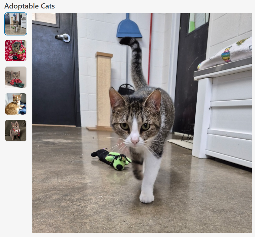
Image Collection Viewer / Selector Component
Image Collection Viewer / Selector Component
A flexible and accessible image viewer / selector for Blazor applications, similar to what popular eCommerce websites use to show products.
Features
- Accessibility: Uses ARIA roles and labels for screen reader support and keyboard navigation.
- Configurable Layout: Supports custom
HeightandWidthparameters to fit various UI needs. - Aspect Ratio Control:
ConstrainImageHeightandConstrainImageWidthparameters allow precise control over aspect ratio, whether to maintain aspect ratio and/or constrain height and width. - ImageInfo Model: Accepts a collection of
ImageInfoobjects, each with a required image source and optional alt text for accessibility. - Alt Text Support: Ensures all images have descriptive alt text for improved accessibility.
- Scrollbar Handling: Automatically displays a vertical scrollbar if the image list exceeds the constrained height, ensuring all images remain accessible.
- Visual Feedback: Selected and focused images are visually highlighted for clear user interaction.
Sample Code
ImageCollectionViewer.razor
@inject ITelerikStringLocalizer Loc

<LanguageTrackProvider OnInitializeEvent="provider => provider.RegisterComponent(this)" />

@if (Images.Any() && _selectedImage != null)
{
    <div class="d-flex @Class" style="height: @Height; width: @Width;">
        <ul aria-label="@Loc["ImageThumbnails"]" role="radiogroup" class="image-collection-button-container">
            @foreach (var image in Images)
            {
                <li>
                    <button @onclick="() => OnImageSelect(image)"
                            class="@($"image-collection-button{(image.Src == _selectedImage.Src ? " selected" : "")}")"
                            role="radio" aria-checked="@(image.Src == _selectedImage.Src ? "true" : "false")">
                        <img src="@image.Src" alt="@image.Alt" />
                    </button>
                </li>

            }
        </ul>
        <div class="image-collection-image-container">
            <MagnifiableImage Image="@(new ImageInfo(_selectedImage.Src, _selectedImage.Alt))" Class="image-collection-image" MagnifyScale="@MagnifyScale"
                              Height="@(ConstrainImageHeight ? "calc(100% - 2px)" : "auto")" Width="@(ConstrainImageWidth ? "100%" : "auto")" />
        </div>
    </div>
}
else
{
    <TelerikSkeleton ShapeType="@SkeletonShapeType.Rectangle" Height="@Height" Width="@Width" Class="@Class"/>
}

<style>
    .image-collection-button-container {
        flex: 0 0 auto;
        width: 10%;
        height: 100%;
        min-width: 90px;
        max-width: 110px;
        overflow-y: auto;
        padding: 2px;
        margin: 0;
        scrollbar-color: rgba(1, 1, 1, 0.25) rgba(0, 0, 0, 0);
        scrollbar-gutter: stable;
        list-style: none;
    }

    .image-collection-button {
        padding: 0;
        margin-bottom: 1rem;
        border: 1px solid var(--kendo-color-border, rgba(0, 0, 0, 0.08));
        border-radius: 0.5rem;
        width: auto;
        aspect-ratio: 1 / 1;
        display: block;
    }
    .image-collection-button:hover {
        filter: brightness(90%);
    }
    .image-collection-button:focus {
        outline: none;
        box-shadow: 0 0 0 2px color-mix(in srgb, var(--kendo-color-on-app-surface, #424242) 50%, transparent);
    }
    .image-collection-button.selected {
        box-shadow: 0 0 0 2px var(--kendo-color-primary, #1274AC);
    }
    .image-collection-button img {
        width: 100%;
        height: 100%;
        min-width: 70px;
        min-height: 70px;
        max-width: 90px;
        max-height: 90px;
        object-fit: cover;
        border-radius: 0.5rem;
        display: block;
    }

    .image-collection-image-container {
        flex: 0 0 auto;
        width: 90%;
        padding: 2px;
    }

    .image-collection-image {
        border: 1px solid var(--kendo-color-border, rgba(0, 0, 0, 0.08));
    }
</style>
ImageCollectionViewer.razor.cs
using Microsoft.AspNetCore.Components;
using Telerik.Blazor.Components;
namespace RazorLibrary.Components.Images;
/// <summary>
/// <para>
/// Displays a collection of selectable image thumbnails provided by <see cref="Images"/> and a main image display area.
/// If <see cref="Images"/> is empty, displays a <see cref="TelerikSkeleton"/> placeholder instead. Supports
/// accessibility, configurable height via <see cref="Height"/>, width via <see cref="Width"/>, aspect ratio control
/// via <see cref="ConstrainImageHeight"/> and <see cref="ConstrainImageWidth"/>, and alt text for images.
/// </para>
/// <para>
/// Usage:
/// <code>
/// @using RazorLibrary.Components.Images
///
///
/// <ImageCollection Images="myImages" Height="300px" Width="100%" />
///
///
/// @code {
/// private List<ImageInfo> myImages = new()
/// {
/// new ImageInfo("img1.jpg", "First image"),
/// new ImageInfo("img2.jpg", "Second image")
/// };
/// }
/// </code>
/// </para>
/// </summary>
public partial class ImageCollection
{
/// <summary>
/// The collection of images to display in the image collection.
/// </summary>
[Parameter] public IEnumerable<ImageInfo> Images { get; set; } = [];
/// <summary>
/// The overall height of the image collection component (e.g., "200px", "100%", or "auto"). Default is "auto".
/// </summary>
[Parameter] public string Height { get; set; } = "auto";
/// <summary>
/// The overall width of the image collection component (e.g., "200px", "100%", or "auto"). Default is "auto".
/// </summary>
[Parameter] public string Width { get; set; } = "auto";
/// <summary>
/// If true, sets the main image display height to 100%, which constrains it to the value specified by <c>Height</c>.
/// If false, height is auto. Maintains aspect ratio unless both <c>FixImageHeight</c> and <c>FixImageWidth</c> are true.
/// Default is false.
/// </summary>
[Parameter] public bool ConstrainImageHeight { get; set; } = false;
/// <summary>
/// If true, sets the main image display width to 100%, which constrains it to the value specified by <c>Width</c>.
/// If false, width is auto. Maintains aspect ratio unless both <c>FixImageHeight</c> and <c>FixImageWidth</c> are true.
/// Default is true.
/// </summary>
[Parameter] public bool ConstrainImageWidth { get; set; } = true;
/// <summary>
/// The magnification scale for the magnifier. Default is 3 (3x magnification).
/// </summary>
[Parameter]
public double MagnifyScale { get; set; } = 3;
/// <summary>
/// Applies additional CSS classes to the ImageCollection's root element for custom styling and visual modifications.
/// </summary>
[Parameter] public string Class { get; set; } = string.Empty;
private ImageInfo? _selectedImage;
/// <inheritdoc />
protected override void OnInitialized()
{
_selectedImage = Images.FirstOrDefault();
}
private void OnImageSelect(ImageInfo imageInfo)
{
_selectedImage = imageInfo;
}
}ImageInfo.cs
namespace RazorLibrary.Components.Images;

/// <summary>
/// Information about an image, including the source URL and alt text.
/// </summary>
/// <param name="Src">The image source URL. Required.</param>
/// <param name="Alt">The image alt text. Optional.</param>
public record ImageInfo(string Src, string? Alt = null);
Note
The sample code uses the MagnifiableImage component, which is another feature request. The MagnifiableImage component can be replaced with a img element.
1 comment
ADMIN
Hristian Stefanov
Posted on:
06 Jan 2026 14:31