It would be fantastic to be able to visualize boolean data on a time based chart. We have a lot of time series data, and a good bit of it is boolean. It would be very beneficial to be able to plot that data along side our numeric data to provide context to both.
Example (blue/green bar at bottom of chart):
Hi Brad,
Thanks for the update.
Meanwhile, I discussed this with the product team. We agree that there is a valid need to visualize status data in some way. Alas, we don't think that this approach will be a good fit for a built-in Chart feature, from both business and technical perspective. So for the time being, I will close this request. I am truly sorry to bring the bad news.
Regards,
Dimo
Progress Telerik
Love the Telerik and Kendo UI products and believe more people should try them? Invite a fellow developer to become a Progress customer and each of you can get a $50 Amazon gift voucher.
So if I generalize, you need a feature that will display boolean or enum data in horizontal fashion on a horizontal date axis, right?
Yes, exactly that.
We have certainly considered using the a similar solution to the workaround you described. We utilize scatter line series to prevent the need for aggregations into a timebound window. So we'd utilize scatter lines to plot the data.
We also considered using vertical plot bands. However, I wasn't sure if that would scale well because it's not being handled as a "series". Do you know if any testing has ever been done to test the scalability of hundreds of plot bands?
Hello Brad,
Thanks for the follow-up.
So if I generalize, you need a feature that will display boolean or enum data in horizontal fashion on a horizontal date axis, right?
In the meantime, a possible way to display such data may be to use any of the existing series types, with a fixed number of possible values on the vertical value axis. Here is an example with a CandleStick.
<TelerikChart Height="300px" Width="600px">

    <ChartSeriesItems>
        <ChartSeries Type="@ChartSeriesType.Candlestick"
                     Name="Sensor Status"
                     Data="@StatusData"
                     CategoryField="@(nameof(StatusPoint.Date))"
                     OpenField="@nameof(StatusPoint.Open)"
                     CloseField="@nameof(StatusPoint.Close)"
                     HighField="@nameof(StatusPoint.High)"
                     LowField="@nameof(StatusPoint.Low)"
                     ColorField="@nameof(StatusPoint.Color)" />
        <ChartSeries Type="@ChartSeriesType.Line"
                     Color="orange"
                     Name="Sensor Data"
                     Data="@MeasureData"
                     CategoryField="@(nameof(MeasurePoint.Date))"
                     Field="@nameof(MeasurePoint.Value)" />
    </ChartSeriesItems>

    <ChartCategoryAxes>
        <ChartCategoryAxis Type="@ChartCategoryAxisType.Date" BaseUnit="@ChartCategoryAxisBaseUnit.Hours">
        </ChartCategoryAxis>
    </ChartCategoryAxes>

    <ChartValueAxes>
        <ChartValueAxis>
            <ChartValueAxisLabels></ChartValueAxisLabels>
        </ChartValueAxis>
    </ChartValueAxes>

</TelerikChart>

@code {
    List<StatusPoint> StatusData { get; set; }
    List<MeasurePoint> MeasureData { get; set; }

    protected override async Task OnInitializedAsync()
    {
        await GenerateChartData();
    }

    async Task GenerateChartData()
    {
        StatusData = new List<StatusPoint>()
        {
            new StatusPoint(new DateTime(2022, 7, 4, 7, 0, 0), true),
            new StatusPoint(new DateTime(2022, 7, 4, 8, 0, 0), false),
            new StatusPoint(new DateTime(2022, 7, 4, 9, 0, 0), true),
            new StatusPoint(new DateTime(2022, 7, 4, 10, 0, 0), true),
        };

        MeasureData = new List<MeasurePoint>()
        {
            new MeasurePoint() { Date = new DateTime(2022, 7, 4, 7, 0, 0), Value = 4 },
            new MeasurePoint() { Date = new DateTime(2022, 7, 4, 8, 0, 0), Value = null },
            new MeasurePoint() { Date = new DateTime(2022, 7, 4, 9, 0, 0), Value = 15 },
            new MeasurePoint() { Date = new DateTime(2022, 7, 4, 10, 0, 0), Value = 6 }
        };
    }

    public class MeasurePoint
    {
        public DateTime Date { get; set; }
        public decimal? Value { get; set; }
    }

    public class StatusPoint
    {
        public StatusPoint() { }

        public StatusPoint(DateTime date, bool status)
        {
            Date = date;
            Open = 0;
            Close = 1;
            Color = status ? "green" : "red";
        }
        public DateTime Date { get; set; }
        public int Open { get; set; }
        public int Close { get; set; }
        public int High => Close;
        public int Low => Open;
        public string Color { get; set; }
    }
}
Regards,
Dimo
Progress Telerik
Coming to you live from Progress360 in-person or on your own time, DevReach for all. Register Today.
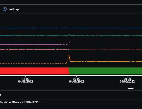
In the screenshot, the two values are due to the windowing of the data. The screenshot below is another example with a smaller window. At some point during that window, the value was true and false, so they show them stacked. The grey state is null.
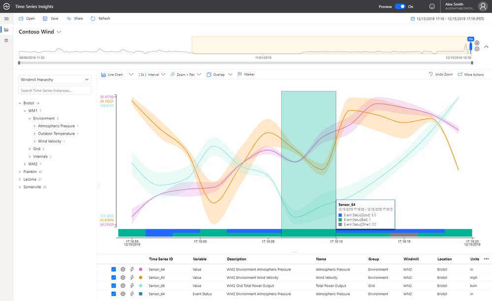
This screenshot is from Azure Time Series Insights. I believe they also allow you to plot strings using this logic as well. One series with X colors for different values. Something like this would also be very helpful for us to plot things like IoT device status. With that, we could show when a device went from good state to bad state on the same x-axis as you'd see numerical values showing what happens during that transition.
Hi Brad,
While discussing the feature with the team, an additional question appeared. If it's convenient, let's cover it below.
What happens when there is the same color (blue/green) on two lines on top of each other at the bottom of the Chart? Is the boolean value true or false in such a case? If it's possible, please clarify a little more the idea for the bottom part of the Chart.
I look forward to your reply.
Regards,
Hristian Stefanov
Progress Telerik
Love the Telerik and Kendo UI products and believe more people should try them? Invite a fellow developer to become a Progress customer and each of you can get a $50 Amazon gift voucher.
- All
- Completed (1457)
- Declined (372)
- Duplicated (410)
- In Development (3)
- Need More Info (25)
- Planned (1)
- Under Review (2)
- Unplanned (1106)
- Won't Fix (23)
- All
- UI for Blazor
- Agentic UI Generator
- AIPrompt
- AnimationContainer
- AppBar
- ArcGauge
- AutoComplete
- Avatar
- Badge
- Barcode
- Breadcrumb
- BrowserExtension
- Button
- ButtonGroup
- Calendar
- Card
- Carousel
- Charts
- Chat
- Checkbox
- Chip
- ChipList
- ChunkProgressBar
- CircularGauge
- ColorGradient
- ColorPalette
- ColorPicker
- ComboBox
- ContextMenu
- DateInput
- DatePicker
- DateRangePicker
- DateTimePicker
- Diagram
- Dialog
- DockManager
- Drawer
- DropDownButton
- DropDownList
- DropDownTree
- DropZone
- Editor
- FileManager
- FileSelect
- Filter
- FlatColorPicker
- FloatingActionButton
- FloatingLabel
- Form
- Gantt
- Grid
- GridLayout
- InlineAIPrompt
- Installer and VS Extensions
- Licensing
- LinearGauge
- ListBox
- ListView
- Loader
- LoaderContainer
- Map
- MaskedTextBox
- MediaQuery
- Menu
- MultiColumnComboBox
- MultiSelect
- Notification
- NumericTextBox
- Page Templates / Building Blocks
- Pager
- PanelBar
- PDFViewer
- PivotGrid
- Popover
- Popup
- ProgressBar
- PromptBox
- QRCode
- RadialGauge
- RadioGroup
- RangeSlider
- Rating
- Scheduler
- SegmentedControl
- Signature
- Skeleton
- Slider
- SmartPasteButton
- SpeechToTextButton
- SplitButton
- Splitter
- Spreadsheet
- StackLayout
- Stepper
- StockChart
- Switch
- TabStrip
- TaskBoard
- TextArea
- TextBox
- TileLayout
- TimePicker
- ToggleButton
- ToolBar
- Tooltip
- TreeList
- TreeView
- Upload
- ValidationMessage
- ValidationSummary
- ValidationTooltip
- VS Code Extension
- WebMCP
- Window
- Wizard