Completed
Last Updated:
27 Oct 2021 08:49
by ADMIN
Release 2.28.0
Vinoth Palanivelu
Created on:
08 Jul 2021 12:04
Category:
Grid
Type:
Bug Report
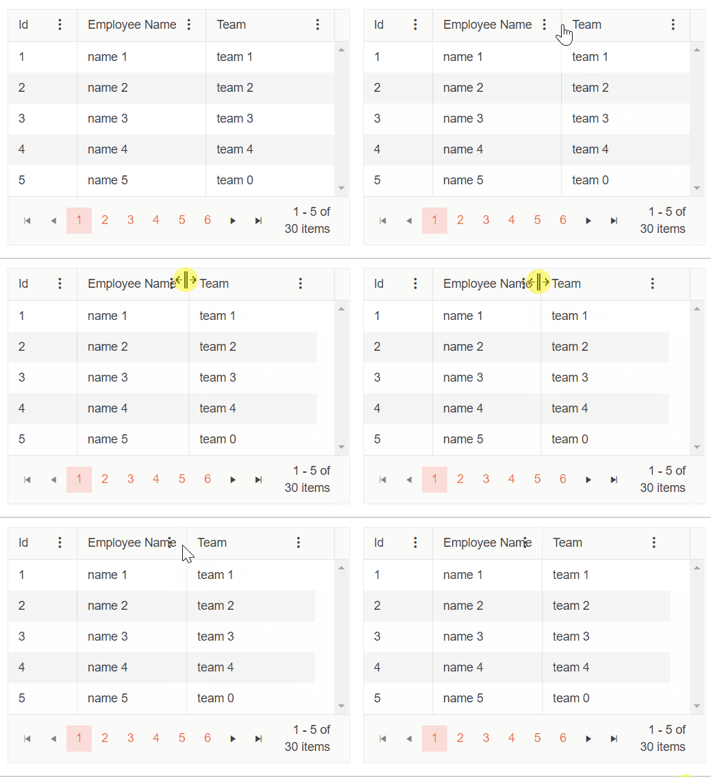
Column menu and Filter menu indicators are overlapping the Grid column header text
When you shrink a Grid column, ellipsis is rendered to represent the clipped text. However, at some point of resizing the Column menu and Filter menu indicators are overlapping the Grid column header text.
==========
ADMIN EDIT
==========
In the meantime, a possible workaround would be to use some custom CSS to add right padding to the k-link span, so it does not get overlapped by the column menu icon. That padding should be approximately as wide as the span holding the column menu icon. You can also set a custom CSS class to the Grid through its Class parameter to make sure you are styling this exact instance of the Grid and not all instances on the page/app. The example below demonstrates how to achieve the described approach.
<style>
    .my-grid .k-link {
        padding-right: 40px;
    }
</style>

<TelerikGrid Data="@MyData"
             Class="my-grid"
             Pageable="true"
             PageSize="5"
             FilterMode="@GridFilterMode.FilterMenu"
             Sortable="true"
             Resizable="true"
             ShowColumnMenu="true">
    <GridColumns>
        <GridColumn Field="@(nameof(SampleData.Id))" Width="80px" />
        <GridColumn Field="@(nameof(SampleData.Name))" Title="Employee Name"/>
        <GridColumn Field="@(nameof(SampleData.Team))" Title="Team" />
        <GridColumn Field="@(nameof(SampleData.HireDate))" Title="Hire Date" />
    </GridColumns>
</TelerikGrid>

@code {
    public IEnumerable<SampleData> MyData = Enumerable.Range(1, 30).Select(x => new SampleData
    {
        Id = x,
        Name = "name " + x,
        Team = "team " + x % 5,
        HireDate = DateTime.Now.AddDays(-x).Date
    });

    public class SampleData
    {
        public int Id { get; set; }
        public string Name { get; set; }
        public string Team { get; set; }
        public DateTime HireDate { get; set; }
    }
}
2 comments
ADMIN
Dimo
Posted on:
19 Oct 2021 09:30
Nemo
Posted on:
12 Oct 2021 20:54

