I'm using trial licence to test your component, I just started today and the first thing I'm trying is the layout.
We need a customizable dashbord where we can place our "widget" and store its layout.
I see you have TileLayout component but it doesn't support a proper flexible dashboard design because everytime I resize an element (or reorder) the grid auto-adjust, while we need to be possible to have "holes" in between while designing the dashboard, otherwise it's difficult to have control over the design process and UX is bad.
A simple example to explain the problem, is if I want to design a dashboard starting to place a vertical widget on the right. It's not possible until I don't fill the left space with other controls.
That's not what we'd expect, is this because of a bad usage or because it's not supported? (I think the latter because I tried to play with different settings)
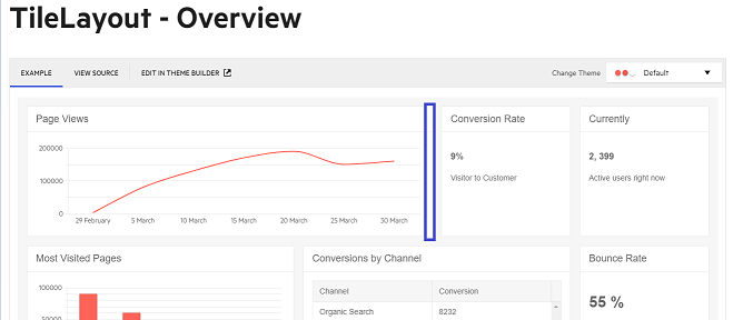
What I'd expect is, for example looking at your demo in https://demos.telerik.com/blazor-ui/tilelayout/overview, that if I resize the first panel (Page Views) the content on the right stays there and don't move to the left
In your documentation you say that you follow CSS Grid Layout but css grid layout allows you to have empty elements in your template, while I see this is a missing feature that would be really useful
Example of the unwanted behavior:
Starting point:
I'm going to resize (shrink) the Page Views panel
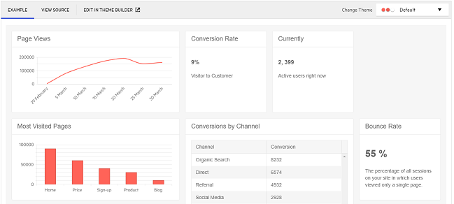
Actual result:
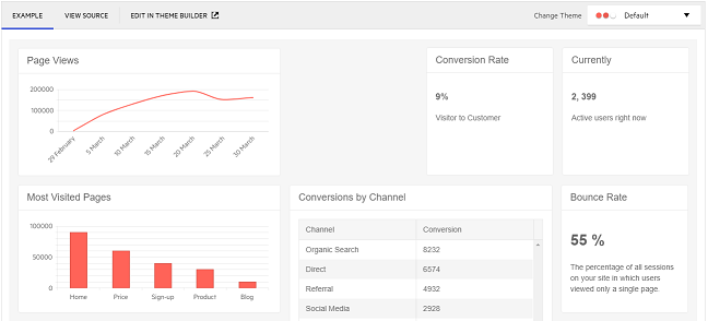
Expected result:
note the empty cell.
Basically components should be able to be placed freely on the grid and should be locked in place during resize (it could be an option)
Let me know if I've to give more details,
Thanks
Hi Fabio,
I must start by noting that there isn't a visual designer for Blazor (actually, there hasn't been one for any of the razor syntax frameworks like MVC for over a decade), and that the TileLayout component is not a design tool. This is now a desktop component that controls its own rendering pixel by pixel that can achieve pixel perfect design.
What I am trying to explain is that what sounds simple "to leave holes" opens up a huge avalanche of scenarios and problems.
The grid that the component provides is not a collection of discreet matrix points you can put content into. On the contrary, the component fills up the available space as much as possible depending on the number of columns you tell it to render, the size of the individual tile items it has - then the number of rows depends on the relation between these two.
Thus, we have no plans for implementing such complications like docking zones, gaps or predefined spaces in this component.
For the windows - the resizing feature is not going to be part of the next release, it is going to be part in one of the next releases. You can Follow its status here and I see you've already added your Vote to it. The enhancement to the window our next release will bring is dynamic stacking and focus (see here) and predefined dialogs (see here). The 2.23.0 release is planned for the end of March which should be a couple of days before your trial expires.
Regards,
Marin Bratanov
Progress Telerik
Virtual Classroom, the free self-paced technical training that gets you up to speed with Telerik and Kendo UI products quickly just got a fresh new look + new and improved content including a brand new Blazor course! Check it out at https://learn.telerik.com/.
Hello Marin,
- What happens if you pin several tiles, then resize a tile so that it covers one that is resized? This is undefined (heuristic) behavior - should tiles stop being locked, should resizing stop at one point (if so, which)?
- What happens if you lock all tiles and then resize? Again, it is unclear whether it should be allowed, whether it should change pinning/locking and if so - when and how, and what should happen with the size of the tile, the size of the tile layout and the size of the rows and columns.
In an hypotetical designer with such settings, you'd have control over the behavior by using attributes
In the default behavior it should just prevent you to resize an element on top.
Anyway I'm not even suggesting an explicit locking feature but an implicit one: if I resize a component on the left, it shouldn't affect the position of the right one but leave "holes" (that could be filled by empty elements by your component, either using grid-areas or other ways)
- When gaps are allowed how would one control what fills them up, what does not, what drops on the next row and when? This is more heuristic behavior.
Gaps are transient during design, if you resize a component that "cover" part of the gap, that gap should be reduced to allow the component to take its space
Moreover, the TileLayout component does not aim to be a design tool, its purpose is not to create mockups or to designs or entire web site layouts, it is a UI component for creating dashboards with several relatively tiny widgets that fits inside an already existing layout.
The problem is that currently it fails when you want to move some component in a SPA: if I want my dashboard be a 40x40 tiles and I want to place element in specific position, I can achieve it only if I fill the page with panels and the operation isn't straightforward because you have to move panels thinking how the layout flow works,
I can record a video if you want I show you what I mean
We thought about using window but the lack of resizing stopped us but since you say next version will have resize, it may be probably the best option (but I suppose these window wouldn't be fluid like TileLayout so if the page is resized they won't resize according.
When is the new release supposed to be shipped? I hope before the trial expires :)
Thanks
Hello Fabio,
You are not missing anything, the behavior you see is correct and expected.
The executive summary
What you are seeking is not in our plans for this component.
Considering he explanations below, I am marking this as "Declined".
Longer explanations
There are several key aspects as to why gaps and pinning and locking cannot be supported:
- What happens if you pin several tiles, then resize a tile so that it covers one that is resized? This is undefined (heuristic) behavior - should tiles stop being locked, should resizing stop at one point (if so, which)?
- What happens if you lock all tiles and then resize? Again, it is unclear whether it should be allowed, whether it should change pinning/locking and if so - when and how, and what should happen with the size of the tile, the size of the tile layout and the size of the rows and columns.
- When gaps are allowed how would one control what fills them up, what does not, what drops on the next row and when? This is more heuristic behavior.
There are probably many more scenarios that will be problematic and undefined that I cannot come up with off the top of my head.
At the same time. the purpose of the component is to let the user rearrange a dashboard to their liking and to optimize the space so you can see the most of the widgets in it, and to arrange the next widgets. It already accomplishes that. It does not aim to let you create incredibly complex layouts like what you could do with the Visual Studio windows.
Moreover, the TileLayout component does not aim to be a design tool, its purpose is not to create mockups or to designs or entire web site layouts, it is a UI component for creating dashboards with several relatively tiny widgets that fits inside an already existing layout.
So, while based on the CSS grid concept, we are not making a wrapper for the full functionality its specification exposes, but a UI component that has a rather particular purpose and that uses a CSS grid. If you need all the flexibility of a CSS grid to create your web site layouts, you should use that, and not the TileLayout component.
Alternative
You could consider using several Window components. They are now movable and you can store their top and left location in an application state for your user.
In our next releases we will make the windows resizable too, so you can also store their size. In the very next release we will allow nesting of windows (having more than one active at a time) and activating (bringing to front) the one that the user just clicked.
Thus, users who need to customize many settings and want to look at very custom layouts could probably keep widgets or tools in such dialogs rather than a dashboard.
Regards,
Marin Bratanov
Progress Telerik
Virtual Classroom, the free self-paced technical training that gets you up to speed with Telerik and Kendo UI products quickly just got a fresh new look + new and improved content including a brand new Blazor course! Check it out at https://learn.telerik.com/.
- All
- Completed (1395)
- Declined (370)
- Duplicated (405)
- In Development (3)
- Need More Info (24)
- Planned (16)
- Under Review (2)
- Unplanned (1127)
- Won't Fix (22)
- All
- UI for Blazor
- Agentic UI Generator
- AIPrompt
- AnimationContainer
- AppBar
- ArcGauge
- AutoComplete
- Avatar
- Badge
- Barcode
- Breadcrumb
- Button
- ButtonGroup
- Calendar
- Card
- Carousel
- Charts
- Chat
- Checkbox
- Chip
- ChipList
- ChunkProgressBar
- CircularGauge
- ColorGradient
- ColorPalette
- ColorPicker
- ComboBox
- ContextMenu
- DateInput
- DatePicker
- DateRangePicker
- DateTimePicker
- Diagram
- Dialog
- DockManager
- Drawer
- DropDownButton
- DropDownList
- DropDownTree
- DropZone
- Editor
- FileManager
- FileSelect
- Filter
- FlatColorPicker
- FloatingActionButton
- FloatingLabel
- Form
- Gantt
- Grid
- GridLayout
- InlineAIPrompt
- Installer and VS Extensions
- Licensing
- LinearGauge
- ListBox
- ListView
- Loader
- LoaderContainer
- Map
- MaskedTextBox
- MediaQuery
- Menu
- MultiColumnComboBox
- MultiSelect
- Notification
- NumericTextBox
- Page Templates / Building Blocks
- Pager
- PanelBar
- PDFViewer
- PivotGrid
- Popover
- Popup
- ProgressBar
- PromptBox
- QRCode
- RadialGauge
- RadioGroup
- RangeSlider
- Rating
- Scheduler
- Signature
- Skeleton
- Slider
- SmartPasteButton
- SpeechToTextButton
- SplitButton
- Splitter
- Spreadsheet
- StackLayout
- Stepper
- StockChart
- Switch
- TabStrip
- TextArea
- TextBox
- TileLayout
- TimePicker
- ToggleButton
- ToolBar
- Tooltip
- TreeList
- TreeView
- Upload
- ValidationMessage
- ValidationSummary
- ValidationTooltip
- VS Code Extension
- Window
- Wizard


