Declined
Last Updated: 14 Jan 2020 07:41 by Christian
Christian
Created on: 13 Jan 2020 16:06
Category: Grid
Type: Bug Report
2
Grid: Header and grid body sizes do not fit if no scrollbar is shown (Customized CSS)

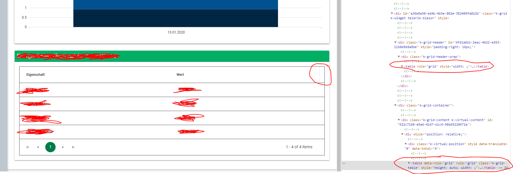
We have a Telerik grid which is customized by some CSS rules. The problem is that the header width does not fill the width of the table if no scrollbar is shown.

My question is: Why did you create the table like it is right now in HTML (See screenshot as well)? In my opinion, it would be easier to use something more simple like described here: https://www.w3schools.com/html/html_tables.asp

<table style="width:100%">
  <tr>
    <th>Firstname</th>
    <th>Lastname</th>
    <th>Age</th>
  </tr>
  <tr>
    <td>Jill</td>
    <td>Smith</td>
    <td>50</td>
  </tr>
  <tr>
    <td>Eve</td>
    <td>Jackson</td>
    <td>94</td>
  </tr>
</table>


This would make it easier to customize the table / grid as well as having no issues with the widths at all. This rectangle on the right top edge doesn't look good...


I'm not sure if this is a feature request or just a discussion / idea for the developers :) I just wanted to bring this in and get an explanation why you chose to do it that way (And maybe get a fix for this as well).


Best regards,

Christian

2 comments
Christian
Posted on: 14 Jan 2020 07:41

Hi Marin,

thank you for the explanation. I was just curious why you decided to build the grid like that :)

 .my-special-grid .k-grid-header { /* assumes that the .my-special-grid class is present somewhere on or above this modified grid */
       padding-right: 0 !important;
    }

worked as desired for my use case.


Best regards,

Christian

ADMIN
Marin Bratanov
Posted on: 13 Jan 2020 16:58

Hi Christian,

We use separate tables for a variety of reasons, the most succinct way I can put is that this enables complex features like groupuing and virtual scrolling.

The top right corner is, indeed, a space for a scrollbar and we calculate it dynamically. I expect that the custom CSS on the page removes it from the body of the grid, so you should remove it from the header as well. So, I expect you are hitting something like the following issue that we fixed, and you can take the CSS from the workarounds there to test with: https://feedback.telerik.com/blazor/1411521-wrong-column-alignment-when-no-scrollbar-is-present-e-g-on-mobile-devices maybe something like this


   .my-special-grid .k-grid-header { /* assumes that the .my-special-grid class is present somewhere on or above this modified grid */
       padding-right: 0 !important;
    }

With that said, this is not something we can consider as a bug at this point - adding CSS rules that alter the expected built-in functionality of the components can always have some side effects and resolving them is usually up to the overriding code that causes the problem in the first place.


Regards,
Marin Bratanov
Progress Telerik

 UI for Blazor