At the moment start and end times effectively "round" to the nearest half an hour. This can give the impression of events overlapping when they do not
e.g.

Admin edit: This feature would be similar to the Exact Time Rendering in our WebForms suite: https://demos.telerik.com/aspnet-ajax/scheduler/examples/exacttimerendering/defaultcs.aspx
Hi Federico,
At this stage, the item is not yet planned for the upcoming releases. I spoke with our Product Manager and Product owner - I can confirm we are tracking the interest for this feature based on the votes, so we can plug it in the roadmap accordingly.
Regards,
Nadezhda Tacheva
Progress Telerik
Love the Telerik and Kendo UI products and believe more people should try them? Invite a fellow developer to become a Progress customer and each of you can get a $50 Amazon gift voucher.
Hi support,
is there any update about this feature? It is very important in my business, and I must decide if I have to use it or another component suite for the scheduler.
Thank You
Regards
Federico
Hi Dean,
Thank you for the details. Indeed, what you are seeking is this feature that we called "Exact Time Rendering" in our WebForms suite: https://demos.telerik.com/aspnet-ajax/scheduler/examples/exacttimerendering/defaultcs.aspx. I have also updated the title and opener post to clarify this a little for other people looking for it.
Regards,
Marin Bratanov
Progress Telerik
Thanks for your reply.
My request description would be better worded:
'At the moment start and end times effectively "round" to the nearest slot division".'
It's clearly inappropriate to show two events which are at different times - not even overlapping - as if they are at the same time, unless the space on the screen is ridiculously tight, which it is not in the example I uploaded.
I have attached another image which shows the problem even more clearly. A 2-minute appointment is represented as twice the size of a 15-minute appointment, because the former straddles a slot division, whereas the latter doesn't.
It should be possible to represent the appointments far more accurately in this amount of screen space.
Hi Dean,
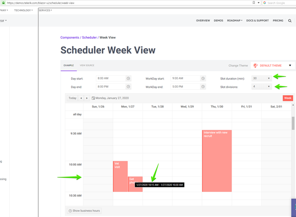
If you have a lower duration for the slots, you can have more accurate display: https://docs.telerik.com/blazor-ui/components/scheduler/views/week#view-parameters
You can try this out yourself in the following demo: https://demos.telerik.com/blazor-ui/scheduler/week-view - see the slot ropdowns on the right hand side. Here's a basic example where I put a couple of arrows on the key positions:
If this does not suffice for your case, could you provide some more details on how you would expect the scheduler to handle a minute difference in such a tight spot otherwise? Perhaps a feature like this one (note that for it to make a difference it would still require large enough slots): https://demos.telerik.com/aspnet-ajax/scheduler/examples/exacttimerendering/defaultcs.aspx
Regards,
Marin Bratanov
Progress Telerik
- All
- Completed (1405)
- Declined (370)
- Duplicated (406)
- In Development (6)
- Need More Info (25)
- Planned (14)
- Under Review (2)
- Unplanned (1125)
- Won't Fix (23)
- All
- UI for Blazor
- Agentic UI Generator
- AIPrompt
- AnimationContainer
- AppBar
- ArcGauge
- AutoComplete
- Avatar
- Badge
- Barcode
- Breadcrumb
- Button
- ButtonGroup
- Calendar
- Card
- Carousel
- Charts
- Chat
- Checkbox
- Chip
- ChipList
- ChunkProgressBar
- CircularGauge
- ColorGradient
- ColorPalette
- ColorPicker
- ComboBox
- ContextMenu
- DateInput
- DatePicker
- DateRangePicker
- DateTimePicker
- Diagram
- Dialog
- DockManager
- Drawer
- DropDownButton
- DropDownList
- DropDownTree
- DropZone
- Editor
- FileManager
- FileSelect
- Filter
- FlatColorPicker
- FloatingActionButton
- FloatingLabel
- Form
- Gantt
- Grid
- GridLayout
- InlineAIPrompt
- Installer and VS Extensions
- Licensing
- LinearGauge
- ListBox
- ListView
- Loader
- LoaderContainer
- Map
- MaskedTextBox
- MediaQuery
- Menu
- MultiColumnComboBox
- MultiSelect
- Notification
- NumericTextBox
- Page Templates / Building Blocks
- Pager
- PanelBar
- PDFViewer
- PivotGrid
- Popover
- Popup
- ProgressBar
- PromptBox
- QRCode
- RadialGauge
- RadioGroup
- RangeSlider
- Rating
- Scheduler
- SegmentedControl
- Signature
- Skeleton
- Slider
- SmartPasteButton
- SpeechToTextButton
- SplitButton
- Splitter
- Spreadsheet
- StackLayout
- Stepper
- StockChart
- Switch
- TabStrip
- TextArea
- TextBox
- TileLayout
- TimePicker
- ToggleButton
- ToolBar
- Tooltip
- TreeList
- TreeView
- Upload
- ValidationMessage
- ValidationSummary
- ValidationTooltip
- VS Code Extension
- Window
- Wizard

