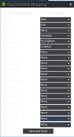
Hi Guys,
the colour scheme on your SchedulerBinderDataSource Appointment Mapping form is barely visible
Could you please darken the text so I can map things without squinting.
Thanks.
Hello, Kieran,
Thank you for the provided additional information. After changing to the dark theme in VS I observed the same look on my end.
I have approved this bug report in our feedback portal. You can track its progress, subscribe for status changes and add your comments on the following link - feedback item.
I have also updated your Telerik Points.
I hope this helps. Should you have other questions do not hesitate to contact me.
Regards,
Nadya
Progress Telerik
Love the Telerik and Kendo UI products and believe more people should try them? Invite a fellow developer to become a Progress customer and each of you can get a $50 Amazon gift voucher.
Hi there,
In visual studio I am using the standard Dark theme.
The theme I have applied to my form is TelerikMetroBlue
regards Kieran
Hello, Kieran,
The provided picture is greatly appreciated. According to it, I suppose that you use some dark theme in your application and I confirm that appointment properties in the Appointment Mapping Dialog are not visible on the white background which is wrong and seems to be an issue. Since our controls are styled according to the theme that is used it is important to know which is the specific theme which you use.
Is it possible to specify which is the exact theme from our suite that you use so I can test it locally and address the issue accordingly? Thank you in advance for your cooperation and understanding.
Looking forward to your reply.
Regards,
Nadya
Progress Telerik
Love the Telerik and Kendo UI products and believe more people should try them? Invite a fellow developer to become a Progress customer and each of you can get a $50 Amazon gift voucher.
- All
- Completed (5947)
- Declined (540)
- Duplicated (41)
- In Development (4)
- Need More Info (1)
- Planned (4)
- Unplanned (1847)
- All
- UI for WinForms
- AI Coding Assistant
- AIPrompt
- ApplicationMenu
- AutoCompleteBox
- Barcode (Obsolete)
- BarcodeView
- BindingNavigator
- BreadCrumb
- BrowseEditor
- Buttons
- ButtonTextBox
- Calculator
- CalculatorDropDown
- Calendar
- Callout
- CardView
- Carousel
- ChartView
- Chat
- CheckedDropDownList
- CheckedListBox
- CollapsiblePanel
- ColorBox
- ColorDialog
- CommandBar
- ContextMenu
- DataEntry
- DataFilter
- DataLayout
- DateOnlyPicker
- DateTimePicker
- DesktopAlert
- Diagram, DiagramRibbonBar, DiagramToolBox
- Dock
- DomainUpDown
- DropDownList
- Editors
- FileDialogs
- FilterView
- Flyout
- FontDropDownList
- Form
- Forms/Dialogs/Templates
- GanttView
- GridView
- GroupBox
- HeatMap
- ImageEditor
- Installer and VS Extensions
- Label
- LayoutControl
- Licensing
- ListControl
- ListView
- Map
- MaskedEditBox
- Menu
- MessageBox
- MultiColumnCombo
- NavigationView
- NotifyIcon
- OfficeNavigationBar
- Overlay
- PageView
- Panel
- Panorama
- PdfViewer
- PictureBox
- PipsPager
- PivotGrid
- PopupEditor
- ProgressBar
- PropertyGrid
- RadialGauge, LinearGauge, BulletGraph
- RangeSelector
- Rating
- RibbonBar
- RibbonForm
- RichTextEditor
- Rotator
- Scheduler/Reminder
- ScrollablePanel
- ScrollBar
- Separator
- ShapedForm
- SlideView
- SparkLine
- SpeechToTextButton
- SpellChecker
- SpinEditor
- SplashScreen
- SplitContainer
- Spreadsheet
- StatusStrip
- StepProgressBar
- SyntaxEditor
- TabbedForm
- TaskbarButton
- TaskBoard
- TaskDialog
- TextBox
- TextBoxControl
- TimeOnlyPicker
- TimePicker
- TimeSpanPicker
- TitleBar
- ToastNotificationManager
- ToolbarForm
- Tools for WinForms: Visual Style Builder, Control Spy, Shape Editor, Element Hierarchy Editor
- TrackBar
- TreeMap
- TreeView
- UI Framework
- ValidationProvider
- VirtualGrid
- VirtualKeyboard
- WaitingBar
- WebCam
- Wizard

