RadSplitButton does not get a focus rectangle when focus by the Tab key. One should first click the action part and then the focus rectangle will appear..

The current workaround is:
public class MyRadSplitButton : RadSplitButton
{
    protected override void OnEnter(EventArgs e)
    {
        base.OnEnter(e);

        this.DropDownButtonElement.ActionButton.Focus();
    }
}
We can create a FloatingActionButton similar to the one in Telerik UI for ASP.NET Core.
We are using the DropDownButtonElement on a RibbonBar, there are a very frustating issue with the RadArrowButtonElement.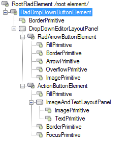
On this image it show 5 children, but on code there are 6 children, here is a CopyPase of your CreateChildElements in RadArrowButtonElement.
    protected override void CreateChildElements()
    {
        arrow = new ArrowPrimitive(ArrowDirection.Down);
        arrow.Class = "RadArrowButtonArrow";
        arrow.AutoSize = false;
        arrow.Alignment = System.Drawing.ContentAlignment.MiddleCenter;
        overflowArrow = new OverflowPrimitive(ArrowDirection.Down);
        overflowArrow.Class = "RadArrowButtonOverflowArrow";
        overflowArrow.AutoSize = false;
        overflowArrow.Alignment = System.Drawing.ContentAlignment.MiddleCenter;
        overflowArrow.Visibility = ElementVisibility.Collapsed;
        fillPrimitive = new FillPrimitive();
        fillPrimitive.Class = "RadArrowButtonFill";
        fillPrimitive.AutoSizeMode = RadAutoSizeMode.FitToAvailableSize;
        borderPrimitive = new BorderPrimitive();
        borderPrimitive.Class = "RadArrowButtonBorder";
        borderPrimitive.AutoSizeMode = RadAutoSizeMode.FitToAvailableSize;
        imagePrimitive = new ImagePrimitive();
        imagePrimitive.Class = "RadArrowButtonImage";
        imagePrimitive.AutoSizeMode = RadAutoSizeMode.FitToAvailableSize;
        imagePrimitive.Alignment = System.Drawing.ContentAlignment.MiddleCenter;
        textPrimitive = new TextPrimitive();
        textPrimitive.Class = "RadArrowButtonTextGlyph";
        textPrimitive.AutoSizeMode = RadAutoSizeMode.FitToAvailableSize;
        textPrimitive.TextAlignment = System.Drawing.ContentAlignment.MiddleCenter;
        textPrimitive.StretchHorizontally = true;
        textPrimitive.StretchVertically = true;
        Children.Add(fillPrimitive);
        Children.Add(borderPrimitive);
        Children.Add(arrow);
        Children.Add(overflowArrow);
        Children.Add(imagePrimitive);
        Children.Add(textPrimitive);
    }
The problem is that we are changing the ArrowButton size to (6, 0) width, here is the how it looks:

As you can see the triangle is outside the ArrowButton, my first idea was to look the ArrowPrimitive and OverflowPrimitive, but that triangle is on TextPrimitive.
Making this change on RadDropDownButtonElement i was able to "solve" the offset and the size.
base.ArrowButton.TextPrimitive.Font = new Font(base.ArrowButton.TextPrimitive.Font.FontFamily, 6);
I have to comment this to something like: "I dont know why this works, but the triangle is on a child text primitive... So don't erase this line".
To reproduce:
- Add RadDropDownButton to a blank form.
- Set its anchor property to top, right and its AutoSize property to true.
- At runtime set the button text to a long string, you will notice that the button is resized to the right when it should be resized to the left.

To workaround this you can subscribe to the SizeChanged event of the button change its location depending on the new size:
Size prevSize;

public Form1()
{
    InitializeComponent();
    radDropDownButton1.AutoSize = true;

    this.Shown += Form1_Shown;
}

void Form1_Shown(object sender, EventArgs e)
{
    prevSize = radDropDownButton1.Size;

    radDropDownButton1.SizeChanged += radDropDownButton1_SizeChanged;
}

void radDropDownButton1_SizeChanged(object sender, EventArgs e)
{
    RadDropDownButton button = sender as RadDropDownButton;
    button.Location = new Point(button.Location.X - (radDropDownButton1.Size.Width - prevSize.Width), button.Location.Y);
    prevSize = button.Size;

}

private void radButton2_Click(object sender, EventArgs e)
{
    radDropDownButton1.Text = "Very long button text set";
}
            this.radButton1.ButtonElement.ImagePrimitive.SvgImage = RadSvgImage.FromFile(@"..\..\image.svg");
            this.radButton1.TextImageRelation = TextImageRelation.TextBeforeImage;
            this.radButton1.ButtonElement.ImagePrimitive.ImageLayout = ImageLayout.Zoom;
            this.radButton1.ButtonElement.ImagePrimitive.StretchVertically = true;
            this.radButton1.ButtonElement.ImagePrimitive.StretchHorizontally = true;
If there are boolean application Settings:
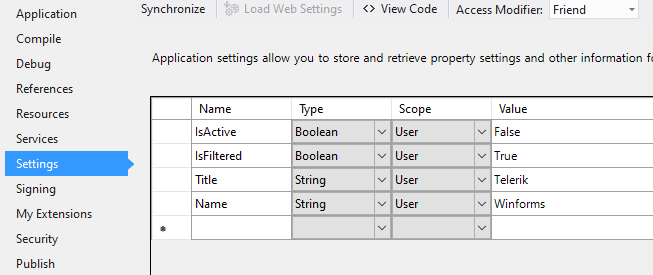
It is good to have the possibility to bind the Checked property for RadCheckBox in a similar way like the MS CheckBox offers:
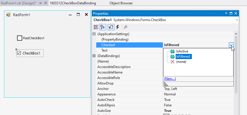
RadCheckBox offers only the Text option:

Steps to reproduce:
1. Press the left mouse button inside RadToggleSwitch. (MouseDown)
2. Move the mouse 1 px up or down (but still inside the RadToggleSwitch). (MouseMove)
3. If you release the left mouse button now, the switch will not toggle. (MouseUp)
Only if the mouse location at the moment of Press and Release are exactly the same, the toggle action will be triggered.

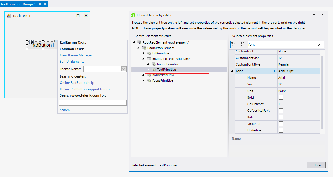
To recreate the problem:
1. Create a new Telerik Winforms .Net Project
2. Add a radButton
3. Change the font property in the designer to a different size
Workaround: change the font for the TextPrimitive:
Just like in the case of RadCheckBox, RadToggleButton has a few states. Therefore, we need to add the possibility in Visual Style Builder to style the RadToggleButton when it is disabled and taking into consideration the toggle state (on/off)
See attached to reproduce.
Workaround: set it to the element:
radToggleSwitch1.ToggleSwitchElement.Font = new Font("Segoe Script", 18, FontStyle.Regular);
FIX. RadButton does not indicate that it is pressed when it is clicked with key instead of clicking with mouse
After double click on a shape I open another modal form (let's call it form2). The second mouse click is fired on a modal form (Form2) which in some cases, based on shape position in Form1 (precisely when the shape is in center of the screen), change the state of my ToogleSwitch which is in center of Form2.