
Hi Dess,
Thank you. That worked well :)
Hello, Connor,
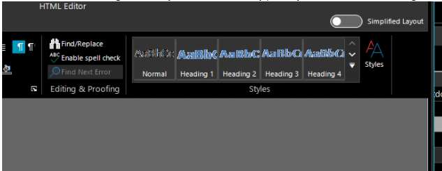
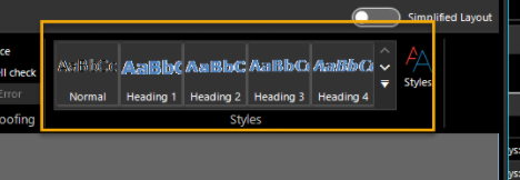
According to the provided screenshots, indeed, the text looks blurry and difficult to read. I was able to observe such a design with FluentDark and CrystalDark themes. It comes from the dark back color of the style items.
I have logged it in our feedback portal by making this thread public on your behalf. You can track its progress, subscribe for status changes and add your comments on the following link - feedback item.
I have also updated your Telerik points.
Currently, the possible solution that I can suggest is to use the following custom implementation for the Ribbon UI and customize the back color for the style items:
        public class CustomRichTextEditorRibbonBar : RichTextEditorRibbonBar
        {
            protected override void FillStylesGallery()
            {
                base.FillStylesGallery();
                foreach (Telerik.WinControls.UI.RichTextEditorRibbonUI.StyleGalleryItem item in galleryStyles.Items)
                {
                    item.ForeColor = Color.Black ;
                    FillPrimitive fill = item.FindDescendant<FillPrimitive>();
                    fill.GradientStyle = GradientStyles.Solid;
                    fill.BackColor = Color.White;
                }
            }
        }
I hope this information helps. If you need any further assistance please don't hesitate to contact me.
Regards,
Dess | Tech Support Engineer, Sr.
Progress Telerik
Тhe web is about to get a bit better!
The Progress Hack-For-Good Challenge has started. Learn how to enter and make the web a worthier place: https://progress-worthyweb.devpost.com.
- All
- Completed (5947)
- Declined (540)
- Duplicated (41)
- In Development (4)
- Need More Info (1)
- Planned (4)
- Unplanned (1847)
- All
- UI for WinForms
- AI Coding Assistant
- AIPrompt
- ApplicationMenu
- AutoCompleteBox
- Barcode (Obsolete)
- BarcodeView
- BindingNavigator
- BreadCrumb
- BrowseEditor
- Buttons
- ButtonTextBox
- Calculator
- CalculatorDropDown
- Calendar
- Callout
- CardView
- Carousel
- ChartView
- Chat
- CheckedDropDownList
- CheckedListBox
- CollapsiblePanel
- ColorBox
- ColorDialog
- CommandBar
- ContextMenu
- DataEntry
- DataFilter
- DataLayout
- DateOnlyPicker
- DateTimePicker
- DesktopAlert
- Diagram, DiagramRibbonBar, DiagramToolBox
- Dock
- DomainUpDown
- DropDownList
- Editors
- FileDialogs
- FilterView
- Flyout
- FontDropDownList
- Form
- Forms/Dialogs/Templates
- GanttView
- GridView
- GroupBox
- HeatMap
- ImageEditor
- Installer and VS Extensions
- Label
- LayoutControl
- Licensing
- ListControl
- ListView
- Map
- MaskedEditBox
- Menu
- MessageBox
- MultiColumnCombo
- NavigationView
- NotifyIcon
- OfficeNavigationBar
- Overlay
- PageView
- Panel
- Panorama
- PdfViewer
- PictureBox
- PipsPager
- PivotGrid
- PopupEditor
- ProgressBar
- PropertyGrid
- RadialGauge, LinearGauge, BulletGraph
- RangeSelector
- Rating
- RibbonBar
- RibbonForm
- RichTextEditor
- Rotator
- Scheduler/Reminder
- ScrollablePanel
- ScrollBar
- Separator
- ShapedForm
- SlideView
- SparkLine
- SpeechToTextButton
- SpellChecker
- SpinEditor
- SplashScreen
- SplitContainer
- Spreadsheet
- StatusStrip
- StepProgressBar
- SyntaxEditor
- TabbedForm
- TaskbarButton
- TaskBoard
- TaskDialog
- TextBox
- TextBoxControl
- TimeOnlyPicker
- TimePicker
- TimeSpanPicker
- TitleBar
- ToastNotificationManager
- ToolbarForm
- Tools for WinForms: Visual Style Builder, Control Spy, Shape Editor, Element Hierarchy Editor
- TrackBar
- TreeMap
- TreeView
- UI Framework
- ValidationProvider
- VirtualGrid
- VirtualKeyboard
- WaitingBar
- WebCam
- Wizard

