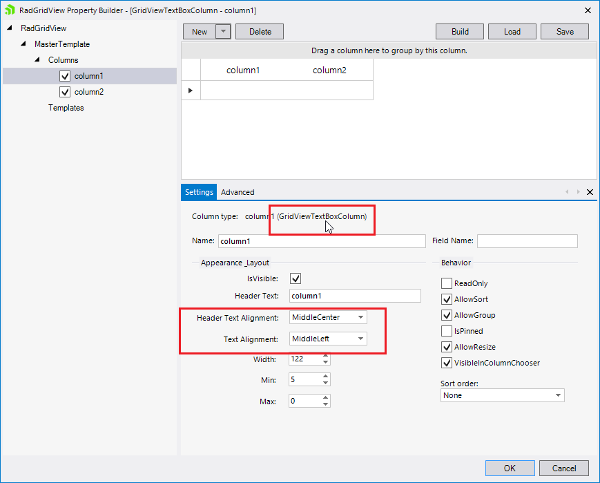
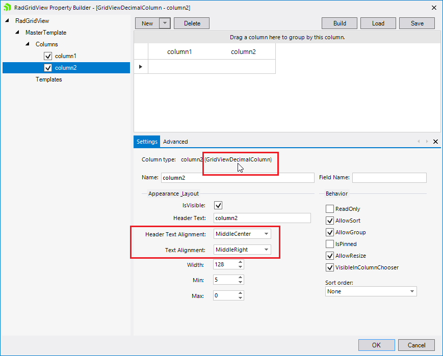
By default, in the Property Builder for GridView, the defaults are:
Header Text Alignment = Middle Center
Text Alignment = Middle Left.
This means that EVERY time I create a new grid, I have to remember to make them both the same.
Why make them different? It makes the grid look rubbish whenthe defaults are used.
Hi, Ian,
Depending on the column type, different settings are preloaded in the Property Builder:
As you can see in the above screenshots, the text column and the decimal column have different text alignment.
The base GridViewColumn type has default values like this:
- TextAlignment >> ContentAlignment.MiddleLeft
- HeaderTextAlignment >> ContentAlignment.MiddleCenter
They are used for the text column.
I have approved the feature request so we can track the demand by other customers for such a change. Make sure that you cast your vote for the item in order to increase its priority. Click the Follow button in order to get notified once any status changes occur.
Regards,
Dess | Tech Support Engineer, Principal
Progress Telerik
Love the Telerik and Kendo UI products and believe more people should try them? Invite a fellow developer to become a Progress customer and each of you can get a $50 Amazon gift voucher.
- All
- Completed (5947)
- Declined (540)
- Duplicated (41)
- In Development (4)
- Need More Info (1)
- Planned (4)
- Unplanned (1847)
- All
- UI for WinForms
- AI Coding Assistant
- AIPrompt
- ApplicationMenu
- AutoCompleteBox
- Barcode (Obsolete)
- BarcodeView
- BindingNavigator
- BreadCrumb
- BrowseEditor
- Buttons
- ButtonTextBox
- Calculator
- CalculatorDropDown
- Calendar
- Callout
- CardView
- Carousel
- ChartView
- Chat
- CheckedDropDownList
- CheckedListBox
- CollapsiblePanel
- ColorBox
- ColorDialog
- CommandBar
- ContextMenu
- DataEntry
- DataFilter
- DataLayout
- DateOnlyPicker
- DateTimePicker
- DesktopAlert
- Diagram, DiagramRibbonBar, DiagramToolBox
- Dock
- DomainUpDown
- DropDownList
- Editors
- FileDialogs
- FilterView
- Flyout
- FontDropDownList
- Form
- Forms/Dialogs/Templates
- GanttView
- GridView
- GroupBox
- HeatMap
- ImageEditor
- Installer and VS Extensions
- Label
- LayoutControl
- Licensing
- ListControl
- ListView
- Map
- MaskedEditBox
- Menu
- MessageBox
- MultiColumnCombo
- NavigationView
- NotifyIcon
- OfficeNavigationBar
- Overlay
- PageView
- Panel
- Panorama
- PdfViewer
- PictureBox
- PipsPager
- PivotGrid
- PopupEditor
- ProgressBar
- PropertyGrid
- RadialGauge, LinearGauge, BulletGraph
- RangeSelector
- Rating
- RibbonBar
- RibbonForm
- RichTextEditor
- Rotator
- Scheduler/Reminder
- ScrollablePanel
- ScrollBar
- Separator
- ShapedForm
- SlideView
- SparkLine
- SpeechToTextButton
- SpellChecker
- SpinEditor
- SplashScreen
- SplitContainer
- Spreadsheet
- StatusStrip
- StepProgressBar
- SyntaxEditor
- TabbedForm
- TaskbarButton
- TaskBoard
- TaskDialog
- TextBox
- TextBoxControl
- TimeOnlyPicker
- TimePicker
- TimeSpanPicker
- TitleBar
- ToastNotificationManager
- ToolbarForm
- Tools for WinForms: Visual Style Builder, Control Spy, Shape Editor, Element Hierarchy Editor
- TrackBar
- TreeMap
- TreeView
- UI Framework
- ValidationProvider
- VirtualGrid
- VirtualKeyboard
- WaitingBar
- WebCam
- Wizard


