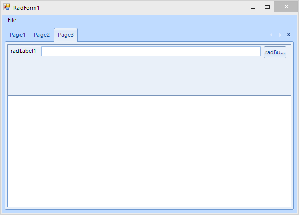
The layout on a monitor with 100%:
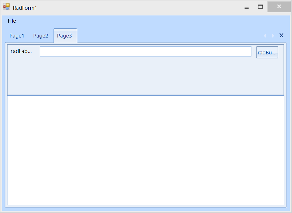
After moving the form to a monitor with higher than 100% DPI scaling, e.g. 175% or greater:
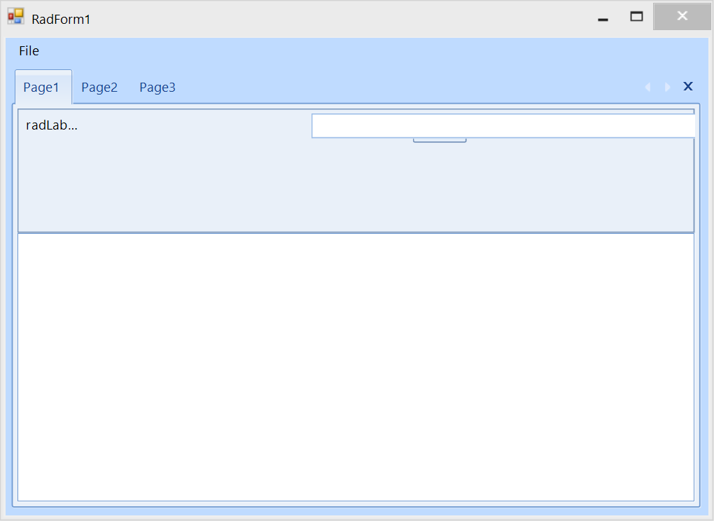
Once you switch to the first page which contains exactly the same UserControl, the layout is not correct:
Hello,
At the core of the problem is using:
this.AutoScaleMode = System.Windows.Forms.AutoScaleMode.None;This will disable scaling logic and is not recommended at all, if you desire DPI scaling.
Instead use the recommended settings:
this.AutoScaleDimensions = new System.Drawing.SizeF(6F, 13F);
this.AutoScaleMode = System.Windows.Forms.AutoScaleMode.Font;
or
this.AutoScaleMode = System.Windows.Forms.AutoScaleMode.Dpi;
this.AutoScaleDimensions = new System.Drawing.SizeF(96, 96);
It is also highly recommended to have the same setting for all your controls/forms.
For more information on DPI scaling and good practices I suggest checking our updated blog out.
Regards,
Stoyan
Progress Telerik
Virtual Classroom, the free self-paced technical training that gets you up to speed with Telerik and Kendo UI products quickly just got a fresh new look + new and improved content including a brand new Blazor course! Check it out at https://learn.telerik.com/.
Hi,
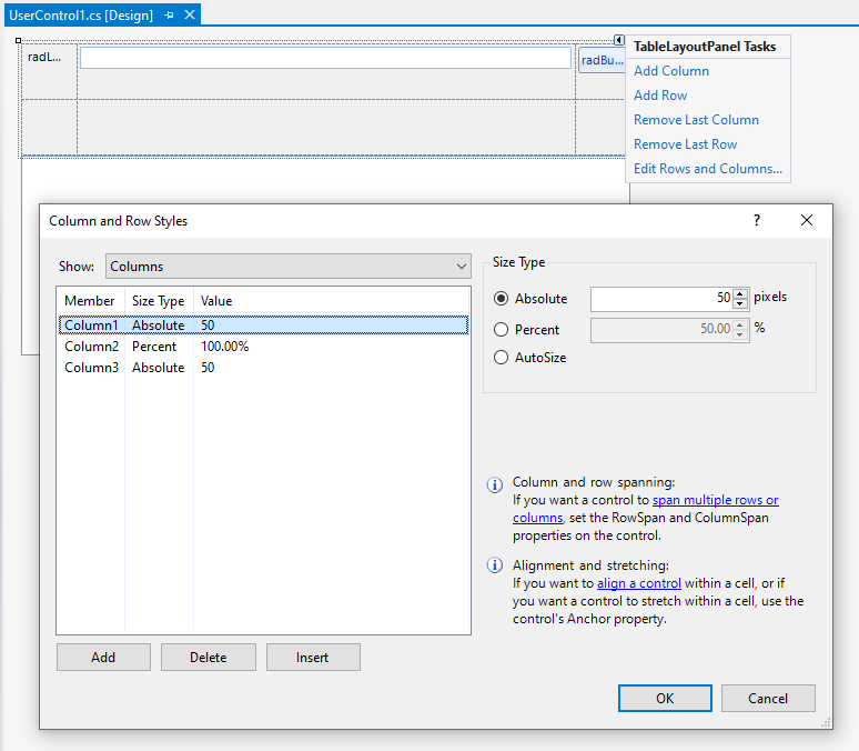
In order to achieve better layout, the possible solution that I can suggest is to use a TableLayoutPanel with 3 columns and place the label, textbox and button in each of the columns. You can define fixed size for the first and last column and leave the middle column with 100% to fill the available space:
This improves the behavior on my end when moving the form between the monitors and switching the pages.
Regards,
Dess | Tech Support Engineer, Sr.
Progress Telerik
Virtual Classroom, the free self-paced technical training that gets you up to speed with Telerik and Kendo UI products quickly just got a fresh new look + new and improved content including a brand new Blazor course! Check it out at https://learn.telerik.com/.
- All
- Completed (5947)
- Declined (540)
- Duplicated (41)
- In Development (4)
- Need More Info (1)
- Planned (4)
- Unplanned (1847)
- All
- UI for WinForms
- AI Coding Assistant
- AIPrompt
- ApplicationMenu
- AutoCompleteBox
- Barcode (Obsolete)
- BarcodeView
- BindingNavigator
- BreadCrumb
- BrowseEditor
- Buttons
- ButtonTextBox
- Calculator
- CalculatorDropDown
- Calendar
- Callout
- CardView
- Carousel
- ChartView
- Chat
- CheckedDropDownList
- CheckedListBox
- CollapsiblePanel
- ColorBox
- ColorDialog
- CommandBar
- ContextMenu
- DataEntry
- DataFilter
- DataLayout
- DateOnlyPicker
- DateTimePicker
- DesktopAlert
- Diagram, DiagramRibbonBar, DiagramToolBox
- Dock
- DomainUpDown
- DropDownList
- Editors
- FileDialogs
- FilterView
- Flyout
- FontDropDownList
- Form
- Forms/Dialogs/Templates
- GanttView
- GridView
- GroupBox
- HeatMap
- ImageEditor
- Installer and VS Extensions
- Label
- LayoutControl
- Licensing
- ListControl
- ListView
- Map
- MaskedEditBox
- Menu
- MessageBox
- MultiColumnCombo
- NavigationView
- NotifyIcon
- OfficeNavigationBar
- Overlay
- PageView
- Panel
- Panorama
- PdfViewer
- PictureBox
- PipsPager
- PivotGrid
- PopupEditor
- ProgressBar
- PropertyGrid
- RadialGauge, LinearGauge, BulletGraph
- RangeSelector
- Rating
- RibbonBar
- RibbonForm
- RichTextEditor
- Rotator
- Scheduler/Reminder
- ScrollablePanel
- ScrollBar
- Separator
- ShapedForm
- SlideView
- SparkLine
- SpeechToTextButton
- SpellChecker
- SpinEditor
- SplashScreen
- SplitContainer
- Spreadsheet
- StatusStrip
- StepProgressBar
- SyntaxEditor
- TabbedForm
- TaskbarButton
- TaskBoard
- TaskDialog
- TextBox
- TextBoxControl
- TimeOnlyPicker
- TimePicker
- TimeSpanPicker
- TitleBar
- ToastNotificationManager
- ToolbarForm
- Tools for WinForms: Visual Style Builder, Control Spy, Shape Editor, Element Hierarchy Editor
- TrackBar
- TreeMap
- TreeView
- UI Framework
- ValidationProvider
- VirtualGrid
- VirtualKeyboard
- WaitingBar
- WebCam
- Wizard


