Steps to reproduce the problem:
Have a grid with:
- specified width (e.g: 1000)
- column virtualization
- multiple columns with a width of 100, but most of them hidden in initial state (e.g.: 50 total, but only 8 shown)
- columnMenu true
- resizable true
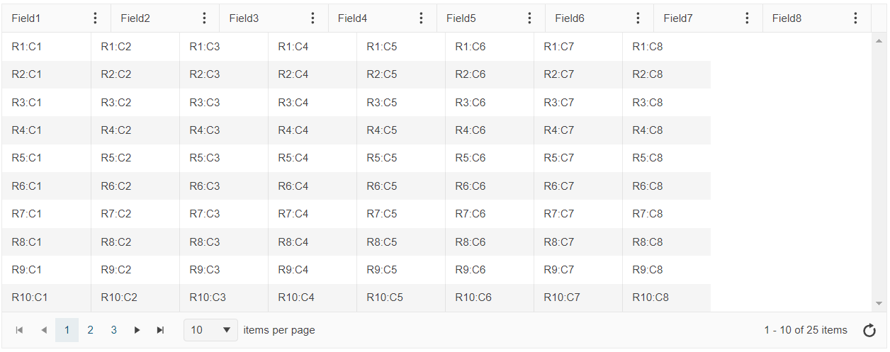
When running the code that create the grid, the initial state looks like this:
Current behavior:
The header columns are filling the width of the grid (each bigger than the specified 100), but the rows columns cells have the specified width of 100, causing a misalignment.
However, changing the width of a column with the resize handle fixes all the widths (header + rows).
Same thing for adding/removing a column from the menu.
See the attached video for an example.
If in the initial state there are more shown columns so they can fill the grid width (and have the horizontal scrollbar), the issue is not present.
Expected behavior:
Rows columns should always match the width of the header.
Dojo example:
Here's an example, based on the one from https://demos.telerik.com/kendo-ui/grid/column-virtualization
https://dojo.telerik.com/@pgarand/UfEkIGiD
Hi, Philippe,
Thank you for the provided report.
I've logged an item in our public GitHub repository that you can track:
https://github.com/telerik/kendo-ui-core/issues/7957
You can use several approaches as a workaround:
- Use the showColumn/hideColumn methods upon initialization to force the Grid to re-align.
- Use the following snippet in the dataBound event to call the internal alignment mechanism.
let initialRender = true;
           $("#grid").kendoGrid({
             dataBound: function() {
               if (initialRender) {
                 initialRender = false;
                 this._updateContentWidth();
               }
             },
- Init the Grid with more columns and hide them programmatically afterwards.
Best Regards,
Georgi Denchev
Progress Telerik
Do you have a stake in the designеr-developer collaboration process? If so, take our survey to share your perspective and become part of this global research. You’ll be among the first to know once the results are out.
-> Start The State of Designer-Developer Collaboration Survey 2024
- All
- Completed (2298)
- Declined (1301)
- Duplicated (80)
- In Development (2)
- Need More Info (43)
- Pending Review (3)
- Planned (10)
- Under Review (31)
- Unplanned (1796)
- Won't Fix (9)
- All
- Kendo UI for jQuery
- ActionSheet
- AICodingAssistant
- AIPrompt
- AppBar
- ArcGauge
- AutoComplete
- Avatar
- Badge
- Barcode
- BottomNavigation
- Breadcrumb
- BulletChart
- Button
- ButtonGroup
- Calendar
- Captcha
- Card
- Chart
- Chart Wizard
- Chat
- Checkbox
- CheckBoxGroup
- Chip
- ChipList
- CircularGauge
- CircularProgressBar
- Collapsible
- ColorGradient
- ColorPalette
- ColorPicker
- ComboBox
- ContextMenu
- Data Source
- Date Picker
- DateInput
- DateRangePicker
- DateTimePicker
- Diagram
- Dialog
- DockManager
- Drag and Drop
- Drawer
- Drawing API
- DropDownButton
- DropDownList
- DropDownTree
- Editor
- Effects
- ExpansionPanel
- FileManager
- Filter
- FlatColorPicker
- FloatingActionButton
- Form
- Gantt
- Globalization
- Grid
- Heatmap
- Hierarchical Data Source
- ImageEditor
- InlineAIPrompt
- Licensing
- LinearGauge
- ListBox
- ListView
- Loader
- Map
- MaskedTextBox
- MediaPlayer
- Menu
- MultiColumnComboBox
- MultiSelect
- MultiViewCalendar
- MVVM
- Notification
- NumericTextBox
- OrgChart
- OTP Input
- Pager
- PanelBar
- PDFViewer
- PivotGrid
- PivotGridV2
- Popover
- Popup
- ProgressBar
- PropertyGrid
- QRCode
- RadialGauge
- RadioButton
- RadioGroup
- RangeSlider
- Rating
- ResponsivePanel
- RippleContainer
- Sankey
- Scheduler
- ScrollView
- SegmentedControl
- Signature
- SkeletonContainer
- Slider
- Sortable
- SPA
- Sparkline
- SpeechToTextButton
- SplitButton
- Splitter
- Spreadsheet
- Stepper
- StockChart
- Switch
- TabStrip
- TaskBoard
- Templates
- TextArea
- TextBox
- TileLayout
- TimeDurationPicker
- Timeline
- TimePicker
- ToggleButton
- Toolbar
- Tooltip
- Touch
- TreeList
- TreeMap
- TreeView
- Upload
- Validator
- VS Code Extension
- Window
- Wizard

