I understand at the moment it is not available, but I would like to see drag and drop functionality in the future for the Kendo UI Upload's Synchronous mode.
Thank you!
Hi,
I've followed your AI integration example but I noticied that when I use the updateMessage method for some reason the chat scroll move toward the start of the message. Maybe I'm wrong but looking at the source code I think that the problem is the chat-widget.js inside this method
_refreshStandardSync(message, isOwnMessage, wasNearBottom) {
        if (!message) {
            return;
        }
        this.renderMessage(message);
        if (isOwnMessage) {
            this.scrollToBottom();
        }
        else if (wasNearBottom && message.uid) {
            this.view.scrollIncomingMessage(message.uid);
        }
}This is my code to manage streaming token AI and kendo chat initialization
$("#copilotChat").kendoChat({
	authorId: "user",
	height: "100%",
	messageBox: {
		mode: "auto"
	},
	fileAttachment: false,
	speechToText: false,
	messageWidthMode: "full",
	skipSanitization: true,
	sendMessage: function (e) {
		if (e.generating) {
			//cancelling request, code omitted
		}
		else {
			//new request, code omitted

		}
	}
});
//receive message via SSE (code omitted)

const chat = $("#copilotChat").data("kendoChat");
let messageObject = chat.dataSource.get(params.runId);

dashboardProposal.currentCopilotChatText += params.content;
if (messageObject) {
	const markdown = markdownInstance.parse(dashboardProposal.currentCopilotChatText);
	chat.updateMessage(messageObject, { text: markdown });
}
else {
	chat.postMessage({
		authorId: "assistant",
		authorName: app.i18n("advice_dashboardProposal_authorNameCopilot"),
		text: params.content,
		id: params.runId
	});
}
I believe this feature would greatly facilitate the integration of AI token streaming into web applications.
Thanks in advance
This is an enhancement request.
Wizard buttons can be modified via the activate event and replaced with a fully initialized Button, but it would be better to just offer more of the Button properties right on the wizard steps.buttons object properties. For example, the icon/image properties, fillMode, size, etc.
Bug report
`DropDownListSelectEvent.dataItem` is undefined when using keyboard to select the optionLabel, but is defined when using the mouse
Reproduction of the problem
Steps
Dojo: https://dojo.telerik.com/IvEXOvUH
Make a selection (e.g. "Apples").
Select the optionLabel item.
Expected
The value of DropDownListSelectEvent.dataItem is the same whether the selection is made via keyboard or mouse (assumedly).
The value of DropDownListSelectEvent.dataItem is clearly specified in the API docs when selecting the optionLabel.
Actual
The value of DropDownListSelectEvent.dataItem is "Select an option…" when selecting with the mouse.
The value of DropDownListSelectEvent.dataItem is undefined when selecting with the keyboard.
Environment
Kendo UI version: 2024.1.130
Browser: [all]
The timezone should be adjustable [e.g. like in Moment Timezone date.tz('Asia/Tokyo')] or today should be accessible/configurable from outside the widget. Currently getToday() always returns the local time. Suggestion: Add the attribute today to the options and change the initialization of var today = new DATE() in getToday() to var today = new DATE(options.today) ...
Hi Team,
I would like to request a way to utilize formattingMarks for the Kendo UI Inline Editor without having to set inlineHeight. The way we use the editor requires its height to grow dynamically as the user types text. We usually have around five editors displayed on the screen at the same time, so it is important for us that formattingMarks works correctly across multiple editors on a single page.
Thank you!
We're using the kendo spreadsheet with validation.
There's a cell that validates against a list of values.
The list of values can be up to 50 values or so.
It would be beneficial if there is a scrollbar for the dropdown, similar to the Excel behavior.
Problem There's no way to display milestones that apply across the entire Gantt independent of the task hierarchy. Tying milestones to task rows means they disappear when rows collapse, and sibling-row workarounds are visually indistinguishable from real content rows.
Requested Behavior A pinned milestone band rendered above the task rows, below the timeline header, that:
- Stays visible regardless of row collapse state
- Scrolls horizontally with the timeline but not vertically with tasks
- Accepts milestone objects with date, label, color, and type
- Supports multiple milestones on the same band (stagger or tooltip on hover)
Use Case In our publication planning workflow, study-level dates (Data Lock, Embargo Lift, Interim Analysis) are reference points that need to be visible while scrolling through 20–50 task rows. These don't belong to any single task — they're plan-wide context.
Proposed API
globalMilestones: [
  { date: new Date("2026-03-01"), label: "Data Lock", color: "#F58010" },
  { date: new Date("2026-05-15"), label: "Embargo Lift", color: "#20B34A" },
],
showGlobalMilestoneBand: true,
globalMilestoneBandHeight: 32Hi Team,
I would like to request a way to prevent a responsive Grid from displaying an input when the screensize/container is shorter. Perhaps, decreasing the buttonCount automatically instead of displaying the input may be a reasonable alternative. This would be better than setting the pageable.responsive configuration to false.
Thank you!
Hi Team,
Background
Kendo controls column width exclusively via <colgroup><col width="Npx"> attributes. CSS min-width on <col> is not supported by browsers (per spec). There is no minWidth property in the column configuration API. When a column has no explicit width set, it can collapse to near-zero width when the grid container is narrow - making content completely unreadable. This request excludes the columns.minResizableWidth as resizable is necessary with this configuration.
Request
We need the following to work generically across all grids without per-instance config changes:
1. Column minWidth API
columns: [
  { field: "name", title: "Name", minWidth: 150 }  // ← requested or it would be great if this min width we can apply at global level
]
Where minWidth is respected even if no width is specified, and is not overridden if an explicit width larger than minWidth is set else the global min width of 150px should be considered.
2. Grid-level minWidth config
$("#grid").kendoGrid({
  minWidth: 1000  // ← requested: grid never renders narrower than this or columnCount * default columns global width (150px) whichever is higher
});
Or ideally computed automatically as Math.max(1000, columns.length * defaultMinColWidth).
Thanks & RegardsKishan
Hi Team,
What we're looking to achieve, is that when the page/grid enters edit mode, ALL fields in the grid should immediately become editable fields. This would help prevent the user from having to click on every cell to edit first, and the user would have a direct view of all fields actually being editable, make their changes, hit the save button on the page, and save everything at once.
Currently it's difficult for the user to actually know which fields they can edit, as they have to click a cell before it becomes editable.
Thank you!
The horizontal space between all OrgChart nodes on the same level is one and the same and it is equal to the horizontal space needed to show the child nodes of the parent with most child nodes. It is represented by the red squares on the image below. This results in excessive empty horizontal space between nodes with no child nodes or no visible child nodes.
This may be observed on the following Dojo runner. Currently the OrgChart has empty space between the first level nodes, and also there is empty space after the last node:
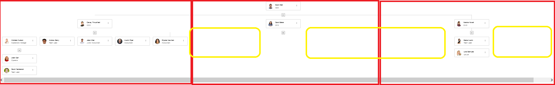
Suggested behavior:
There is no empty horizontal space between nodes on the same level - highlighted in yellow on the image above. In the above scenario, there should be no empty space between the first level's second and third node and no space after the third node, which may be observed, when the first node has no expanded child node:
Hello,
We would like to request this feature to expand on a Grid components Options.
Provide a built-in way for end-users to redefine or rename a Grid column's title directly through the user interface. Currently, if a user wants to change a column header from "Title1" to "Title2”, developers must write significant custom jQuery to modify the DOM or update the column via set options.
This is a functional request from our users, that we would like to provide for them.
Thanks,
John
Hi Team,
I would like to ask for a built-in Kendo UI implementation to import Excel files into the Kendo UI Grid.
Thank you!
Hi Team,
I would like to ask for virtualization for the Kendo UI Scheduler when there is no grouping.
Thank you!
Hi Team,
I would like to request adding the EventsPerDay configuration for the Week view.
Thank you!
I realize this has been covered by this workaround in the past, but the need to write extra code for moving the column back to the original position makes this seem a bit "hacky" and most importantly, the user experience of being allowed to drag the column in the first place just to see it jump back seems wrong.
The good news is that the kendoGrid already has a mechanism for preventing the columnReorder event from getting fired in the first place! The bad news is that it only happens for columns that have either of these 2 classes ["k-group-cell, "k-hierarchy-cell"]
My request is to have a configuration option that enforces that same behavior for specific columns as:
1. Add a "reorderable" flag to be set as part of the column configuration (set it to false for those we want to keep in place)
2. This flag will set a class on those columns the same way it works for columns with "k-group-cell" or "k-hierarchy-cell" classes, so the event can be prevented.
There is one important caveat to consider with this approach: Only columns at the front and the back of the grid can be locked in place, so there needs to be validation to prevent having non-reorderable columns among reorderable ones.
I am currently using the ANDI accessibility tool and have encountered an accessibility issue with the tooltip icons across my application.
The tool reports an "Aria-Hidden Alert" stating: "Element is focusable but has or is contained by [aria-hidden = true]." The tool also reports as "Keyboard Access Alerts" which states" "Focusable element is not in keyboard tab order; should it be tabbable"?
The HTML for these elements shows aria-hidden = true and focusable = false. I believe the focusable attribute should be set to true.
I have attempted to resolve this using JavaScript to directly removing aria-hidden = true and changing focusable to true. However, there is no built-in configuration in Kendo UI for ASP.NET MVC to customize these accessibility attributes for tooltip icons therefore it didn't work.
Can you make the icons customizable?
I am including a screenshot of the code.
We use the KendoUI for jQuery framework in the enterprise SaaS application we create. Giving our clients access to their data and being able to provide a mechanism where a client could build out some of their own functionality on our Saas platform (ie accessing the Data, webservices etc) is highly desirable.
Our front end is based on a MicroUI approach, so if the client can vibecode building a new microUI, the UI experience with the other microUI we provide would be seamless. Examples might be: Create a Scheduler view showing all the European Holidays in 2026, or create a grid view populated with all the customers who have not transacted in 2025 and show their linkedin link/profile.
We can easily wrap any vide coded application into our application now using the microUI approach, but what we dont get is the same look and feel, themes and components being used. It is this we are looking to solve.