I understand at the moment it is not available, but I would like to see drag and drop functionality in the future for the Kendo UI Upload's Synchronous mode.
Thank you!
Bug report
Reproduction of the problem
- Open the Dojo - https://dojo.telerik.com/IbJSAmGX
- Try to reorder the rows and place for example row 1 below row 5
Current behavior
No row can be placed below row 5.
Expected/desired behavior
It should be possible to reorder and place a row at last possition
The issue is a regression starting with 2026.1.415
Environment
- Kendo/Telerik version: 2026.2.520
- Browser: [all ]
Bug Report
When the Grid is exported with child columns hidden with Multi-column headers, the columns headers are not exported.
Reproducible
- Go to this Progress Kendo UI Dojo
- Export the Grid
Current Behavior
The column headers do not all export:
Expected Behavior
The Grid should export all column headers like when they are not hidden - Dojo :
Workaround
Explicitly set the parent column's exportable configuration to true - Dojo:
$("#grid").kendoGrid({
    columns: [
        { field: "name", title: "Name" },
        {
            title: "Address",
            exportable: true,  //set to true
            columns: [
                { field: "street", title: "Street", hidden:true, exportable: true },
                { field: "city", title: "City", hidden:true, exportable: true }
            ]
        },
        { field: "phone", title: "Phone" }
    ]
    //....
});
Environment
Kendo UI version: 2026.2.520
jQuery version: 4.0.0
Browser: all
Hi there,
I am using Kendo UI version 2026.2.520. I have a gantt chart and the view options (day, week, month etc.) disappears when I change the width of the chart. However, when I change the version to 2025.2.520, the same width shows the view types. Is there some way to solve this issue so it was working as it previously did?
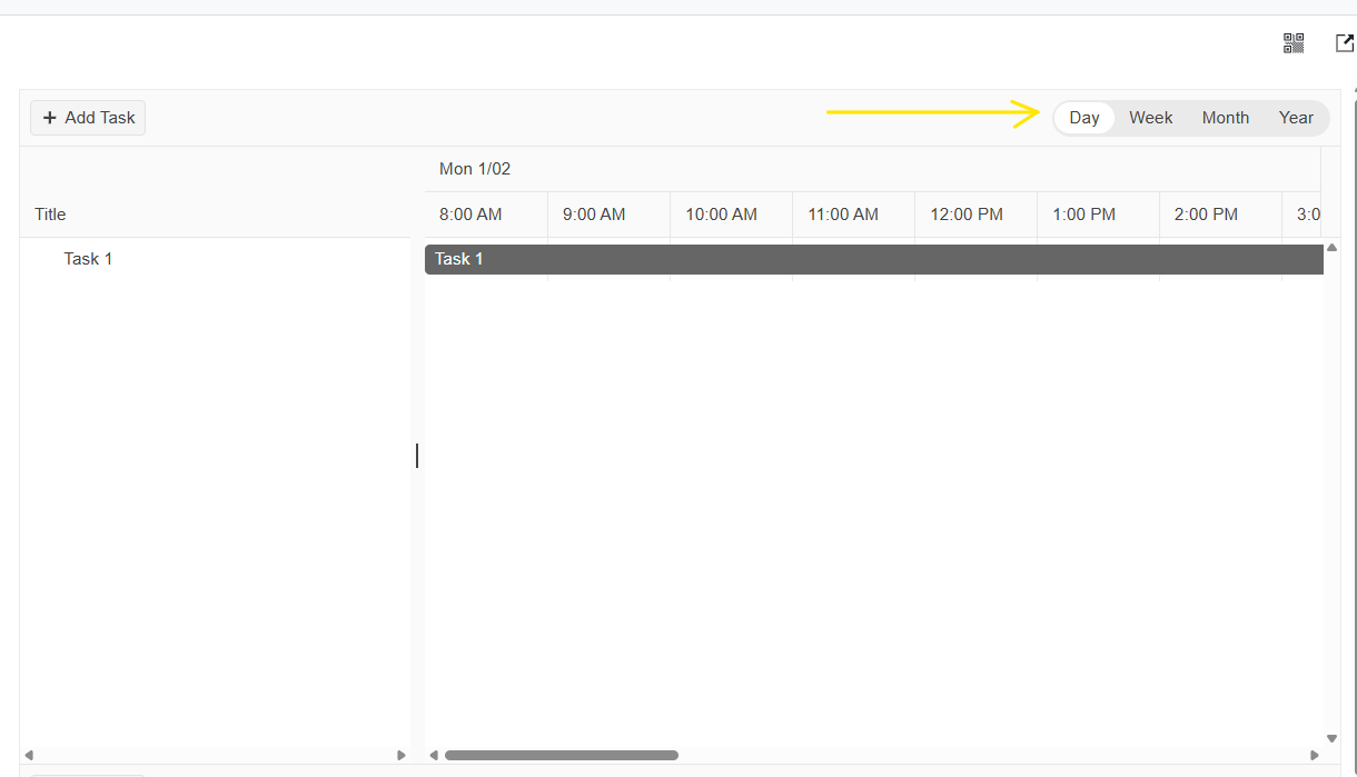
Here is the dojo I used
Bug report
Reproduction of the problem
- Run this dojo - https://runner.telerik.io/fullscreen/aKRBlRDR
- Quickly change the views in no particular order
Current behavior
Occasionally the k-focus class is not cleared from a previously selected view.
Expected/desired behavior
The k-focus class should be cleared
TicketID:
1715639
Environment
- Kendo/Telerik version: 2026.2.520
Bug report
Current behavior
Errors during build process:
(replace-metadata plugin) [SOURCEMAP_BROKEN] Sourcemap is likely to be incorrect: a plugin (replace-metadata) was used to transform files, but didn't generate a sourcemap for the transformation. Consult the plugin documentation for help: https://rolldown.rs/guide/troubleshooting#warning-sourcemap-is-likely-to-be-incorrect
Expected/desired behavior
There should be no errors
TicketID:
1716119
This problem can be easily demonstrated by looking at the page on the demonstration page, and then copying and pasting the same code into the kendo dojo.
The official demonstration page displays the buttons like so:

But the same code on the dojo displays the buttons like so:

As you can see, the demonstration page has a consistent style for all of the buttons, while the dojo page does not.
Both pages have the same classes on the icons:
- k-svg-i-caret-alt-to-left
- k-svg-i-chevron-left
- k-svg-i-chevron-right
- k-svg-i-caret-alt-to-right
The mixture of styles gives an unprofessional impression to the customer, and is preventing me from upgrading my codebase from version 2025.4.1321
For the simplest possible example, see this dojo snippet: https://dojo.telerik.com/aroNDBBv
In Kendu UI 2026 Q2 (version 520) file kendo.all.d.ts
The interface IChatOptions has a duplicate defintion for the messageTemplate
Line 3849:
messageTemplate?: MessageTemplateFunction | null;Lines 3916/3917
/** Template for rendering individual messages */
messageTemplate?: MessageTemplateFunction | null;
The DropDownList's Keyboard Navigation Docs specify that the arrow keys move the highlight in the dropDownList, while Enter selects the highlighted item.
However, in reality, the arrow keys already select items. Via keyboard, it is not possible to select e.g. the third item in the list without selecting the first and the second item first (by pressing the down arrow).
E.g. the docs for Angular describe a different behavior.
Bug report
DropDownList: dataItem(e.item) returns undefined when selecting across different groups
Regression since 2026.1.212
Reproduction of the problem
1. Open the next Dojo: https://dojo.telerik.com/aVJUwDTZ
2. Open the DropDownList.
3. Select an item from a group different from the one currently active/selected.
Observe the console for this.dataItem(e.item).
Current behavior
undefined is logged for this.dataItem(e.item)
Workaround: https://dojo.telerik.com/LUdpEmnY
Environment
Kendo UI version: 2026.1.212 or newer
Browser: all
Bug report
When the style attribute is used to style the 'td' elements in the TreeList, the attribute is removed from the rendered markup.
Reproduction of the problem
- Open the Dojo - https://dojo.telerik.com/@NeliK/ulIZuKEG and inspect the
Current behavior
The style attribute is removed.

Expected/desired behavior
The style attribute should persist in the rowTemplate.
Environment
- Kendo UI version: 2024.3.806
- Browser: [all ]
there is no binding for noData
e.g.
noData?: boolean | undefined; interface ChartOptions {
name?: string | undefined;
autoBind?: boolean | undefined;
axisDefaults?: ChartAxisDefaults | undefined;
categoryAxis?: ChartCategoryAxisItem | ChartCategoryAxisItem[] | undefined;
chartArea?: ChartChartArea | undefined;
dataSource?: any|any|kendo.data.DataSource | undefined;
legend?: ChartLegend | undefined;
panes?: ChartPane[] | undefined;
pannable?: boolean | ChartPannable | undefined;
pdf?: ChartPdf | undefined;
persistSeriesVisibility?: boolean | undefined;
plotArea?: ChartPlotArea | undefined;
renderAs?: string | undefined;
series?: ChartSeriesItem[] | undefined;
seriesColors?: any;
seriesDefaults?: ChartSeriesDefaults | undefined;
theme?: string | undefined;
subtitle?: string | ChartSubtitle | undefined;
title?: string | ChartTitle | undefined;
tooltip?: ChartTooltip | undefined;
transitions?: boolean | undefined;
valueAxis?: ChartValueAxisItem | ChartValueAxisItem[] | undefined;
xAxis?: ChartXAxisItem | ChartXAxisItem[] | undefined;
yAxis?: ChartYAxisItem | ChartYAxisItem[] | undefined;
zoomable?: boolean | ChartZoomable | undefined;
axisLabelClick?(e: ChartAxisLabelClickEvent): void;
dataBound?(e: ChartDataBoundEvent): void;
drag?(e: ChartDragEvent): void;
dragEnd?(e: ChartDragEndEvent): void;
dragStart?(e: ChartDragStartEvent): void;
legendItemClick?(e: ChartLegendItemClickEvent): void;
legendItemHover?(e: ChartLegendItemHoverEvent): void;
legendItemLeave?(e: ChartLegendItemLeaveEvent): void;
noteClick?(e: ChartNoteClickEvent): void;
noteHover?(e: ChartNoteHoverEvent): void;
noteLeave?(e: ChartNoteLeaveEvent): void;
paneRender?(e: ChartPaneRenderEvent): void;
plotAreaClick?(e: ChartPlotAreaClickEvent): void;
plotAreaHover?(e: ChartPlotAreaHoverEvent): void;
plotAreaLeave?(e: ChartPlotAreaLeaveEvent): void;
render?(e: ChartRenderEvent): void;
select?(e: ChartSelectEvent): void;
selectEnd?(e: ChartSelectEndEvent): void;
selectStart?(e: ChartSelectStartEvent): void;
seriesClick?(e: ChartSeriesClickEvent): void;
seriesHover?(e: ChartSeriesHoverEvent): void;
seriesOver?(e: ChartSeriesOverEvent): void;
seriesLeave?(e: ChartSeriesLeaveEvent): void;
zoom?(e: ChartZoomEvent): void;
zoomEnd?(e: ChartZoomEndEvent): void;
zoomStart?(e: ChartZoomStartEvent): void;
}
Bug report
Reproduction of the problem
- Open the Dojo - https://dojo.telerik.com/guOqNNgh
- Edit a row and save the new value
Current behavior
An error: kendo.grid.js:16278 Uncaught TypeError: Cannot read properties of undefined (reading 'field')
Expected/desired behavior
No error should be thrown. It should be possible to use detailedTemplate along with the stackedLayout
TicketID: 1715859
Environment
- Kendo/Telerik version: 2026.2.520
- Browser: [all ]
Bug report
Reproduction of the problem
When the diagram is zoomed the click event is not fired when clicking on shapes.
- Open this dojo - https://dojo.telerik.com/iALWmVGY
- Zoom diagram out
- Click on a shape
Current behavior
Click event is not fired.
Expected/desired behavior
Click event should be fired when clicking on a shape in zoomed out diagram
TicketID:
1715835
Hi,
I've followed your AI integration example but I noticied that when I use the updateMessage method for some reason the chat scroll move toward the start of the message. Maybe I'm wrong but looking at the source code I think that the problem is the chat-widget.js inside this method
_refreshStandardSync(message, isOwnMessage, wasNearBottom) {
        if (!message) {
            return;
        }
        this.renderMessage(message);
        if (isOwnMessage) {
            this.scrollToBottom();
        }
        else if (wasNearBottom && message.uid) {
            this.view.scrollIncomingMessage(message.uid);
        }
}This is my code to manage streaming token AI and kendo chat initialization
$("#copilotChat").kendoChat({
	authorId: "user",
	height: "100%",
	messageBox: {
		mode: "auto"
	},
	fileAttachment: false,
	speechToText: false,
	messageWidthMode: "full",
	skipSanitization: true,
	sendMessage: function (e) {
		if (e.generating) {
			//cancelling request, code omitted
		}
		else {
			//new request, code omitted

		}
	}
});
//receive message via SSE (code omitted)

const chat = $("#copilotChat").data("kendoChat");
let messageObject = chat.dataSource.get(params.runId);

dashboardProposal.currentCopilotChatText += params.content;
if (messageObject) {
	const markdown = markdownInstance.parse(dashboardProposal.currentCopilotChatText);
	chat.updateMessage(messageObject, { text: markdown });
}
else {
	chat.postMessage({
		authorId: "assistant",
		authorName: app.i18n("advice_dashboardProposal_authorNameCopilot"),
		text: params.content,
		id: params.runId
	});
}
I believe this feature would greatly facilitate the integration of AI token streaming into web applications.
Thanks in advance
Bug report
Reproduction of the problem
- Open the link in Firefox - https://demos.telerik.com/kendo-ui/editor/inline-editing .
- Select and delete all the text in one of the inline editors.
- Type any two (or more) characters to reproduce the issue.
Current behavior
If the user begins typing a word into the editor, the first character is automatically wrapped in a <p> tag.
Expected/desired behavior
The behavior between the browsers should be consistent. There should be no additional <p> tag.
Workaround: https://dojo.telerik.com/usTyJAmt/3
Environment
- Kendo/Telerik version: 2026.2.520
- Browser: [all ]
Bug report
Reproduction of the problem
Run this dojo - https://dojo.telerik.com/MkKhDjxX
The results are different when using the same values in Excel.
Current behavior
Result comparison for cells with numeric values
| COUNTIF(B5:B9,”<> “) | COUNTIF(B5:B9,”<>11”) | COUNTIF(B5:B9,”*” | COUNTIF(B5:B9,”?3”) | |
| Kendo | 4 | 3 | 4 | 1 |
| Excel | 5 | 4 | 0 | 0 |
Result comparison for cells with text values
| COUNTIF(B12:B16,”<>11”) | COUNTIF(B12:B16,”<>???00”) | |
| Kendo | 3 | 4 |
| Excel | 5 | 1 |
TicketID:
1715542
Environment
- Kendo/Telerik version: 2026.2.520
Bug report
Reproduction of the problem
Approach described in the documentation is not working as described after version 2024.4.1112
Dojo: https://dojo.telerik.com/pXPIOvsq/2 - works with version 2024.3.1015, broken in version 2024.4.1112
Current behavior
Splitter cannot be made resizable as documented.
Expected/desired behavior
It should be possible to change the resizable option for panes.
TicketID:
1713187
Environment
- Kendo/Telerik version: 2024.4.1112
In some scenarios, the PDFViewer does not show the correct end page in its toolbar.
I have a file with 73 pages; some of the pages have different sizes.
Current behavior: When I load the file in the PDFViewer and click the 'Last page' button, there is a slight moment where the correct page number is displayed (73), but after that it is changed to 71.
Expected behavior: The correct page number should be displayed when clicking the 'Last page' button.
This is an enhancement request.
Wizard buttons can be modified via the activate event and replaced with a fully initialized Button, but it would be better to just offer more of the Button properties right on the wizard steps.buttons object properties. For example, the icon/image properties, fillMode, size, etc.