Completed
Last Updated:
06 Feb 2025 13:12
by ADMIN
Release 2025 Q1 (Feb)
Soaham
Created on:
14 May 2024 10:32
Category:
Grid
Type:
Bug Report
Aria labels for Grid row filter inputs are not descriptive
Bug report
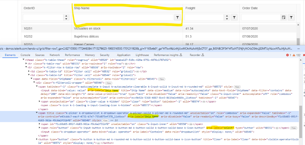
Aria labels for row filter inputs are not descriptive.
Reproduction of the problem
Open this demo: https://demos.telerik.com/kendo-ui/grid/filter-row
Examine aria labels for row filter inputs
Expected/desired behavior
Aria labels should have descriptive names, such as ‘Search value’ or ‘Search term’ for the first input and ‘Filter type’ or ‘Comparison type’ or similar for the second. They should communicate the purpose of the input.
Environment
Kendo UI version: [all]
Browser: [all]
0 comments
Type
Status
- All
- Completed (2295)
- Declined (1301)
- Duplicated (80)
- In Development (2)
- Need More Info (42)
- Pending Review (3)
- Planned (10)
- Under Review (31)
- Unplanned (1796)
- Won't Fix (9)
Category
- All
- Kendo UI for jQuery
- ActionSheet
- AICodingAssistant
- AIPrompt
- AppBar
- ArcGauge
- AutoComplete
- Avatar
- Badge
- Barcode
- BottomNavigation
- Breadcrumb
- BulletChart
- Button
- ButtonGroup
- Calendar
- Captcha
- Card
- Chart
- Chart Wizard
- Chat
- Checkbox
- CheckBoxGroup
- Chip
- ChipList
- CircularGauge
- CircularProgressBar
- Collapsible
- ColorGradient
- ColorPalette
- ColorPicker
- ComboBox
- ContextMenu
- Data Source
- Date Picker
- DateInput
- DateRangePicker
- DateTimePicker
- Diagram
- Dialog
- DockManager
- Drag and Drop
- Drawer
- Drawing API
- DropDownButton
- DropDownList
- DropDownTree
- Editor
- Effects
- ExpansionPanel
- FileManager
- Filter
- FlatColorPicker
- FloatingActionButton
- Form
- Gantt
- Globalization
- Grid
- Heatmap
- Hierarchical Data Source
- ImageEditor
- InlineAIPrompt
- Licensing
- LinearGauge
- ListBox
- ListView
- Loader
- Map
- MaskedTextBox
- MediaPlayer
- Menu
- MultiColumnComboBox
- MultiSelect
- MultiViewCalendar
- MVVM
- Notification
- NumericTextBox
- OrgChart
- OTP Input
- Pager
- PanelBar
- PDFViewer
- PivotGrid
- PivotGridV2
- Popover
- Popup
- ProgressBar
- PropertyGrid
- QRCode
- RadialGauge
- RadioButton
- RadioGroup
- RangeSlider
- Rating
- ResponsivePanel
- RippleContainer
- Sankey
- Scheduler
- ScrollView
- SegmentedControl
- Signature
- SkeletonContainer
- Slider
- Sortable
- SPA
- Sparkline
- SpeechToTextButton
- SplitButton
- Splitter
- Spreadsheet
- Stepper
- StockChart
- Switch
- TabStrip
- TaskBoard
- Templates
- TextArea
- TextBox
- TileLayout
- TimeDurationPicker
- Timeline
- TimePicker
- ToggleButton
- Toolbar
- Tooltip
- Touch
- TreeList
- TreeMap
- TreeView
- Upload
- Validator
- VS Code Extension
- Window
- Wizard

