Completed
Last Updated:
27 Jan 2020 13:53
by ADMIN
Release 2020.R1.SP.next
Anna
Created on:
16 Jan 2020 11:52
Category:
FileManager
Type:
Bug Report
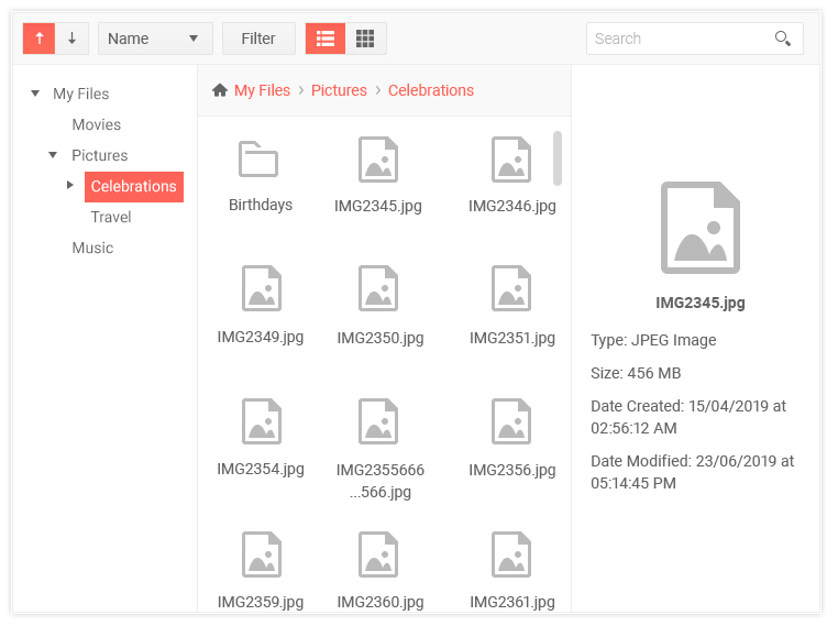
File Manager: list and grid views are swapped
As can be seen on the screenshot on https://www.telerik.com/support/whats-new/kendo-ui :
- actual behavior: active view is grid, but highlighted button is list
- expected behavior: active view and highlighted button match

2 comments
ADMIN
Dimitar
Posted on:
21 Jan 2020 08:01
Hello Anna,
Thank you for your feedback!
Indeed you are correct that the icons for the built-in GridView and ListView that are rendered in the Toolbar of the FileManager should be swapped. I have linked this bug report to a GitHub item and already committed a fix for the issue:
After the testing process is completed successfully, and provided that everything works correctly, the fix will become available in the next Service Pack.
I have also updated your Telerik Points as a small token of gratitude for reporting this issue.
Regards,
Dimitar
Progress Telerik
Get quickly onboarded and successful with your Telerik and/or Kendo UI products with the Virtual Classroom free technical training, available to all active customers. Learn More.
Anna
Posted on:
16 Jan 2020 16:40
The source of the confusion comes from this:
- the first view has one-dimensional data, it's technically a list, but the visual layout is a two-dimensional grid of items
- the second view has two-dimensional data, a grid is used under the hood, but what the user sees a one-dimensional list of items.
Type
Status
- All
- Completed (2301)
- Declined (1301)
- Duplicated (80)
- In Development (3)
- Need More Info (42)
- Pending Review (2)
- Planned (11)
- Under Review (32)
- Unplanned (1799)
- Won't Fix (9)
Category
- All
- Kendo UI for jQuery
- ActionSheet
- AICodingAssistant
- AIPrompt
- AppBar
- ArcGauge
- AutoComplete
- Avatar
- Badge
- Barcode
- BottomNavigation
- Breadcrumb
- BulletChart
- Button
- ButtonGroup
- Calendar
- Captcha
- Card
- Chart
- Chart Wizard
- Chat
- Checkbox
- CheckBoxGroup
- Chip
- ChipList
- CircularGauge
- CircularProgressBar
- Collapsible
- ColorGradient
- ColorPalette
- ColorPicker
- ComboBox
- ContextMenu
- Data Source
- Date Picker
- DateInput
- DateRangePicker
- DateTimePicker
- Diagram
- Dialog
- DockManager
- Drag and Drop
- Drawer
- Drawing API
- DropDownButton
- DropDownList
- DropDownTree
- Editor
- Effects
- ExpansionPanel
- FileManager
- Filter
- FlatColorPicker
- FloatingActionButton
- Form
- Gantt
- Globalization
- Grid
- Heatmap
- Hierarchical Data Source
- ImageEditor
- InlineAIPrompt
- Licensing
- LinearGauge
- ListBox
- ListView
- Loader
- Map
- MaskedTextBox
- MediaPlayer
- Menu
- MultiColumnComboBox
- MultiSelect
- MultiViewCalendar
- MVVM
- Notification
- NumericTextBox
- OrgChart
- OTP Input
- Pager
- PanelBar
- PDFViewer
- PivotGrid
- PivotGridV2
- Popover
- Popup
- ProgressBar
- PromptBox
- PropertyGrid
- QRCode
- RadialGauge
- RadioButton
- RadioGroup
- RangeSlider
- Rating
- ResponsivePanel
- RippleContainer
- Sankey
- Scheduler
- ScrollView
- SegmentedControl
- Signature
- SkeletonContainer
- Slider
- SmartPasteButton
- Sortable
- SPA
- Sparkline
- SpeechToTextButton
- SplitButton
- Splitter
- Spreadsheet
- Stepper
- StockChart
- Switch
- TabStrip
- TaskBoard
- Templates
- TextArea
- TextBox
- TileLayout
- TimeDurationPicker
- Timeline
- TimePicker
- ToggleButton
- Toolbar
- Tooltip
- Touch
- TreeList
- TreeMap
- TreeView
- Upload
- Validator
- VS Code Extension
- Window
- Wizard
