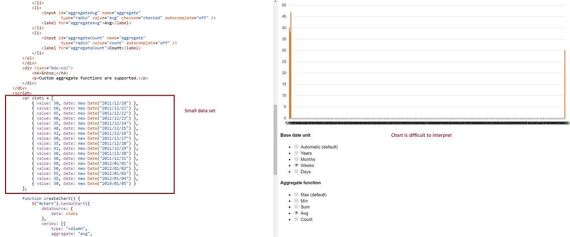
-- Problem: Consider a datasource where at least two date fields span a large time frame. We can build a chart that aggregates that data by small units (categoryAxis.baseUnits) such as 'days' or 'months'. That chart however contains many empty data points and the 'real' data is difficult to locate on the chart. This often requires zooming in and out many times to view the data one is looking for. However, it is still very valuable to be able to group by day or month, and to view this data in one succinct image.
-- Demo: The best way to experience this is to use the following Demo
https://dojo.telerik.com/eCILAMOB
This dojo is from the 'Date axis' chart demo on the demos.telerik.com site under Kendo UI for JQuery. Edit the example. There are 17 values in the datasource. Change the year on the last value to '2019'. All current values have dates between 2011-2012.
-- Required Chart Setup: Create a chart utilizing the following chart options
series.aggregate = 'avg'
categoryAxis.baseUnit = 'days'
dataSource with fields that contain at least one large date span
-- Suggestion
Add option to hide date aggregates chart points where no data exists within the datasource.
-- Image
You can consider the following options for handling this type of data with the currently available Chart features:
1. Use a category axis of type "category" instead of date:
https://dojo.telerik.com/eCILAMOB/3
When categories are treated as discrete values, no gap will be shown.
2. Use a StockChart with a navigator, which makes navigation through this data much easier for the user and still keeps the aggregates and scale of the data:
https://dojo.telerik.com/eCILAMOB/2
Regards,
Tsvetina
Progress Telerik
- All
- Completed (2301)
- Declined (1301)
- Duplicated (80)
- In Development (3)
- Need More Info (42)
- Pending Review (2)
- Planned (12)
- Under Review (32)
- Unplanned (1801)
- Won't Fix (9)
- All
- Kendo UI for jQuery
- ActionSheet
- AICodingAssistant
- AIPrompt
- AppBar
- ArcGauge
- AutoComplete
- Avatar
- Badge
- Barcode
- BottomNavigation
- Breadcrumb
- BulletChart
- Button
- ButtonGroup
- Calendar
- Captcha
- Card
- Chart
- Chart Wizard
- Chat
- Checkbox
- CheckBoxGroup
- Chip
- ChipList
- CircularGauge
- CircularProgressBar
- Collapsible
- ColorGradient
- ColorPalette
- ColorPicker
- ComboBox
- ContextMenu
- Data Source
- Date Picker
- DateInput
- DateRangePicker
- DateTimePicker
- Diagram
- Dialog
- DockManager
- Drag and Drop
- Drawer
- Drawing API
- DropDownButton
- DropDownList
- DropDownTree
- Editor
- Effects
- ExpansionPanel
- FileManager
- Filter
- FlatColorPicker
- FloatingActionButton
- Form
- Gantt
- Globalization
- Grid
- Heatmap
- Hierarchical Data Source
- ImageEditor
- InlineAIPrompt
- Licensing
- LinearGauge
- ListBox
- ListView
- Loader
- Map
- MaskedTextBox
- MediaPlayer
- Menu
- MultiColumnComboBox
- MultiSelect
- MultiViewCalendar
- MVVM
- Notification
- NumericTextBox
- OrgChart
- OTP Input
- Pager
- PanelBar
- PDFViewer
- PivotGrid
- PivotGridV2
- Popover
- Popup
- ProgressBar
- PromptBox
- PropertyGrid
- QRCode
- RadialGauge
- RadioButton
- RadioGroup
- RangeSlider
- Rating
- ResponsivePanel
- RippleContainer
- Sankey
- Scheduler
- ScrollView
- SegmentedControl
- Signature
- SkeletonContainer
- Slider
- SmartPasteButton
- Sortable
- SPA
- Sparkline
- SpeechToTextButton
- SplitButton
- Splitter
- Spreadsheet
- Stepper
- StockChart
- Switch
- TabStrip
- TaskBoard
- Templates
- TextArea
- TextBox
- TileLayout
- TimeDurationPicker
- Timeline
- TimePicker
- ToggleButton
- Toolbar
- Tooltip
- Touch
- TreeList
- TreeMap
- TreeView
- Upload
- Validator
- VS Code Extension
- Window
- Wizard

