I've encountered a tiny bug when it comes to styling AutoCompleteBox using StyleManager.
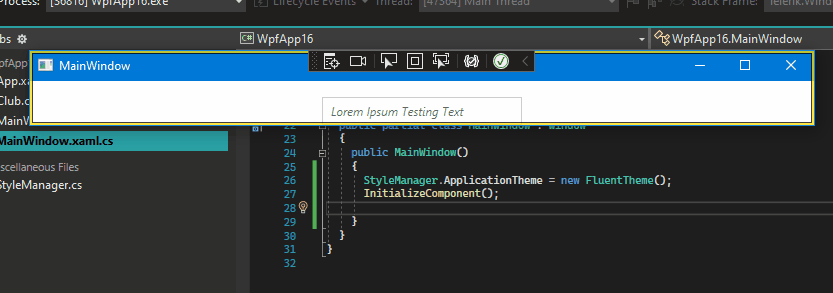
If I set the StyleManager.ApplicationTheme of my app, the styling is correct, see the reference gif:
But if I set the style of AutoCompleteBox during runtime with StyleManager.SetTheme, the styling is not quite right - the underlying RadWatermarkBox is using the basic style I believe, because the text doesn't change it opacity when I hover over it (in the case of watermark text) or when I defocus the element (in the case of real text).
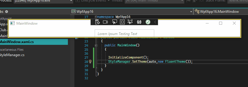
The example I'm using is just an empty WPF project with MainWindow.xaml having one RadAutoCompleteBox inside it, and MainWindow.xaml.cs is pictured in the gifs.
Best Regards,
Mateusz
Hello Mateusz,
I have further tested this scenario and we will consider this behavior a bug.
In addition, you could find your Telerik points updated, as a token of gratitude for bringing this to our attention.
Regards,
Stenly
Progress Telerik
Love the Telerik and Kendo UI products and believe more people should try them? Invite a fellow developer to become a Progress customer and each of you can get a $50 Amazon gift voucher.
Thank you for your answer. Will this work when I'm using Xaml binaries? (I cannot use NoXaml binaries)
Moreover, I don't want to change the theme at runtime - I am creating a new control at runtime and I want it to have only one theme - Fluent - from the beginning.
Best Regards,
Mateusz
Hello Mateusz,
Generally, switching themes at runtime is only fully supported by using implicit styles. Setting a theme at runtime by using the StyleManager theming approach, may lead to results similar to the one presented in the second gif that you have provided.
Additionally, using the implicit styles theming approach, you could still theme certain controls only, by modifying their MergedDictionaries collection.
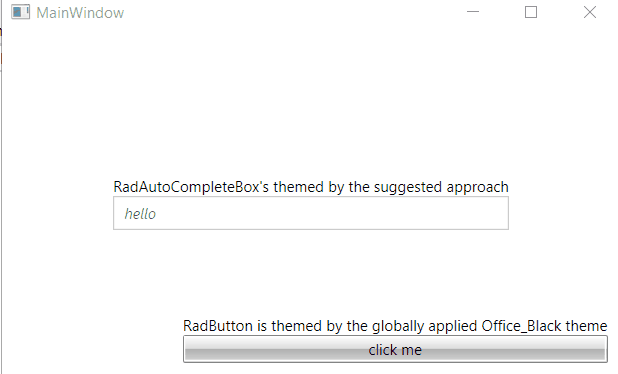
The following code snippet shows how to change the theme of the RadAutoCompleteBox element to Fluent when the global one is set to Office_Black:
public MainWindow()
{
    InitializeComponent();

    this.radAutoCompleteBox.Resources.MergedDictionaries.Clear();
    this.radAutoCompleteBox.Resources.MergedDictionaries.Add(new ResourceDictionary()
    {
        Source = new Uri("/Telerik.Windows.Themes.Fluent;component/Themes/System.Windows.xaml", UriKind.RelativeOrAbsolute)
    });
    this.radAutoCompleteBox.Resources.MergedDictionaries.Add(new ResourceDictionary()
    {
        Source = new Uri("/Telerik.Windows.Themes.Fluent;component/Themes/Telerik.Windows.Controls.xaml", UriKind.RelativeOrAbsolute)
    });
    this.radAutoCompleteBox.Resources.MergedDictionaries.Add(new ResourceDictionary()
    {
        Source = new Uri("/Telerik.Windows.Themes.Fluent;component/Themes/Telerik.Windows.Controls.Input.xaml", UriKind.RelativeOrAbsolute)
    });
}
The produced result is as follows (an example):
With this being said, I hope the provided information would be of help to you.
Regards,
Stenly
Progress Telerik
Love the Telerik and Kendo UI products and believe more people should try them? Invite a fellow developer to become a Progress customer and each of you can get a $50 Amazon gift voucher.
- All
- Completed (3551)
- Declined (776)
- Duplicated (58)
- In Development (2)
- Under Review (1)
- Unplanned (3210)
- Won't Fix (151)
- All
- UI for WPF
- AI Coding Assistant
- AIPrompt
- AutoCompleteBox
- AutoSuggestBox
- Badge
- Barcode
- BarcodeReader
- Book
- BreadCrumb
- BulletGraph
- BusyIndicator
- Buttons
- Calculator
- Calendar
- Callout
- CardView
- Carousel
- ChartView
- ChartView3D
- Chat
- CircularProgressBar
- CloudUpload
- CollectionNavigator
- ColorEditor
- ColorPicker
- ComboBox
- ContextMenu
- Data Virtualization
- DataBar
- DataFilter
- DataForm
- DataPager
- DataServiceDataSource
- DatePicker
- DateRangePicker
- DateTimePicker
- DesktopAlert
- Diagram
- Docking
- DragAndDropManager
- DragDropManager
- EntityFrameworkCoreDataSource
- EntityFrameworkDataSource
- Expander
- ExpressionEditor
- ExpressionParser
- FileDialogs
- FilePathPicker
- GanttView
- Gauge
- GridView
- HeatMap
- HighlightTextBlock
- ImageEditor
- Installer and VS Extensions
- LayoutControl
- Licensing
- ListBox
- Map
- MaskedInput
- Menu
- MultiColumnComboBox
- NavigationView
- NotifyIcon
- NumericUpDown
- OfficeNavigationBar
- OutlookBar
- PanelBar
- PasswordBox
- PDFViewer
- PersistenceFramework
- PipsPager
- PivotGrid
- ProgressBar
- PropertyGrid
- RadialMenu
- Rating
- RibbonView
- RichTextBox
- ScheduleView
- Slider
- SlideView
- Sparkline
- SpellChecker
- SplashScreen
- Spreadsheet
- StepProgressBar
- SvgImage
- SyntaxEditor
- TabbedWindow
- TabControl
- TaskBoard
- TileList
- TileView
- TimeBar
- TimeLine
- TimePicker
- TimeSpanPicker
- ToolBar
- ToolTip
- TouchManager
- TransitionControl
- TreeListView
- TreeMap and PivotMap
- TreeView
- VirtualGrid
- VirtualizingWrapPanel
- VirtualKeyboard
- WatermarkTextBox
- WebCam
- Window
- Wizard