Hi Team,
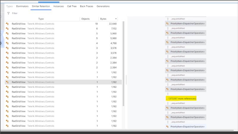
We have a large-scale WPF application that uses the Telerik WPF RadGridView across multiple screens. We are experiencing significant memory growth issues. Upon deep analysis of the memory dump, we observed that the RadGridView continuously pushes DispatcherPriority items into the Dispatcher queue. We also noticed an internal timer within the RadGridView that appears to be active even after the control is no longer visible. We would like to understand how to completely detach and stop this internal timer once the control is removed from the screen, and why the RadGridView keeps pushing DispatcherItem entries into the Dispatcher queue.
Telerik Version : 2017.2.503.45
The bug happens when we have two or more rows merged in the first column and programmatically, we make the rowDetails for the first row visible, the merged cells of the first column stay merged and are over of the rowDetails, hiding a part of the Row Details:
Custom column is defined in code with IsReadOnly False.
Runtime, user edits a cell from the column and then scrolls horizontally - this leads to UI freeze, endlessly.
Bind a grid to a DataView
Start editing and change the values of a few cells.
Press Escape twice to cancel the edit of the entire row.
Expected: the values return to the old values
Actual: the values remain the last entered ones
When using an INotifyCollectionChanged (like ObservableCollection<T>), RadGridView's data engine subscribes to the CollectionChanged event of the bound collection.
It seems that the WPF views are recreated when you connect to a running remote desktop session or switch the user to a session where the corresponding WPF app is already opened. This creates new instances of all controls, but no unload or another disposal event happens. In this case, the logic that subscribes to the CollectionChanged event again is triggered for the new RadGridView, but the old one never detaches from the event. This causes a memory leak.
If you connect to the session multiple times, the CollectionChanged handler will be attached multiple times leading to a memory leak.
To work this around, set the ItemsSource of RadGridView to null in the SystemEvents.SessionChanged static event.
private void SystemEvents_SessionSwitch(object sender, SessionSwitchEventArgs e)
{
    if (e.Reason == SessionSwitchReason.SessionLock)
    {
        BindingOperations.ClearAllBindings(this.RadGridViewFixed);
    }
}
The following exception is raised when adding a ColumnGroupDescriptor to the GroupDescriptors property of a RadGridView. This bug is data specific and I've only been able to duplicate it with a large data set but the issue seems like it could be addressed without the actual data, given that the code causing the issue is apparently passing a pixelWidth < 0.
System.ArgumentOutOfRangeException: 'The parameter value must be greater than zero.
Parameter name: pixelWidth'
Telerik.Windows.Controls.dll!Telerik.Windows.Controls.FrameworkElementToImageConverter.ToImage(System.Windows.FrameworkElement element) Unknown
Telerik.Windows.Controls.GridView.dll!Telerik.Windows.Controls.GridView.GridViewGroupPanel.ConvertFrameworkElementToImage(System.Windows.FrameworkElement frameworkElement) Unknown
Telerik.Windows.Controls.GridView.dll!Telerik.Windows.Controls.GridView.GridViewGroupPanel.GetEffectiveContentForDescriptor(Telerik.Windows.Data.IGroupDescriptor descriptor) Unknown
Telerik.Windows.Controls.GridView.dll!Telerik.Windows.Controls.GridView.GridViewGroupPanel.PrepareContainerForItemOverride(System.Windows.DependencyObject element, object item) Unknown
PresentationFramework.dll!System.Windows.Controls.ItemsControl.MS.Internal.Controls.IGeneratorHost.PrepareItemContainer(System.Windows.DependencyObject container, object item) Unknown
PresentationFramework.dll!System.Windows.Controls.Panel.AddChildren(System.Windows.Controls.Primitives.GeneratorPosition pos, int itemCount) Unknown
PresentationFramework.dll!System.Windows.Controls.Panel.OnItemsChangedInternal(object sender, System.Windows.Controls.Primitives.ItemsChangedEventArgs args) Unknown
PresentationFramework.dll!System.Windows.Controls.Panel.OnItemsChanged(object sender, System.Windows.Controls.Primitives.ItemsChangedEventArgs args) Unknown
PresentationFramework.dll!System.Windows.Controls.ItemContainerGenerator.OnItemAdded(object item, int index, System.Collections.Specialized.NotifyCollectionChangedEventArgs collectionChangedArgs) Unknown
PresentationFramework.dll!System.Windows.Controls.ItemContainerGenerator.OnCollectionChanged(object sender, System.Collections.Specialized.NotifyCollectionChangedEventArgs args) Unknown
WindowsBase.dll!System.Windows.WeakEventManager.ListenerList<System.Collections.Specialized.NotifyCollectionChangedEventArgs>.DeliverEvent(object sender, System.EventArgs e, System.Type managerType) Unknown
WindowsBase.dll!System.Windows.WeakEventManager.DeliverEvent(object sender, System.EventArgs args) Unknown
PresentationFramework.dll!System.Windows.Data.CollectionView.OnCollectionChanged(System.Collections.Specialized.NotifyCollectionChangedEventArgs args) Unknown
PresentationFramework.dll!System.Windows.Data.ListCollectionView.ProcessCollectionChangedWithAdjustedIndex(System.Collections.Specialized.NotifyCollectionChangedEventArgs args, int adjustedOldIndex, int adjustedNewIndex) Unknown
System.dll!System.Collections.ObjectModel.ObservableCollection<System.__Canon>.OnCollectionChanged(System.Collections.Specialized.NotifyCollectionChangedEventArgs e) Unknown
Telerik.Windows.Data.dll!Telerik.Windows.Data.ObservableItemCollection<Telerik.Windows.Data.IGroupDescriptor>.OnCollectionChanged(System.Collections.Specialized.NotifyCollectionChangedEventArgs e) Unknown
System.dll!System.Collections.ObjectModel.ObservableCollection<System.__Canon>.InsertItem(int index, System.__Canon item) Unknown
> Sage.Platform.Core.Wpf.dll!Sage.EstDataSource.Wpf.RadGridViewSerializer.DeserializeGroupDescriptors(Telerik.Windows.Controls.GridView.GridViewDataControl grid, Sage.Wpf.Utilities.GridViewSerializationInfo serializationInfo) Line 524 C#
Sage.Platform.Core.Wpf.dll!Sage.EstDataSource.Wpf.RadGridViewSerializer.DeserializeGridInfo(Telerik.Windows.Controls.GridView.GridViewDataControl grid, System.Func<string, bool> isRenamableColumn, System.Xml.XmlReader reader, bool skipDeserializeGroups) Line 235 C#
Sage.Platform.Core.Wpf.dll!Sage.EstDataSource.Wpf.RadGridViewSerializer.DeserializeGridSettings(Telerik.Windows.Controls.GridView.GridViewDataControl grid, System.Func<string, bool> isRenamableColumn, System.IO.Stream stream, bool skipDeserializeGroups) Line 199 C#
Sage.Platform.Core.Wpf.dll!Sage.EstDataSource.Wpf.RadGridViewSerializer.DeserializeGridSettings(Telerik.Windows.Controls.GridView.GridViewDataControl grid, System.Func<string, bool> isRenamableColumn, System.IO.Stream stream) Line 168 C#
Sage.Estimating.DataSource.Wpf.dll!Sage.EstDataSource.Wpf.ViewModel.EstimateDB.EstimateGridViewModel.DeserializeLayoutGridInfo(Telerik.Windows.Controls.RadGridView dataGrid, System.IO.MemoryStream stream) Line 122 C#
Sage.Estimating.DataSource.Wpf.dll!Sage.EstDataSource.Wpf.ViewModel.EstimateDB.EstimateGridViewModel.DeserializeCurrentLayoutGridInfo(Telerik.Windows.Controls.RadGridView dataGrid, System.IO.MemoryStream defaultLayoutStream) Line 257 C#
Sage.Estimating.DataSource.Wpf.dll!Sage.EstDataSource.Wpf.View.EstimateDB.EstimateGrid.ApplyCurrentLayoutToGrid() Line 210 C#
Sage.Estimating.DataSource.Wpf.dll!Sage.EstDataSource.Wpf.View.EstimateDB.EstimateGrid.EstimateInfoGrid_Loaded(object sender, System.Windows.RoutedEventArgs e) Line 167 C#
PresentationCore.dll!System.Windows.EventRoute.InvokeHandlersImpl(object source, System.Windows.RoutedEventArgs args, bool reRaised) Unknown
PresentationCore.dll!System.Windows.UIElement.RaiseEventImpl(System.Windows.DependencyObject sender, System.Windows.RoutedEventArgs args) Unknown
PresentationFramework.dll!System.Windows.BroadcastEventHelper.BroadcastEvent(System.Windows.DependencyObject root, System.Windows.RoutedEvent routedEvent) Unknown
PresentationFramework.dll!System.Windows.BroadcastEventHelper.BroadcastLoadedEvent(object root) Unknown
PresentationCore.dll!MS.Internal.LoadedOrUnloadedOperation.DoWork() Unknown
PresentationCore.dll!System.Windows.Media.MediaContext.FireLoadedPendingCallbacks() Unknown
PresentationCore.dll!System.Windows.Media.MediaContext.FireInvokeOnRenderCallbacks() Unknown
PresentationCore.dll!System.Windows.Media.MediaContext.RenderMessageHandlerCore(object resizedCompositionTarget) Unknown
PresentationCore.dll!System.Windows.Media.MediaContext.RenderMessageHandler(object resizedCompositionTarget) Unknown
WindowsBase.dll!System.Windows.Threading.ExceptionWrapper.InternalRealCall(System.Delegate callback, object args, int numArgs) Unknown
WindowsBase.dll!System.Windows.Threading.ExceptionWrapper.TryCatchWhen(object source, System.Delegate callback, object args, int numArgs, System.Delegate catchHandler) Unknown
WindowsBase.dll!System.Windows.Threading.DispatcherOperation.InvokeImpl() Unknown
WindowsBase.dll!MS.Internal.CulturePreservingExecutionContext.CallbackWrapper(object obj) Unknown
mscorlib.dll!System.Threading.ExecutionContext.RunInternal(System.Threading.ExecutionContext executionContext, System.Threading.ContextCallback callback, object state, bool preserveSyncCtx) Unknown
mscorlib.dll!System.Threading.ExecutionContext.Run(System.Threading.ExecutionContext executionContext, System.Threading.ContextCallback callback, object state, bool preserveSyncCtx) Unknown
mscorlib.dll!System.Threading.ExecutionContext.Run(System.Threading.ExecutionContext executionContext, System.Threading.ContextCallback callback, object state) Unknown
WindowsBase.dll!MS.Internal.CulturePreservingExecutionContext.Run(MS.Internal.CulturePreservingExecutionContext executionContext, System.Threading.ContextCallback callback, object state) Unknown
WindowsBase.dll!System.Windows.Threading.DispatcherOperation.Invoke() Unknown
WindowsBase.dll!System.Windows.Threading.Dispatcher.ProcessQueue() Unknown
WindowsBase.dll!System.Windows.Threading.Dispatcher.WndProcHook(System.IntPtr hwnd, int msg, System.IntPtr wParam, System.IntPtr lParam, ref bool handled) Unknown
WindowsBase.dll!MS.Win32.HwndWrapper.WndProc(System.IntPtr hwnd, int msg, System.IntPtr wParam, System.IntPtr lParam, ref bool handled) Unknown
WindowsBase.dll!MS.Win32.HwndSubclass.DispatcherCallbackOperation(object o) Unknown
WindowsBase.dll!System.Windows.Threading.ExceptionWrapper.InternalRealCall(System.Delegate callback, object args, int numArgs) Unknown
WindowsBase.dll!System.Windows.Threading.ExceptionWrapper.TryCatchWhen(object source, System.Delegate callback, object args, int numArgs, System.Delegate catchHandler) Unknown
WindowsBase.dll!System.Windows.Threading.Dispatcher.LegacyInvokeImpl(System.Windows.Threading.DispatcherPriority priority, System.TimeSpan timeout, System.Delegate method, object args, int numArgs) Unknown
WindowsBase.dll!MS.Win32.HwndSubclass.SubclassWndProc(System.IntPtr hwnd, int msg, System.IntPtr wParam, System.IntPtr lParam) Unknown
[Native to Managed Transition]
[Managed to Native Transition]
WindowsBase.dll!System.Windows.Threading.Dispatcher.PushFrameImpl(System.Windows.Threading.DispatcherFrame frame) Unknown
PresentationFramework.dll!System.Windows.Application.RunDispatcher(object ignore) Unknown
PresentationFramework.dll!System.Windows.Application.RunInternal(System.Windows.Window window) Unknown
Sage.EstManagementConsole.exe!Sage.EstManagementConsole.EstimatingManagementConsoleApp.Main() Unknown
The vertical scrolling seems to become very slow and even unresponsive, when the following conditions are met:
- left and right frozen columns count is 0
- the summary width of all columns is smaller than the width of the RadGridView element
To minimize the issue, you can set the GroupRenderMode property of RadGridView to Nested.
Exception when resizing column with width set to star and min-width set to 0.
Set the properties to the above and resize a column to 0 and then to the original width -> an exception occurs.
The RadGridView control hangs when the frozen columns are enabled and the application is resized. The exact resizing depends on the screen resolution and the exact new size. This was originally recreated on a monitor with 1600x900 resolution 125% DPI and the application was maximized (resized from restored to full screen size). The issue occurs in the Fluent theme. Also, the FluentPalette.Palette.ScrollBarsMode static property should be set to Normal.
To work this around, you can overrider the MeasureOverride method of RadGridView and add the following code:
public class CustomGridView: RadGridView
{
    private static readonly PropertyInfo internalColumnsProp = typeof(GridViewDataControl).GetProperty("InternalColumns", BindingFlags.Instance | BindingFlags.NonPublic);
    private static MethodInfo invalidateColumnsMethod;

    protected override Size MeasureOverride(Size availableSize)
    {
        if (EnableRowVirtualization && !double.IsInfinity(availableSize.Height))
        {
            var internalColumns = internalColumnsProp.GetValue(this);
            if (invalidateColumnsMethod == null)
            {
                invalidateColumnsMethod = internalColumns.GetType().GetMethod("InvalidateColumnWidthsCalculation", BindingFlags.Instance | BindingFlags.NonPublic);
            }

            invalidateColumnsMethod.Invoke(internalColumns, null);
        }
        return base.MeasureOverride(availableSize);
    }