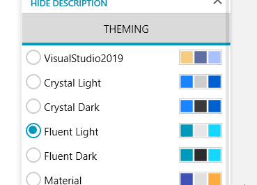
The check mark of the RadioButton is misaligned when DPI settings are set to a higher than the default value, e.g. 125%.
The problem can easily be reproduced using the Telerik UI for WPF Demo application:
Hello,
This item's status will be changed to Won't Fix. We investigated the behavior profoundly and came to the conclusion that it is framework related and can also be reproduced without applying any Telerik theme and its styles for the RadioButton at all (tested on 125 and 150 %). The main reason for this behavior is the size of the ellipses inside the template - there appears to be no suitable value that renders properly on higher scaling sizes. A possible workaround is to rework the style with sizes that match the desired scaling size of your WPF application. Do not hesitate to contact us in case you need help with that.
Regards,
Vicky
Progress Telerik
Virtual Classroom, the free self-paced technical training that gets you up to speed with Telerik and Kendo UI products quickly just got a fresh new look + new and improved content including a brand new Blazor course! Check it out at https://learn.telerik.com/.
- All
- Completed (3512)
- Declined (772)
- Duplicated (58)
- In Development (18)
- Need More Info (1)
- Under Review (2)
- Unplanned (3214)
- Won't Fix (151)
- All
- UI for WPF
- AI Coding Assistant
- AIPrompt
- AutoCompleteBox
- AutoSuggestBox
- Badge
- Barcode
- BarcodeReader
- Book
- BreadCrumb
- BulletGraph
- BusyIndicator
- Buttons
- Calculator
- Calendar
- Callout
- CardView
- Carousel
- ChartView
- ChartView3D
- Chat
- CircularProgressBar
- CloudUpload
- CollectionNavigator
- ColorEditor
- ColorPicker
- ComboBox
- ContextMenu
- Data Virtualization
- DataBar
- DataFilter
- DataForm
- DataPager
- DataServiceDataSource
- DatePicker
- DateRangePicker
- DateTimePicker
- DesktopAlert
- Diagram
- Docking
- DragAndDropManager
- DragDropManager
- EntityFrameworkCoreDataSource
- EntityFrameworkDataSource
- Expander
- ExpressionEditor
- ExpressionParser
- FileDialogs
- FilePathPicker
- GanttView
- Gauge
- GridView
- HeatMap
- HighlightTextBlock
- ImageEditor
- Installer and VS Extensions
- LayoutControl
- Licensing
- ListBox
- Map
- MaskedInput
- Menu
- MultiColumnComboBox
- NavigationView
- NotifyIcon
- NumericUpDown
- OfficeNavigationBar
- OutlookBar
- PanelBar
- PasswordBox
- PDFViewer
- PersistenceFramework
- PipsPager
- PivotGrid
- ProgressBar
- PropertyGrid
- RadialMenu
- Rating
- RibbonView
- RichTextBox
- ScheduleView
- Slider
- SlideView
- Sparkline
- SpellChecker
- SplashScreen
- Spreadsheet
- StepProgressBar
- SvgImage
- SyntaxEditor
- TabbedWindow
- TabControl
- TaskBoard
- TileList
- TileView
- TimeBar
- TimeLine
- TimePicker
- TimeSpanPicker
- ToolBar
- ToolTip
- TouchManager
- TransitionControl
- TreeListView
- TreeMap and PivotMap
- TreeView
- VirtualGrid
- VirtualizingWrapPanel
- VirtualKeyboard
- WatermarkTextBox
- WebCam
- Window
- Wizard

