Completed
Last Updated: 24 Sep 2020 08:18 by ADMIN
Lee
Created on: 31 Aug 2020 18:45
Category: Grid
Type: Feature Request
1
Ability to specify column width with units besides pixels

Currently in the Vue Native grid, you can only specify column widths in pixels.

This becomes problematic if the user has their browser font size set to a larger size. Since our font size, padding, etc. are using responsive rem units for sizing, they properly resize to a larger size, but since the column widths are set in pixels, the now larger filter fields and buttons don't fit appropriately in the alloted space (see below screenshot). For smaller columns, you can't even see what you've typed into the filter field.

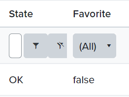
In the screenshot, the larger font size was set in Google Chrome by going to Settings > Appearance > Font size > Very Large.

This enhancement would be helpful to ensure improved accessibility for those who need a larger font size in order to read the text.


3 comments
ADMIN
Plamen
Posted on: 15 Sep 2020 10:45

Hello,

If the grid is not scrollable and has no width specified and it resizes based on the available space. In such case the width of the column can be set in percentage using CSS or with rem or em. Here is the example with the percentage - https://stackblitz.com/edit/u3ya25-q7xbwa?file=index.html

Regards,
Plamen
Progress Telerik

Virtual Classroom, the free self-paced technical training that gets you up to speed with Telerik and Kendo UI products quickly just got a fresh new look + new and improved content including a brand new Blazor course! Check it out at https://learn.telerik.com/.

Lee
Posted on: 08 Sep 2020 12:50
Thanks for the reply, Plamen. However, this isn't the issue I'm trying to solve. I'm not looking to set columns as a percentage; I want to set them as either em or rem units so that the column sizes scale with the text size. Thanks!
ADMIN
Plamen
Posted on: 07 Sep 2020 04:53

Hi,

In cases when we need to set the width of the columns in percentage we recommend to calculate their with as for example it is done in this example where we set the width depending on the width of the wrapping div and change it on window resize - https://stackblitz.com/edit/u3ya25-habzyz?file=index.js

Hope this information will be helpful. If you have further questions please let me know.

Regards,
Plamen
Progress Telerik

Virtual Classroom, the free self-paced technical training that gets you up to speed with Telerik and Kendo UI products quickly just got a fresh new look + new and improved content including a brand new Blazor course! Check it out at https://learn.telerik.com/.