Describe the bug
The event parameter available in the event handler of the TreeViewCheckChangeEvent has an incorrect type of TreeViewExpandChangeEvent while it should be TreeViewCheckChangeEvent.
The TreeView Wrapper component provides the autoScroll property that allows the out-of-the-box scrolling of component items when performing drag-and-drop operations.
Please provide the autoScroll property inside the Native TreeView component.
Describe the bug
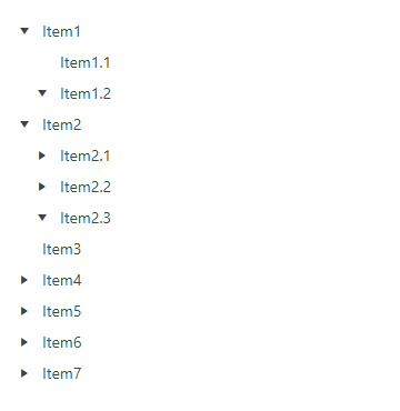
When we have a multi-level nesting in the data loaded in the Native TreeView the parent nodes that are below level0 are not displayed correctly when set as expanded.
Sample TreeView structure
|-Level0
-|-Level1
--|-Level2
---|-Level3
- The issue is replicable when the "animate" prop of the component is set to "true". If "animate" is set to "false", the TreeView is displaying all its nodes as expected.
- The issue is replicable when the processTreeViewItems method is used. If the TreeView is directly bound to an array, the component is working correctly. See this example.
To Reproduce
Steps to reproduce the behavior:
- Open this StackBlitz project
- See nodes "Item1.2" and "Item2.3"
Expected behavior
The "Item1.2" and "Item2.3" nodes should be expanded and their child nodes should be displayed by default as in this example.
The current implementation of the Native TreeView doesn't allow you to customize the expand/collapse arrows of the component.
Can you please provide a property that allows the definition of a custom class for a given TreeView group? Being able to define such a class, using CSS we can easily control the look of the different elements of each TreeView group.


