Add active class to the column menu icon once something in it is different from default
Currently we recommend using custom class on the header(https://www.telerik.com/kendo-vue-ui/components/grid/columns/column-menu/#toc-styling-the-column-menu-icon), yet not visualising that the menu is populated seems like a UI misleading issue when using the component so we should add it by default
Describe the bug
at Nuxt Environment
- pagable info option doesn't render information about the current page and the total number of records (both of setting true / false, all)
- set pageable info option false, error raise like this.
To Reproduce
- https://stackblitz.com/edit/nuxt-starter-mcocsr
Expected behavior
- render information about the current page and the total number of records
- do not error raise
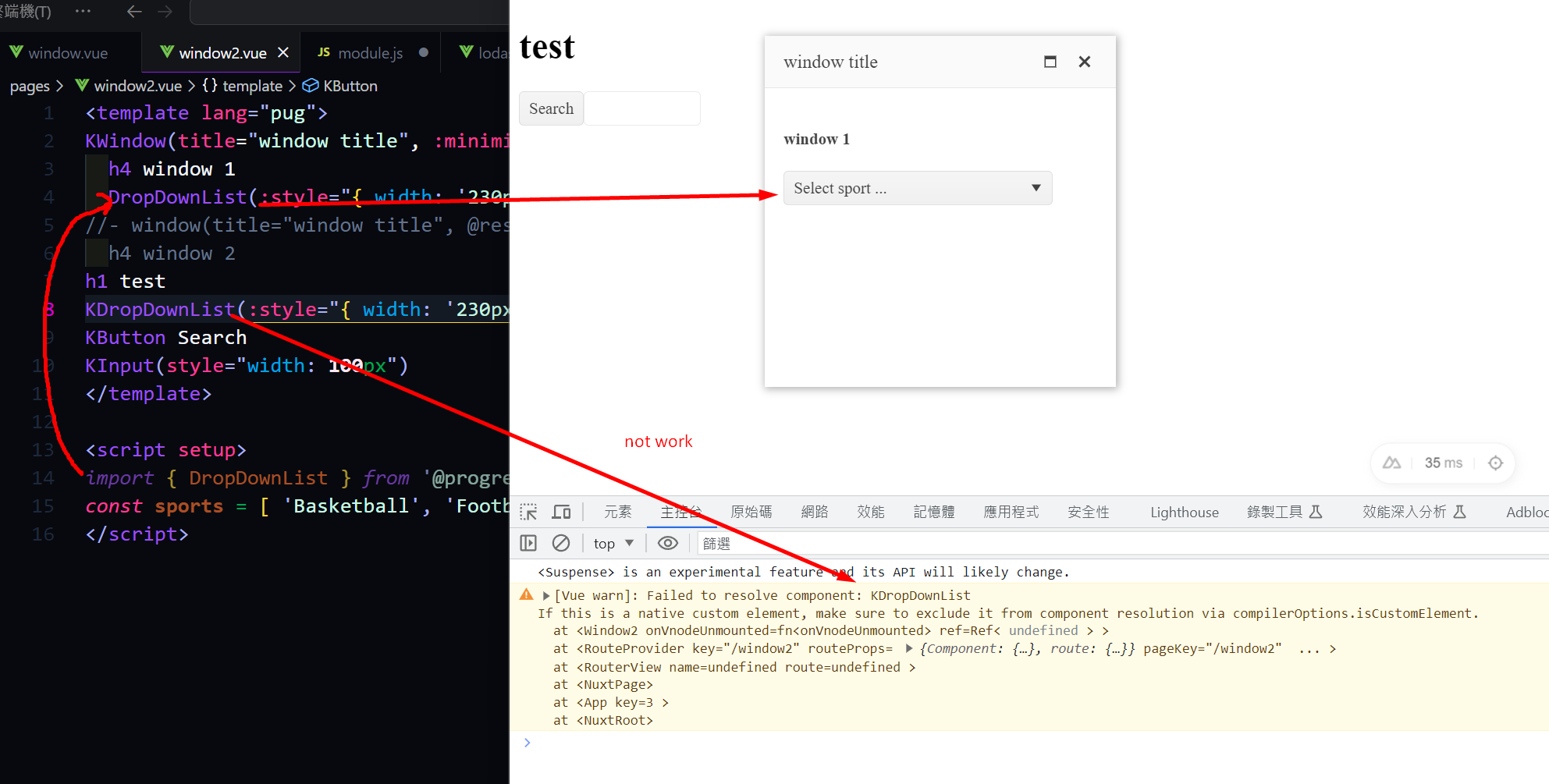
Nuxt 3 has a robust module system, which is highly beneficial for importing components easily. I have previously used modules like element-plus, headlessUI, and Vuetify. However, as we are currently transitioning to Kendo UI, we have encountered difficulties in finding a similar module. It is essential for us to be able to import Kendo UI components seamlessly and efficiently. Therefore, we have developed a module similar to the one for element-plus. During the process of writing and testing the code, everything has fallen into place. However, we have encountered an issue with importing the UI DropDownList from the module. It would be greatly appreciated if Kendo UI could provide an official Nuxt 3 module.
out test module
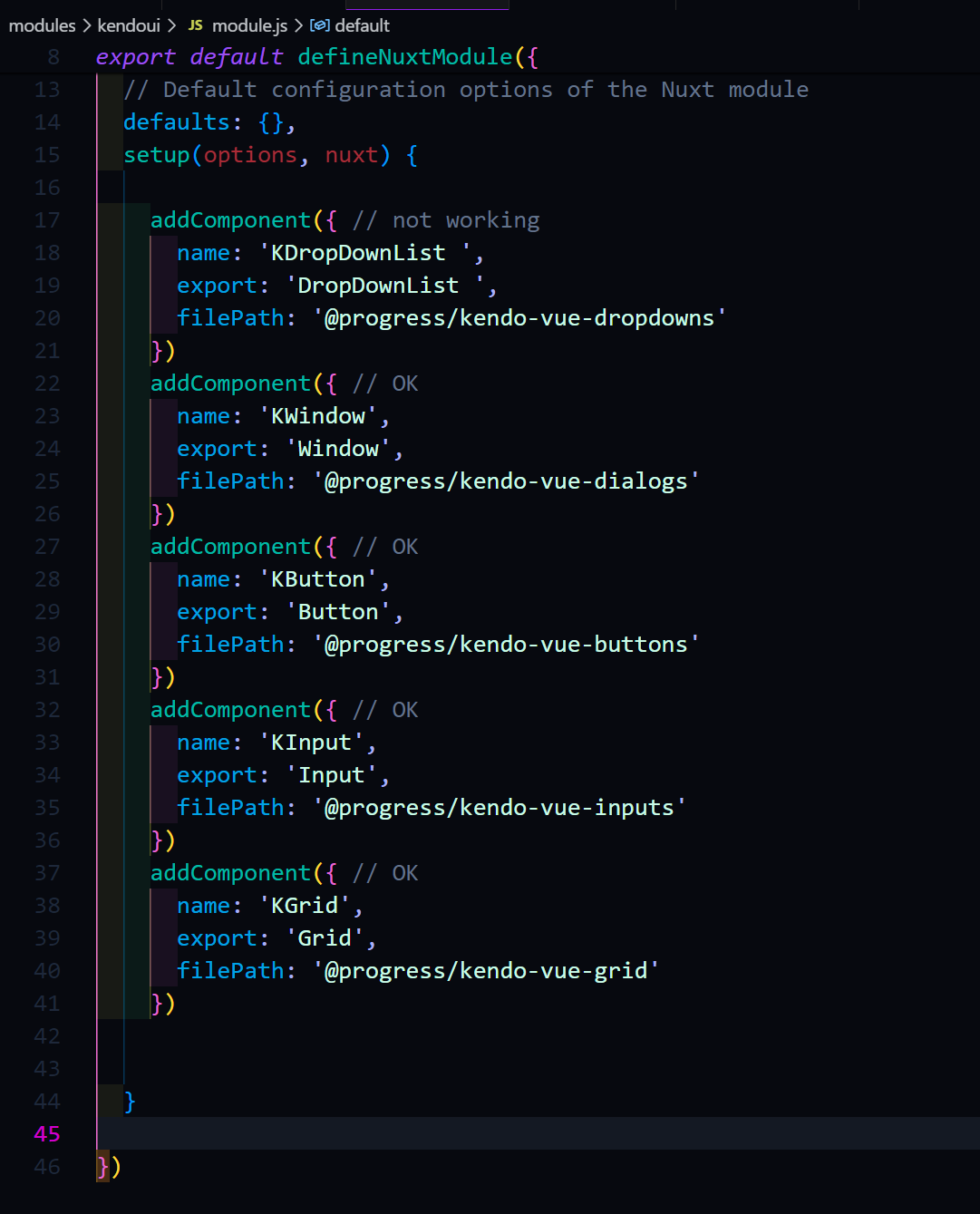
KDropDownList not work but else compoents work good.
Describe the bug
multiple false still allows more than one files dropped on windows
To Reproduce
https://stackblitz.com/edit/gvptz7-ltakhv?file=src%2Fmain.vue
Drop more than one file on windows
Expected behavior
it should not be allowed
Describe the bug
Locked and resized columns leave a small gap between the columns when scrolling is performed
To Reproduce
Steps to reproduce the behavior:
https://stackblitz.com/edit/mzxqs7-hy29kw?file=src%2Fmain.vue
lock both first and the second column from the column menu
resize the first column
scroll the columns
Curent -
A tiny gap is visible between the first and the second column

Currently, the Kendo UI for Vue Native DropDownList doesn't have the valuePrimitive property which is available in the:
- Angular DropDownList - https://www.telerik.com/kendo-angular-ui/components/dropdowns/api/DropDownListComponent/#toc-valueprimitive
- and the jQuery DropDownList - https://docs.telerik.com/kendo-ui/api/javascript/ui/dropdownlist/configuration/valueprimitive
Providing such property for the Native Vue DropDownList will be useful in different use-case scenarios.
Currently, the Chip component provides the option to add an image to it by using a CSS class whose background-color property has a value of the image we want to be displayed in the Chip.
While the above works in a scenario with a smaller number of Chips, where the values of the Chips are pre-defined, this approach can't be used when we have dynamic data that holds different URL links. To be able to pass an image URL to the Chip component one of the following can be implemented:
- Option 1: Add an option to define a custom template for the Chip component
- Option 2: Provide a Chip property to which the image URL can be passed and the component will handle the correct visualization
I’ve encountered an issue when using the KendoUI Grid component inside a dialog. When I try to open the column menu, it opens briefly and immediately closes itself, making it unusable.
This behavior seems to be related to a conflict with the UI component library I’m using (Ark UI). However, since the Grid’s source code is not open source, it’s difficult to pinpoint exactly where the issue originates or where a patch could be applied.
Reproduction:
Here is a minimal reproduction on StackBlitz: https://stackblitz.com/edit/rmldf7vs?file=src%2Fmain.vue
Expected Behavior:
When clicking the column menu button, the menu should remain open, allowing the user to interact with it.
Actual Behavior:
The column menu opens and instantly closes, without any interaction.
Notes:
- The issue only appears when the Grid is rendered inside a dialog.
- It might be related to focus/blur or click outside detection behavior conflicting between Kendo and Ark UI.
- Tested with the latest version of @progress/kendo-vue-grid.
Let me know if any additional details are needed!
Thanks!
We are requesting the implementation of external source drag and drop functionality for the Kendo UI Native Vue Scheduler component (@progress/kendo-vue-scheduler). This feature enables users to drag items from an external list or container — such as a task panel or resource list — and drop them onto Scheduler time slots to create new events.
vue- ^3.5.34
@progress/kendo-vue scheduler - ^8.3.0
@progress/kendo-theme default - 14.0
@progress/kendo licensing- latest
It would be beneficial for Kendo UI for Vue Grid columns to provide a built-in option for text truncation with ellipsis and an optional tooltip for overflow content
Like below dropdown tree, AutoComplete also need to support tree view.
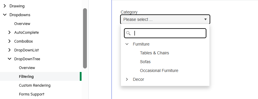
If we use dropdown tree, it's extra step to search or filter, so we add a feature of tree view for AutoComplete is good.
A dedicated column picker would be far more intuitive: its discoverability is higher, and features like the indeterminate ‘select all’ checkbox and instant search align with the law of approximation.
For our users handling large datasets, this makes for a much faster, more cohesive tool.
1. You have documentation, eg at https://www.telerik.com/kendo-vue-ui/components/charts/sparkline
2. Type "sparkline" into the search box on your own website
3. No results are returned.
This used to work. You pushed a change which broke your site's search functionality.
.png)
It's great to see MCP servers now available for Angular, React, and Blazor. Any plans to add support for Kendo UI for Vue as well?
We use Kendo UI for Vue in production, and having MCP support would really improve AI-assisted development, component discovery, and overall DX. It would also help keep feature parity across the Kendo ecosystem.
Would love to see Vue.js included.
Thanks!
Pete
Describe the bug
The rowReorder event is missing in the Wrapper Grid component, while it is available in the Kendo UI for jQuery Grid. Currently, the only way the event can be used is by using a code like the below in the mounted hook of the Vue app:
    var grid = this.$refs.grid.kendoWidget();
    grid.bind('rowReorder', function (e) {
      console.log('row', e);
    });
Expected behavior
The rowReorder event should be available for usage as the other events of the Wrapper Grid
Currently in Vue we don't provide the ability to share with the customers the source code before the compilation but just the already compiled code.
We need to provide the ability to fork the repository and build components from the Vue repository similarly to the way it is done in Angular and React.
I am using Kendo Vue Wrapper Grid that is editable. I am using the propery
:editable-create-at="bottom"
but the new rows are always added at the top.
There is another open issue related to this.
https://github.com/telerik/kendo-ui-core/issues/5198
Please provide a fix.
The jquery grid has the aria-label and title populated with the column name. I think it'd be even more useful if the label said "Filter by {columnName}".