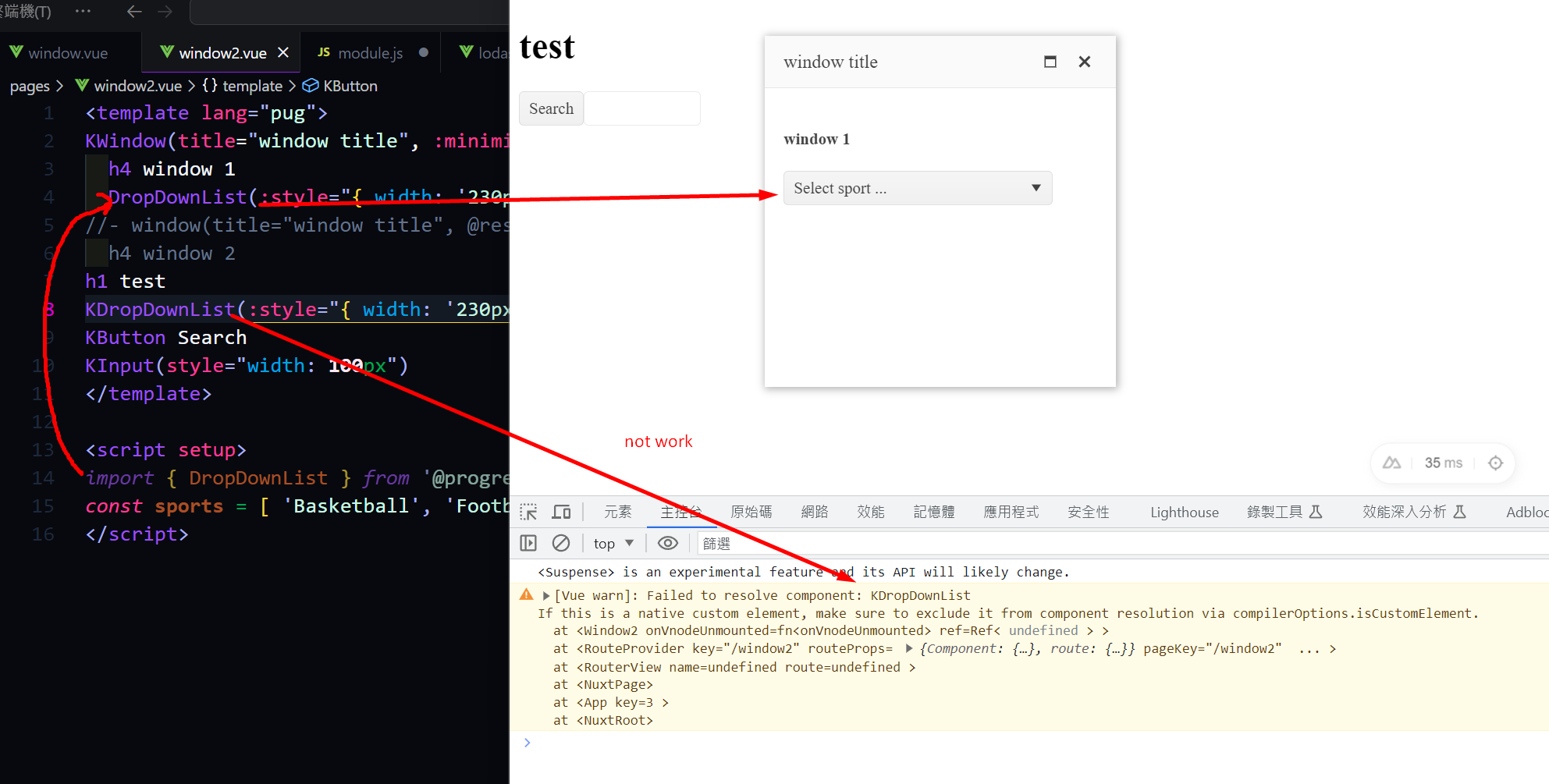
Nuxt 3 has a robust module system, which is highly beneficial for importing components easily. I have previously used modules like element-plus, headlessUI, and Vuetify. However, as we are currently transitioning to Kendo UI, we have encountered difficulties in finding a similar module. It is essential for us to be able to import Kendo UI components seamlessly and efficiently. Therefore, we have developed a module similar to the one for element-plus. During the process of writing and testing the code, everything has fallen into place. However, we have encountered an issue with importing the UI DropDownList from the module. It would be greatly appreciated if Kendo UI could provide an official Nuxt 3 module.
out test module
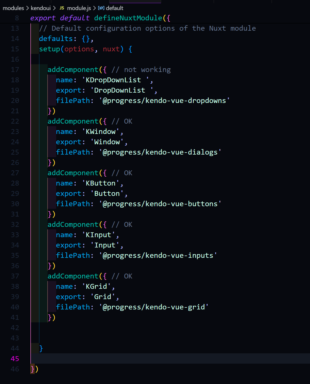
KDropDownList not work but else compoents work good.
Describe the bug
multiple false still allows more than one files dropped on windows
To Reproduce
https://stackblitz.com/edit/gvptz7-ltakhv?file=src%2Fmain.vue
Drop more than one file on windows
Expected behavior
it should not be allowed
Describe the bug
Locked and resized columns leave a small gap between the columns when scrolling is performed
To Reproduce
Steps to reproduce the behavior:
https://stackblitz.com/edit/mzxqs7-hy29kw?file=src%2Fmain.vue
lock both first and the second column from the column menu
resize the first column
scroll the columns
Curent -
A tiny gap is visible between the first and the second column

We are requesting the implementation of external source drag and drop functionality for the Kendo UI Native Vue Scheduler component (@progress/kendo-vue-scheduler). This feature enables users to drag items from an external list or container — such as a task panel or resource list — and drop them onto Scheduler time slots to create new events.
vue- ^3.5.34
@progress/kendo-vue scheduler - ^8.3.0
@progress/kendo-theme default - 14.0
@progress/kendo licensing- latest
It would be beneficial for Kendo UI for Vue Grid columns to provide a built-in option for text truncation with ellipsis and an optional tooltip for overflow content
Like below dropdown tree, AutoComplete also need to support tree view.
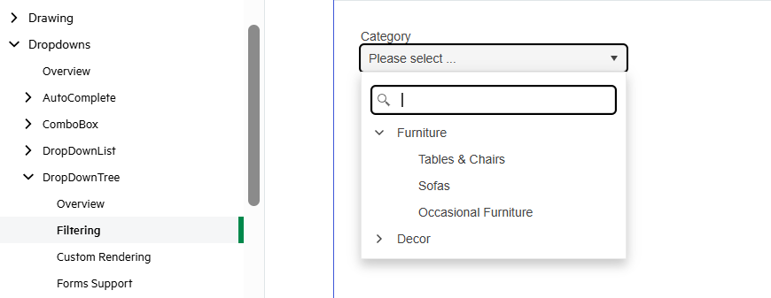
If we use dropdown tree, it's extra step to search or filter, so we add a feature of tree view for AutoComplete is good.
A dedicated column picker would be far more intuitive: its discoverability is higher, and features like the indeterminate ‘select all’ checkbox and instant search align with the law of approximation.
For our users handling large datasets, this makes for a much faster, more cohesive tool.
.png)
It's great to see MCP servers now available for Angular, React, and Blazor. Any plans to add support for Kendo UI for Vue as well?
We use Kendo UI for Vue in production, and having MCP support would really improve AI-assisted development, component discovery, and overall DX. It would also help keep feature parity across the Kendo ecosystem.
Would love to see Vue.js included.
Thanks!
Pete
Description:
We would like to request the addition of multi-cell selection functionality to the Kendo Grid for Vue, similar to what is available in the Kendo Grid jQuery version.
Current Situation: The Kendo Grid for Vue currently supports:
Row selection via the selectedField prop with checkboxes
Single row highlighting
Cell navigation via the navigatable prop
However, it lacks the ability to select multiple individual cells or cell ranges, which is a feature available in the jQuery version of Kendo Grid.
Requested Feature: Add multi-cell selection capabilities to the Kendo Grid for Vue, including:
Selection Modes:
- Single cell selection
- Multiple cell selection (Ctrl+Click)
- Range selection (click and drag, or Shift+Click)
- Column selection
- Row selection (already exists)
API/Props:
selectable prop with values like:
-"cell" - single cell selection
- "multiple, cell" - multiple cell selection
- "cell, row" - combined cell and row selection
selectedCells prop to track selected cell coordinates
onCellSelectionChange event handler
Functionality:
- Visual feedback for selected cells (highlight/styling)
- Keyboard navigation support (arrow keys, Shift+arrows for range selection)
Use Cases:
- Data analysis and comparison across multiple cells
- Batch operations on selected cells
Hello everyone
We are using Editor for our application,
Is it possible to add the possibility to Copy and Apply Format
It used to be included in the older version "@progress/kendo-editor-vue-wrapper"
Here a screenshot of the older one :

Best Regards
Introduce filter buttons highlight to visualize which column has a filter applied.
The feature is available in KendoReact:
https://www.telerik.com/kendo-react-ui/components/grid/filtering/advanced-filtering#filtering-data-grid-through-column-menu-filter

Currently, if the scrolling is disabled, the resizing of the columns is also not possible.
Introducing auto-sizing mechanism for the Grid column should resolve this situation:
https://www.ag-grid.com/javascript-data-grid/column-sizing/#auto-size-columns-to-fit-grid
The KendoUI Editor for jQuery exposes a stylesheets property that allows the default stylesheet to be defined for the editor. Please add this property to the KendoUI Editor for Vue as well as I would like to be able to set some default css properties such as font family, font size, colors, etc.
The list of stylesheets can be attached after the currently included stylesheets which would allow overriding any default Kendo or ProseMirror specific styles.
Reference: https://www.telerik.com/kendo-jquery-ui/documentation/api/javascript/ui/editor/configuration/stylesheets
As an alternative, you can apply custom CSS (such as font family, font size, and colors) to the Editor's iframe content, you can use the onLoaded event. With this event, you can inject a <style> element or a <link> to an external stylesheet into the iframe's document, allowing you to override default Kendo or ProseMirror styles.
jQuery Editor Table Wizard Dialog - Kendo UI for jQuery
Add a numeric indicator for the sorted columns shown when multiple columns are sorted to indicate which order the columns are being sorted in.
This feature is already available in the angular Grid:
https://www.telerik.com/kendo-angular-ui/components/grid/sorting/multi-sort
Introduce an option to setup locked columns with grouping in Kendo UI for Vue Grid.
The feature is already available in the React Grid:
It would be beneficial to explicitly control the left-to-right rendering order of overlapping events — for example, by using a custom field such as isPrivate or by following the data source order.