Problem
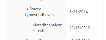
The Treelist expandable cells are indented for each level. When a name is too long, however, the indentation and spacing are difficult to read and throw off the grid's design (Codesandbox link):
Solution
We don't frequently run into this issue, and we've now got a common component for this cell redesign, but it would be nice if it worked like this out of the box:
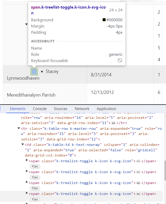
- Utilize padding on the cell instead of empty icon boxes (screenshot of DOM below) ==> this would prevent the text overflow from falling onto the next line as the padding will force the overflow text to stay indented by a certain amount. This would fix the design of the Stacey Lynnwoodhaven text and the Meredithanalynn Parrish text
Thank you,
Janki
Hello Janki,
Thank you for sharing your implementation. I do agree showing the text in this way is much more structured and easier to read. Regardless of whether this will be added as a built-in style or not, I am sure the custom implementation will be useful for others, so once again, thank you for sharing.
Regards,
Konstantin Dikov
Progress Telerik
Stay tuned by visiting our public roadmap and feedback portal pages! Or perhaps, if you are new to our Kendo family, check out our getting started resources!
Hi Konstantin,
I agree, and I think then the next workaround with the padding in place is to give that column a bit more width with a manual width override.
Unfortunately, I cannot share our TreeList data or a screenshot of our fixed cell design/layout from our env, but I can share our custom cell (which I'm sure can be written better):
};
=-=-=-=-=-=-=-=-=
Implementing this in the original Codesandbox makes the long cells look like this:
Hi Janki,
If the text is limited to be displayed only within the remaining space after the padding, that would most likely make long text really difficult to read as well. Could you please share a screenshot of the desired result or share the custom cell that you are using? This could prove to be helpful with the evaluation of the feature request.
Best Regards,
Konstantin Dikov
Progress Telerik
Stay tuned by visiting our public roadmap and feedback portal pages! Or perhaps, if you are new to our Kendo family, check out our getting started resources!
Hey Konstantin,
I appreciate you posting a workaround! Unfortunately, I believe that would be unacceptable for users on smaller screens for who, when they reach level 5+, the text would become completely unreadable. Going from "Konstantin" to "Ko...", for example. For the best UX, I would prefer to keep the whole text in the cell (in a readable design/format/layout).
Thank you for converting this issue into a ticket for me! I hope it will be planned for a fix soon!
Best,
Janki
Hi Janki,
Thank you for contacting us.
I converted the request to a public feedback item, so that other developers can vote for the idea and increase its priority.
Meanwhile, using a custom cell seems to be the only option.
Just as a side note, another thing that can be used is to show ellipsis, so that the text stays on a single line:
            <style>
            .k-treelist-scrollable td,
            .k-treelist-scrollable th,
            .k-treelist-scrollable col{
                overflow: hidden;
                text-overflow: ellipsis;
                white-space: nowrap;
                max-width: 0;
            }
Regards,
Konstantin Dikov
Progress Telerik
Stay tuned by visiting our public roadmap and feedback portal pages! Or perhaps, if you are new to our Kendo family, check out our getting started resources!
- All
- Completed (213)
- Declined (64)
- Duplicated (14)
- In Development (2)
- Need More Info (2)
- Planned (6)
- Under Review (1)
- Unplanned (569)
- Won't Fix (13)
- All
- KendoReact
- ActionSheet
- Agentic UI Generator
- AIPrompt
- Animation
- AppBar
- ArcGauge
- AutoComplete
- Avatar
- Badge
- Barcode
- BottomNavigation
- Breadcrumb
- Button
- ButtonGroup
- Calendar
- Card
- Chart
- Chart Wizard
- Chat
- Checkbox
- Chip
- ChipList
- ChunkProgressBar
- CircularGauge
- ColorGradient
- ColorPalette
- ColorPicker
- ComboBox
- ContextMenu
- Conversational UI
- Data Grid
- Data Query
- Date Math
- DateInput
- DatePicker
- DateRangePicker
- DateTimePicker
- Dialog
- Drag & Drop
- Drawer
- Drawing
- DropDownButton
- DropDownList
- DropDownTree
- Editor
- Error
- Excel Export
- ExpansionPanel
- ExternalDropZone
- File Saver
- FileManager
- Filter
- FlatColorPicker
- FloatingActionButton
- FloatingLabel
- FontIcon
- Form
- Gantt
- Gauge
- GridLayout
- Hint
- InlineAIPrompt
- Input
- Label
- Licensing
- LinearGauge
- ListBox
- ListView
- Loader
- Map
- MaskedTextBox
- Menu
- MultiColumnComboBox
- MultiSelect
- MultiSelectTree
- MultiViewCalendar
- Notification
- NumericTextBox
- OrgChart
- Page Templates / Building Blocks
- Pager
- PanelBar
- PDF Processing
- PDF Viewer
- PivotGrid
- Popover
- Popup
- ProgressBar
- QR Code
- RadialGauge
- RadioButton
- RadioGroup
- RangeSlider
- Rating
- Ripple
- Sankey
- Scheduler
- ScrollView
- Signature
- Skeleton
- Slider
- Sortable
- Sparkline
- SpeechToTextButton
- SplitButton
- Splitter
- Spreadsheet
- StackLayout
- Stepper
- StockChart
- SVGIcon
- Switch
- TabStrip
- TaskBoard
- TextArea
- TextBox
- TileLayout
- Timeline
- TimePicker
- Toolbar
- Tooltip
- TreeList
- TreeView
- Typography
- Upload
- VS Code Extension
- Window


