URL: https://codesandbox.io/p/sandbox/objective-blackburn-jvz3py
User Impact:
- Open URL: https://codesandbox.io/p/sandbox/objective-blackburn-jvz3py in the latest chrome browser.
- Code sandbox page will appear.
- Press tab key from the top of the page to "https://jvz3py.csb.app/" edit field on right side to reach the Bar chart.
- Press tab key to move focus between bar charts and press arrow keys to navigate through the bar chart points.
- Verify on pressing tab keys whether the keyboard focus order is logical while navigating the "Upload" controls of Bar chart components.
I have noticed that whenever you want to upload multiple photos at once, using this React Upload Component & Events - KendoReact Docs & Demos (telerik.com) component the previews of the images uploaded bounce/ shake around. I've tried this on multiple browsers and they all have the same bouncing effect for the image previews. For a single photo it doesn't do it but once multiple images are added, it will do it.
OS: Windows 11 Version 25H2 (OS Build 26200.8039)
Pre-Requisites:
- Connect to 'MSFT AzVPN-Manual' VPN.
- Turn on Screen Readers:
NVDA: Ctrl + Alt + N
JAWS: Ctrl + Alt + J
Narrator: Ctrl + win + Enter - Verbosity:
NVDA: Default
JAWS: Beginner, Highest
Narrator: Default
- Open the URL: https://agoradev-ppe.azurewebsites.net/home?dashboard-id=RnRToolsHomePage in edge/chrome browser in windows.
- Agora Home page will open.
- Press tab key to navigate to the 'Add a widget' control and activate it.
- Press tab key to navigate to the 'Table' control and activate it.
- 'Create Table' dialog will open.
- Press tab key to reach to the 'Font' dropdown control and activate it using enter key.
- Font color options will appear.
- Verify whether screen reader announces the name for the colors Present in Font dropdown control in windows or not.
Screen reader does not announce the name for the colors Present in Font dropdown control in windows.
- Screen reader does not announce the name for the colors Present in Font dropdown control in windows.png
- Screen reader does not announce the name for the colors Present in Font dropdown control in windows.mp4
Pre-Requisites:
- Connect to 'MSFT AzVPN-Manual' VPN.
- Turn on Screen Readers:
NVDA: Ctrl + Alt + N
JAWS: Ctrl + Alt + J
Narrator: Ctrl + win + Enter - Verbosity:
NVDA: Default
JAWS: Beginner, Highest
Narrator: Default
- Open the URL: https://agoradev-ppe.azurewebsites.net/home?dashboard-id=RnRToolsHomePage in edge/chrome browser in windows.
- Agora Home page will open.
- Press tab key to navigate to the 'Save As' control and activate it.
- 'Save As' dialog will open.
- Press tab key to reach to the 'Save to workspace' combo box and activate it using enter key.
- Verify whether screen reader focus order is incorrect after activating the 'Workspace to be Saved As in' combo box or not.
After activating the “Workspace to be Saved As in” combo box, keyboard focus moves to the search edit field, while the screen reader focus shifts to the /user control, causing a mismatch in focus.
- Screen Reader focus order is incorrect after activating the 'Save to workspace' combo box in windows.png
- Screen Reader focus order is incorrect after activating the 'Save to workspace' combo box in windows.mp4
After activating the combo box, both keyboard focus and screen reader focus should remain in sync and move to the search edit field in a proper sequence.
When typing into a date picker and trying to type Feb 29th, 2024 (or any other leap year ofc) the date is updated incorrectly by the kendo date picker validation. As the user types the year their previous entry of 29 is updated to 28. This should update check should probably not occur until the user is done updating the input. If there is some fix or workaround we can do on our end to resolve this issue please let us know
Here's a video of the bug in our application
However, I was also able to reproduce the exact same behavior even in the documentation:
Hi!
I have noticed that keyboard navigation doesn't work in the filter editor components inside the Filter component
Reproduction:
- Open https://stackblitz.com/edit/react-rvwjsm?file=index.html
- Choose "name" or "price" from the first dropdown
- Type anything in the input field
- Try to change the cursor position in the field using arrow keys - doesn't work
Is there a way to enable it or go around it?
Issue 1:
I've implemented insert table tool in the editor and I'm setting some states on editor blur. The bug appears when the editor is focused and I try to add a table. When I select the rows and cols from the dropdown and click to insert the table the editor blur is called my setStates are called and somehow the table insertion doesn't happen. In order to add the table I should not focus the editor and I have to click on the insert table button and select again the cols and rows.
Issue 2:
In the same editor I've added tableResizing plugin. The bug appears when I already have a table in the editor and open the insert table dropdown to add a new one. In that moment when the dropdown is still opened I hover over some of the already inserted table cells borders the insert table dropdown is closed.
Issue 3:
When the editor is controlled we have undefined as initial value and then we type something or try to add table for example the editor crashes and throw an error `Uncaught RangeError: Applying a mismatched transaction`. Even though the value type allows undefined EditorProps.value?: string | Node | undefined. It works fine though if the initial value is empty string.
Package
"@progress/kendo-react-editor":"^5.11.0 | 5.12.0"
Minimal reproduction
I'm providing an vite + react + ts project. Steps to run the project:
npm install
npm run dev
It's reproducible in the provided examples in StackBlitz from Kendo, but the editor packages are not always resolved with turbo package manager. I guess it's the same issue as https://github.com/telerik/kendo-react/issues/1530
To demonstrate:
1. Open your simplest interactivity/selection demo, which is not grouped, in StackBlitz. See: https://www.telerik.com/kendo-react-ui/components/grid/interactivity/selection/
2. Add the Grid's group prop. To demonstrate the bug nothing else needs changed
<Grid group={[]} ...3. Run demo, scroll down and pick a row.
4. Observe the grid scrolls to the top and you cannot see your selected row unless you scroll back.
Any help would be appreciated.
Hi,
The first render of a DatePicker component with an onOpen prop throws an error: Unknown event handler property `onOpen`. It will be ignored.
Reproduction:
1. Open https://stackblitz.com/edit/react-xje2zdjc?file=app%2Fapp.tsx
2. The error will appear in the console
Expected behavior:
No errors in the console
The examples from https://www.telerik.com/kendo-react-ui/components/intl/i18n/loading-data work with cldr* packages up to version 47.0.0. The Current version 48.0.0 causes an error:
Cannot read properties of undefined (reading 'replace')
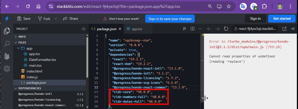
Please see the example - https://codesandbox.io/p/sandbox/silly-wind-tpfg8n
When column "Unit Price" is locked, while moving the horizontal scroll bar, the group header is sticky (expected behavior), but the group footer is not sticky (wrong behavior).
I'm submitting a...
- Bug report
Current behavior
Timepicker component in adaptive mode behaves differently in version 11.0.0 (and above) compared to version 10.0.0 (and above):
- "Set" button sets value but does not close popup - one more click needed
- "NOW" button scrolls to current time, but does neither set value nor close the popup - two more clicks needed
- in the top right corner there is a button with check icon which does the only thing - closes the popup (the same as "Close" button) - it is confusing
Expected behavior
We would expect the same behavior as in the 10.0.0:
- "Set" button sets value and closes the popup
- "NOW" button scrolls to current time, sets value and closes the popup
- there are no two buttons with the same functionality
Minimal reproduction of the problem with instructions
- Please run following link: https://stackblitz.com/edit/react-j3smansk?file=app%2Fapp.tsx,package.json and adjust app container width so that the timepicker popup is rendered in the bottom half of the screen, allowing both the popup and the editor to be visible at the same time.
- Repeat previous step for following link: https://stackblitz.com/edit/react-ukfuqrdy?file=package.json,app%2Fapp.tsx
- As you can see in "app.tsx" examples are very the same (taken from https://www.telerik.com/kendo-react-ui/components/dateinputs/timepicker/adaptive-rendering), only versions of kendo-react components in "package.json" are different
- Observe situations described in Current behavior and Expected behavior sections
What is the motivation or use case for changing the behavior?
We would like to upgrade to 11.0.0 but we do not like this behaviour because it is disturbing, confusing and requires more clicks (time) to work with it.
Environment
Browser:
- Chrome (desktop) version 138.0.7204.50 (Official build) (64-bit)
- Firefox version 140.0 (64-bit)
- Edge Version 137.0.3296.93 (Official build) (64-bit)
System:
- TypeScript version: KendoReact demos page version
- Node version: KendoReact demos page version
- Platform: Windows 10
Best regards,
Peter
When clicking on a resize handle (without dragging), the window unexpectedly shrinks.
Steps to reproduce:
- Open a Window component
- Click on any resize handle without dragging
Expected behavior: The window size remains unchanged when clicking a resize handle without dragging.
Actual behavior: The window shrinks.
Reproducible on the demo page: https://www.telerik.com/kendo-react-ui/components/dialogs/window
Hi,
After pasting a value into the input box of the DatePicker I am then unable to clear it. The value of the DatePicker is correctly set to null, but the value displayed in the input box is unchanged.
Reproduction steps:
1. Open the grid filtering demo,
2. Copy any of the date values from the grid, e.g. 9/20/1996, and paste it into the "First Ordered On" filter,
3. Clear the filter using the clear button.
Result:
The value remains in the input box.
Expected behaviour:
The value should not be visible in the input box.
I'm submitting a...
- Bug report
Current behavior
Timepicker components now button in certain situations does not scroll timeselector to current time in adaptive mode.
Expected behavior
We would expect the now button scrolls to current time in all situations, also in adaptive mode .
Minimal reproduction of the problem with instructions
- Please run following link: https://www.telerik.com/kendo-react-ui/components/dateinputs/timepicker/adaptive-rendering
- Clear timepicker value, there should be "hour:minute PM" in input
- Switch to tablet (or mobile) view
- Open time selector, it should be positioned to 12:00 AM, because it is min value
- Scroll AM/PM selector to PM
- Press NOW button
- Observe that timeselector did not scrolled to current time (if yes, only by huge accident)
What is the motivation or use case for changing the behavior?
It is obviously buggy behavior, we would like to use now button, but it has to work correctly.
Environment
Browser:
- Chrome (desktop) version 144.0.7559.133 (Official build) (64-bit)
- Firefox version 147.0.3 (64-bit)
- Edge Version 144.0.3719.115 (Official build) (64-bit)
System:
- TypeScript version: KendoReact demos page version
- Node version: KendoReact demos page version
- Platform: Windows 10
Best regards,
Peter
Hello
Localization messages for ColorPicker popup Apply/Cancel are missed.
Option to hide does not work flatColorPickerSettings={{showButtons: false}}