- Open URL: React Charts Library & StockChart - StockChart - KendoReact Docs & Demos (telerik.com in Edge browser.
- "Kendo React Stock Chart Overview" chart will appear.
- Navigate to the second chart present under Example using tab key.
- Now verify whether the single Pointer options alternative is provided for adjusting the graph points or not.
Overview:
The KendoReact PDF Viewer renders every page of a document up front. For large PDFs this causes long initial load times and high memory use.
Expose load-on-demand / virtualized page rendering in the React component, matching the existing Kendo UI for Angular PDF Viewer which has:
- loadOnDemand - render pages as the user scrolls
- loadOnDemandPageSize - pages fetched/rendered per batch
Reference: https://www.telerik.com/kendo-angular-ui/components/pdfviewer/load-on-demand
This is a framework-parity gap. The same underlying rendering engine already supports on-demand loading in Angular (and virtualization has been requested for Blazor: httpzor/1594054-pdf-viewer-virtualization). React usershitting large documents currently have no first-party option and must swap to a third-party viewer.
Environment: @progress/kendo-react-pdf-viewer 10.2.0, React 19, Next.js 15.
Hello,
I am looking to start using the Kendo React grid control, but I need the grid to be responsive to support viewing on a phone. I noticed that your Angular grid has this functionality, but it is missing from your React grid.
I would like to have rows turn into individual cards when viewed on a phone. The closest thing I see in the react documentation involves hiding columns, which is undesirable. Is there a way to add this behavior to the React grid? If not, when will that be implemented?
Thank you,
Alex
ExcelExport has a prop for 'creator'. When the excel file is generated, "creator"'s value is reflected in the file's metadata
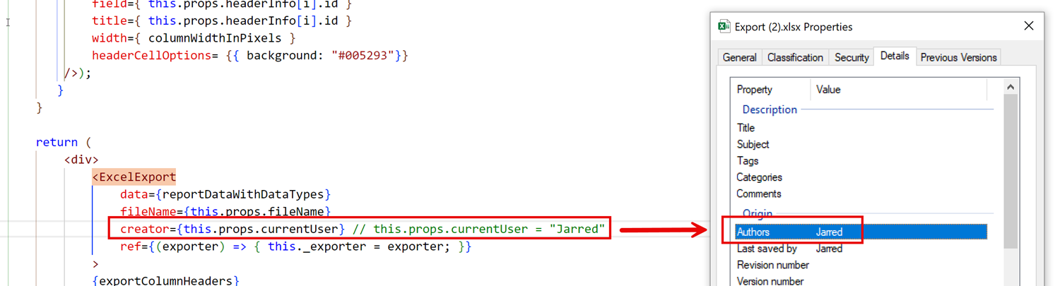
For accessibility / screen reader purposes, Title (under Description) must also be populated. Please allow a "title" prop to be accepted by the ExcelExport component.
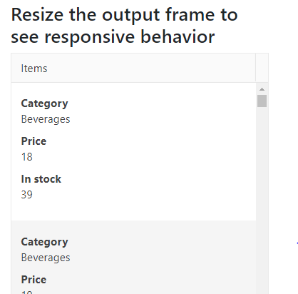
Add the ability to apply table breakpoints to the Grid for responsive behavior.
Similar to the Bootstrap tables:
https://getbootstrap.com/docs/4.4/content/tables/#breakpoint-specific
I would like to request a new Kendo React Grid column editing option so that users can navigate editable columns using the keyboard. This feature should be similar to "navigatable" option from Kendo jQuery grid example - https://demos.telerik.com/kendo-ui/grid/editing
Thanks.
Hi,
I'm in need of the dropdown feature in spreadsheet cells. I had been using the Kendo Spreadsheet React Wrapper which had the dropdown feature but since the latest update to Kendo React Spreadsheet I have been facing issues. Please try to get this feature as soon as possible and I'm sure this will be helpful for other users, too.
Thank you.
React Server Components allow the developer to mix the fast server-side rendering with the interactivity of client-side JavaScript.
So far modern JS frameworks were explicitly operating on the client (with SSR being an optional feature). With server-components it's the opposite - RS Cs introduce a new mental model for building hybrid applications that leverage both the server and the client.
The main advantages of the React Server Components are that:
- Initial page load is faster;
- You can move the data fetching to the server;
- You can keep the large dependencies on the server;
- The client-side JavaScript bundle size is reduced;
Hi
Please build a React Diagram component similar to https://demos.telerik.com/aspnet-ajax/diagram/examples/overview/defaultcs.aspx
Good morning,
I have seen a component within the Angular library that I would like to include in my project using React. The link to it is here:
https://www.telerik.com/kendo-angular-ui/components/dropdowns/dropdownlist/add-new-item
Are you able to advise on how I could implement this please?
Best wishes,
Molly
The TreeList does not support this capability. It uses a fixed filter icon defined in the shared ColumnMenu from @progress/kendo-react-data-tools.
Add equivalent columnMenuIcon support to the TreeList to match the Grid feature set. This change allows users to customize the column menu button icon without reliance on a render callback workaround.
Hi Team,
I want to use annotations and marking in PDF and my tech stack is React is this possible with telerik currently?
Hello,
We are currently developing an application based on Kendo React components.
We are wondering if the React-Gantt chart has the functionality to edit the data by drag-n-drop the same way it possible with JQuery-Gantt (see attachment).
Thanks in advance for your help.
Kind regards,
Sergei
*** Please follow-up with additional details, if necessary. Thank you. ***
The following options are available in the jQuery version:
Insert Comment
Insert Hyperlink
Insert Image
In KendoReact Spreadsheet:
These features are currently not available.
Query:
Are there any APIs or extension points to support these insert operations?
Is there a roadmap for introducing these capabilities?
When implementing a custom filter cell (e.g., to support DatePicker modes such as time-only, date-only, or datetime), there is currently no straightforward way to reuse the built-in filter UI elements like the operator selector and clear button.
At the moment, these controls must be recreated manually to match the behavior and styling of the default Grid filter cells. While GridCustomFilterCellProps.children does include these elements, they are bundled together with the default filter input, making it difficult to extract and reuse only the needed parts.
It would be very helpful if the default operator dropdown and clear button were exposed separately (or made easily accessible), so they can be reused in custom filter cells.
This would:
Ensure visual and behavioral consistency with built-in filter cells
Reduce duplication of logic and styling
Minimize the risk of breaking changes when internal class names or implementations are updated
A supported way to access or compose these default controls would greatly improve the developer experience when building custom filter cells.
Add an optional row-based keyboard navigation mode for the KendoReact Grid where Arrow Up and Arrow Down move focus between entire rows instead of individual cells.