

I can't find anything on your website or on the internet that explains how to navigate a Kendo React ListBox control using the keyboard.
Can you point me in the right direction on this issue?
Thanks.
Ruslan Lyga

It doesn't possible to set different "no events" text for the Agenda component, can we add the ability to set it by prop like in the example below?
<Agend noEventMessage="No meetings" />

<Agend noEventMessage="No vacations" />
Hello,
The Form component does not allow me to submit unless I modify the initial values. We have a Form that is provided with initial values that may not need to be modified by the user first - the data is all valid and acceptable. The user, currently, would need to purposefully modify one of the Field values in order to get the Form to realize that it can be submitted.
I'm aware of the submit click event but that event does not perform any validation.
I believe there needs to be some middle area where the Form can be provided initial values and be allowed to submit without having to modify the form first.
I have created a code sample showing the scenario below ...
https://stackblitz.com/edit/react-wf5veh-reyjj3?file=app/main.jsx
Thank you

Currently the GridFilterCell OnChange returns a subset of a FilterDescriptor (A value an an Operator to run on the value), which allows a custom filter cell to create one filter rule (FilterDescriptor). However, the CompositeFilterDescriptor structure allows a lot more flexibility. `month == 'January' OR 'March' OR 'May'`. If the GridFilterCell could be passed a CompositeFilterDescriptor instead of the current subset, then a custom filter cell could be much more powerful.
In an orders grid for instance, with a status of Pending, Paid, Shipped, and Delivered a "Show/Hide Shipped" button would exclude or include the Shipped and Delivered orders when clicked. Or a list of checkboxes to choose the statuses you want to see (like the JQuery Grids support).
TL;DR: There is currently no way to re-implement multi-checkboxes or other complex filtering interfaces with the Kendo React Grid without re-implementing all of the filtering logic manually from scratch, as the Existing filter cells don't support this and a custom GridFilterCell can't be configured to return that logic in a single FilterDescriptor.
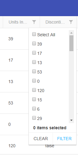
1) Use this StackBlitz application: https://react-scwx3i.stackblitz.io - This is based on Telerik's own DatePicker React example.
2) Highlight the AM/PM section.
3) Try to change the AM/PM section via typing. It doesn't change. Note that other fields in the date/time picker are responsive to keyboard input.
Expectation is that the AM/PM section should respect at least "A" and "P" inputs.
Hi,
How to select the tree-list column like excel column selection ?
How can be copy selected column data with the another column ?
please provide the reference link or example.
--
We can add one of the following options:
1) Add style props to the ComboBox popupSettings. This will allow the developer to set a custom min-width.
2) Provide an option that will set the minWidth to the same as the ComboBox width.
We try to cover the following case:
The Popup will auto grow based on the longest item, but its widht should not be shorted than the ComboBox.
Hi There,
This is the kendo ui for jQuery scheduler we use in our older version of product. Note that the resources are across the top, and dates down the side.
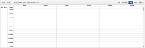
We have switched to react and we want similar view. This is the closest we can get.
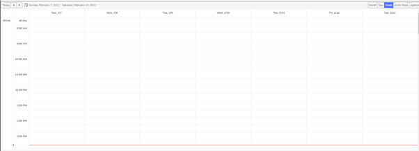
The resources are on left hand side so we cannot see all the resources.
Kendo-ui for jQuery has an additional boolean property ‘date’ (https://docs.telerik.com/kendo-ui/api/javascript/ui/scheduler/configuration/group) which groups the view by date down the left hand side, and resources across the top. There is no alternate property available in kendo-react-ui which will result in same appearance as it does in kendo-ui.
We are using kendo scheduler version 4.0.0.
Is there any way to achieve this? Do we have to implement a custom view? If so how?
- Papiya

Add the ability to customize the Filter component elements.
For example:
1) Customize the fields' DropDownList.
2) Customize the Add expression button. It could be used to open a Dialog with a list of expressions.
Currently, ComboBox generates a UUID and uses it as the input tag's id property (e.g. <input id="2e048165-6468-46c0-ba39-c47b12c7fcf2" />).
As a developer, I want to be able to set my own custom id so that I can set my own label tag as a sibling to the ComboBox component.
For example, I would like this to be possible:
<label for="hello">Hello World</label>
<ComboBox id="hello" />
There is a label prop offered on ComboBox which works fine but it does not let me specify the label tag with custom class names, styling, etc.
This new id prop should be optional and ComboBox can keep using the same technique it does when no id prop is passed to it.
Within the jQuery samples, there is a way to have the MonthView for Scheduler to have 'adaptive' height.
https://demos.telerik.com/kendo-ui/scheduler/adaptive-slot-height
Is this available for the <MonthView> part of the REACT components ? How would this work ?? [adaptiveSlotHeight=true] isn't valid...
The same issue exists for the 'autoeventheight' - is this planned for the REACT component/s ??
https://demos.telerik.com/kendo-ui/scheduler/auto-event-height
Hi Team,
We are trying to implement infinite scrolling for server data to our combobox based on virtual.
Do you have any event in combobox to handle on scroll.
Please help us with any examples you have on this topic. preferably using hooks.
I am looking for added support for multi drag and drop and the ability to select multiple days as this is available in the jquery version:
https://demos.telerik.com/kendo-ui/scheduler/event-selection
Hi,
How do I create a multi-row cell in footer? I have attached a screenshot as reference. Thank you
Similar to how a series is highlighted when clicked, the category can also be highlighted when the bar/column on that category is clicked.