When implementing a custom filter cell (e.g., to support DatePicker modes such as time-only, date-only, or datetime), there is currently no straightforward way to reuse the built-in filter UI elements like the operator selector and clear button.
At the moment, these controls must be recreated manually to match the behavior and styling of the default Grid filter cells. While GridCustomFilterCellProps.children does include these elements, they are bundled together with the default filter input, making it difficult to extract and reuse only the needed parts.
It would be very helpful if the default operator dropdown and clear button were exposed separately (or made easily accessible), so they can be reused in custom filter cells.
This would:
Ensure visual and behavioral consistency with built-in filter cells
Reduce duplication of logic and styling
Minimize the risk of breaking changes when internal class names or implementations are updated
A supported way to access or compose these default controls would greatly improve the developer experience when building custom filter cells.
Currently the GridColumn Component only supports width property. It should also support minWidth and maxWidth properties for better responsive design. https://www.telerik.com/kendo-react-ui/components/grid/api/GridColumnProps/
Hi team,
Is it possible to have the Enter key press automatically apply the filter when the filter menu is open and active similar to submitting a form?
For example in the Column Menu if I enter some text in the filter the Filter button becomes active, if I press the Enter key nothing happens, for the filter it would be nice if it can submit the filter like for normal forms where the enter key would submit the form.
Another example would be the Checkbox Menu Filter, if I check a checkbox in the filter the current active and focused element is the checkbox and if the Enter key is pressed then it de-selects the checkbox. This behaviour is not very useful, a better implementation would be on Enter press the filter is applied.
Thanks.
Currently, if I click the Edit button on a row and then sort by any column, the editable row is also moved according to the sorting rules.
What I’d like to request is a built-in functionality to freeze an editable row at the top of the Grid, so it remains fixed regardless of the applied sorting.
This would prevent the need to manually override the sorting mechanism just to keep the editable row pinned in place.
Hello,
there are numerous problems with navigating / scrolling on the DataGrid using keyboard keys.
Here is the test page:
https://stackblitz.com/edit/react-brdhufzd
1. Grid with navigatable=true:
- arrow keys - when you select a cell to be able to navigate and then keep pressing down and then up, it's not posible to come back to the first record. You need to use the mouse.
- Page up/down keys work the other way round, also sometimes is not possible to come back to the first record, the scrollbar does not show the current position.
- It starts to work correctly after using the arrow keys and page up/down keys alternatively couple of times
2. Grid with navigatable=false:
- arrow,Page up/down keys and scrollbar work correctly
3. Grid with navigatable=true and nested inside Window:
- works the same way as not nested - the same problems occur
4. Grid with navigatable=false and nested inside Window:
- arrow keys move the window instead of navigating the grid
- Page up/down don't work at all
Please consider adding support for virtualization (e.g., virtual settings or similar) to the GridColumnMenuCheckboxFilter so that it can efficiently handle large datasets without performance hits.
Benefits:
- Better performance with large datasets
- Consistent UX with existing Kendo filtering components
- Reduced need for custom workarounds
Add a Column Configurator that can be used to set the displayed columns and create multi-column headers
Hi, there is a problem with filter filter popups in Data Grid.
Steps to reproduce:
1. Go to https://www.telerik.com/kendo-react-ui/components/grid/filtering
2. Open the date filter popup in the "FirstOrderOn" Column and click on any date
3. Open and close the filter combo in "Disconinued" column couple of times.
Actual Behavior
On version 9.1.0 besides Opening the "Disconinued" filter combo, the date popup also openes. On version 8.5.0 seems to work fine
Expected Behavior
Only the popup from "Discontinued" column should be Opened / Closed
Chrome
Browser version
131.0.6778.205
OS type
Windows11
I think this would be a great feature to have out-of-the-box, and hopefully it's something easy to add from your end. UX-wise, it's really difficult to wrap your head around a non-alphabetized list, especially when the list is used for the special purpose of filtering -- you now have to filter down the list before you can filter the grid itself, which adds more overhead for the user.
I understand that Excel is not the end-all and be-all, but Excel also sorts it by default:
Full discussion can be found here - https://www.telerik.com/forums/how-to-make-gridcolumnmenucheckboxfilter-be-alphabetical-order
We use data grids with virtual scrolling for inline editing a large number of records. However, when we want to add a new row to the grid it automatically resets the scroll position and doesn't even fire onPageChange event so the records you see do not correspond to the scroll position.
Check the following example (scroll to bottom, click anywhere on the table - this will add a new row - and observe the described problem):
https://stackblitz.com/edit/react-52zzvz?file=app%2Fapp.tsx%3AL78
As stated in the subject, the GridNoRecords component has an undocumented maximum width of 20em after which the GridNoRecords message is cut off. Please see the following StackBlitz for an example: https://stackblitz.com/edit/react-2z8hh63r?file=app%2Fapp.tsx
Kind regards,
David
The new Built-in State Management does not work with remote data.
For example:
PageSize = 40.
Remotely fetch 40 items.
Click on page 2.
Remotely fetch 40 items.
The grid shows no items, since items 41-80 does not exist in the data provided.
Verified with support who suggested adding a feature request.
As stated in the subject. To reproduce:
- Create a blank react project as per the KendoReact Data Grid Getting Started documentation e.g.
npx create-react-app my-app --template typescript
- Change the react and react-dom dependencies in the generated package.json file from ^19.0.0 to ^18.0.0, add corresponding "@types/react": "^18.0.0" and "@types/react-dom": "^18.0.0" entries to devDependencies, and add a standard tsconfig.json file e.g.
{
    "compilerOptions": {
      "target": "es6",
      "lib": [
        "dom",
        "dom.iterable",
        "esnext"
      ],
      "allowJs": true,
      "skipLibCheck": true,
      "esModuleInterop": true,
      "allowSyntheticDefaultImports": true,
      "strict": true,
      "forceConsistentCasingInFileNames": true,
      "noFallthroughCasesInSwitch": true,
      "module": "esnext",
      "moduleResolution": "node",
      "resolveJsonModule": true,
      "isolatedModules": true,
      "noEmit": true,
      "jsx": "react-jsx"
    },
    "include": [
      "src"
    ]
}- Install required @progress packages as per the KendoReact Data Grid Getting Started documentation e.g.
npm i @progress/kendo-react-grid @progress/kendo-data-query @progress/kendo-react-data-tools @progress/kendo-react-inputs @progress/kendo-react-intl @progress/kendo-react-dropdowns @progress/kendo-react-dateinputs @progress/kendo-drawing @progress/kendo-react-animation @progress/kendo-licensing @progress/kendo-react-buttons @progress/kendo-react-treeview @progress/kendo-react-popup @progress/kendo-svg-icons @progress/kendo-theme-default
- Delete content generated by create-react-app which is not required e.g. App.test.tsx, logo.svg, reportWebVitals.ts, setupTests.ts and corresponding references
- Confirm you can run npm start with no webpack errors or warnings (see screenshot)
- Add a <Grid> with <GridNoRecords> to App.tsx e.g.
    <div className="App">
      <header className="App-header">
        <Grid>
          <GridNoRecords>This generates TS2786</GridNoRecords>
        </Grid>
      </header>
    </div>
Confirm that npm start results in error TS2786 (see screenshot).
Please see attached for the sample project (with the node_modules folder removed). I believe this error was introduced in v9.0.0 as part of the migration from classes to functional components.
Hello,
Seems the link to the GridColumnMenu accessibility page from the DataGrid accessibility page is broken.
Our tools are also warning us about empty links, caused by the GridColumnMenu button. How would we solve these?
Thank you,
Kristiyan Dimitrov
The issue can be seen on your demo at https://www.telerik.com/kendo-react-ui/components/grid/
Steps:
1) Load the demo from https://www.telerik.com/kendo-react-ui/components/grid/
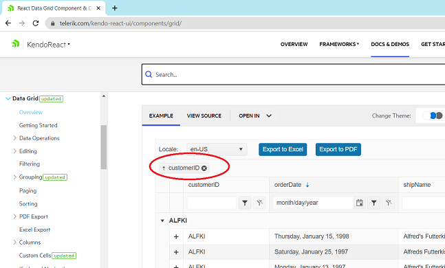
2) Click on (x) in customerID grouping
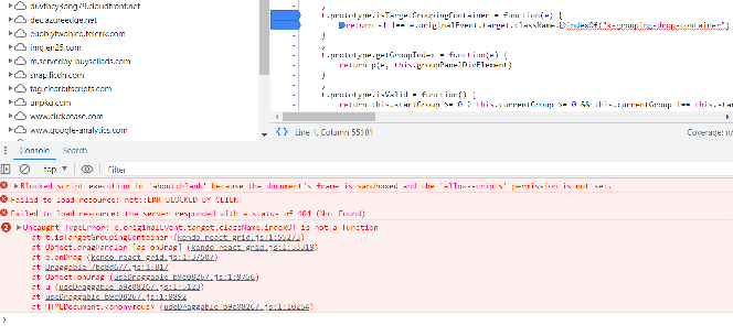
3) Look at the console and see the line with exception:
The problem is that `e.originalEvent.target` is an svg object and it's className property is an object, not a string. The object is `SVGAnimatedString {baseVal: '', animVal: ''}` and it doesn't have the method indexOf.
Please fix asap.
To demonstrate:
1. Open your simplest interactivity/selection demo, which is not grouped, in StackBlitz. See: https://www.telerik.com/kendo-react-ui/components/grid/interactivity/selection/
2. Add the Grid's group prop. To demonstrate the bug nothing else needs changed
<Grid group={[]} ...3. Run demo, scroll down and pick a row.
4. Observe the grid scrolls to the top and you cannot see your selected row unless you scroll back.


