I have noticed that whenever you want to upload multiple photos at once, using this React Upload Component & Events - KendoReact Docs & Demos (telerik.com) component the previews of the images uploaded bounce/ shake around. I've tried this on multiple browsers and they all have the same bouncing effect for the image previews. For a single photo it doesn't do it but once multiple images are added, it will do it.
Hello,
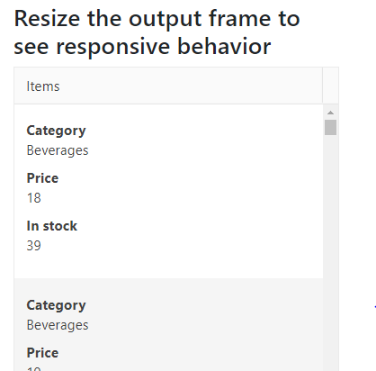
I am looking to start using the Kendo React grid control, but I need the grid to be responsive to support viewing on a phone. I noticed that your Angular grid has this functionality, but it is missing from your React grid.
I would like to have rows turn into individual cards when viewed on a phone. The closest thing I see in the react documentation involves hiding columns, which is undesirable. Is there a way to add this behavior to the React grid? If not, when will that be implemented?
Thank you,
Alex
ExcelExport has a prop for 'creator'. When the excel file is generated, "creator"'s value is reflected in the file's metadata
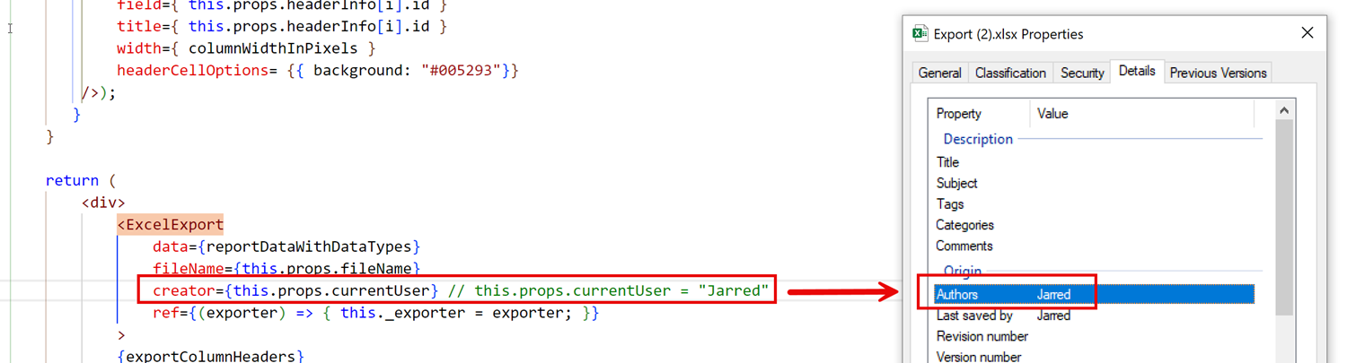
For accessibility / screen reader purposes, Title (under Description) must also be populated. Please allow a "title" prop to be accepted by the ExcelExport component.
OS: Windows 11 Version 25H2 (OS Build 26200.8039)
Pre-Requisites:
- Connect to 'MSFT AzVPN-Manual' VPN.
- Turn on Screen Readers:
NVDA: Ctrl + Alt + N
JAWS: Ctrl + Alt + J
Narrator: Ctrl + win + Enter - Verbosity:
NVDA: Default
JAWS: Beginner, Highest
Narrator: Default
- Open the URL: https://agoradev-ppe.azurewebsites.net/home?dashboard-id=RnRToolsHomePage in edge/chrome browser in windows.
- Agora Home page will open.
- Press tab key to navigate to the 'Add a widget' control and activate it.
- Press tab key to navigate to the 'Table' control and activate it.
- 'Create Table' dialog will open.
- Press tab key to reach to the 'Font' dropdown control and activate it using enter key.
- Font color options will appear.
- Verify whether screen reader announces the name for the colors Present in Font dropdown control in windows or not.
Screen reader does not announce the name for the colors Present in Font dropdown control in windows.
- Screen reader does not announce the name for the colors Present in Font dropdown control in windows.png
- Screen reader does not announce the name for the colors Present in Font dropdown control in windows.mp4
Pre-Requisites:
- Connect to 'MSFT AzVPN-Manual' VPN.
- Turn on Screen Readers:
NVDA: Ctrl + Alt + N
JAWS: Ctrl + Alt + J
Narrator: Ctrl + win + Enter - Verbosity:
NVDA: Default
JAWS: Beginner, Highest
Narrator: Default
- Open the URL: https://agoradev-ppe.azurewebsites.net/home?dashboard-id=RnRToolsHomePage in edge/chrome browser in windows.
- Agora Home page will open.
- Press tab key to navigate to the 'Save As' control and activate it.
- 'Save As' dialog will open.
- Press tab key to reach to the 'Save to workspace' combo box and activate it using enter key.
- Verify whether screen reader focus order is incorrect after activating the 'Workspace to be Saved As in' combo box or not.
After activating the “Workspace to be Saved As in” combo box, keyboard focus moves to the search edit field, while the screen reader focus shifts to the /user control, causing a mismatch in focus.
- Screen Reader focus order is incorrect after activating the 'Save to workspace' combo box in windows.png
- Screen Reader focus order is incorrect after activating the 'Save to workspace' combo box in windows.mp4
After activating the combo box, both keyboard focus and screen reader focus should remain in sync and move to the search edit field in a proper sequence.
Add the ability to apply table breakpoints to the Grid for responsive behavior.
Similar to the Bootstrap tables:
https://getbootstrap.com/docs/4.4/content/tables/#breakpoint-specific
I would like to request a new Kendo React Grid column editing option so that users can navigate editable columns using the keyboard. This feature should be similar to "navigatable" option from Kendo jQuery grid example - https://demos.telerik.com/kendo-ui/grid/editing
Thanks.
Hi,
I'm in need of the dropdown feature in spreadsheet cells. I had been using the Kendo Spreadsheet React Wrapper which had the dropdown feature but since the latest update to Kendo React Spreadsheet I have been facing issues. Please try to get this feature as soon as possible and I'm sure this will be helpful for other users, too.
Thank you.
- Open URL: React Charts Library & StockChart - StockChart - KendoReact Docs & Demos (telerik.com in Edge browser.
- "Kendo React Stock Chart Overview" chart will appear.
- Navigate to the second chart present under Example using tab key.
- Now verify whether the single Pointer options alternative is provided for adjusting the graph points or not.
When typing into a date picker and trying to type Feb 29th, 2024 (or any other leap year ofc) the date is updated incorrectly by the kendo date picker validation. As the user types the year their previous entry of 29 is updated to 28. This should update check should probably not occur until the user is done updating the input. If there is some fix or workaround we can do on our end to resolve this issue please let us know
Here's a video of the bug in our application
However, I was also able to reproduce the exact same behavior even in the documentation:
React Server Components allow the developer to mix the fast server-side rendering with the interactivity of client-side JavaScript.
So far modern JS frameworks were explicitly operating on the client (with SSR being an optional feature). With server-components it's the opposite - RS Cs introduce a new mental model for building hybrid applications that leverage both the server and the client.
The main advantages of the React Server Components are that:
- Initial page load is faster;
- You can move the data fetching to the server;
- You can keep the large dependencies on the server;
- The client-side JavaScript bundle size is reduced;
Hi!
I have noticed that keyboard navigation doesn't work in the filter editor components inside the Filter component
Reproduction:
- Open https://stackblitz.com/edit/react-rvwjsm?file=index.html
- Choose "name" or "price" from the first dropdown
- Type anything in the input field
- Try to change the cursor position in the field using arrow keys - doesn't work
Is there a way to enable it or go around it?
Issue 1:
I've implemented insert table tool in the editor and I'm setting some states on editor blur. The bug appears when the editor is focused and I try to add a table. When I select the rows and cols from the dropdown and click to insert the table the editor blur is called my setStates are called and somehow the table insertion doesn't happen. In order to add the table I should not focus the editor and I have to click on the insert table button and select again the cols and rows.
Issue 2:
In the same editor I've added tableResizing plugin. The bug appears when I already have a table in the editor and open the insert table dropdown to add a new one. In that moment when the dropdown is still opened I hover over some of the already inserted table cells borders the insert table dropdown is closed.
Issue 3:
When the editor is controlled we have undefined as initial value and then we type something or try to add table for example the editor crashes and throw an error `Uncaught RangeError: Applying a mismatched transaction`. Even though the value type allows undefined EditorProps.value?: string | Node | undefined. It works fine though if the initial value is empty string.
Package
"@progress/kendo-react-editor":"^5.11.0 | 5.12.0"
Minimal reproduction
I'm providing an vite + react + ts project. Steps to run the project:
npm install
npm run dev
It's reproducible in the provided examples in StackBlitz from Kendo, but the editor packages are not always resolved with turbo package manager. I guess it's the same issue as https://github.com/telerik/kendo-react/issues/1530
To demonstrate:
1. Open your simplest interactivity/selection demo, which is not grouped, in StackBlitz. See: https://www.telerik.com/kendo-react-ui/components/grid/interactivity/selection/
2. Add the Grid's group prop. To demonstrate the bug nothing else needs changed
<Grid group={[]} ...3. Run demo, scroll down and pick a row.
4. Observe the grid scrolls to the top and you cannot see your selected row unless you scroll back.
Any help would be appreciated.
Hi,
The first render of a DatePicker component with an onOpen prop throws an error: Unknown event handler property `onOpen`. It will be ignored.
Reproduction:
1. Open https://stackblitz.com/edit/react-xje2zdjc?file=app%2Fapp.tsx
2. The error will appear in the console
Expected behavior:
No errors in the console
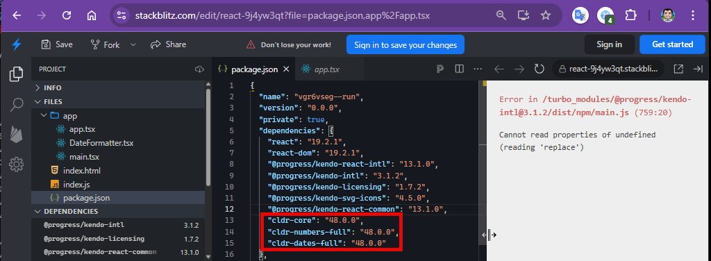
The examples from https://www.telerik.com/kendo-react-ui/components/intl/i18n/loading-data work with cldr* packages up to version 47.0.0. The Current version 48.0.0 causes an error:
Cannot read properties of undefined (reading 'replace')