OS: Windows 11 Version 25H2 (OS Build 26200.8039)
Pre-Requisites:
- Connect to 'MSFT AzVPN-Manual' VPN.
- Turn on Screen Readers:
NVDA: Ctrl + Alt + N
JAWS: Ctrl + Alt + J
Narrator: Ctrl + win + Enter - Verbosity:
NVDA: Default
JAWS: Beginner, Highest
Narrator: Default
- Open the URL: https://agoradev-ppe.azurewebsites.net/home?dashboard-id=RnRToolsHomePage in edge/chrome browser in windows.
- Agora Home page will open.
- Press tab key to navigate to the 'Add a widget' control and activate it.
- Press tab key to navigate to the 'Table' control and activate it.
- 'Create Table' dialog will open.
- Press tab key to reach to the 'Font' dropdown control and activate it using enter key.
- Font color options will appear.
- Verify whether screen reader announces the name for the colors Present in Font dropdown control in windows or not.
Screen reader does not announce the name for the colors Present in Font dropdown control in windows.
- Screen reader does not announce the name for the colors Present in Font dropdown control in windows.png
- Screen reader does not announce the name for the colors Present in Font dropdown control in windows.mp4
Pre-Requisites:
- Connect to 'MSFT AzVPN-Manual' VPN.
- Turn on Screen Readers:
NVDA: Ctrl + Alt + N
JAWS: Ctrl + Alt + J
Narrator: Ctrl + win + Enter - Verbosity:
NVDA: Default
JAWS: Beginner, Highest
Narrator: Default
- Open the URL: https://agoradev-ppe.azurewebsites.net/home?dashboard-id=RnRToolsHomePage in edge/chrome browser in windows.
- Agora Home page will open.
- Press tab key to navigate to the 'Save As' control and activate it.
- 'Save As' dialog will open.
- Press tab key to reach to the 'Save to workspace' combo box and activate it using enter key.
- Verify whether screen reader focus order is incorrect after activating the 'Workspace to be Saved As in' combo box or not.
After activating the “Workspace to be Saved As in” combo box, keyboard focus moves to the search edit field, while the screen reader focus shifts to the /user control, causing a mismatch in focus.
- Screen Reader focus order is incorrect after activating the 'Save to workspace' combo box in windows.png
- Screen Reader focus order is incorrect after activating the 'Save to workspace' combo box in windows.mp4
After activating the combo box, both keyboard focus and screen reader focus should remain in sync and move to the search edit field in a proper sequence.
The Data Grid does not work properly with large datasets. In the example below with one million records, it is impossible to scroll to the bottom of the grid.
Firefox: Rows fail to render after scrolling past approximately 200,000 rows.Chrome: Rows do render, but the skip parameter never exceeds 745,645 even when the scrollbar is at the bottom, preventing access to the remaining ~254,000 records.
This contradicts the documentation's claim that the grid "scales from hundreds to millions of records while maintaining a responsive user experience."
https://stackblitz.com/edit/react-aaxnyzxm?file=app%2Fapp.tsx
With the ArcGauge component, when you set the rangeLineCap to something other than 'butt' (ie: round or square), the indicator does not line up with the tick lines. This leads to misleading values. Please look at this StackBlitz:
https://stackblitz.com/edit/react-itztql
This will show the comparison between round and butt rangeLineCaps.
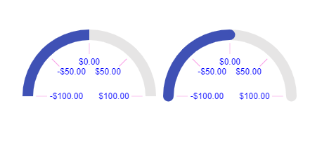
From the screenshot as well, the ArcGauge on the right looks like the value is greater than 0, resulting in the user being mislead on the result.
Test Environment:
OS: Windows_11Screen Reader: NVDA (2021.3)
Repro Steps:
1. Open URL: SMB Scheduler (agentcalendardevone.azurewebsites.net) page in Edge Browser.
7. Observe an issue that Incorrect role 'link' is defined on button controls.
Actual Behavior:
Incorrect role 'link' is defined on button controls present on 'Calendar' popup.
Expected Behavior:
In this case, the expected role is {button}. All components need a proper role attribute, ideally with semantics. In rare cases a role attribute should be added to give full context and information to assistive technology. Learn more by reading about when to use an aria role and the html/aria role mappings.
Environment Details:
OS: Windows11 version 21H2 (OS build 22000.856)
Edge Browser version: 104.0.1293.47
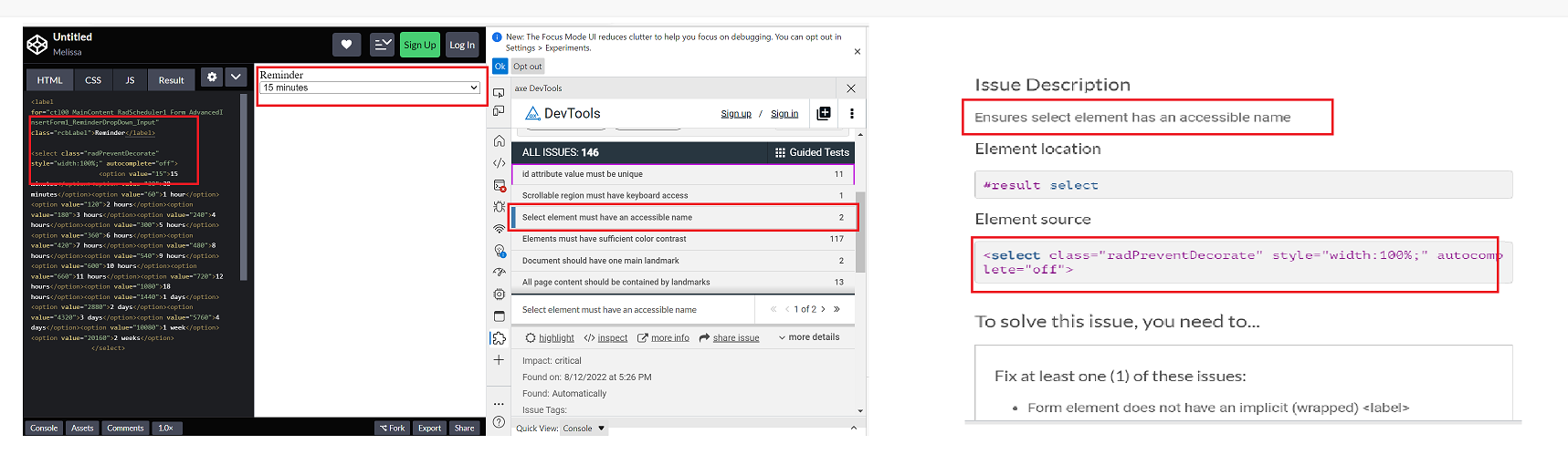
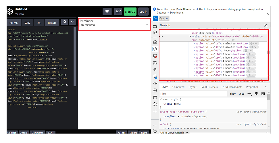
Repro steps:
1. Open Code Pen: https://codepen.io/m1mrt/pen/VwXjEzJ page in Edge Browser.2. Run Axe dev tools3. Observe an issue that select element has an accessible name.
Actual Result:Select element does not have an accessible name.
Expected Result:
All components need an accessible name, ideally using semantic elements and attributes. In rare cases, aria-label or aria-labelled by may be needed to alter the name.
Screenshot attachment:
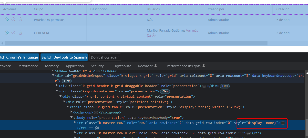
We have problems with the grid because for no reason a 'display:none' appears, specifically in this creation action
We can't understand when the error might occur, we think it's a coincidence of class names.
Can you guide us through this error?
It is my first time raising a support contact so I don't know what background they can mostly support.Greetings and thank you very much
Actual Result:
While navigating in table, Narrator is not announcing as 'enter table' and it is also not announcing rows and column information. while navigating in table, With arrow keys or table navigation keys or tab key, Narrator is announcing as 'end of line/blank'.
With caps-arrow keys, Narrator is giving row and column information.
Expected
While navigating in table, Narrator should announce as enter table and it should also give row and column information. And while navigating with arrow keys or table navigation keys or tab key, Narrator should not announce as 'end of line/blank' instead it should give row or column information
- This issue is observed with all three screen readers.
- Same issue is observed in chrome browser as well.
- Turn on Screen Readers:
- Narrator: Win + Shift + Enter
- NVDA: Ctrl + Alt + N
- JAWS: Ctrl + Alt + J
- Verbosity:
- Narrator: Default
- JAWS: Beginner, Highest
- NVDA: Default
- Open the URL: Agora Home Page (PPE) in latest edge browser.
- Press tab key to move to the 'Save as' control present in the page and activate it using enter key.
- Save as dialog gets displayed.
- Press tab key to move to the 'workspace to be saved as in' edit field and activate it using 'Alt + down arrow key'.
- Enter any invalid data in the search edit field.
- Now Verify whether screen reader is announcing the search result information on giving invalid data in the search edit field in windows or not.
- This issue is observed with all three screen readers.
- Same issue is observed in chrome browser as well.
- Name is not properly defined for once control. Screen reader is narrating the name twice for the once control as "Once check box not checked report frequency: once"
Path: Home > Header > Reports > Schedule a report button > Schedule a Report pop-up.
Refer Attachment: Name is not properly defined for once control.png
- Turn on Screen Readers:
- Narrator: Win + Shift + Enter
- NVDA: Ctrl + Alt + N
- JAWS: Ctrl + Alt + J
- Verbosity:
- Narrator: Default
- JAWS: Beginner, Highest
- NVDA: Default
- Open the URL: Agora Home Page (PPE) in latest edge browser.
- Press tab key to move to the 'Alerts' control present in the page and activate it using enter key.
- 'Alert Definitions' page gets displayed.
- Press tab key to move to the 'Functions? Filter' control and activate it using 'Enter key'.
- Navigate through the radio buttons in the displayed popup using arrow keys and verify whether screen reader is announcing incorrect name for the radio buttons present in the filter dropdown in windows or not.
- Same issue repro on heading 'Workspaces & Dashboards' [appears on Home --> Header--> Hamburger menu--> Popup] (Refer Attachment: Note_1_Same issue repro on heading 'Workspaces & Dashboards'..mp4).
- Heading hierarchy is not sequential in the Home page.
- Turn on Accessibility insights for web extension.
- Navigate to the headings toggle control and turn it on.
- Open the URL: Agora Home Page (PPE) in latest edge browser.
- 'Agora home page (PPE)' will be displayed.
- Navigate to 'Hamburger' menu control using tab key and activate it using enter key.
- 'Workspace and dashboards' popup will be displayed.
- Navigate to 'Add dashboard' control in the list displayed using tab key and activate it using enter key.
- 'Create Dashboard' dialog gets displayed.
- Observe and verify whether visually appearing heading text 'Create Dashboard' in the dialog is not programmatically defined as heading or not.
@progress/kendo-react-inputs@9.0.0
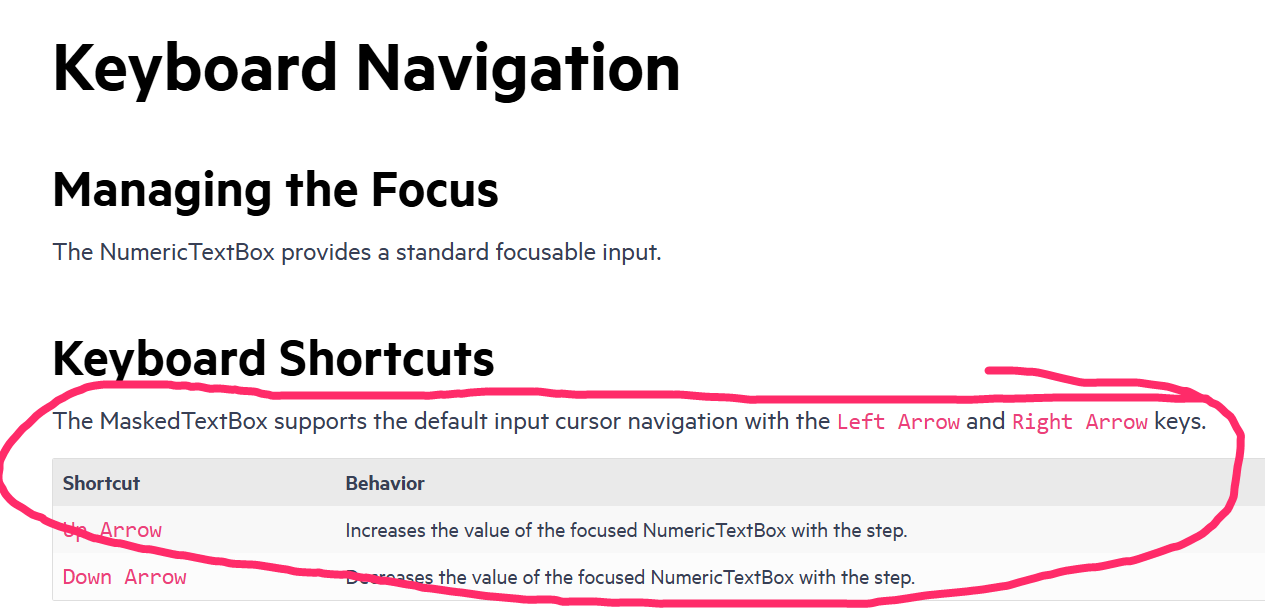
going back to this ticket, we'd like to use CTRL+up/down for our own purposes... as such, you can now disregard that feature request in lieu of fixing this bug =)
since this is undocumented behavior (documentation screenshot below) i believe we have a legitimate bug claim.
also, other controls like DateTimePicker reliably ignore the CTRL+up/down while implementing bare up/down as documented.
Test Environment:
- Open URL: https://www.telerik.com/kendo-react-ui/components/charts/chart/elements/axes/#toc-displaying-time-series
- Kendo React home page will appear.
- Navigate to the "Displaying Time Series" bar graph using tab key.
- Navigate using arrow keys through the chart controls.
- Verify whether the Screen reader is announcing the complete data points information of the "Displaying time Series" bar graph or not.
https://www.jqwidgets.com/jquery-widgets-demo/demos/jqxgrid/index.htm#demos/jqxgrid/dropdowngrid.htm
I would like to use my custom component as the chat input. Is it possible to add new prop to chat component? Similar to DatePicker's "dateInput" prop.
To Whom It May Concern,
I am requesting the Kendo team to implement a new feature of programmatically setting a Grid's page for the Kendo React Grid.
This can be accomplished by having a listener for the Grid's state. For example, when the Grid's skip props is changed, the Grid's page will also change to the number of elements skipped.
Please consider implementing this feature.
Thank you.
Sincerely,
Andrew J. Yang
Keysight Technologies