Hi team.
We would like to provide a possibility to use our specific masks for Date Picker component, like this:
- d.m.y = Current date
- 1.m.y = 1st day of current month
- 31.m.y = Last day of current month
- etc.
Can you recommend a good solution for this?
Hi, Martin.
We are not going to combine MaskedTextBox and DatePicker, we are planing to use selector what will help customer use one of this components.
Thank you for your help, we will try to implement this solution.
Ekaterina.
Hi Ekaterina,
Thank you for providing additional details on this case.
In general, the MaskedTextBox and the DatePicker components are intended to serve different purposes, thus they cannot be combined.
The user can type only numeric values inside the DatePicker component and this is by default.
To achieve the desired outcome the developer should tweak the MaskedTextBox component dynamically and based on the typed value to show the desired date or dynamically toggle the visibility of a DatePicker component and a TextBox. However such implementation would rely on a custom business logic that is left in the hands of the developer.
Regards,
Martin
Progress Telerik
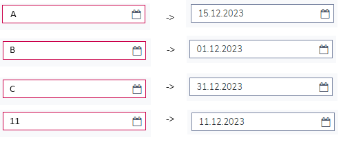
Hi, Martin.
As I explained to your colleague, this is not a formatting task - it is a mask task, so we need components like the MaskedTextBox component, but for a date picker.
For example, we have a mask:
- A - for Current date
- B - for 1st day of current month
- C - for Last day of current month
And when customer type letters/numbers the result should be:
Hi Ekaterina,
The developer can set the format option for the DatePicker to a built-in predefined format
the format table is from the Grid docs, but valid for the DatePicker as well:
or custom format by using custom date format strings:
https://www.telerik.com/kendo-angular-ui/components/grid/columns/formats/#toc-custom-date-formats
In this case, the developer can set the format of the DatePicker to a custom function that accepts the custom format and parses it to the desired one in the function:
<kendo-datepicker [format]="setFormat('d.m.y')" > </kendo-datepicker> setFormat(format) {
console.log(format);
if (format === 'd.m.y') {
return 'd';
}
}For scenarios when the last day should be shown, the value of the DatePicker must be changed along with the custom format.
Regards,
Martin
Progress Telerik
- All
- Completed (449)
- Declined (461)
- Duplicated (86)
- In Development (2)
- Pending Review (1)
- Planned (1)
- Unplanned (745)
- All
- Kendo UI for Angular
- ActionSheet
- Agentic UI Generator
- AIPrompt
- AppBar
- ArcGauge
- AutoComplete
- Avatar
- Badge
- Barcode
- BottomNavigation
- BreadCrumb
- BrowserExtension
- Button
- ButtonGroup
- Calendar
- Card
- Chart Wizard
- Charts
- Chat
- CheckBox
- Chip
- ChipList
- ChunkProgressBar
- CircularGauge
- CircularProgressBar
- ColorGradient
- ColorPalette
- ColorPicker
- ComboBox
- ContextMenu
- DataQuery
- DateInput
- DateMath
- DatePicker
- DateRange
- DateTimePicker
- Diagram
- Dialog
- Drag and Drop
- Drawer
- Drawing
- DropDownButton
- DropDownList
- DropDownTree
- Editor
- ExcelExport
- ExpansionPanel
- FileSaver
- FileSelect
- Filter
- FlatColorPicker
- FloatingActionButton
- FloatingLabel
- FormField
- Forms
- Gantt
- Grid
- GridLayout
- Icon
- InlineAIPrompt
- Label
- Licensing
- LinearGauge
- ListBox
- ListView
- Loader
- Map
- MaskedTextBox
- Menu
- MultiColumnComboBox
- MultiSelect
- MultiSelectTree
- MultiViewCalendar
- Notification
- NumericTextBox
- OTP Input
- Page Templates / Building Blocks
- Pager
- PanelBar
- PDFExport
- PDFViewer
- PivotGrid
- Popover
- Popup
- ProgressBar
- PromptBox
- QRCode
- RadialGauge
- RadioButton
- RangeSlider
- Rating
- Ripple
- Sankey
- Scheduler
- ScrollView
- SegmentedControl
- Signature
- Skeleton
- Slider
- SmartPasteButton
- Sortable
- Sparkline
- SpeechToTextButton
- SplitButton
- Splitter
- Spreadsheet
- StackLayout
- Stepper
- StockChart
- SVGIcon
- Switch
- TabStrip
- TextArea
- TextBox
- TileLayout
- Timeline
- TimePicker
- ToolBar
- Tooltip
- TreeList
- TreeView
- Typography
- Upload
- VS Code Extension
- WebMCP
- Window