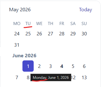
Currently, there is no public API to customize the visible month window. The built-in header buttons move the months window by a two-month span.
Provide a way in the MultiViewCalendar to programmatically shift the displayed months by one month backward or forward. For example:
- Calendar currently shows June and July
- User clicks a Previous button - calendar should show May and June
- Or, user clicks a Next button - calendar should show July and August
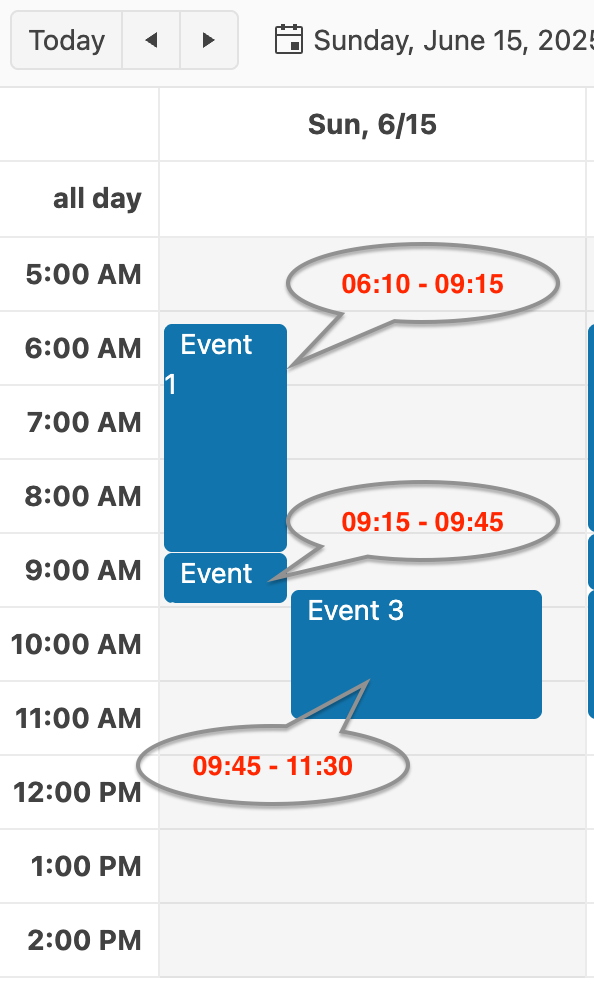
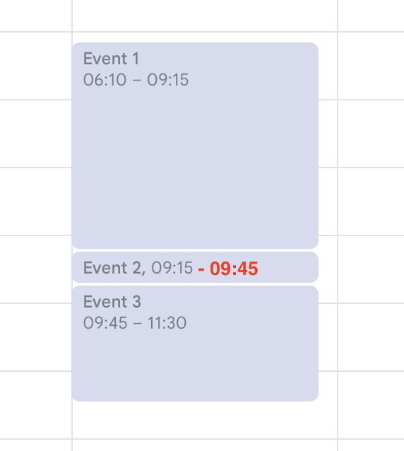
Due to the internal mechanism by which the Scheduler displays events per day, some events are shrunk without reason, because others are shrunk due to overlap.
In the following screenshot, the Scheduler Event 1 has enough space to occupy the entire column, but is shrunk the same as Event 2 (which is shrunk due to the overlap with Event 3). Internally, each day use column separation logic to distribute the events. Since all three events fall into the same slot, the entire column is divided by 3 and events are distributed among them. Since Event 1 is the first event, it has been shown in the first 1/3. This isn't optimal, as this case proves it.
Here is how Kendo Scheduler behaves compared to Google Calendar in this case
Google Calendar
Hello,
I have prepared an example, here's how you reproduce the bug (https://stackblitz.com/edit/angular-2nwrn7db?file=src%2Fapp%2Fapp.component.ts):
1. Move the Product Name column between the Category and Unit Price columns
2. Save the Grid state using the Save State button
3. Reload the page
4. Restore the saved state using the Load State button
5. The multi-column Test (k-grid0-col4) has the wrong OrderIndex (0 instead of 4)
Best regards,
Igor
When dateinput format is "d/M/y" and "allowCaretMode" is enabled, users are unable to enter valid dates. Tested with dateinput and datepicker components.
Steps to reproduce
- Setup a kendo-dateinput component with "allowCaretMode" set to "true" and the "format" set to "d/M/y" (see stackblitz below).
- Enter a valid single-digit day and valid single-digit month into the input.
- Try typing a year.
- Observe that only one character of the year can be entered and the input locks up, preventing the user from completing a valid date.
- Try typing a double digit month.
- Observe that only one character of the month can be entered and the input locks up.
- Try typing a double digit day.
- Observe that only one character of the day can be entered and the input locks up.
Stackblitz example - angular v22 + kendo v24
https://stackblitz.com/edit/angular-kendo-dateinput-bug-rdocwtvr
Expected Behaviour:
The user should be able to enter a full year, month, and day after typing a valid single-digit day and month.
Observed Behaviour:
After entering a single-digit day and month, the input locks up, preventing the user from typing more than one character for the year or month. This prevents users from entering valid dates, making the input unusable in this scenario.
Thanks
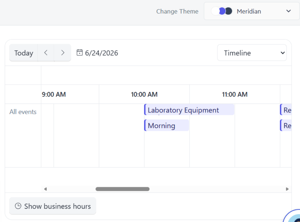
For example, a way to set in the data for the event "Morning" to display first instead of "Laboratory Equipment". It cannot depend on the time range.
Thank you!
Currently, the Diagram component allows setting the zoom level through the zoom property, but it does not provide a way to specify the zoom location or point. As a result, zooming always centers on the (0,0) coordinate.
Add built-in support for programmatically zooming into a specific point through the DiagramComponent API. This can be a method similar to the one available in the Kendo UI for jQuery Diagram widget:
Signal Forms are now stable with Angular@22.
It would be nice to have an ability to use all kendo widgets with new form API.
It would be great if you would allow loading single sheets instead of all the sheets every time. I receive data per sheet from my server.
Also the Spreadsheet fails to trigger events for:
- row added
- row deleted
- column width changed
- row height changed
- cell style changed
- format changed
- cells merged
Provide a built-in option to paste Excel data inside the Editor formatted as a table (like the KendoReact Editor):
The built-in kendoDropDownFilter directive normalizes text using String.prototype.toLowerCase() when caseSensitive: false. This is locale-insensitive and produces incorrect results for languages with non-standard case-folding rules, most notably Turkish.
The correct fix is to use String.prototype.toLocaleLowerCase(locale), which respects locale-specific case rules. The DropDownFilterSettings interface should expose a locale option for this:
filterSettings = {
  caseSensitive: false,
  operator: 'startsWith',
  locale: 'tr-TR'   // ← proposed new option
};
Affected components: kendoDropDownFilter directive (used with AutoCompleteComponent, ComboBoxComponent, MultiColumnComboBoxComponent, DropDownListComponent, MultiSelectComponent).
For the Kendo DatePicker, if you try to set the size on a kendo-datepicker with plain text, it will not render and give a console error of "ERROR TypeError: Cannot read properties of undefined (reading 'nativeElement')".
Errors:
// HTML
<kendo-datepicker size="small" ... />
---
But on the other hand, it does work if you create a field of type "DateInputSize" and pass that variable to the size.
Works:// TS
protected size: DateInputSize = 'small';
// HTML
<kendo-datepicker [size]="size" ... />
Please repeat the following steps to reproduce this critical accessibility issue:
- Go to https://www.telerik.com/kendo-angular-ui/components/editor#angular-editor-example
- In the Angular Editor Example. click in the editor and type one letter to enable the "Undo" toolbar button
- Navigate to toolbar via Shift+Tab key
- Use the left or right arrow key to navigate to "Undo" button
- Use Enter to trigger the "Undo" button which should then re-focus the editor and disable the "Undo" button
- Immediately press Shift+Tab key to navigate back to the toolbar with the "Undo" button disabled
Expected behaviour: The disabled "Undo" button is focused so that toolbar navigation with left or right arrow keys is enabled.
Experienced behaviour: The toolbar is permanently unfocusable with keyboard navigation and the element (theme selector) before the toolbar is focused. It is no longer possible to navigate to any buttons in the toolbar with Tab or Shift+Tab at this point. This happens with any toolbar button that becomes disabled after triggering such as the "outdent" button.
NOTE: The expected behaviour actually works in the jQuery Editor (https://demos.telerik.com/kendo-ui/editor/all-tools), so the Angular Editor should be fixed to match.
it seems like for defining a custom color palette it's currently not possible to use css variables. When doing something like this:
I get a "Cannot parse color: var(--my-color)".
Am I missing something?
If not, is this feature planned to be implemented sometime soon?
For me, I absolutely need this feature since I want to maintain the link between colors used within the application. We have custom colors defined as css variables. I want those colors to appear inside the kendo colorpicker palette and when selecting one I want this css variable to be used, let's say as a colored line in a graph component. when later changing the value of the css variable the color within the graph should update. that's why converting my css variables into hex values does not work for me, since it's breaking the link.
On a sidenote - is it possibel to define a custom palette preset, like the ones available:
  public palettes: string[] = [
    "office",
    "clarity",
    "slipstream",
    "basic",
    "monochrome",
  ];
Thanks for your help.
Thomas
Hi,
We're heavily using the Scheduler component, but we've hit a problem with `slotClick` in scenarios involving multiple scheduler instances on the same page.
With two schedulers on one page, slot detection for the second scheduler (used in context-menu flows via slotByPosition) can be wrong.
Detaild repro: Stackblitz
Repro steps:- Right-click any slot in Scheduler #2.
- slotClick gives expected slot, but slotByPosition(...) can resolve incorrectly/undefined, which can cause error in the app when code depends on slotByPosition.
The issue:
- BaseSlotService.calculateScaleX() uses document.querySelector(".k-scheduler"), which always picks the first scheduler in DOM.
- With two schedulers on one page, slot detection for the second scheduler (used in context-menu flows via slotByPosition) can be wrong.
- Relevant code:
const h = document.querySelector(".k-scheduler");
return h.getBoundingClientRect().width / h.offsetWidth;
- Expected: the instance of scheduler used in the calculation should be the one that fired event, not the first one from DOM.
If we format kendo-datepicker to (MMMM/dd/yyyy) and if we enter number of month in input then it is not reflecting and shows month in input field.
As you can see in screenshot, I called (valueChange) event to see the changed value, I have enter 10 in month input field so it shows two value in console, first one is when 1 is press and second is when 0 is pressed after 1 so it gives null and in input field it shows month instead of October.
It is working if we enter first letter of month but it should work if we enter month in number.
Please fix this issue asap.
Thanks.
Hi Telerik Support Team,
I would like to request a feature enhancement for the Kendo UI for Angular TreeList component, specifically regarding the selection mechanisms.
Feature Request:
Please consider adding a (selectAllChange) event emitter to the <kendo-treelist-checkbox-column> component, similar to how selection events are handled or how other advanced components expose header checkbox interactions.
Use Case / Motivation:
Currently, when a user clicks the "Select-All" checkbox in the header, it is difficult to intercept this specific action efficiently to run custom business logic, perform secondary async operations, or manually update external states that depend strictly on the "all selected/unselected" toggle.
While we can listen to general selection changes on the TreeList, having a dedicated (selectAllChange) event that emits the current state (e.g., true, false, or even a custom event object) would provide much cleaner control over the application state, especially in complex data-binding scenarios.
Proposed Syntax:
<kendo-treelist-checkbox-column
    [showSelectAll]="true"
    (selectAllChange)="onSelectAllChange($event)">
</kendo-treelist-checkbox-column>
Hi,
When the first day of the week is changed dynamically through a custom IntlService, the Calendar weekday headers are updated, but the date cells are not repositioned. (The first day is changed as described in your guide: https://www.telerik.com/kendo-angular-ui/components/knowledge-base/calendar-first-day )
Reproduction (forked from your example): https://stackblitz.com/edit/angular-tqvypgwg
Click on "Set first day to Monday ": the weekday headers are updated to start with Monday, but the date cells remain in their previous positions.
Best regards,
Michael
This event would be useful to focus the editor on some specific scenarios like in the Dialog:
https://www.telerik.com/kendo-angular-ui/components/knowledge-base/focusing-editor-inside-dialog
It currently relies on a short delay, which might differ depending on the machine.
When the user wants to select a date, the filter closes up and the user is not able to select any date from the calendar.
The issue is happening on tablet device in portrait mode and we found out that it's happening on your documentation too. To reproduce the issue, please go to the "Angular Grid Filter Menu" in your documentation:
https://www.telerik.com/kendo-angular-ui/components/grid/filtering/filter-menu/
Please open the dev tools and set the browser on any tablet portrait size or use Galaxy Tab S4.
In your first example (Angular Grid Filter Menu), please click on the "Date" filter in the grid. When the popup opens up, please click on the calendar icon
of the date input field.
When the calendar shows up, try to select any date. You'll see that the filter closes up and the user is not able to select any date. Demo video attached for reference.
Please fix this bug as we support Samsung Galaxy tablet devices and we're using this feature in our project.