For the Kendo DatePicker, if you try to set the size on a kendo-datepicker with plain text, it will not render and give a console error of "ERROR TypeError: Cannot read properties of undefined (reading 'nativeElement')".
Errors:
// HTML
<kendo-datepicker size="small" ... />
---
But on the other hand, it does work if you create a field of type "DateInputSize" and pass that variable to the size.
Works:// TS
protected size: DateInputSize = 'small';
// HTML
<kendo-datepicker [size]="size" ... />
Hi,
When the first day of the week is changed dynamically through a custom IntlService, the Calendar weekday headers are updated, but the date cells are not repositioned. (The first day is changed as described in your guide: https://www.telerik.com/kendo-angular-ui/components/knowledge-base/calendar-first-day )
Reproduction (forked from your example): https://stackblitz.com/edit/angular-tqvypgwg
Click on "Set first day to Monday ": the weekday headers are updated to start with Monday, but the date cells remain in their previous positions.
Best regards,
Michael
When the user wants to select a date, the filter closes up and the user is not able to select any date from the calendar.
The issue is happening on tablet device in portrait mode and we found out that it's happening on your documentation too. To reproduce the issue, please go to the "Angular Grid Filter Menu" in your documentation:
https://www.telerik.com/kendo-angular-ui/components/grid/filtering/filter-menu/
Please open the dev tools and set the browser on any tablet portrait size or use Galaxy Tab S4.
In your first example (Angular Grid Filter Menu), please click on the "Date" filter in the grid. When the popup opens up, please click on the calendar icon
of the date input field.
When the calendar shows up, try to select any date. You'll see that the filter closes up and the user is not able to select any date. Demo video attached for reference.
Please fix this bug as we support Samsung Galaxy tablet devices and we're using this feature in our project.
When enabling the showSelectAll option in a checkbox column on the TreeList component, a checkbox is rendered with the TreeListSelectAllCheckboxDirective. In its constructor, this directive includes some logic that causes the TreeList to instantiate a new ViewCollection every time a selection change occurs. However, the call to ViewCollection.loadView() does not pass the service responsible for determining expanded nodes, so the default fallback (which returns true for all nodes) is used.
Problem
As a result, every checkbox interaction triggers fetchChildren() for all nodes, even those that were never expanded or loaded. This leads to:Unnecessary and potentially expensive backend calls
Performance degradation, especially with large datasets
Inefficient "select all" logic that does not respect the current loaded/visible state
This behavior appears to ignore the fact that TreeList is configured for remote data binding with lazy-loaded children.
Expected Behavior
showSelectAll should only evaluate the currently loaded and visible itemsfetchChildren() should not be called for every nodeIntegration with remote/lazy-loaded data should be respected
Suggested Solutions
Update TreeListSelectAllCheckboxDirective to properly integrate with the expanded node detection logic or allow injection of a custom service.
Provide an override or callback to control the behavior of the "select all" checkbox manually in remote scenarios.
Steps to Reproduce
Configure a TreeList with hasChildren and children to fetch child nodes lazily.
Enable selection with checkbox column and showSelectAll: true.
Click any checkbox inside the TreeList.
Observe that fetchChildren() is triggered for all nodes, not just expanded ones.
StackBlitz repro:
Open console and click on the first cell.
https://stackblitz.com/edit/angular-e2ai4pjx?file=src%2Fapp%2Fapp.component.ts,angular.json
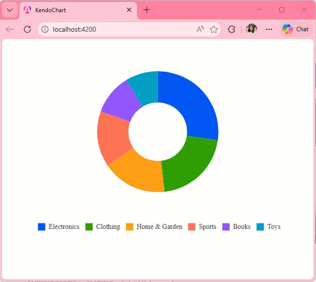
Description
When you move the cursor to a new series item, the tooltip position does not move until you leave the chart area and re-enter. It changes the content based on where the cursor is pointing, but does not change the position.
Steps To Reproduce
- Create a new Angular application
- Add the Kendo UI Chart and paste the following code in the app.component.ts file:
import { Component } from '@angular/core';
import {KENDO_CHARTS} from "@progress/kendo-angular-charts";

@Component({
  selector: 'app-root',
  imports: [KENDO_CHARTS],
  template: `
    <kendo-chart>
      <kendo-chart-legend position="bottom"></kendo-chart-legend>
      <kendo-chart-series>
        <kendo-chart-series-item
          type="donut"
          [data]="data"
          field="value"
          categoryField="category"
          colorField="color"
          [holeSize]="60"
          [tooltip]="{
            visible: true,
            format: '{0:C0}'
          }"
          [highlight]="{ visible: true }"
        >
        </kendo-chart-series-item>
      </kendo-chart-series>
    </kendo-chart>
`,
})
export class App {
  public data = [
    { category: "Electronics", value: 245000, color: "#0058e9" },
    { category: "Clothing", value: 189000, color: "#37b400" },
    { category: "Home & Garden", value: 156000, color: "#f59c1a" },
    { category: "Sports", value: 134000, color: "#ff6358" },
    { category: "Books", value: 98000, color: "#8c43ff" },
    { category: "Toys", value: 78000, color: "#00acc1" },
  ];
}
- Run the application
Screenshots or video

Actual Behavior
The Tooltip position only changes when you leave and reenter the Chart area. It does not change when you move the cursor from one series item to other, it updates the content displayed in the Tooltip though.
Expected Behavior
The Tooltip position should move with the cursor as seen in the screen recording below:
Because of the CSS, if a parent element has used translate (transform: translateX(0px); ) every child element under it is no longer fixed.
This causes components like kendo-dialog to be relatively positioned inside the drawer - usually cut off.
Even turning off animation still leaves the style rule.
- Disabling animation should also ensure no related CSS is applied (like using transform: none at least)
- Provide a keyframe based animation instead of translateX (example http://jsfiddle.net/whnuLf6v/50/)
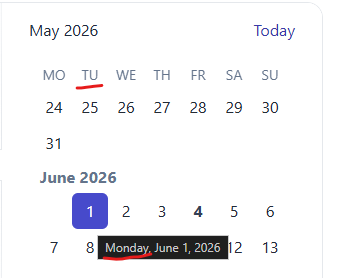
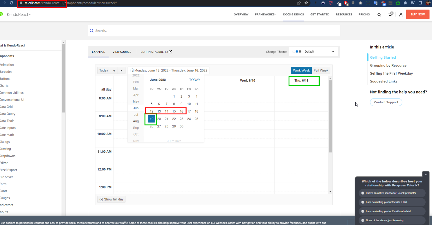
For Angular Kendo Scheduler, if the Work week view is selected (default Mon-Fri), and Sunday is selected on the mini calendar to select the date to display - the previous week will be displayed. This is confusing, as simply toggling to Week view will then display the different, current week.
https://www.telerik.com/kendo-angular-ui/components/scheduler/views/day-week/
Expected behaviour: current week on mini calendar corresponds to the current week displayed regardless of whether full week or work week view is selected
Actual behaviour: selecting any day up until the desired "work week's start" (even if it's customized to start on e.g. Tuesday - and selecting Monday) will show previous week; switching then to full week view switches the week displayed to the one selected on mini calendar
------
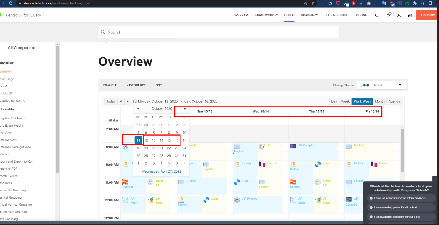
Curiously, this does not happen for Kendo scheduler for JQuery (https://demos.telerik.com/kendo-ui/scheduler/index):
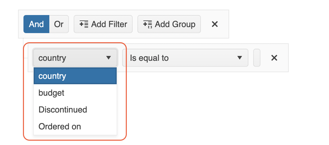
Ability to customize the fields control of the FilterExressions:
Hi,
in the ListBoxComponent, there is the concept of custom messages, by which a "noData" message can be set:
https://www.telerik.com/kendo-angular-ui/components/listbox/api/custommessagescomponent#nodatatext
A similar concept would be beneficial for the ListView (https://www.telerik.com/kendo-angular-ui/components/listview), so that we can show a message in here as well in case no data is available.
Thanks,
Felix
Hi,
Please provide a template for the operators of the FilterExressions.
thanks
Currently, the (X) close button is always shown and visible. In other words, it is not possible to configure the dialog component to NOT display this icon button. It is actually not just about the icon button, but also the ESC shortcut. It should not be possible to close the dialog when the input is set.
Feature request: Add an input `closable` for the Dialog Component ('kendo-dialog') to be able to turn off the closable behaviour. Example:
```html
<kendo-dialog [closable]="false"></kendo-dialog>
```
The "closable" is `true` by default, ensuring that it is backwards compatible.
Use case: A certain dialog is presented to the user and user must NOT be able to close/ignore the dialog. The user is thus forced to resolve the instructions presented in the dialog and resolve it the intended way.
In certain scenario, Popup of the Multiselect component is not quite opened on the correct position. I did not check but this issue is probably reproducible for other dropdown components (such as Combobox, DropdownList, etc) as well.
It seems to me this happens when:
- A width greater than the widht of the input is set
- AND input is too close to the bottom-right edge of the window and as a result popup cannot be shown below the input element but above it instead
THEN in the very first render, the popup is not position quite right and moves a bit in the next render.
Precise steps to reproduce problem:
- Make sure to use minimal reproducible example attached below.
- Click and hold left button of a mouse inside the MultiSelect Component.
- The popup should open up and be positioned above the input but not being quite aligned right with the window nor the input.
- Release the left button of a mouse.
- The popup recalculates its position.
- Problem: The popup should have been positioned correctly when opened (NOT after releasing mouse button).
Minimal reproducible example:
import { Component, ViewEncapsulation } from '@angular/core';
import { FormsModule } from '@angular/forms';
import {
  KENDO_DROPDOWNS,
  PopupSettings,
} from '@progress/kendo-angular-dropdowns';
import { KENDO_INPUTS } from '@progress/kendo-angular-inputs';
import { KENDO_LABELS } from '@progress/kendo-angular-label';

@Component({
  selector: 'my-app',
  imports: [FormsModule, KENDO_DROPDOWNS, KENDO_LABELS, KENDO_INPUTS],
  styles: [
    `
      .app-layout {
        padding: 1rem;
        height: 800px;
        display: grid;
        grid-template-columns: 1fr 230px;
      }

      .sidebar {
        height: 100%;
        padding: 1rem;
        display: flex;
        flex-direction: column;
        justify-content: space-between;
      }

      .unrelated-sidebar-content {
        height: 200px;
      }

      .box {
        border: 1px solid grey;
      }
    `,
  ],
  template: `
    <div class="app-layout">
      <main class="box"> Main Content </main>
      <aside class="box sidebar">
        <div class="box unrelated-sidebar-content">Imagine some other content here</div>
        <kendo-formfield showHints="always">
          <kendo-label text="Favorite sport:">
            <kendo-multiselect
              [data]="listItems"
              [(ngModel)]="value"
              [popupSettings]="popupSettings"
            ></kendo-multiselect>
          </kendo-label>
          <kendo-formhint
            >Add your favourite sport, if it is not in the
            list.</kendo-formhint
          >
        </kendo-formfield>
      </aside>
    </div>
  `,
  encapsulation: ViewEncapsulation.None,
})
export class AppComponent {
  public listItems: Array<string> = [
    'Width Must Be Greater Than Width Of The Multiselect Component Because We Have Super Long Text',
    'When List Is Open, It Moves Slightly To The Right',
    'It Is Not Possible To Align Popup With The Right Edge',
    'It Is Not Possible To Set "anchorAlign" and "popupAlign"',
  ];
  public value: any = [];
  // @see https://www.telerik.com/kendo-angular-ui/components/popup/aligning-positioning#positioning
  public popupSettings: PopupSettings = { width: 500 };
}
Alignment to the right
I believe, this could be simply solved if we were able to configure "anchorAlign" and "popupAlign" as described here: https://www.telerik.com/kendo-angular-ui/components/popup/aligning-positioning#positioning .
In addition, it would be a nice feature in general, to be able to align popup with the element's right edge. Currently, this is pretty much hard coded:
        const horizontalAlign = this.direction === "rtl" ? "right" : "left";
        const anchorPosition = <Align>{ horizontal: horizontalAlign, vertical: "bottom" };
        const popupPosition = <Align>{ horizontal: horizontalAlign, vertical: "top" };
        const appendToComponent = typeof this.popupSettings.appendTo === 'string' && this.popupSettings.appendTo === 'component';

        this.popupRef = this.popupService.open({
            anchor: this.wrapper,
            anchorAlign: anchorPosition,
            animate: this.popupSettings.animate,
            appendTo: this.appendTo,
            content: this.popupTemplate,
            popupAlign: popupPosition,
            popupClass: this.listContainerClasses,
            positionMode: appendToComponent ? 'fixed' : 'absolute'
        });
From the code above, it is clear that the "horizontalAlign" cannot be really configured. In simple terms, you could use "left" alignment as a default intead of it being hard-coded like that; and prefer alignment specified in the "popupSettings".
Please, let me know if something needs to be further clarified.
The Angular Grid export only includes PDF and Excel formats. Requesting an enhancement to be able to export to CSV for purposes of opening the data in a text editor other than Excel or to allow for easier upload into other applications.
There are articles that show how to do this but it would be better out of the box from Telerik.
https://stackblitz.com/edit/kendo-angular-grid-csv-export?file=app/app.component.ts
https://www.codeproject.com/Articles/5162666/CSV-Export-In-Angular-with-Kendo-Control
Provide the possibility to dynamically change the height of the slots in Month, Multi-Week, and other views. This feature is useful in order to fit the events in the specific slot:
jQuery Scheduler:
https://demos.telerik.com/kendo-ui/scheduler/adaptive-slot-height
Enable event handling for paste, copy, and cut actions in the Spreadsheet. This allows developers to track and customize these interactions, improving user experience and data management.
Similar to Kendo jQuery Spreadsheet widget:
https://docs.telerik.com/kendo-ui/api/javascript/ui/spreadsheet#events
https://stackblitz.com/edit/angular-obj4gecf
If you click the first 2 cells in column "UnitPrice", the first one reports column 2 (which is correct), the second reports column 1.
I suspect rowSpan causes this, rows without rowSpan seem to work.