In firefox, open the Kendo Radio Button documentation and slowly resize the window (https://www.telerik.com/kendo-angular-ui/components/inputs/radiobutton)
The radio button will kind of jiggle around and occasionally the white dot in the radio button will become off-center.

This also seems to happen in response to some material bouncy (cubic-bezier) animation transitions.
Kendo timeline range in the gantt can be miscalculated if children have start and end days earlier that their parent.
This happens to due oversight in TimelineBaseViewService.getRange function. Two variables startResult and endResult are calculated using only top-level entities from the supplied data hierarchy.
This stackblitz shows 2 cases.
- The item is out of the bounds on the left due to an earlier start date than its parent's start date.
- The item is rendered either as three dots or out of bounds on the right side (depends on the browser. Firefox tend to display three dots, Chrome clips the right side) due to end date being later than its parent's end date.
That's mostly visible on Day and Week timelines, however I believe can be reproduced on monthly and yearly views if the date spread is large enough.
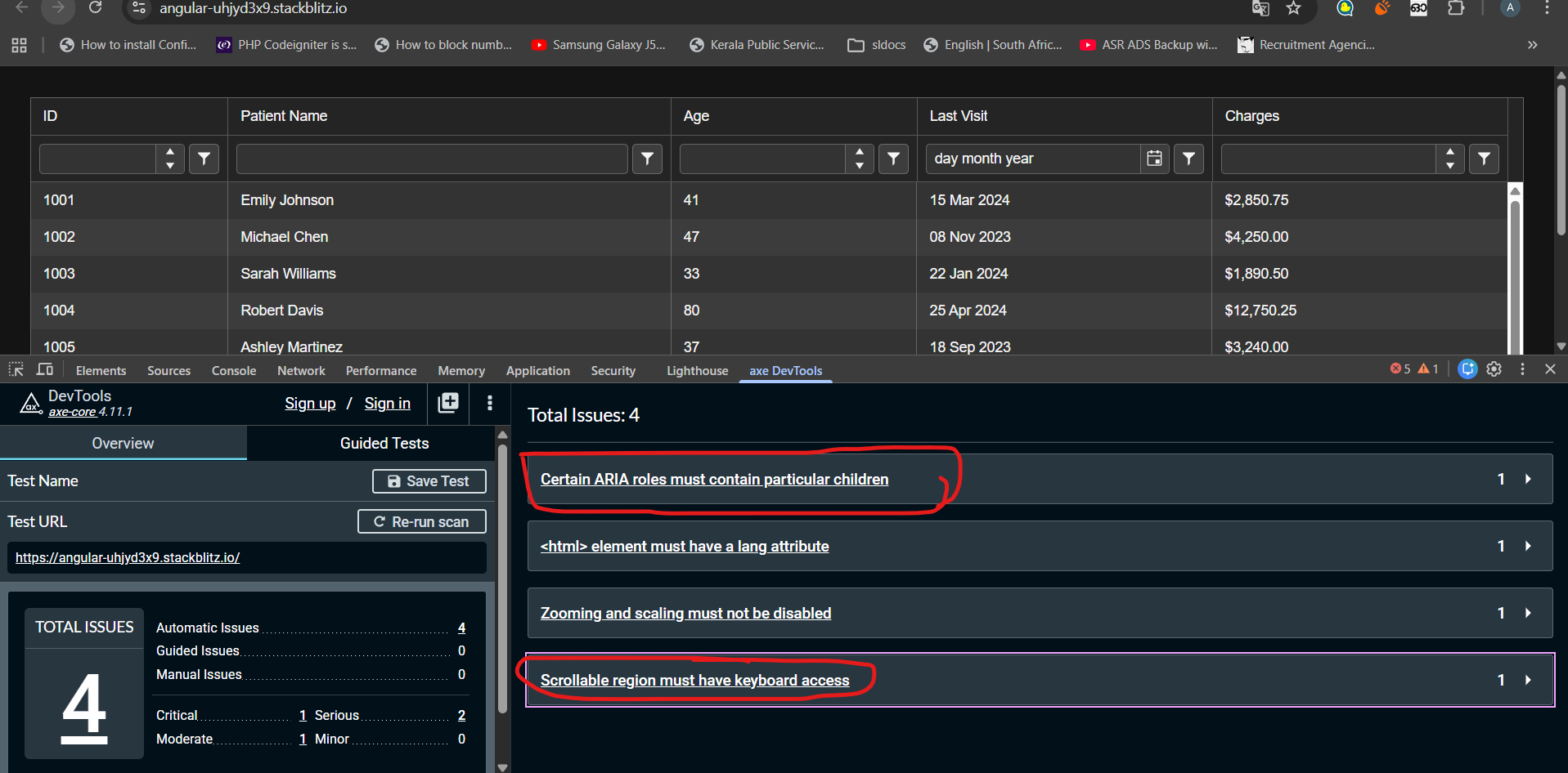
I have tested kendo grid accessibility with AXE Dev tool. Found following errors that seems difficult to fix.
1)Certain ARIA roles must contain particular children
2)Scrollable region must have keyboard access
Any suggestion to fix these above-mentioned issues could be very helpful. Noticed these issues even exist in kendo grid demos published in kendo documentation. Check the link below
stack blitz link : https://stackblitz.com/edit/angular-uhjyd3x9?file=src%2Findex.html
When a tooltip of a dialog is shown and the dialog is closed, the tooltip is still present and is moved into the top left corner.
We use e.g. `kendo-dialog-titlebar` and the close button has a tooltip.
Hi,
if I change the [placeholder] input on a kendo-editor, the changes are not reflected.
Reproduction (forked from your example): https://stackblitz.com/edit/angular-uqbchubd
Can you please take a look at it?
Best regards,
Michael
momentjs is a widely used date library which makes handling dates much more comfortable, and all Date components should support it
It would be nice to have access to a valueChange event in the autocomplete similar to the other dropdowns. This way when binding against arrays of complex objects, we could receive the whole object selected instead of the single value property out of it.
In the Kendo ComboBox, the selection part is not working with shadow dom.
1. Reproduction:
Please look at the below links,
With ShadowDOM:
https://stackblitz.com/edit/angular-evkasb?file=app%2Fapp.component.ts
Without ShadowDOM:
An example is provided in the below link under 'ENABLING SUGGESTION' section
https://www.telerik.com/kendo-angular-ui/components/dropdowns/combobox/suggestions/
Expected Result:
When user type 'C', the first word starts with C in the list 'Croatia' is suggested and 'roatia' is selected. But as soon as I type 'y' next to 'c', the combo box is suggesting 'Cyprus' and 'prus' should be selected
Actual Result:
As soon as I type the first word starts with C in the list is 'Croatia' is populated in the Combobox and 'roatia' is NOT selected. So the user cannot type ‘y’ in this case. But the user wants to select ‘CYPRUS’ but 'Croatia' is filled as the input and Cyprus is not suggested.
I have attached the video for the difference between with/without shadow dom.
Also, If you need any additional information, I have created a support ticket:
Allow defining buttons in ButtonGroup component using NgTemplateOutlet:
  <kendo-buttongroup>
    <ng-container *ngTemplateOutlet="buttonsList"></ng-container>
  </kendo-buttongroup>

  <ng-template #buttonsList>
    <button kendoButton size="small">Button 1</button>
    <button kendoButton size="small">Button 2</button>
    <button kendoButton size="small">Button 3</button>
  </ng-template>
So far, the ButtonGroup doesn't appear when using this markup.
Ran this on StackBlitz
import { Component } from '@angular/core';
import {
  LegendLabelsContentArgs,
  SeriesClickEvent,
} from '@progress/kendo-angular-charts';
import { IntlService } from '@progress/kendo-angular-intl';

@Component({
  selector: 'my-app',
  template: `
    <kendo-chart
      (plotAreaClick)="onClick($event)"
      [transitions]="false"
      title="World Population by Broad Age Groups"
    >
      <kendo-chart-legend position="bottom"></kendo-chart-legend>
      <kendo-chart-series>
        <kendo-chart-series-item
          type="donut"
          [data]="pieData"
          field="value"
          categoryField="category"
          explodeField="exploded"
          [labels]="{ visible: true, content: labelContent }"
        >
        </kendo-chart-series-item>
      </kendo-chart-series>
    </kendo-chart>
  `,
})
export class AppComponent {
  public pieData: Array<{
    category: string;
    value: number;
    exploded: boolean;
  }> = [
    { category: '0-14', value: 0.2545, exploded: false },
    { category: '15-24', value: 0.1552, exploded: false },
    { category: '25-54', value: 0.4059, exploded: false },
    { category: '55-64', value: 0.0911, exploded: false },
    { category: '65+', value: 0.0933, exploded: false },
  ];

  constructor(private intl: IntlService) {
    this.labelContent = this.labelContent.bind(this);
  }

  public labelContent(args: LegendLabelsContentArgs): string {
    return `${args.dataItem.category} years old: ${this.intl.formatNumber(
      args.dataItem.value,
      'p2'
    )}`;
  }

  public onClick(event: any): void {
    console.log('Click');
  }
}
When the event is seriesClick, it works as expected, and if I change the type to bar, it works as expected, but when it's as shown as above, the onClick event isn't triggered.
As I have donuts/pies that might not have data in it, I needed to use plotAreaClick (which I have done for the bar charts)
Thanks,
Please support out of the box support for modality. I know there is how to, but out of the box, for such basic feature seems reasonable.
Also suggested how to doesn't work for windows initialised through service.
This would also align Angular Window component with KendoUI Window component modality.
I would like to move dialog (because there is some content behind I need to see in order to fill form in dialog).
It would also be great if it could be resizable. If you have an input component inside dialog, you could set width to 100%.
Please provide row virtualization as addition to the current virtual scrolling functionality.
Current behavior
Virtual scrolling is currently tied to the pageSize. This is not always desirable as page size can be much higher than the visible area to optimise for network latency.
For example if the pageSize is 200 rows and the grid is only 10 rows high we'll be rendering 190 more rows than needed at initialization time.
Expected behavior
Virtual scrolling should include an option to render only the visible rows at any given time.
I am using below piece of code inside <kendo-grid>. Here, I am using a dropdown and kendo excel export button inside toolbar. dropdown is in left and button is right aligned. Earlier, it was working till Kendo 18. When I upgraded to kendo 19, it stopped working.
Root Cause is kendo-dropdownlist contains an array button. When we click on button to expand dropdown, excel export button gets the focus and dropdown loses focus. When we click on dropdown button, 'k-focus' class is applied on 'excel-export'. Because of this, dropdown is not working.
Code:
<ng-template kendoGridToolbarTemplate>
<div class="toolbar-container" style="display: flex; align-items: center; gap: 16px; width: 100%;">
<!-- Dropdown Wrapper -->
<div style="flex-shrink: 0;">
<kendo-dropdownlist [data]="data"
[(ngModel)]="someField" [valuePrimitive]="true" (valueChange)="perform()"
[popupSettings]="{ appendTo: 'component' }" style="width: 175px;">
</kendo-dropdownlist>
</div>
<!-- Spacer to push button to right -->
<div style="flex-grow: 1;"></div>
<!-- Excel Export Button -->
<div style="flex-shrink: 0;">
<button type="button" kendoGridExcelCommand>Export</button>
</div>
</div>
</ng-template>
I used this example to replace the built-in icons of the Kendo UI components. I was able to modify all the icons except the x icon in the Kendo UI Dialog and Window component. The x icon in the Kendo UI ComboBox was replaced as well.
The issue can be seen in this StackBlitz example.
./node_modules/@progress/kendo-angular-layout/fesm2022/progress-kendo-angular-layout.mjs:19:0-75 - Error: Module not found: Error: Can't resolve '@progress/kendo-angular-progressbar' in 'C:\LiveMRIProjects\MRI.AgoraInsightsAnywhere-Angular\node_modules\@progress\kendo-angular-layout\fesm2022'
./node_modules/@progress/kendo-angular-layout/fesm2022/progress-kendo-angular-layout.mjs:22:0-56 - Error: Module not found: Error: Can't resolve '@progress/kendo-angular-intl' in 'C:\LiveMRIProjects\MRI.AgoraInsightsAnywhere-Angular\node_modules\@progress\kendo-angular-layout\fesm2022'
this is the error is coming
when we add kendo thing into module.ts file
If the pane is scrolled, the dark highlight shown when grabbing the splitter is misaligned like this:

Stackblitz repro can be found here
Provide an option to focus programmatically a multiselect item, in order to prevent the popup list from scrolling when the last item is selected.
Here is an example:
https://stackblitz.com/edit/angular-qpbow1-awhxbr?file=app%2Fapp.component.ts
Hi,
https://stackblitz.com/edit/angular-dadm5ywe?file=src%2Fapp%2Fapp.component.ts
Please select the top-most button, then press TAB until the focus is on the button in the last grid cell.
Then press tab again => the focus moves to the last cell itself.
Press tab again => the focus moves back to the last button.
=> here we got into an endless loop, you cannot navigate to the button below the grid.
Interestingly, you can leave the grid if you navigate backwards with shift+tab.
best regards,
Michael