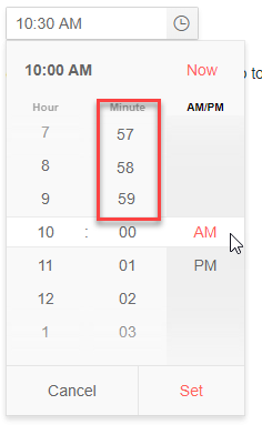
In the TimePicker (and other Date Input controls) you can in the input field use the arrow keys or mousewheel to go endless through the options. E.g. for minutes you can go directly from 00 to 59 using the down arrow. Especially with large ranges like minutes this is handy.
But in the popup you can't do that. It would be nice that the user can scroll directly from 00 to 59, 58 and so on. See composed image below.
(This should not be done when there are less options than the size of the popup, else you whould get duplicate options visible. That would be confusing for the user.)
Would be a usefull feature, especially when using this control on touch devices.
Hi Eldad,
Thank you for the provided feedback.
There is no doubt that the feature would be a great addition to the component. But due to the lack of interest and votes, we declined the request.
It seems that you are also interested in it, that is why I added your vote.
In case the feature gets more popular in the future we will reconsider the status of the request.
Regards,
Martin
Progress Telerik
Please reconsider this feature, if possible.
Not only it is more comfortable to have an endless scroll and to be able to go directly to 59 from 1, but it also visually much more compelling: at the moment the initial view contains a pretty large empty portion, waiting there for the user to scroll. it would look better if it will always be filled with numbers.
Hi Jaap,
We are declining this request due to low interest and demand. However, if there is a surge in popularity at a later time, we will reconsider its status.
Regards,
Yanmario
Progress Telerik
Hi Jaap,
Thank you for the logged feature request.
Indeed, that would be a valuable addition to the widgets using this type of popup.
We will track the customer demand here and will consider providing such an enhancement in the future, based on the interest.
Regards,
Martin
Progress Telerik
Our thoughts here at Progress are with those affected by the outbreak.
- All
- Kendo UI for Angular
- ActionSheet
- Agentic UI Generator
- AIPrompt
- AppBar
- ArcGauge
- AutoComplete
- Avatar
- Badge
- Barcode
- BottomNavigation
- BreadCrumb
- Button
- ButtonGroup
- Calendar
- Card
- Chart Wizard
- Charts
- Chat
- CheckBox
- Chip
- ChipList
- ChunkProgressBar
- CircularGauge
- CircularProgressBar
- ColorGradient
- ColorPalette
- ColorPicker
- ComboBox
- ContextMenu
- DataQuery
- DateInput
- DateMath
- DatePicker
- DateRange
- DateTimePicker
- Diagram
- Dialog
- Drag and Drop
- Drawer
- Drawing
- DropDownButton
- DropDownList
- DropDownTree
- Editor
- ExcelExport
- ExpansionPanel
- FileSaver
- FileSelect
- Filter
- FlatColorPicker
- FloatingActionButton
- FloatingLabel
- FormField
- Forms
- Gantt
- Grid
- GridLayout
- Icon
- InlineAIPrompt
- Label
- Licensing
- LinearGauge
- ListBox
- ListView
- Loader
- Map
- MaskedTextBox
- Menu
- MultiColumnComboBox
- MultiSelect
- MultiSelectTree
- MultiViewCalendar
- Notification
- NumericTextBox
- OTP Input
- Page Templates / Building Blocks
- Pager
- PanelBar
- PDFExport
- PDFViewer
- PivotGrid
- Popover
- Popup
- ProgressBar
- PromptBox
- QRCode
- RadialGauge
- RadioButton
- RangeSlider
- Rating
- Ripple
- Sankey
- Scheduler
- ScrollView
- Signature
- Skeleton
- Slider
- SmartPasteButton
- Sortable
- Sparkline
- SpeechToTextButton
- SplitButton
- Splitter
- Spreadsheet
- StackLayout
- Stepper
- StockChart
- SVGIcon
- Switch
- TabStrip
- TextArea
- TextBox
- TileLayout
- Timeline
- TimePicker
- ToolBar
- Tooltip
- TreeList
- TreeView
- Typography
- Upload
- VS Code Extension
- Window

