Hello,
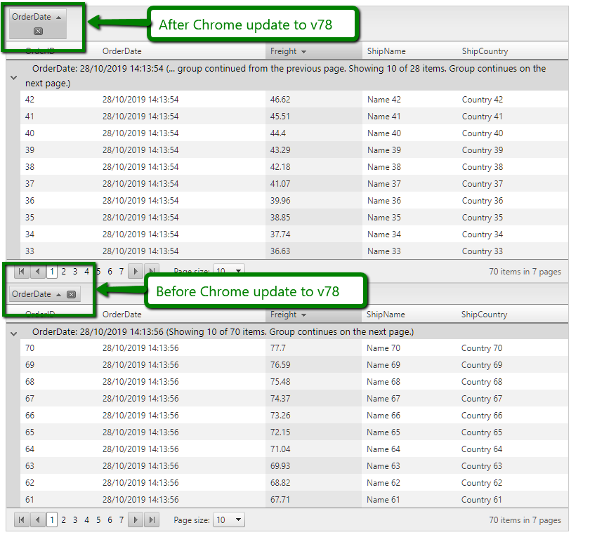
There is an issue with Classic render mode Grid when grouping is enabled. The width of the grouping is incorrect and some of the icons are wrapped on the next row.
Hello YC,
Thank you for bringing this issue to our attention.
It seems that Google Chrome introduced yet another regression regarding the table styling as the same problem is replicated with the following pure HTML snippet:
<!DOCTYPE html>
<html>
<head>
<title></title>
<meta charset="utf-8" />
</head>
<body>
<table>
<tbody>
<tr>
<th scope="col" style="white-space: nowrap;">
OrderDate
<input type="submit" value=" ">
<input type="submit" value=" ">
</th>
<td style="width: 100%;"></td>
</tr>
</tbody>
</table>
</body>
</html>The good news is that the issue is not replicated in Google Chrome Canary, which is 2 versions ahead of Google Chrome(i.e. if Google Chrome is v78, Google Chrome Canary will be equivalent to v80). That means in a few weeks the problem will be gone once Google Chrome is updated to v80.
Meanwhile, you can use one of the following approaches:
1) Migrate to the supported and new Lightweight render mode:
2) Use the following CSS style that is applied only for Google Chrome versions v78 and v79:
<style>
    .t-chrome78 .RadGrid table.rgGroupPanel table th.rgGroupItem,
    .t-chrome79 .RadGrid table.rgGroupPanel table th.rgGroupItem{
        display:-webkit-box;
    }
</style>
Regards,
Peter Milchev
Progress Telerik
- All
- Completed (3272)
- Declined (931)
- Duplicated (30)
- In Development (1)
- Unplanned (951)
- Won't Fix (297)
- All
- UI for ASP.NET AJAX
- AIPrompt
- Ajax
- AjaxLoadingPanel
- AjaxPanel
- AsyncUpload
- AutoCompleteBox
- Avatar
- Badge
- Barcode
- BinaryImage
- Breadcrumb
- Button
- Calendar
- Captcha
- Card
- Chat
- CheckBox
- Chip
- ChipList
- ClientDataSource
- ClientExportManager
- CloudUpload
- ColorPicker
- ComboBox
- Compression
- DataForm
- DataPager
- DateInput
- DatePicker
- DateRangePicker
- DateTimePicker
- DeviceDetectionFramework
- Diagram
- Dock
- DragDropManager
- Drawer
- DropDownList
- DropDownTree
- Editor
- FileExplorer
- Filter
- FloatingActionButton
- FormDecorator
- Gantt
- Gauge
- Grid
- HtmlChart
- ImageButton
- ImageEditor
- ImageGallery
- Input
- InputManager
- Installer and VS Extensions
- Label
- Licensing
- LightBox
- LinkButton
- ListBox
- ListView
- Map
- MaskedTextBox
- MediaPlayer
- Menu
- MonthYearPicker
- MultiColumnComboBox
- MultiSelect
- Navigation
- Notification
- NuGet feed
- NumericTextBox
- ODataDataSource
- OrgChart
- OTPInput
- PageLayout
- PanelBar
- PdfViewer
- PersistenceFramework
- PivotGrid
- ProgressArea
- ProgressBar
- PushButton
- Rating
- RibbonBar
- Rotator
- Scheduler
- ScriptManager
- SearchBox
- Signature
- SiteMap
- SkinManager
- Slider
- SmartPasteButton
- SocialShare
- SpeechToTextButton
- Spell
- SplitButton
- Splitter
- Spreadsheet
- Stepper
- StyleSheetManager
- Switch
- TabStrip
- TagCloud
- Theme Builder
- Ticker
- TileList
- TimeLine
- TimePicker
- ToggleButton
- ToolBar
- ToolTip
- TreeList
- TreeMap
- TreeView
- Visual Style Builder
- Window
- Wizard
- XmlHttpPanel

