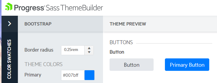
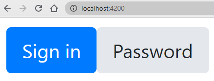
There seems to be a styling bug in the Kendo theme for Bootstrap.
Default Bootstrap buttons has this strange shadow or border issue
Hi Maikel,
Thank you for the provided details. I was able to reproduce the problem in the ThemeBuilder and logged the issue for further investigation and fixing. As a small sign of gratitude I updated your points.
Regards,
Iliana Nikolova
Progress Telerik
Virtual Classroom, the free self-paced technical training that gets you up to speed with Telerik and Kendo UI products quickly just got a fresh new look + new and improved content including a brand new Blazor course! Check it out at https://learn.telerik.com/.
Let me clarify on what button we use.
The problem is not with the kendo button but with the bootstrap button combined with Kendo theme SASS.
When you use the default bootstrap button (style) when combined with kendo, the kendo theme bundle overrides bootstrap styling. Applying a shadow on the btn class of bootstrap.
As previously stated, on the theme builder, when you scroll down to the button section where the default bootstrap button is used without the kendoButton attribute and with the class="btn ..." styling, there is a strange shadow applied.
Because kendo does not support a success, danger etc.. type button, we still use the bootstrap button.
Kind regards,
Maikel
Hello,
Thank you for the provided additional details about this case.
If I understand correctly, the initially provided image was taken from our ThemeBuilder application. I checked it, but there is no such styling issue (Bootstrap theme used ):
Based on the provided information - 'If we use precompiled, there is no issue. But to minimize the size of styling, we only load that is needed.' it seems that the issue is caused when importing the style files for the components in use (following this approach).
I created an example, where I load just the button styles
but the buttons are again rendered without the discussed styling mismatch
I am attaching the project, used for testing purposes.
Please let me know, am I missing something.
Regards,
Martin
Progress Telerik
Virtual Classroom, the free self-paced technical training that gets you up to speed with Telerik and Kendo UI products quickly just got a fresh new look + new and improved content including a brand new Blazor course! Check it out at https://learn.telerik.com/.
As requested:
The image is taken directly from: Progress Sass Theme Builder (telerik.com) as an example. The same issue resides in our application
To reproduce:
1. Load kendo through sass
2. Load Bootstrap through sass
3. Compile sass
The precompiled doesn't have this issue because it does not conflict with the bootstrap variables.
We don't have any custom styling applied on neither Kendo nor Bootstrap. If we use precompiled, there is no issue. But to minimize the size of styling, we only load that is needed.
Hi,
I tested the Bootstrap theme with Kendo UI Button for Angular and Bootstrap predefined button styles (https://stackblitz.com/edit/angular-as8wa3?file=app/app.component.ts), however I am not able to reproduce the illustrated issue. Could you please check if there are any custom CSS rules in your application which may influence the default button styling? Or is it possible to modify my example and demonstrate the problem - this way I would be able to check what exactly is going wrong and provide concrete recommendations? Thank you in advance for your cooperation.
Regards,
Iliana Nikolova
Progress Telerik
Virtual Classroom, the free self-paced technical training that gets you up to speed with Telerik and Kendo UI products quickly just got a fresh new look + new and improved content including a brand new Blazor course! Check it out at https://learn.telerik.com/.
- All
- Kendo UI for Angular
- ActionSheet
- Agentic UI Generator
- AIPrompt
- AppBar
- ArcGauge
- AutoComplete
- Avatar
- Badge
- Barcode
- BottomNavigation
- BreadCrumb
- Button
- ButtonGroup
- Calendar
- Card
- Chart Wizard
- Charts
- Chat
- CheckBox
- Chip
- ChipList
- ChunkProgressBar
- CircularGauge
- CircularProgressBar
- ColorGradient
- ColorPalette
- ColorPicker
- ComboBox
- ContextMenu
- DataQuery
- DateInput
- DateMath
- DatePicker
- DateRange
- DateTimePicker
- Diagram
- Dialog
- Drag and Drop
- Drawer
- Drawing
- DropDownButton
- DropDownList
- DropDownTree
- Editor
- ExcelExport
- ExpansionPanel
- FileSaver
- FileSelect
- Filter
- FlatColorPicker
- FloatingActionButton
- FloatingLabel
- FormField
- Forms
- Gantt
- Grid
- GridLayout
- Icon
- InlineAIPrompt
- Label
- Licensing
- LinearGauge
- ListBox
- ListView
- Loader
- Map
- MaskedTextBox
- Menu
- MultiColumnComboBox
- MultiSelect
- MultiSelectTree
- MultiViewCalendar
- Notification
- NumericTextBox
- OTP Input
- Page Templates / Building Blocks
- Pager
- PanelBar
- PDFExport
- PDFViewer
- PivotGrid
- Popover
- Popup
- ProgressBar
- PromptBox
- QRCode
- RadialGauge
- RadioButton
- RangeSlider
- Rating
- Ripple
- Sankey
- Scheduler
- ScrollView
- Signature
- Skeleton
- Slider
- SmartPasteButton
- Sortable
- Sparkline
- SpeechToTextButton
- SplitButton
- Splitter
- Spreadsheet
- StackLayout
- Stepper
- StockChart
- SVGIcon
- Switch
- TabStrip
- TextArea
- TextBox
- TileLayout
- Timeline
- TimePicker
- ToolBar
- Tooltip
- TreeList
- TreeView
- Typography
- Upload
- VS Code Extension
- Window


