Unplanned
Last Updated:
07 Oct 2024 09:32
by Aiden
Aiden
Created on:
07 Oct 2024 09:32
Category:
Editor
Type:
Feature Request
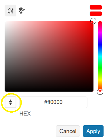
ColorPicker input mode selection redesign
Consider changing the design for the ColorPicker's input mode selection.
Currently, this is done through clicking a button with "up" and "down" arrow icons:
A more UI-friendly design for the mode selection would be nice to have, for instance, a radio group, dropdown, switch, etc.
0 comments
Type
Status
- All
- Completed (334)
- Declined (54)
- Duplicated (10)
- Need More Info (3)
- Pending Review (3)
- Planned (3)
- Under Review (2)
- Unplanned (361)
- Won't Fix (1)
Category
- All
- UI for ASP.NET Core
- ActionSheet
- AICodingAssistant
- AIPrompt
- AppBar
- ArcGauge
- AutoComplete
- Avatar
- Badge
- Barcode
- BottomNavigation
- Breadcrumb
- BulletChart
- Button
- ButtonGroup
- Calendar
- Captcha
- Cards
- Chart
- ChartWizard
- Chat
- Checkbox
- CheckBoxGroup
- Chip
- ChipList
- CircularGauge
- CircularProgressBar
- ColorGradient
- ColorPalette
- ColorPicker
- ComboBox
- ContextMenu
- DataSource
- DateInput
- DatePicker
- DateRangePicker
- DateTimePicker
- Diagram
- Dialog
- DockManager
- Draggable
- Drawer
- DropDownButton
- DropDownList
- DropDownTree
- Editor
- ExpansionPanel
- FileManager
- Filter
- FlatColorPicker
- FloatingActionButton
- Form
- Gantt
- Grid
- GridLayout
- HeatMap
- ImageEditor
- InlineAIPrompt
- Installer and VS Extensions
- Licensing
- LinearGauge
- ListBox
- ListView
- Loader
- Map
- MaskedTextBox
- MediaPlayer
- Menu
- MultiColumnComboBox
- MultiSelect
- MultiViewCalendar
- Notification
- NumericTextBox
- OrgChart
- OTPInput
- Pager
- PanelBar
- PDFViewer
- PivotGrid
- PivotGridV2
- Popover
- ProgressBar
- PropertyGrid
- QRCode
- RadialGauge
- RadioButton
- RadioGroup
- Rating
- ResponsivePanel
- Ripple
- Sankey
- Scheduler
- ScrollView
- SegmentedControl
- Signature
- SkeletonContainer
- Slider
- Sortable
- Sparkline
- SpeechToTextButton
- SplitButton
- Splitter
- Spreadsheet
- StackLayout
- Stepper
- StockChart
- Switch
- TabStrip
- TaskBoard
- Template
- TextArea
- TextBox
- TileLayout
- TimeDurationPicker
- Timeline
- TimePicker
- ToggleButton
- Toolbar
- ToolTip
- TreeList
- TreeMap
- TreeView
- Upload
- VS Code Extension
- Window
- Wizard

